


Echarts图表基础配置:
import * as echarts from 'echarts';
var myChart = echarts.init(要写入echarts的元素(div)); //初始化
var option = {
color: ['green', 'red', 'blue'], //配置每一条数据线的颜色
title: { //这里的title可以在option里面配置;也可以不配置,在元素div外面再写元素,自己写title文字及样式
text: 'echarts图表的标题'
},
xAxis: { //x轴
type: 'category', //坐标轴的类型,默认是category
data: ['1', '2', '3', '4'], //横轴的坐标值,是一个数组
axisTick: { //坐标轴刻度
show: false //不显示坐标轴的刻度
//或者
lineStyle: {默认显示刻度,刻度线的样式},
alignWithLabel: true //保证刻度线和标签对齐(在使用了interval划分步长后,可以使用这个,使一个时间节点对应一个刻度)
},
axisLine: { //坐标轴轴线
show: false //不显示坐标轴轴线
},
boundaryGap: ['5%', '5%'] //坐标轴两边留白(不配置的话,数据就会贴着纵轴开始显示,设置两边留白),
axisLabel: { //刻度的标签
interval: 1 //坐标轴的刻度显示间隔
}
},
yAxis: { //y轴
name: '盈利', //纵轴的名称
axisTick: { //坐标轴刻度
show: false //不显示坐标轴的刻度
},
axisLine: { //坐标轴轴线
show: false //不显示坐标轴轴线
},
},
series: [{ //图表数据以及数据线配置
name: '上衣', //由数据组成的这条线的名称(每一条线都应该有一个名称)
type: 'line', //表示是折线图
showSymbol: false, //折线图上面每个数据点(有一个小圈圈),不用显示出来
data: ['40', '54', '54', '44', '123', '65'], //线上的所有数据
},{ //一条线对应一个对象
name: '裙装', //第二条数据线对应的名称
type: 'line',
data: ['100', '123', '133', '234']
},
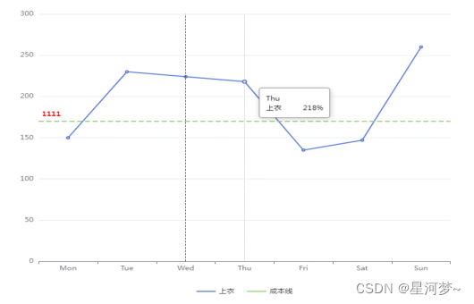
/* //通过series来显示竖线或横线
{
name: '成本线',
type: 'line',
markLine: {
symbol: 'none', //不显示线两端的标志
silent: true, //false为默认,鼠标移动到线上,线会变粗。true关闭这个效果。
label: {
position:'insideStartTop', //在线的开头的上方显示label
formatter: '1111', //label标志的内容
color:'red', //label颜色
lineHeight: 15,
fontWeight: 600
},
data: [
{
yAxis: 170 //表示是横线
}
],
lineStyle: { //线条的样式
width: 2,
type: 'dashed'
}
}
},
{
type: 'line',
markLine: {
symbol: 'none',
silent: true,
label: {
show: false
},
data: [{
xAxis: 'Wed' //竖线
}],
lineStyle: {
type: 'dashed',
color: 'red',
width: 1
}
}
}
*/
],
legend: { //echarts图下方的图形标记
type: 'scroll',
icon: 'rect',
data: ['上衣', '成本线'], // 可写可不写。这里的data应该对应series里面,每一条数据线的name(必须对应才可以)
selectedMode: false, //false时不可以通过点击图例,控制该图例对应的图像是否显示
bottom: 0,
itemWidth: 30,
itemGap: 20,
itemHeight: 2,
},
grid: {
left: '5%', //图表离父盒子左侧的距离
top: '10%',
bottom: '10%'
},
tooltip: {
trigger: 'axis', //坐标轴触发
axisPointer: { //坐标轴指示器,指示坐标轴当前刻度
lineStyle: { //指示线的样式
width: 1,
type: 'dotted',
},
},
textStyle: { //tooltip指示框中字体的样式
color: 'black',
fontSize: 12,
lineHeight: 24
},
backgroundColor: 'white',
borderWidth: 1, //指示框样式
borderColor: 'gray',
formatter: (data) => { //这里的data是图上每一个点的数据(seriesName线条名称, name横坐标名称, value纵坐标对应的值)
let valueStyle = 'display: inline-block;margin-left: 30px;'; //为某个元素单独设置样式
let params = data[0];
return `<div>
<p>${ params.name }</p>
<span>${ params.seriesName }</span>
<span style="${ valueStyle }"> ${ params.value }%</span>
</div>`
}
}
}
option && myChart.setOption(option);
实例:
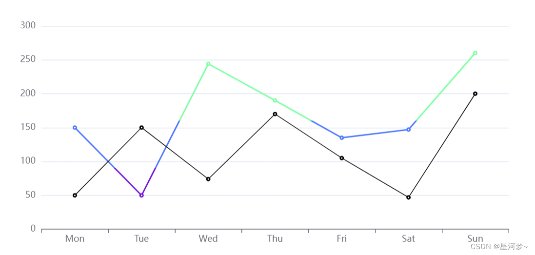
(1)将折线图在y轴分段,不同的范围用不同的颜色展示:
import * as echarts from 'echarts';

var chartDom = document.getElementById('main');
var myChart = echarts.init(chartDom);
var option;

option = {
  grid: {   //设置图表距离图表边框的距离
    left: '3%',
    right: '4%',
    bottom: '20%',
    containLabel: true   //必须要有
  },
  tooltip: {   // 先在外层写一个tooltip配置,然后可以分别为series里面的所有图形配置tooltip
  	trigger: 'item'
  },
  xAxis: {   //x轴
    type: 'category',
    data: ['Mon', 'Tue', 'Wed', 'Thu', 'Fri', 'Sat', 'Sun']
  },
  yAxis: {   //y轴
    type: 'value'
  },
  series: [
    {
      data: [150, 50, 244, 190, 135, 147, 260],
      type: 'line',
      tooltip:{
      	padding: 0,
      	backgroundColor: 'white',
      	formatter: param => {
      		const spanStyle = 'display: block;'
      		return `<div>
      					<span style="${spanStyle}">名称:${param.name}</span>
      				</div>`
      	}
      }
    },
    {
      data: [50, 150, 74, 170, 105, 47, 200],
      type: 'line',
      color: 'rgb(0, 0, 0)',
      lineStyle: {
        width: 1  //折线的宽度
      },
      tooltip: {
      	formatter: param => {
      		return `<div>
      					<span>标志:${param.data.tag}</span>
      				</div>`
      	}
      }
    }
  ],
  visualMap: {    //视觉映射
    show: false,   //不显示分段的标志
    type: 'piecewise',   //分段型
    seriesIndex: 0,   //选择要分段的系列数据,这里选择第一条数据
    pieces: [   //自定义分段
      {
        gt: 0,  //>0
        lte: 90,   <=90
        color: 'rgb(116, 21, 219)'
      },
      {
        gt: 90,  // >90
        lte: 160,  //  <=160
        color: 'rgb(77, 119, 255)'
      },
      /*{
        gt: 160,   //  >160
        color: 'rgb(128, 255, 165)'
      }
      */
      //或者
      outOfRange: {   //超出上面的范围的
		  color: 'rgb(128, 255, 165)'
	  }
    ]
  }
};

option && myChart.setOption(option);

/* vue组件里面,让Echart图渲染到页面*/
this.$nextTick(() => {
    this.chart.resize();
});
效果:
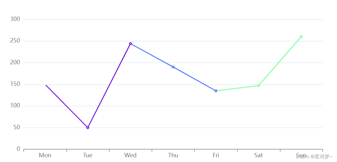
(2)将折线图以x轴进行分段(dimension: 0),显示不同的颜色:
option = {
  grid: {
    left: '3%',
    right: '4%',
    bottom: '20%',
    containLabel: true
  },
  xAxis: {
    type: 'category',
    data: ['Mon', 'Tue', 'Wed', 'Thu', 'Fri', 'Sat', 'Sun']
  },
  yAxis: {
    type: 'value'
  },
  series: [
    {
      data: [150, 50, 244, 190, 135, 147, 260],
      type: 'line'
    }
  ],
  visualMap: {
    dimension: 0, //有这一个配置,才是以x轴分段
    seriesIndex: 0,
    pieces: [
      {
        gt: 0,
        lte: 2,
        color: 'rgb(116, 21, 219)'
      },
      {
        gt: 2,
        lte: 4,
        color: 'rgb(77, 119, 255)'
      },
      {
        gt: 4,
        color: 'rgb(128, 255, 165)'
      }
    ]
  }
};
(3)在一条折线图上展示两部分数据(第一部分数据为历史数据,第二部分为预测数据)
const hisData = [93, 76, 91, 122, 113, 132, 140]  //历史数据数组
const hisDate = ['06-13', '06-14', '06-15', '06-16']
const hisVal = new Array(hisData.length-1).fill('');   //生成一串字符串构成的数组,长度为历史数据数组长度-1(因为历史数据分为这么多段),作为预测数据数组的前一部分
const preNum = 3;
let today = new Date().getTime();  //当天的时间(毫秒)
//假如需要5天的预测数据,那么就在历史数据最后一个数据的基础上,进行预测
let preDate = []
let preValue = [];
for(let i = 0; i<5; i++) {
	preDate.push(today + 86400000 * i)  //时间轴
	preValue.push(hisData[hisData.length-1] + preNum * i);   //预测的数据
}
preValue.unshift(hisData[hisData.length-1])   //预测的数据段,起始点是历史数据最后一个点

let predictVal = hisVal.concat(preValue);      //预测数据的数组  ['', '', '', '', '', '', 140, 143, 146, 149, 152]
let predictDate = preDate.map(item => format(item))   //预测数据的日期

//x轴的日期
let xDate = hisDate.concat(predictDate );

option = {
  xAxis: {
    type: 'category',
    data: xDate
  },
  yAxis: {
    type: 'value'
  },
  series: [
    {
      data: hisData ,
      type: 'line'
    },
    {
	  data: predictVal ,
      type: 'line'
	}
  ]
};
//格式化时间
方法一:
const timeStamp = [1650338644357, 1651338644357, 1652338644357, 1653338644357, 996422400000, 996508800000, 1659338644357]
const res = timeStamp.map(item => {
	return echarts.format.formatTime('yyyy-MM-dd', item)  // echarts中格式化时间 'yyyy-MM-dd','MM-dd'
	// return this.$echarts.format.formatTime('yyyy-MM-dd', item)  // vue中使用echarts格式化时间的方法
})

二:
function format(dat){
    //获取年月日,时间
    var year = dat.getFullYear();
    var mon = (dat.getMonth()+1) < 10 ? "0"+(dat.getMonth()+1) : dat.getMonth()+1;
    var data = dat.getDate()  < 10 ? "0"+(dat.getDate()) : dat.getDate();
    var hour = dat.getHours()  < 10 ? "0"+(dat.getHours()) : dat.getHours();
    var min =  dat.getMinutes()  < 10 ? "0"+(dat.getMinutes()) : dat.getMinutes();
    var seon = dat.getSeconds() < 10 ? "0"+(dat.getSeconds()) : dat.getSeconds();

    //var newDate = year +"-"+ mon +"-"+ data +" "+ hour +":"+ min +":"+ seon;
    var newDate = mon +"-"+ data;
    return newDate;
}


 3176
3176


 被折叠的 条评论
为什么被折叠?
被折叠的 条评论
为什么被折叠?
 到【灌水乐园】发言


