


uniapp自定义封装tabbar
开发原因: 有很多时候 小程序并没有其类目 需要通过配置发布审核,
ps:需要去掉项目pages.json tabbar配置,不然重进会显示默认,跳转页面不能uni.switchTab。
-
组件tabbar
<template>
  <view
    class="myTabBar"
    style="box-sizing: content-box"
    :style="{
      height: height,
      background: backgroundColor,
      'border-top-color': borderStyle,
      'padding-bottom': isIPhoneXX && iOSBottomBarHeight
    }"
  >
    <view
      class="tabBar-item"
      v-for="(item, index) in list"
      :key="index"
      @click="onClickItem(index,item)"
    >
      <view class="tabTag"  :class="{
        'ischose': tacurrent != index,
      }" v-if="item.num && item.num>0">
        <u-badge size="small" :count="item.num" type="error"></u-badge>
      </view>
      <!-- <view class="tabTag" v-if="item.num===-1">
        <u-badge size="small" :count="item.num" is-dot type="error"></u-badge>
      </view> -->
      <view class="tabBar-img">
        <image
            class="tabBar-img"
            :src="item.iconPath"
            mode="widthFix"
            v-if="tacurrent !== index"
            :style="{
          width: iconWidth
        }"
        ></image>
        <image
            class="tabBar-img"
            :src="item.selectedIconPath"
            mode="widthFix"
            v-if="tacurrent === index"
            :style="{
          width: iconWidth
        }"
        ></image>
      </view>
      <view
        class="tabBar-text"
        :style="{
          color: color,
          color: tacurrent === index && selectedColor,
          'font-size': fontSize,
          'font-family':'Microsoft YaHei',
          'padding-top': spacing
        }"
        >{{ item.text }}</view
      >
    </view>
  </view>
</template>
<script>
export default {
  components: {},
  data() {
    return {
      iOSBottomBarHeight: '34px',
      isIPhoneXX: false
    }
  },
  props: {
    tacurrent: Number, // 当前选中的值
    color: {
      // tab 上的文字默认颜色
      type: String,
      default: '#100405'
    },
    selectedColor: {
      // tab 上的文字选中时的颜色
      type: String,
      default: '#C31107'
    },
    backgroundColor: {
      // tab 的背景色
      type: String,
      default: '#ffffff'
    },
    borderStyle: {
      // tabbar 上边框的颜色
      type: String,
      default: '#dddddd'
    },
    fontSize: {
      // 文字默认大小
      type: String,
      default: '13px'
    },
    iconWidth: {
      // 图标默认宽度
      type: String,
      default: '20px'
    },
    spacing: {
      // 图标和文字的间距
      type: String,
      default: '0px'
    },
    height: {
      // tabBar 默认高度
      type: String,
      default: '50px'
    },
    list: {
      type: Array
      /**
				[
					{
						pagePath: '', // 页面路径
						text: '', // tab 上按钮文字
						iconPath: '', // 图片路径 图片请使用base64
						selectedIconPath: '', // 选中时的图片路径 图片请使用base64
						num: '', // 红色数字角标
					}
				]
			 */
    }
  },
  onLoad() {},
  onShow() {},
  onHide() {},
  created() {
    try {
      const { isIPhoneXX } = getApp().globalData
      this.isIPhoneXX = isIPhoneXX
    } catch (e) {}
    // try {
    //   const res = wx.getSystemInfoSync()
    //   console.log('getSystemInfoSync', res)
    //   if (
    //     res.model.search('iPhone X') != -1 ||
    //     res.model.search('iPhone 12 mini') != -1 ||
    //     res.model.search('iPhone 11') != -1 ||
    //     res.model.search('iPhone 12') != -1 ||
    //     res.model.search('iPhone 13') != -1 ||
    //     res.model.search('iPhone 14') != -1
    //   ) {
    //     this.isIPhoneXX = true
    //   }
    // } catch (e) {
    //   // Do something when catch error
    // }
  },
  methods: {
    onClickItem(index,item) {
      this.$emit('update:value', index)
      this.$emit('callback', index,item)
    }
  }
}
</script>

<style lang="scss" scoped>
.myTabBar {
  // display: flex;
  // justify-content: space-between;
  // align-items: center;
  // border-top: 1px solid #eee;
  // width: 100%;
  // padding-top: 10rpx;
    display: flex;
    flex-direction: row;
    align-items: center;
    position: relative;
    position: fixed;
    bottom: 0;
    left: 0;
    width: 100%;
    z-index: 998;
    padding-bottom:15px;
    padding-top:5px;
    box-sizing: initial;
  .tabBar-item {
    position: relative;
    // flex: 1;
    // text-align: center;
    // line-height: 1;
    flex: 1;
    justify-content: center;
    height: 100%;
    padding: 6px 0;
    display: flex;
    flex-direction: row;
    flex-direction: column;
    align-items: center;
  }
  .tabBar-text {
    line-height: 1;
  }
  .tabBar-img {
    display: inline-block;
    width: 40rpx;
    height: 48rpx;
  }
  .tabTag {
    position: absolute;
    top: 0;
    left: 50%;
    // margin: 0 auto;
    z-index: 9;
  }
  .ischose{
    top: -16% !important;
    left: 83% !important;
  }
}
</style>
2.使用页面
.使用组件
<!--底部菜单--> <template> <view class="btn-bar"> <tabbar :tacurrent="tacurrent" :list="tabList" @callback="tabbarCallback" /> </view> </template> . 定义变量
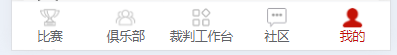
tacurrent:0,//当前显示
tabList:[ {
    iconPath: "/static/img/Navigation1.png",
    selectedIconPath: "/static/img/Navigation1_1.png",
    text: "比赛",

    pagePath: "/pages/index/index",
    midButton: true,
  },

 {
    iconPath: "/static/img/Navigation3.png",
    selectedIconPath: "/static/img/Navigation3_3.png",
    text: "俱乐部",
    pagePath: "/pages/club/index",
    midButton: false,
  },
  {
    iconPath: "/static/img/Navigation4.png",
    selectedIconPath: "/static/img/Navigation4_4.png",
    text: "裁判工作台",
    customIcon: false,
    pagePath: "/pages/referee/index",
  },
  {
    iconPath: "/static/img/Navigation5.png",
    selectedIconPath: "/static/img/Navigation5_5.png",
    text: "我的",
    customIcon: false,
    pagePath: "/pages/center/center",
  },]
.悬浮底部样式
.btn-bar {
	position: fixed;
	bottom: 0;
	left: 0;
	width: 100%;
	height: 130rpx;
	background-color: #ffffff;
	box-shadow: 0 0 36rpx 0 rgba(0, 0, 0, 0.08);
	display: flex;
	justify-content: space-between;
	align-items: center;
	padding: 0 24rpx;
	z-index: 9999;
}


 扫一扫
扫一扫


 980
980

 被折叠的 条评论
为什么被折叠?
被折叠的 条评论
为什么被折叠?
 到【灌水乐园】发言


