


如何让 matplotlib 在 Ubuntu 16.04 中流畅地显示中文
如何让 matplotlib 在 Ubuntu 16.04 中流畅地显示中文
最近,为了帮朋友处理高考数据,我们需要用matplotlib来画画,画图例需要用中文说明。因此,我们需要解决 matplotlib 默认不能显示中文的问题。
需要强调的是,本文测试的环境是 Ubuntu 16.04.4 LTS,本文测试的 matplotlib 库是通过 conda 命令安装的(如何使用 conda 管理 python 环境可以参考我的另一篇博客)。纯终端命令启动您的 Anaconda 安装和 Python 环境管理也就是说,本文要解决的问题是:在 Ubuntu 16.04 下,如何在 conda 管理的 python 环境中在 matplotlib 中正确显示中文。
- 本文中使用的非代码资源包括:
simhei 字体 百度云链接 Ubuntu 16.04
提取代码:rxhd
1. 确定您正在使用的 matplotlib
在python中使用以下代码获取您正在使用的matplotlib的字体设置文件位置
import matplotlib
matplotlib.matplotlib_fname()
以下是我的 python 返回的值:
'/home/lab-chen.yirong/anaconda2/envs/py36/lib/python3.6/site-packages/matplotlib/mpl-data/matplotlibrc'
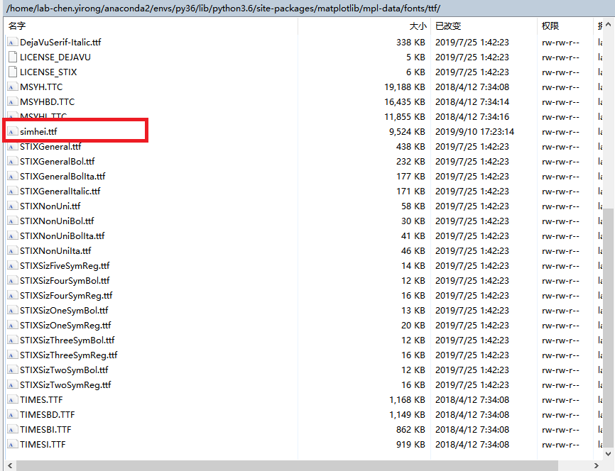
那么,字体存储位置是:/首页/实验室陈。Yirong / anaconda2 / envs / py36 / lib / Python 3.6 / site-packages / Matplotlib / mpl-data / fonts / ttf
要修改的字体设置文件是:/ home/lab-chen.yirong/anaconda2/envs/py36/lib/python 3.6/site-packages/matplotlib/mpl-data/matplotlibrc。
2. 下载适用于 Ubuntu 16.04 的 simhei 字体
simhei 字体 百度云链接 Ubuntu 16.04
提取代码:rxhd 将字体文件
移动到…/matplotlib/mpl-data/fonts/ttf。下图显示了我如何使用 Windows 将文件从 Windows 发送到服务器:
3. 修改 matplotlibrc 文件
当你打开 matplotlibrc 文件文件时,可以看到每一行都使用 # 注释来删除代码,所以我们需要找到对应的代码并删除注释,修改代码:
- 在文件的第 162 行左右,出现了 FONT,这提醒我们字体设置将随之而来。
我把 198 到 213 行放在下面,你可以看到每一行都是灰色的(也就是说,它被注释掉了):
#font.family         : sans-serif
#font.style          : normal
#font.variant        : normal
#font.weight         : normal
#font.stretch        : normal
## note that font.size controls default text sizes.  To configure
## special text sizes tick labels, axes, labels, title, etc, see the rc
## settings for axes and ticks. Special text sizes can be defined
## relative to font.size, using the following values: xx-small, x-small,
## small, medium, large, x-large, xx-large, larger, or smaller
#font.size           : 10.0
#font.serif          : DejaVu Serif, Bitstream Vera Serif, Computer Modern Roman, New Century Schoolbook, Century Schoolbook L, Utopia, ITC Bookman, Bookman, Nimbus Roman No9 L, Times New Roman, Times, Palatino, Charter, serif
#font.sans-serif     : DejaVu Sans, Bitstream Vera Sans, Computer Modern Sans Serif, Lucida Grande, Verdana, Geneva, Lucid, Arial, Helvetica, Avant Garde, sans-serif
#font.cursive        : Apple Chancery, Textile, Zapf Chancery, Sand, Script MT, Felipa, cursive
#font.fantasy        : Comic Sans MS, Chicago, Charcoal, ImpactWestern, Humor Sans, xkcd, fantasy
#font.monospace      : DejaVu Sans Mono, Bitstream Vera Sans Mono, Computer Modern Typewriter, Andale Mono, Nimbus Mono L, Courier New, Courier, Fixed, Terminal, monospace
- 其中,我们需要修改 font.family 和 font.sans-serif。一种是删除评论,另一种是添加SimHei字体。修改后的代码如下:
font.family         : sans-serif
#font.style          : normal
#font.variant        : normal
#font.weight         : normal
#font.stretch        : normal
## note that font.size controls default text sizes.  To configure
## special text sizes tick labels, axes, labels, title, etc, see the rc
## settings for axes and ticks. Special text sizes can be defined
## relative to font.size, using the following values: xx-small, x-small,
## small, medium, large, x-large, xx-large, larger, or smaller
#font.size           : 10.0
#font.serif          : DejaVu Serif, Bitstream Vera Serif, Computer Modern Roman, New Century Schoolbook, Century Schoolbook L, Utopia, ITC Bookman, Bookman, Nimbus Roman No9 L, Times New Roman, Times, Palatino, Charter, serif
font.sans-serif     : SimHei, DejaVu Sans, Bitstream Vera Sans, Computer Modern Sans Serif, Lucida Grande, Verdana, Geneva, Lucid, Arial, Helvetica, Avant Garde, sans-serif
#font.cursive        : Apple Chancery, Textile, Zapf Chancery, Sand, Script MT, Felipa, cursive
#font.fantasy        : Comic Sans MS, Chicago, Charcoal, ImpactWestern, Humor Sans, xkcd, fantasy
#font.monospace      : DejaVu Sans Mono, Bitstream Vera Sans Mono, Computer Modern Typewriter, Andale Mono, Nimbus Mono L, Courier New, Courier, Fixed, Terminal, monospace
保存后退出!
4. 删除 ~/.cache/matplotlib/
- 进入~/。终端缓存
cd ~/.cache/
- 使用 rm 命令删除文件夹 matplotlib/
rm -rf matplotlib/
5. 关闭 python 内核,重新打开并运行代码
需要注意的是,在运行测试代码之前,建议关闭python内核,即如果Pycharm正在打开,请将其关闭;如果 Jupyter 笔记本正在打开,请先将其关闭。然后重新进入编译环境。
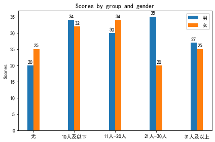
运行以下代码,查看中文是否可以正确显示:
# Applicant Number Options in Statistical Institute's Secondary Schools
import matplotlib
import matplotlib.pyplot as plt
import numpy as np


labels = ['nothing', '10 Below and below', '11 people-20 people', '21 people-30 people', '31 People and above']

men_means = [20, 34, 30, 35, 27]
women_means = [25, 32, 34, 20, 25]

x = np.arange(len(labels))  # the label locations
width = 0.15  # the width of the bars

fig, ax = plt.subplots()
rects1 = ax.bar(x - width/2, men_means, width, label='male')
rects2 = ax.bar(x + width/2, women_means, width, label='female')

# Add some text for labels, title and custom x-axis tick labels, etc.
ax.set_ylabel('Scores')
ax.set_title('Scores by group and gender')
ax.set_xticks(x)
ax.set_xticklabels(labels)
ax.legend()

for l in ax.yaxis.get_ticklabels():
        l.set_family('SimHei')

def autolabel(rects):
    """Attach a text label above each bar in *rects*, displaying its height."""
    for rect in rects:
        height = rect.get_height()
        ax.annotate('{}'.format(height),
                    xy=(rect.get_x() + rect.get_width() / 2, height),
                    xytext=(0, 3),  # 3 points vertical offset
                    textcoords="offset points",
                    ha='center', va='bottom')

autolabel(rects1)
autolabel(rects2)

fig.tight_layout()
plt.show()
我在 jupyter 笔记本上运行的结果如下:


 9773
9773


 被折叠的 条评论
为什么被折叠?
被折叠的 条评论
为什么被折叠?
 到【灌水乐园】发言


