for col in 特征列表:
data[ col] . replace( [ 0 ] , [ None ] , inplace= True )
data_drop= data. dropna( )
ax= ( ( data_drop. mean( ) - data. mean( ) ) / data. mean( ) ) . plot( kind= "bar" , title= "change in mean" )
ax. set_ylabel( "% change" )
data. hist( figsize= ( 15 , 15 ) ,share= True )
test= np. loadtxt( "路径"
,delimiter= ","
, dtype= "int"
, unpack= True )
a= [ 1 , 2 , 3 , 4 , 5 , 32 , 34 , 34 , 4 , 3 , ]
np. argmax( a, axis= 0 )
np. unique( y)
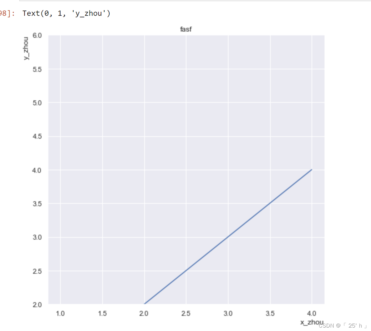
fig= plt. figure( figsize= ( 8 , 8 ) )
ax= fig. add_subplot( 111 )
ax. set_ylim( [ 2 , 6 ] )
ax. set_title( "fasf" )
ax. plot( [ 1 , 2 , 3 , 4 ] , [ 1 , 2 , 3 , 4 ] )
ax. set_xlabel( "x_zhou" , loc= "right" )
ax. set_ylabel( "y_zhou" , loc= "top" )
plt. tight_layout( )
fig. subplots_adjust( left= None , bottom= None , right= None , top= None
, wspace= None
, hspace= None )
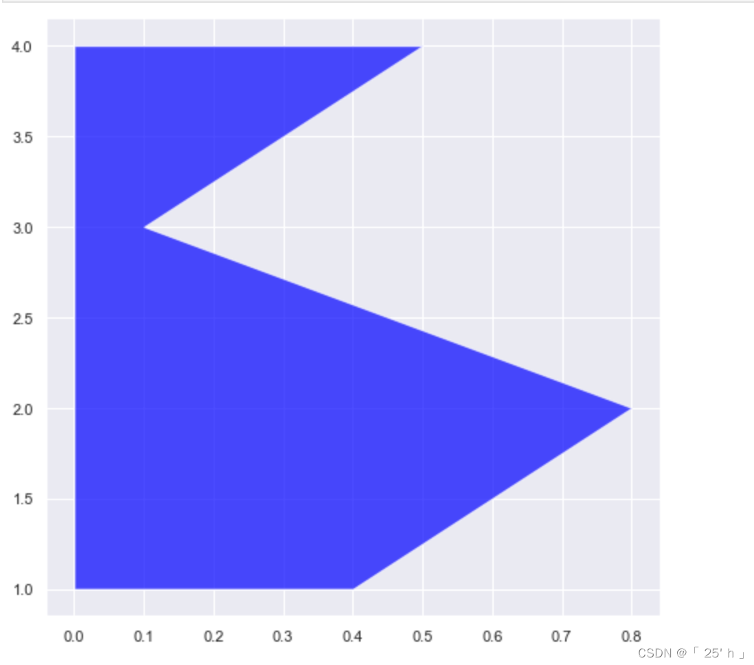
ax. fill_betweenx( [ 1 , 2 , 3 , 4 ] ,
[ 0.4 , 0.8 , 0.1 , 0.5 ] ,
facecolor= "red" ,
alpha= 0.7
)
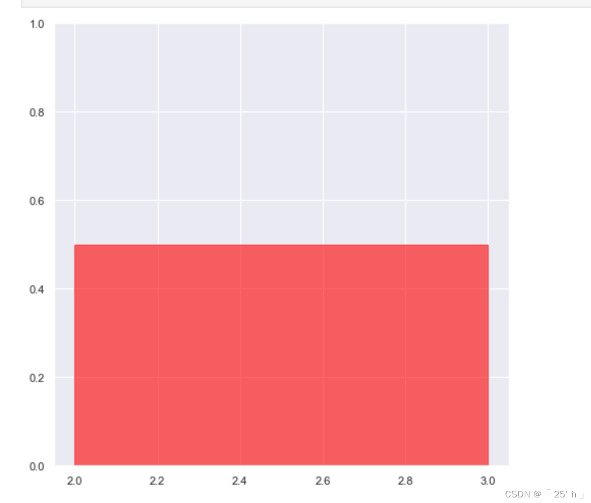
ax. axvspan( xmin= 2
, xmax= 3
, ymin= 0
, ymax= 1
, color= "red"
, alpha= 0.6 )
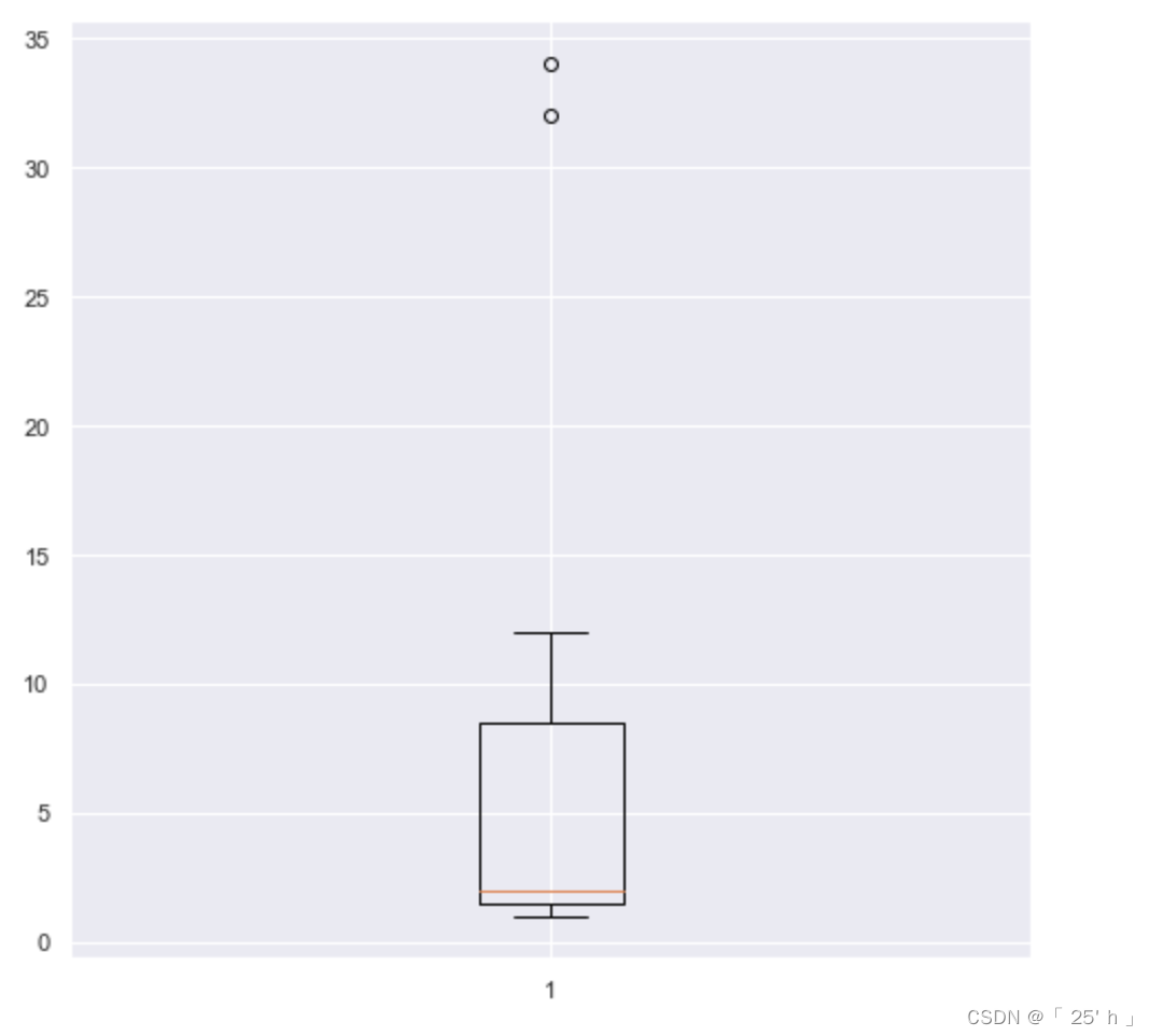
fig = plt. figure( figsize= ( 8 , 8 ) , dpi= 200 )
fig. add_subplot( 111 )
ax. boxplot( [ 1 , 2 , 3 , 2 , 12 , 2 , 1 , 12 , 12 , 1 , 2 , 1 , 2 , 1 , 3 , 4 , 32 , 5 , 34 , ] )
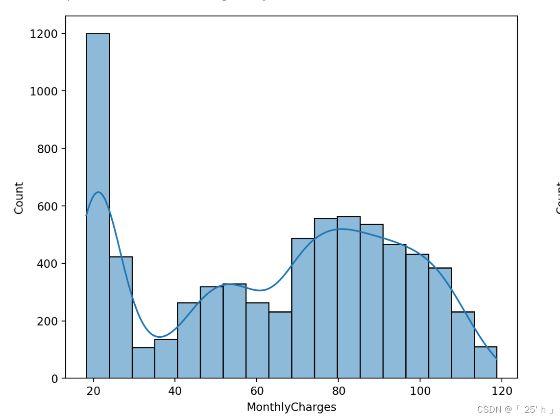
plt. xlabel( 'MonthlyCharges' )
import seaborn as sns
fig = plt. figure( figsize= ( 16 , 6 ) , dpi= 200 )
fig. add_subplot( 121 )
sns. histplot( 数据, kde= True )
fig. add_subplot( 122 )
sns. histplot( tcc[ 'TotalCharges' ] , kde= True )
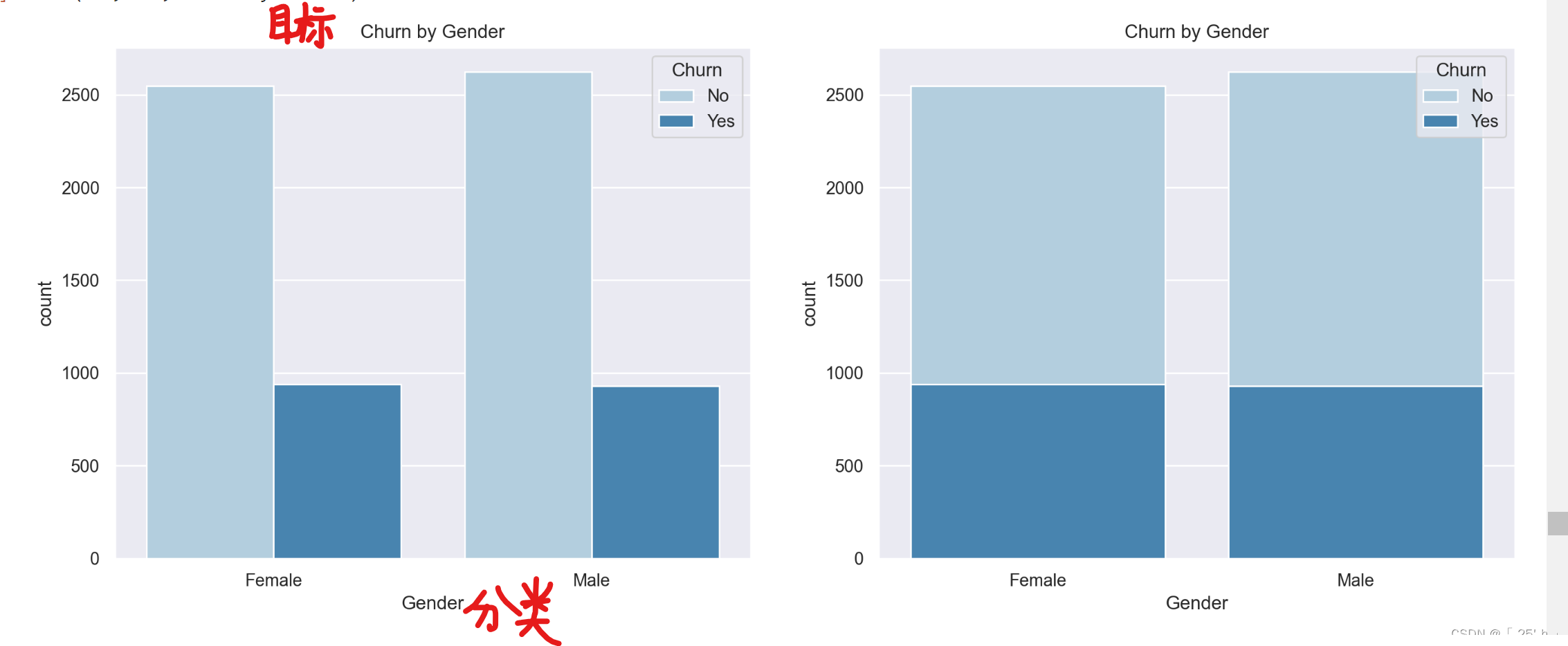
fig = plt. figure( figsize= ( 16 , 6 ) , dpi= 200 )
fig. add_subplot( 121 )
sns. countplot( x= 分类标签, hue= 目标(统计)便签, data= pandas数据, palette= "Blues" , dodge= True )
plt. xlabel( "Gender" )
plt. title( "Churn by Gender" )
fig. add_subplot( 122 )


 1万+
1万+


 被折叠的 条评论
为什么被折叠?
被折叠的 条评论
为什么被折叠?
 到【灌水乐园】发言


