


echarts图表参考案例(https://www.makeapie.cn/echa)
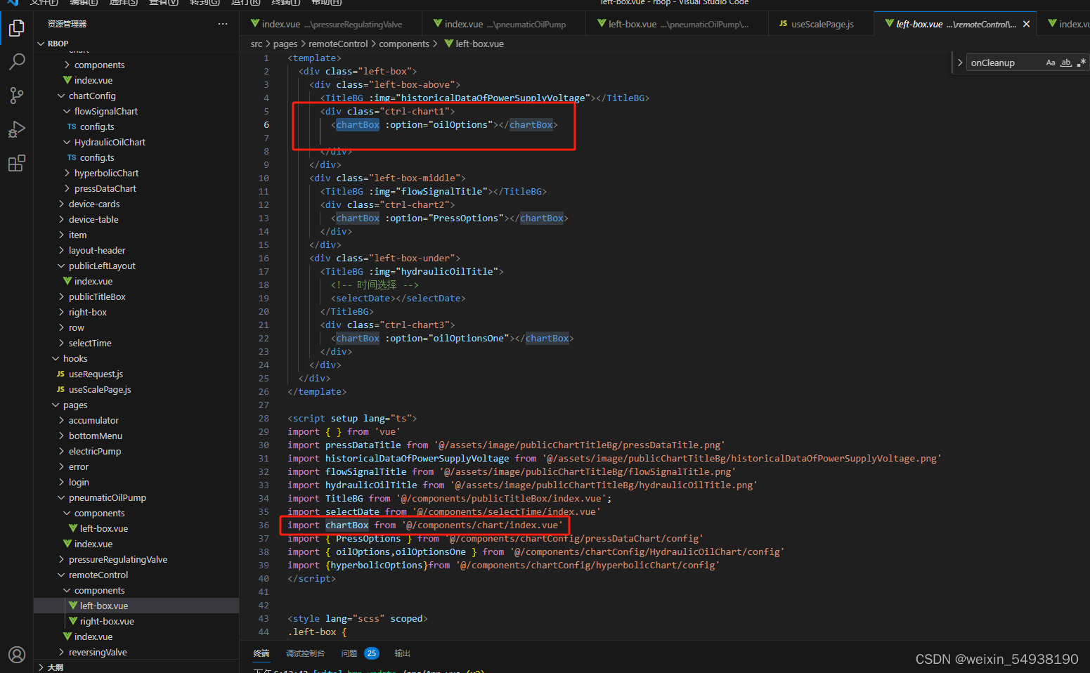
1.封装图表echarts组件
<template>
  <div class="chart-box">
    <div ref="chartDom" class="chart-wrap"></div>
  </div>
</template>

<script  setup>
import { ref, watchEffect, computed,inject } from 'vue'
import { useEventListener } from '@vueuse/core'
import { deepMerge } from '@/utils'

const props = defineProps({
  option: Object,
  theme: String,
  color: String,
})

// const store = useStore()
// const dark = computed(() => (props.theme || store.state.settings.dark ? 'dark' : 'light'))
const dark =ref('dark')
const optionRef = computed(() => props.option)
const echarts = inject('echarts')
const chartDom = ref(null)
let echartsInstance

const disposeChart = () => {
  echartsInstance && echartsInstance.dispose()
}

const initChart = (container) => {
  const { color: _color = '#fff' } = props
  const color = dark.value === 'dark' ? '#fff' : _color
  const defaultOption = {
    legend: {
      itemWidth: 20,
      itemHeight: 10,
      textStyle: {
        color,
      },
    },
    textStyle: {
      color,
      fontSize: 10,
    },
    backgroundColor: 'transparent',
  }
  const _option = deepMerge(defaultOption, optionRef.value)
  echartsInstance = echarts.init(container, dark.value)
  echartsInstance.setOption(_option)

  useEventListener(window, 'resize', function () {
    echartsInstance?.resize()
  })
}

const getEchartsInstance = () => echartsInstance

watchEffect((onCleanup) => {
  if (!chartDom.value || !optionRef.value) return
  onCleanup(disposeChart)
  initChart(chartDom.value)
})

defineExpose({
  getEchartsInstance,
})
</script>

<style lang="scss" scoped>
.chart-box {
  height: 100%;
  .chart-wrap {
    height: 100%;
  }
  // @media screen and (min-width: 3800px) {
  //   .chart-wrap {
  //     height: 50%;
  //     width: 50%;
  //     transform: scale(2);
  //     transform-origin: 0 0;
  //   }
  // }
}
</style>
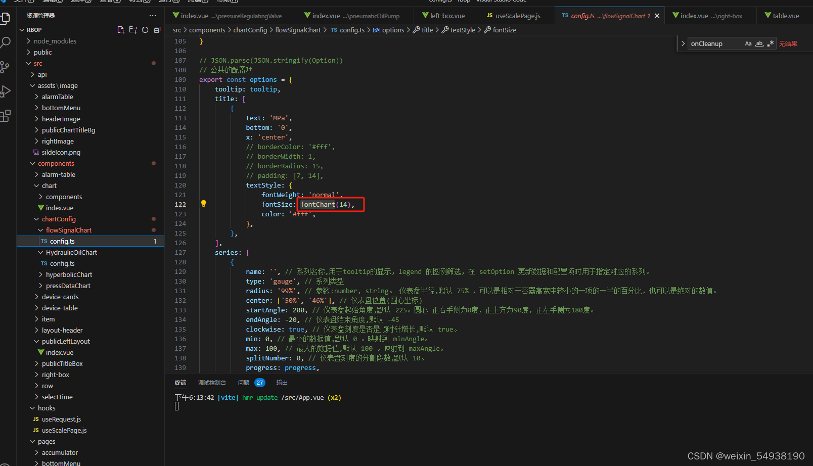
2.echarts图表字体大小自适应(一般情况下页面实现自适应之后,字体也会随着缩放,不用使用该方法了)
// 字体转换 px -> rem
export function fontChart (res) {
  const clientWidth =
    window.innerWidth ||
    document.documentElement.clientWidth ||
    document.body.clientWidth
  if (!clientWidth) return
  // 此处的3840 为设计稿的宽度,记得修改!
  const fontSize = clientWidth / 1920
  console.log(res * fontSize, '文字')
  return res * fontSize
}

// 字体转换 px -> rem
export function transfromFontSize (res) {
  const clientWidth = window.screen.width

  // 此处的3840 为设计稿的宽度,记得修改!
  const fontSize = clientWidth / 1920

  console.log(res * fontSize, '折线图文字')
  return res * fontSize
}
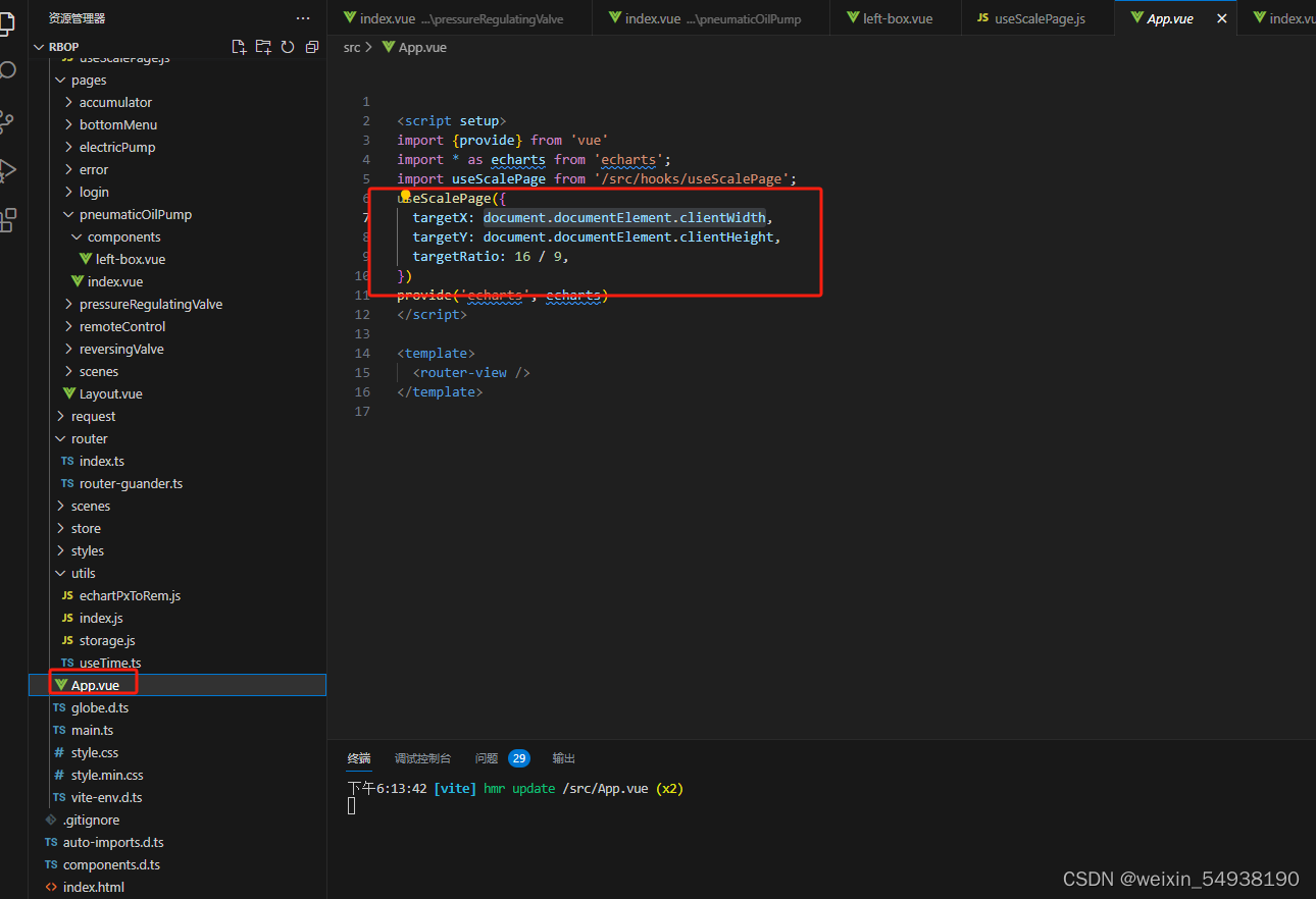
3.大屏项目自适应
a.这是初版,会出现留白的情况
import { onMounted, onUnmounted } from "vue";
import _ from "lodash";

export default function useScalePage(option = {}) {
  let resizeChange = _.throttle(function () {
    triggerScale();
  }, 100);

  onMounted(function () {
    console.log("useScale onmounted");
    triggerScale();
    window.addEventListener("resize", resizeChange);
  });

  onUnmounted(function () {
    console.log("useScale onUnmounted");
    window.removeEventListener("resize", resizeChange);
  });
  console.log("111", option);
  function triggerScale() {
      // let targetX = option.targetX || 1920;
      // let targetY = option.targetY || 1080;
      // 这里面是设计稿的宽高
      let targetX = 1920
      let targetY = 1080
      let targetRatio = option.targetRatio || 16 / 9

      // 1.拿到当前屏幕的宽高
      let currentX =
          document.documentElement.clientWidth || document.body.clientWidth
      let currentY =
          document.documentElement.clientHeight || document.body.clientHeight

      // 2.计算缩放的比例
      let scaleRatio = currentX / targetX

      // 当前的屏幕宽高比
      let currentRatio = currentX / currentY
      if (currentRatio > targetRatio) {
          scaleRatio = currentY / targetY
          // 3.设置缩放( 类似图片放大 )
          document.body.setAttribute(
              'style',
              `width:${targetX}px;height:${targetY}px;transform: scale(${scaleRatio})  translateX(-50%); left:50%`
          )
      } else {
          // 3.设置缩放( 类似图片放大 )
          document.body.setAttribute(
              'style',
              `width:${targetX}px;height:${targetY}px;transform: scale(${scaleRatio})`
          )
      }
  }
}

b.这是更改的第二版,不会出现留白,但是一些奇怪的分辨率下可能会模糊
import { onMounted, onUnmounted } from "vue";
import _ from "lodash";

export const useScalePageByTransfer = (option = {}) => {
  // screen.availHeight:用来显示浏览器的屏幕的可用高度
  let screenWidth = option.targetX
  //  screen.availWidth:用来显示浏览器的屏幕的可用宽度。
  let screenHeight = option.targetY
  let scaleX = screenWidth / 1920
  let scaleY = screenHeight / 1080
  // transform-origin:left top;(以左上角为基点)
  document.body.setAttribute(
    'style',
    `width:1920px;height:1080px;transformOrigin:left top;transform: scale(${scaleX}, ${scaleY})`
)
}


 1063
1063


 被折叠的 条评论
为什么被折叠?
被折叠的 条评论
为什么被折叠?
 到【灌水乐园】发言


