


CSS总结
一些杂七杂八的东西:
画图工具的快速打开方式:win+R 输入:mspaint
案例网站:https://www.w3school.com.cn/
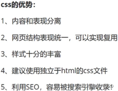
1.CSS的优势
2.CSS的基本语法
<!--规范,<style>可以编写css的代码,没一个声明,最好使用分号结尾
语法:
    选择器{
        声明1;
        声明2;
        声明3;
    }
-->
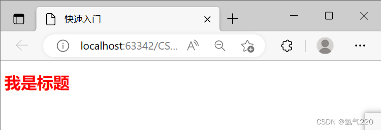
2.1例子(快速入门)
<!DOCTYPE html>
<html lang="en">
<head>
    <meta charset="UTF-8">
    <title>Title</title>
<!--规范,<style>可以编写css的代码,没一个声明,最好使用分号结尾
语法:
    选择器{
        声明1;
        声明2;
        声明3;
    }
-->
<!--    <style>-->
<!--        h1{-->
<!--            color: red;-->
<!--        }-->
<!--    </style>-->
    <link rel="stylesheet" href="css/style.css">
</head>
<body>
<h1>我是标题</h1>
</body>
</html>
2.2效果
3.3种引入的方式
3.1行内样式
行内样式:在标签元素中,编写一个style属性,编写样式即可
<!--行内样式:在标签元素中,编写一个style属性,编写样式即可-->
<h1 style="color: aqua">我是标题</h1>
3.2内部样式
<!--内部样式-->
    <style>
        h1{
            color:red;
        }
    </style>
3.3外部样式
<!--外部样式-->
    <link rel="stylesheet" href="css/style.css">
3.4优先级
就近原则
3.5三者比较
<!DOCTYPE html>
<html lang="en">
<head>
    <meta charset="UTF-8">
    <title>3种引入方式</title>
<!--内部样式-->
    <style>
        h1{
            color:red;
        }
    </style>
<!--外部样式-->
    <link rel="stylesheet" href="css/style.css">
</head>
<body>
<!--优先级:就近原则-->
<!--行内样式:在标签元素中,编写一个style属性,编写样式即可-->
<h1 style="color: aqua">我是标题</h1>
</body>
</html>
4.CSS的选择器
4.1基本选择器
id >class >标签
标签选择器
 /*标签选择器:选择一类标签 标签{}*/
        h1{
            color: rgba(119, 65, 58, 0.93);
        }
id 选择器
  /*id选择器:全局唯一。 #id名{}*/
        #bb{
            color: rgba(54,227,82,0.93);
        }
class 选择器
/*类选择器:选择所有class属性一致的标签,跨标签。 .类名{}*/
        .aa{
            color: rgba(67,63,227,0.93);
        }
例子
<!DOCTYPE html>
<html lang="en">
<head>
    <meta charset="UTF-8">
    <title>Title</title>
    <style>
        /*
        标签选择器:选择一类标签 标签{}
        */
        h1{
            color: rgba(119, 65, 58, 0.93);
        }
        /*类选择器:选择所有class属性一致的标签,跨标签。 .类名{}*/
        .aa{
            color: rgba(67,63,227,0.93);
        }
        /*id选择器:全局唯一。 #id名{}*/
        #bb{
            color: rgba(54,227,82,0.93);
        }
    </style>
</head>
<body>
<h1 class="aa">辉煌说</h1>
<h1 id="bb">辉煌说</h1>
<h1>辉煌说</h1>
</body>
</html>
4.2高级选择器
层次选择器
1.后代选择器
/*后代选择器:某个元素后面 祖爷爷 爷爷 爸爸 你*/
body p{
background: rgba(133,227,33,0.93);
 }
2.子选择器
/*子选择器:一代,儿子*/
        body>p{
            background: rgba(38,23,227,0.93);
        }
3.相邻通用选择器
   /*相邻兄弟选择器 只有一个,相邻,向下*/
        .active+p{
            background: red;
        }
4.通用选择器
/*通用选择器,当前选中元素的向下所有兄弟元素*/
        .active~p{
            background: bisque;
        }
例子
<!DOCTYPE html>
<html lang="en">
<head>
    <meta charset="UTF-8">
    <title>Title</title>
    <style>
        /*后代选择器:某个元素后面*/
        body p{
            background: rgba(133,227,33,0.93);
        }
        /*子选择器:一代,儿子*/
        body>p{
            background: rgba(38,23,227,0.93);
        }
        /*相邻兄弟选择器 只有一个,相邻,向下*/
        .active+p{
            background: red;
        }
        /*通用选择器,当前选中元素的向下所有兄弟元素*/
        .active~p{
            background: bisque;
        }

    </style>
</head>
<body>
<p>p0</p>
<p class="active">p1</p>
<p>p2</p>
<p>p3</p>
<ul>
    <li>
        <p>p4</p>
    </li>
    <li>
        <p>p5</p>
    </li>
    <li>
        <p>p6</p>
    </li>
</ul>
</body>
</html>
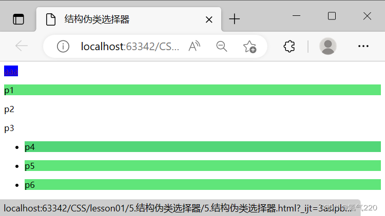
结构伪类选择器
/*ul的第一个子元素*/
        ul li:first-child{
            background: rgba(38,23,227,0.93);
        }
 /*ul的最后一个子元素*/
        ul li:last-child{
            background: red;
        }
 /*选中p1:定位到父元素,选择当前的第一个元素
选择当前元素的父级元素,选中父级元素的第一个,并且是当前元素才生效
*/
   p:nth-child(1){
       background: red;
   }
/*悬停*/
        a:hover{
            background:blue;
        }
例子
<!DOCTYPE html>
<html lang="en">
<head>
    <meta charset="UTF-8">
    <title>Title</title>
    <style>
        /*ul的第一个子元素*/
        ul li:first-child{
            background: rgba(38,23,227,0.93);
        }
        /*ul的最后一个子元素*/
        ul li:last-child{
            background: red;
        }

        /*选中p1:定位到父元素,选择当前的第一个元素
        选择当前元素的父级元素,选中父级元素的第一个,并且是当前元素才生效
        */
        p:nth-child(1){
            background:yellow;
        }

        /*选中父元素下的p元素的第二个类型*/
        p:nth-of-type(1){
            background: rgba(84,227,112,0.93);
        }

        /*悬停*/
        a:hover{
            background:blue;
        }
    </style>
</head>
<body>
<a href="">aaa</a>
<p>p1</p>
<p>p2</p>
<p>p3</p>
<ul>
    <li>
        <p>p4</p>
    </li>
    <li>
        <p>p5</p>
    </li>
    <li>
        <p>p6</p>
    </li>
</body>
</html>
效果
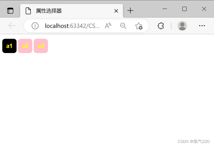
属性选择器
<!--
公式:a[]{}
属性名 = 属性值
= 绝对等于
*= 包含这个元素
^= 以这个开头
$= 以这个结尾
-->
例子
<!DOCTYPE html>
<html lang="en">
<head>
    <meta charset="UTF-8">
    <title>属性选择器</title>
<!--
公式:a[]{}
属性名 = 属性值
= 绝对等于
*= 包含这个元素
^= 以这个开头
$= 以这个结尾
-->
    <style>
        .demo a{
            float: left;
            display: block;
            height: 50px;
            width: 50px;
            border-radius: 10px;
            background: blue;
            text-align: center;
            color: yellow;
            text-decoration: none;
            margin-right: 5px;
            font: bold 20px/50px Arial;
        }
        /*存在id属性的元素*/
        a[id]{
            background: red;
        }
    /*id=a1的元素*/
        a[id=a1]{
            background: black;
        }
    /*class中有links*/
        a[class*=links]{
            background: pink;
        }
    </style>
</head>

<body>
 <p class="demo">
     <a href="#" id="a1" class="a b x ">a1</a>
     <a href="#" class="a links">a2</a>
     <a href="#" class="b links">a3</a>
 </p>
</body>
</html>
效果
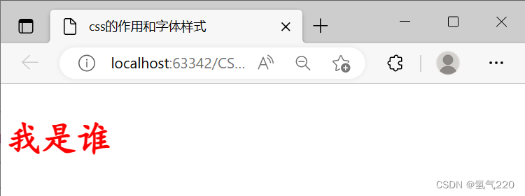
5.CSS的作用和字体样式
        /*font-family:字体*/
        /*font-size:  字体大小*/
        /*font-weight:字体粗细*/
        /*color:      字体颜色*/
    /*字体大小*/
    font-size: 18px;
    /*字体粗细*/
    font-weight: bolder;
    /*首行缩进*/
    text-indent: 1em;
    /*块的高度*/
    line-height: 35px;
例子
<!DOCTYPE html>
<html lang="en">
<head>
    <meta charset="UTF-8">
    <title>css的作用和字体样式</title>
    <style>
        /*font-family:字体*/
        /*font-size:  字体大小*/
        /*font-weight:字体粗细*/
        /*color:      字体颜色*/
        body{
            font-family: 楷体;
            color: red;
            font-size: 50px;
            font-weight: bolder;
        }
    </style>
</head>
<body>
    <p>我是谁</p>
</body>
</html>
效果
5.1文本样式
<!--
1.颜色 color rgb rgbe
2.文本对齐的方式 text-align = center
3.首行缩进 text-indent:2em
4.行高 line-height:单行文字上下局中!line-height=height
5.装饰 text-decoration
6.文本图片水平对齐:vertical-align:middle
-->
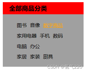
列表样式的练习
html
<!DOCTYPE html>
<html lang="en">
<head>
<meta charset="UTF-8">
<title>列表样式</title>
<link rel="stylesheet" href="style.css">
</head>
<body>
<div id="nav">
<h2 class="title">全部商品分类</h2>
<ul>
<li><a href="#">图书</a> <a href="#">音像</a> <a href="#">数字商品</a></li>
<li><a href="#">家用电器</a> <a href="#">手机</a> <a href="#">数码</a></li>
<li><a href="#">电脑</a> <a href="#">办公</a></li>
<li><a href="#">家居</a> <a href="#">家装</a> <a href="#">厨具</a></li>
</ul>
</div>
</body>
</html>
css
#nav{
    width:230px;
    height: 185px;
    background: #a0a0a0;
}
.title{
    /*字体大小*/
    font-size: 18px;
    /*字体粗细*/
    font-weight: bolder;
    /*首行缩进*/
    text-indent: 1em;
    /*块的高度*/
    line-height: 35px;
    background: red;
}
ul li{
/*height: 30px;*/
line-height: 30px;
    /*把原点去掉*/
    list-style: none;
}
a{
    /*去掉下划线*/
    text-decoration: none;
    font-size: 14px;
    color: #000;
}
a:hover{
    color: orange;
    text-decoration: underline;
}
效果展示
6背景图像应用及渐变
6.1平铺repeat
/* 默认全部平铺*/
background-image: url("images/c.png");
		/*横向平铺*/
        .div1{
            background-repeat: repeat-x;
        }
        /*纵向平铺*/
        .div2{
            background-repeat: repeat-y;
        }
6.2箭头的摆放
 .box{
            /*颜色,图片,图片位置,平铺方式*/
            background: red url("images/c.png") 2700px 100px no-repeat;
        }
  ul li{
            background-image:url("images/c.png");
            background-repeat: no-repeat;
            background-position: 236px 2px ;
        }
6.3渐变色网站
https://www.grabient.com/
7盒子模型及边距使用
7.1盒子模型
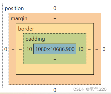
margin:外边距
padding:内边距
border:边框
7.2边框
1.边框的粗细
2.边框的样式
3.边框的颜色
    /* body总有一个默认的外边距margin:0。*/
    /*h1,ul,li,a,body{*/
    /*    margin:0;*/
    /*    padding: 0;*/
    /*    text-decoration: none;*/
    /*}*/
    /*border:粗细,样式,颜色*/
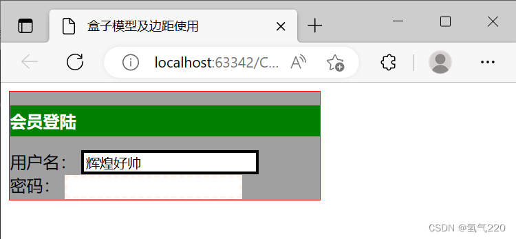
7.3案例
<!DOCTYPE html>
<html lang="en">
<head>
    <meta charset="UTF-8">
    <title>盒子模型及边距使用</title>
    <style>
    /* body总有一个默认的外边距margin:0。*/
    /*h1,ul,li,a,body{*/
    /*    margin:0;*/
    /*    padding: 0;*/
    /*    text-decoration: none;*/
    /*}*/
    /*border:粗细,样式,颜色*/
    .box{
        width: 300px;
        border: 1px solid red;
        background-color: #a0a0a0;
    }
    h2{
        font-size: 16px;
        background-color: green;
        line-height: 30px;
        color: white;
    }
    form{
        background-color: #a0a0a0;
    }
    div:nth-of-type(1) input{
        border: 3px solid black;
    }
    div:nth-of-type(2) input{
        border: 3px dashed seashell;
    }
    </style>
</head>
<body>
<div class="box">
  <h2>会员登陆</h2>
    <form action="#">
        <div>
            <span>用户名:</span>
            <input type="text" value="辉煌好帅">
        </div>
        <div>
            <span>密码:</span>
            <input type="password" name="pwd">
        </div>
    </form>
</div>
</body>
</html>
7.4展示
8.内外边距div居中
/*margin局中*/
        margin: 0 auto;
    /*顺时针旋转:上左下右的边距
    margin:0
    margin:0 1px 2px 3px
    */
    h2{
        font-size: 16px;
        background-color: green;
        line-height: 30px;
        color: white;
        margin:10px 100px 200px 30px
    }
盒子的计算方式:margin+border+padding+内容宽度
9.圆角边框及阴影
/*圆角边框*/
             border-radius: 50px;
            /*阴影*/
            box-shadow: 10px 10px 100px yellow;
10.display和浮动
10.1标准文档流
块级元素:独占一行
h1~h6 p div 列表……
行内元素:不独占一行
span a img strong……
行内元素可以被包含在块级元素中。反之,则不可以
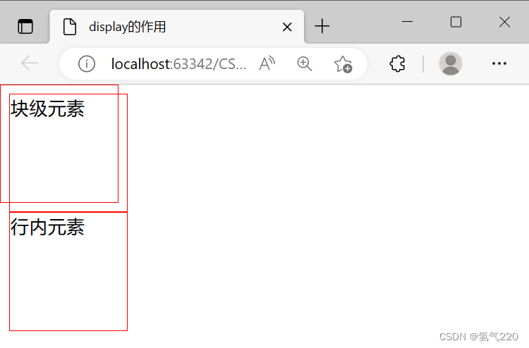
10.2块级元素和行内元素的转换
“块级”转“行内”,div{display:inline;}
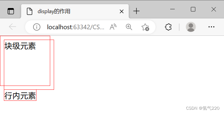
效果
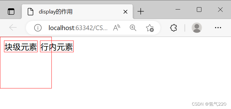
“行内”转“块级”,span{display:inline}
效果
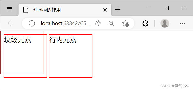
将其转变为行内-块级元素(是块元素,但可以内联在同一行)
效果
10.3flow
这个也是一种实现行内元素排列的方式,但是我们很多情况都是用float(相较于display)
.layer01{
	display:inline-block;
	float:right;
	clear:both
}
- display:方向不可以控制
- float:浮动起来的话会脱离标准文档流,所以要解决父级边框塌陷的问题~
11.父级边框塌陷
 /*
       clear:right;右侧不允许有浮动元素
       clear:left;左侧不允许有浮动元素
       clear:both;两侧不允许有浮动元素
       clear:none;
        */
11.1解决办法
- 浮动元素后面增加空div。(简单,代码中尽量避免空div)
- 设置父元素的高度。(简单,元素假设有了固定的高度,就会被限制)
- overflow。(简单,下拉的一些场景避免使用)
- 父类添加一个伪类:after(推荐)(写法稍微复杂一点,但是没有副作用,推荐使用)
用法:
/*overflow:父级元素中增加一个 overflow:hidden;*/
/*父类添加一个伪类:after*/
#father:after{
	content:'';
	display:block;
	clear:both;
}
12.相对定位
12.1相对定位
相对定位:position:relative;
相对于原来的位置,进行指定的偏移,相对定位的话,它仍然在标准文档流中,原来的位置会被保留。
postion:relative;
- top:-20px;
- left:20px;
- bottom:-10px;
- right:20px;
12.2相对位置的练习
<!DOCTYPE html>
<html lang="en">
<head>
    <meta charset="UTF-8">
    <title>相对位置</title>
    <style>
        #box{
            width: 300px;
            height: 300px;
            padding: 10px;
            border: 2px solid red;
        }
        a{
           width: 100px;
           height: 100px;
            text-decoration: none;
            background: pink;
            line-height: 100px;
            text-align: center;
            color: white;
            display: block;
        }
        a:hover{
            background: blue;
        }
        .a2,.a4{
            position: relative;
            left: 200px;
            top: -100px;
        }
        .a5{
            position: relative;
            left: 100px;
            top: -300px;
        }
    </style>
</head>
<body>
<div id="box">
    <a class="a1" href="https://www.baidu.com/">链接1</a>
    <a class="a2" href="#">链接2</a>
    <a class="a3" href="#">链接3</a>
    <a class="a4" href="#">链接4</a>
    <a class="a5" href="#">链接5</a>
</div>
</body>
</html>
12.3展示
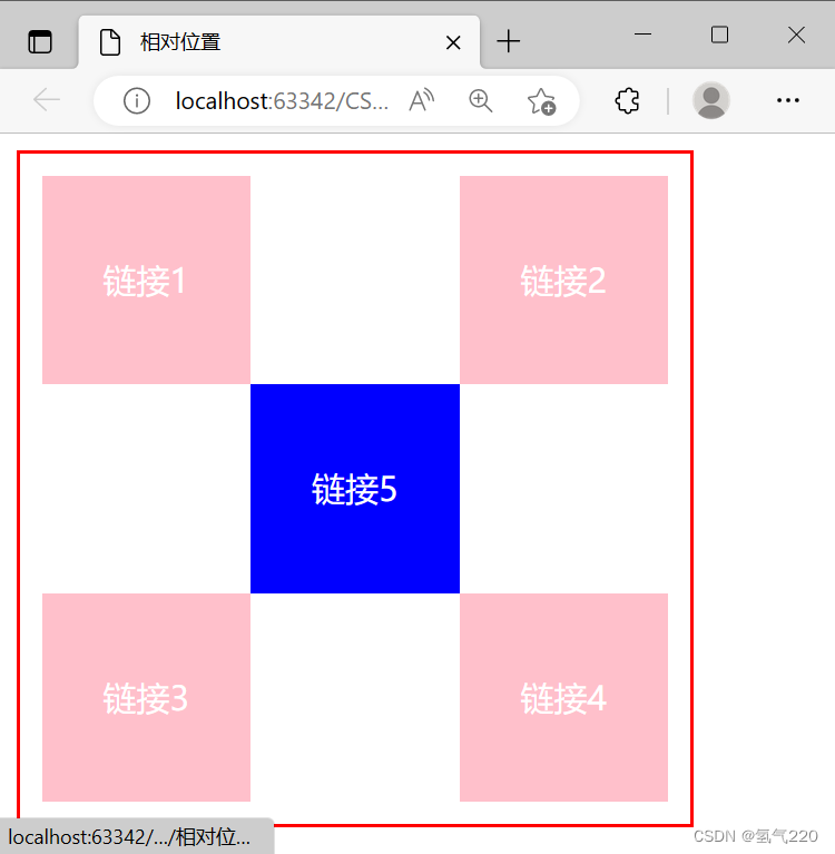
13.绝对位置
定位:基于xxx定位,上下左右~
- 没有父级元素定位的前提下,相对于浏览器定位
- 假设父级元素存在定位,我们通常会相对于父级元素进行偏移~
- 在父级元素范围内移动
相对于父级或浏览器的位置,进行指定的偏移,绝对定位的话,它不在标准文档流中,原来的位置不会被保留。
position:absolute;
left:100px;
14.固定定位
position:fixed;
15.z-index
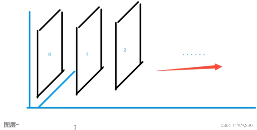
z-index:默认是0,最高无限~(数值越大,越往上移动)
z-index:999
16.背景透明度
两种方式
- opacity:0.5;/* 背景透明度*/
- filter:Alpha(opacity=50); (ie8以前用这个)
17.css动画
https://www.html5tricks.com/


 900
900


 被折叠的 条评论
为什么被折叠?
被折叠的 条评论
为什么被折叠?
 到【灌水乐园】发言


