


CSS3 3D转换应用
CSS3 3D转换详细介绍见:HTML5和CSS3提高
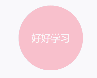
1、3D转换之两面盒子翻转
使用3D转换实现两面盒子的翻转。
<!DOCTYPE html>
<html lang="en">
<head>
    <meta charset="UTF-8">
    <meta http-equiv="X-UA-Compatible" content="IE=edge">
    <meta name="viewport" content="width=device-width, initial-scale=1.0">
    <title>Document</title>
    <style>
        .box {
            /* 子绝父相 */
            position: relative;
            width: 200px;
            height: 200px;
            margin: 100px auto;
            transition: all 2s;
            /* 让子元素保持3D空间 */
            transform-style: preserve-3d;
        }
        .box:hover {
            transform: rotateY(180deg);
        }
        .front,
        .back {
            /* 这个定位的作用是先把所有盒子叠在一起,后续再进行位置的调整 */
            position: absolute;
            top: 0;
            left: 0;
            width: 100%;
            height: 100%;
            border-radius: 50%;
            font-size: 30px;
            color: #fff;
            text-align: center;
            line-height: 200px;
        }
        .front {
            background-color: pink;
            z-index: 1;
        }
        .back {
            background-color: skyblue;
            transform: rotateY(180deg);
        }
    </style>
</head>
<body>
    <div class="box">
        <div class="front">好好学习</div>
        <div class="back">天天向上</div>
    </div>
</body>
</html>
制作效果:
2、3D转换之3D导航栏
使用3D转换实现3D导航栏。
搭建HTML结构
- li做导航栏
- .box是翻转的盒子 front是前面的盒子 bottom是底下盒子
<!DOCTYPE html>
<html lang="en">
<head>
    <meta charset="UTF-8">
    <meta http-equiv="X-UA-Compatible" content="IE=edge">
    <meta name="viewport" content="width=device-width, initial-scale=1.0">
    <title>Document</title>
    <style>
        /* 消除内外边距 */
        * {
            margin: 0;
            padding: 0;
        }
        ul {
            margin: 100px;
        }
        ul li {
            float: left;
            list-style: none;
            width: 120px;
            height: 35px;
            background: pink;
            margin-left: 10px;
            /* 需要给box旋转,需要添加透视(有近大远小的效果) */
            perspective: 300px;
        }
        .box {
            /* 子绝父相 */
            position: relative;
            width: 100%;
            height: 100%;
            /* 添加过渡效果 */
            transition: all 1s;
            /* 保持3D空间效果 */
            transform-style: preserve-3d;
        }
        /* 鼠标经过时沿x轴旋转90deg */
        .box:hover {
            transform: rotateX(90deg);
        }
        .front,
        .bottom {
            /* 这个定位的作用是先把所有盒子叠在一起,后续再进行位置的调整 */
            position: absolute;
            top: 0;
            left: 0;
            width: 100%;
            height: 100%;
            font-size: 20px;
            color: #fff;
            text-align: center;
            line-height: 35px;
        }
        .front {
            background-color: pink;
            /* 提高front的堆叠顺序 */
            z-index: 1;
            transform: translateZ(17.5px);
        }
        .bottom {
            background-color: skyblue;
            /* 这个沿着x轴旋转一定要是负值,如果是正值字体会倒过来 */
            /* 先移动后旋转 */
            transform: translateY(17.5px) rotateX(-90deg);
        }
    </style>
</head>
<body>
    <ul>
        <li>
            <div class="box">
                <div class="front">好好学习</div>
                <div class="bottom">天天向上</div>
            </div>
        </li>
        <li>
            <div class="box">
                <div class="front">天天开心</div>
                <div class="bottom">身体健康</div>
            </div>
        </li>
        <li>
            <div class="box">
                <div class="front">心想事成</div>
                <div class="bottom">万事如意</div>
            </div>
        </li>
    </ul>

</body>
</html>
制作效果:

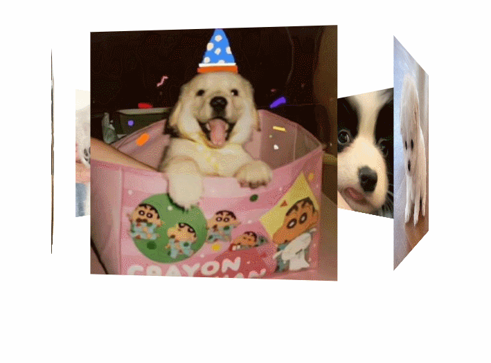
3、3D转换之旋转木马效果
使用3D转换实现旋转木马效果。
<!DOCTYPE html>
<html lang="en">
<head>
    <meta charset="UTF-8">
    <meta http-equiv="X-UA-Compatible" content="IE=edge">
    <meta name="viewport" content="width=device-width, initial-scale=1.0">
    <title>旋转木马效果</title>
    <style>
        body {
            perspective: 800px;
        }
        section {
            /* 子绝父相 */
            position: relative;
            width: 300px;
            height: 300px;
            margin: 300px auto;
            /* 加透视效果 */
            transform-style: preserve-3d;
            /* 添加动画效果:2、调用动画 */
            /* linear:匀速  infinite:无限循环 */
            animation: rotate 5s linear infinite;
            background: url(images/dog.png) no-repeat;
        }
        /* 添加动画效果:1、定义动画 */
        @keyframes rotate {
            0% {
                transform: rotateY(0);
            }
            100% {
                transform: rotateY(360deg);
            }
        }
        /* 设置鼠标经过时,停止旋转 */
        section:hover {
            animation-play-state: paused;
        }
        section div {
            /* 这个定位的作用是先把所有盒子叠在一起,后续再进行位置的调整 */
            position: absolute;
            top: 0;
            left: 0;
            width: 100%;
            height: 100%;
        }

        /* 进行各个盒子位置的调整 */
        section div:nth-child(1) {
            transform: translateZ(300px)
        }
        section div:nth-child(2) {
            /* 先旋转好了 再以新的xy面基准移动 */
            transform: rotateY(60deg) translateZ(300px)
        }
        section div:nth-child(3) {
            transform: rotateY(120deg) translateZ(300px)
        }
        section div:nth-child(4) {
            transform: rotateY(180deg) translateZ(300px)
        }
        section div:nth-child(5) {
            transform: rotateY(240deg) translateZ(300px)
        }
        section div:nth-child(6) {
            transform: rotateY(300deg) translateZ(300px)
        }
    </style>
</head>
<body>
    <section>
        <div><img src="images/dog1.jpg" alt=""></div>
        <div><img src="images/dog2.jpg" alt=""></div>
        <div><img src="images/dog3.jpg" alt=""></div>
        <div><img src="images/dog4.jpg" alt=""></div>
        <div><img src="images/dog5.jpg" alt=""></div>
        <div><img src="images/dog6.jpg" alt=""></div>
    </section>
</body>
</html>
制作效果:


 2660
2660


 被折叠的 条评论
为什么被折叠?
被折叠的 条评论
为什么被折叠?
 到【灌水乐园】发言


