


1 原生HTML标签
<meter>:显示已知范围的标量值或者分数值<progress>:显示一项任务的完成进度,通常情况下,该元素都显示为一个进度条
1.1 <meter>
<html>
<head>
<style>
meter{
width:200px;
}
</style>
</head>
<body>
<div>
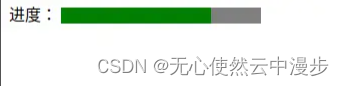
<span>进度:</span>
<meter min="0" max="200" value="150"></meter>
</div>
</body>
</html>
min、max、value 分别表示最大值,最小值与当前值。

1.2 <progress>
<html>
    <head>
        <style>
            progress{
                width:200px;
            }
        </style>
    </head>
    <body>
        <div>
            <span>进度:</span>
            <progress max="200" value="150"></progress>
        </div>
    </body>
</html>
max 描述 progress 元素所表示的任务一共需要完成多少工作量,value 属性用来指定该进度条已完成的工作量。

1.3 区别
主要是语义上的差别。
<meter>:表示已知范围内的标量测量值或分数值<progress>:表示任务的完成进度
比如,一个需求当前的完成度,应该使用 <progress>,而如果要展示汽车仪表盘当前的速度值,应该使用 meter。
1.4 存在问题
- 无法有效的修改
<meter>和<progress>标签的样式,比如背景色,进度前景色等。并且,默认样式在不同浏览器之间不一致。 - 无法添加动画效果、交互效果
<html>
    <head>
        <style>
            meter{
                width:200px;
            }
        </style>
    </head>
    <body>
        <div>
            <span>进度:</span>
            <meter min="0" max="200" value="150"></meter>
        </div>
    </body>
</html>
chrome:

<html>
    <head>
        <style>
            progress{
                width:200px;
                color:red;
                background-color: blue;
            }
        </style>
    </head>
    <body>
        <div>
            <span>进度:</span>
            <progress max="200" value="150"></progress>
        </div>
    </body>
</html>
chrome:
2 HTML标签+CSS
思路:使用背景色配合百分比
2.1 双标签
<html>
<head>
    <style>
        .wrapper {
            width: 220px;
            height: 30px;
            border-radius: 30px;
            background: #8d8d8d;
        }

        .progress {
            width: 70%;
            height: inherit;
            border-radius: 30px 0 0 30px;
            background: #e1e43a;
            text-align: center;
            line-height: 30px;
        }
    </style>
</head>
<body>
    <div>
        <span>进度:</span>
        <div class="wrapper">
            <div class="progress">70%</div>
        </div>
    </div>
</body>
</html>
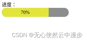
优点:
- 进度具体数值可以直接传参给width属性
- 可以自定义样式,比如前景色,背景色,渐变
- 可以自定义动画和交互效果
2.2 单标签
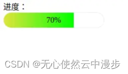
使用渐变属性
<html>
<head>
    <style>
        .progress {
            width: 200px;
            height: 30px;
            border-radius: 30px;
            background: linear-gradient(90deg, #e1e43a, #00ff00 70%, transparent 0);
            border: 1px solid #eee;
            text-align: center;
            line-height: 30px;
        }
    </style>
</head>

<body>
    <div>
        <span>进度:</span>
        <div class="progress">70%</div>
    </div>
</body>
</html>
如果不需要进度条渐变,只需要指定渐变颜色为同一颜色即可
<html>
<head>
    <style>
        .progress {
            width: 200px;
            height: 30px;
            border-radius: 30px;
            background: linear-gradient(90deg, #e1e43a, #e1e43a 70%, transparent 0);
            border: 1px solid #eee;
            text-align: center;
            line-height: 30px;
        }
    </style>
</head>

<body>
    <div>
        <span>进度:</span>
        <div class="progress">70%</div>
    </div>
</body>
</html>
使用变量:
<html>
<head>
    <style>
        .progress {
            width: 200px;
            height: 30px;
            border-radius: 30px;
            background: linear-gradient(90deg, #e1e43a, #e1e43a var(--progress), transparent 0);
            border: 1px solid #eee;
            text-align: center;
            line-height: 30px;
        }
    </style>
</head>

<body>
    <div>
        <span>进度:</span>
        <div class="progress" `style=``"--progress: 70%"`>70%</div>
    </div>
</body>
</html>
存在问题:CSS中,渐变(比如 linear-gradinet、radial-gradient、conic-gradient)不支持过渡变换的,因此.progress增加transition,不会有过渡动画效果。
解决方案:使用CSS@property
<html>
<head>
    <style>
        @property --progress {
            syntax: '<percentage>';
            inherits: false;
            initial-value: 0%;
          }
        .progress {
            width: 200px;
            height: 30px;
            border-radius: 30px;
            background: linear-gradient(90deg, #e1e43a, #e1e43a var(--progress), transparent 0);
            border: 1px solid #eee;
            text-align: center;
            line-height: 30px;
            transition: 0.5s --progress;
        }
    </style>
</head>

<body>
    <div>
        <span>进度:</span>
        <div class="progress" `style=``"--progress: 70%"`>70%</div>
    </div>
</body>
</html>
优点:
- 进度具体数值可以直接传参给--progress变量
- 可以自定义样式,比如前景色,背景色,渐变
- 可以自定义动画和交互效果
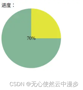
2.3 圆弧进度条
思路:圆锥渐变 conic-gradient()
<html>
<head>
    <style>
        .progress {
            width: 200px;
            height: 200px;
            border-radius: 50%;
            background: conic-gradient(#e1e43a 0, #e1e43a 25%, #83b596 25%, #83b596);
            text-align: center;
            line-height: 200px;
        }
    </style>
</head>
<body>
    <div>
        <span>进度:</span>
        <div class="progress">70%</div>
    </div>
</body>
</html>
中间增加mask: 方法一(仅适用纯色背景):
<html>
<head>
    <style>
        .progress {
            width: 200px;
            height: 200px;
            border-radius: 50%;
            background: conic-gradient(#e1e43a 0, #e1e43a 25%, #83b596 25%, #83b596);
            display:flex;
            justify-content: center;
            align-items: center;
        }
        .mask{
            width:170px;
            height: 170px;
            border-radius: 50%;
            background-color: #fff;
            display:flex;
            justify-content: center;
            align-items: center;
        }
    </style>
</head>
<body>
    <div>
        <span>进度:</span>
        <div class="progress"><div class="mask">70%</div></div>
    </div>
</body>
</html>
<html>
<head>
    <style>
        .progress {
            width: 200px;
            height: 200px;
            border-radius: 50%;
            background: conic-gradient(#e1e43a 0, #e1e43a 25%, #83b596 25%, #83b596);
            position:relative;
        }
        .progress::after{
            content:'70%';
            width: 170px;
            height: 170px;
            border-radius: 50%;
            position:absolute;
            bottom:15px;
            left:15px;
            background-color: #fff;
            display:flex;
            justify-content: center;
            align-items: center;
        }
    </style>
</head>
<body>
    <div>
        <span>进度:</span>
        <div class="progress"></div>
    </div>
</body>
</html>

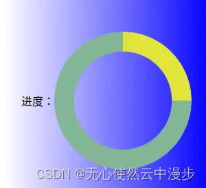
方法二(可适用渐变背景):
<html>
<head>
    <style>
        .box{
            width:300px;
            height: 300px;
            display:flex;
            justify-content: center;
            align-items: center;
            background: linear-gradient(90deg, #fff, #0400ff 100%);
        }
        .progress {
            width: 200px;
            height: 200px;
            border-radius: 50%;
            background: conic-gradient(#e1e43a 0, #e1e43a 25%, #83b596 25%, #83b596);
            mask: radial-gradient(transparent, transparent 50%, #000 50%);
            -webkit-mask: radial-gradient(transparent, transparent 50%, #000 50%);
        }

    </style>
</head>
<body>
    <div class="box">
        <span>进度:</span>
        <div class="progress"></div>
    </div>
</body>
</html>

存在问题:
进度百分比不是类似于 0°、90°、180°、270°、360° 这类数字时,使用圆锥渐变时,不同颜色间的衔接处会有明显的锯齿。
解决办法:
在衔接处空余出一些距离让其应用渐变
<html>
<head>
    <style>
        .box{
            width:300px;
            height: 300px;
            display:flex;
            justify-content: center;
            align-items: center;
            background: linear-gradient(90deg, #fff, #0400ff 100%);
        }
        .progress {
            width: 200px;
            height: 200px;
            border-radius: 50%;
            background: conic-gradient(#e1e43a 0, #e1e43a 25%, #83b596 25.3%, #83b596);
            mask: radial-gradient(transparent, transparent 50%, #000 50%);
            -webkit-mask: radial-gradient(transparent, transparent 50%, #000 50%);
        }

    </style>
</head>
<body>
    <div class="box">
        <span>进度:</span>
        <div class="progress"></div>
    </div>
</body>
</html>
注意对比内圈和上图的不同,颗粒感降低,可以根据需要继续调整


 1244
1244


 被折叠的 条评论
为什么被折叠?
被折叠的 条评论
为什么被折叠?
 到【灌水乐园】发言


