


目录
1.雷达图

温馨提示:如需免费下载数据,请点击跳转——R语言绘图数据 data1.rar
library(openxlsx)
library(RColorBrewer)
df <- read.xlsx('雷达图数据.xlsx')
data <- df[,2:6]
legends <- df[3:7,1]
colors <- brewer.pal(5,'Paired')  #设置5种颜色(Paired适用分类变量)

radarchart(data,pcol = colors)
legend(x=1.45,y=1,                #x和y调整标签位置
       legend = legends,          #标签
       bty='n',                   #去掉标签的边框
       col = colors,              #每个圆点对应的颜色
       pch=20,                    #标签文本的字体大小
       text.col='cornflowerblue', #标签文本的字体颜色
       cex=1.2,                   #整个图例的规模大小调整
       pt.cex=2.2                 #圆点的大小
       )
2.气泡图

df <- read.xlsx('气泡图数据.xlsx')
data <- df[,2:4]
labels <- df[,1]
p <-ggplot(data=data,aes(平均评价数,平均价格))+   #导入数据,设置横、纵坐标轴
      geom_point(aes(size=销售量,color=labels))+  #气泡大小根据销售量变化,设置每个气泡的颜色
      scale_x_continuous(name = '平均评价数')+    #可修改x轴名字
      scale_y_continuous(name = '平均价格')+      #可修改y轴名字
      scale_size_continuous(name='销售量',range=c(0.5,15))+   #设置气泡大小(在原有气泡大小的
                                                                          #基础上等比例放大)
      scale_color_discrete(name='品牌')+
      theme_bw()+                                 #设置为默认背景色
      theme(panel.grid.major = element_blank(),   #去掉网格线
            panel.grid.minor = element_blank())
p
3.树图
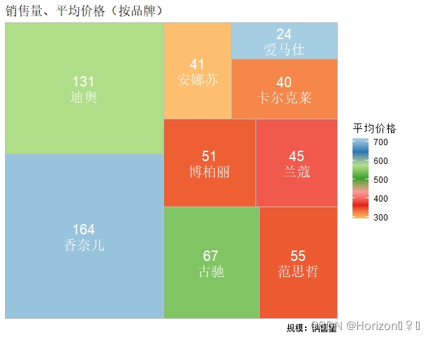
library(treemapify)
library(ggplot2)
df <- read.xlsx('树图数据.xlsx')
data <- df[,2:3]
labels <- df[,1]
ggplot(data = data,aes(area=销售量,fill=平均价格,label=paste(销售量,labels,sep = '\n')))+
  geom_treemap()+
  geom_treemap_text(colour='white',place = 'centre',size=15)+     #设置字体颜色、大小
  scale_fill_distiller(palette = 'Paired',name='平均价格')+        #设置填充颜色
  labs(title='销售量、平均价格(按品牌)',caption = '规模:销售量')
4.双轴图

library(openxlsx)
library(ggplot2)
df <- read.xlsx('双轴图数据.xlsx')
data <- df[,2:3]
labels <- df[,1]
ggplot(data = data,aes(labels))+
  geom_col(aes(y=平均评价数),      #设置第一列数据为第一坐标轴上的数据
           color='black',          #设置柱子边框颜色
           width=0.45,             #设置柱子宽度
           fill='#69b3a2'          #设置柱子填充颜色
           )+
  labs(x='品牌',y='平均评价数')+   #设置x、y轴标签名
  scale_y_continuous(expand = c(0,0),                #调整坐标起始位点
                     limits = c(0,13000),            #设置第一坐标轴(左侧)的区间范围
                     sec.axis = sec_axis(~./16,      #13000/800约等于16倍
                                         name='平均价格/元',
                                         breaks=seq(0,800,155)#第二坐标轴范围为(0,800),155是
                                                                          #为了合理设置间隔
                                         )
                     )+
  geom_line(aes(y=平均价格*16,group=1),color='#E69F00',size=1.0)+   #设置线的颜色和尺寸
  geom_point(aes(y=平均价格*16,group=1),color='#E69F00',size=3.2)+  #设置点的颜色和尺寸
  theme_bw()+                                 #设置默认主题背景色
  theme(panel.grid.major = element_blank(),   #去掉网格
        panel.grid.minor = element_blank())
5.热图

library(openxlsx)
library(ggplot2)
df <- read.xlsx('热图数据.xlsx')
ggplot(data = df,aes(x=df$商品名称,y=df$香调))+
  geom_tile(aes(fill=df$评价))+
  theme( #设置x轴标签旋转角度
        axis.text.x = element_text(size = 12,angle = 40,hjust = 0.8,vjust = 0.8),
        panel.grid = element_blank(), #去掉网格
        ##修改背景为透明的,边框线颜色设置为黑色
        panel.background = element_rect(fill = 'transparent', color = 'black')
        )+
  scale_fill_gradient2(low='white', high='red',mid = 'pink', limit=c(0,100000),
                       name='评价')+   #设置‘白-粉-红’渐变色
  labs(x='',y='')  #去掉x、y轴的label
6.箱线图

library(openxlsx)
library(ggplot2)
df <- read.xlsx('箱线图数据.xlsx')
ggplot(data = df,aes(x=香调,y=评价对数值))+
  geom_boxplot(aes(fill=香调))+
  scale_fill_brewer(palette = 'Paired')+
  theme(  #调整x轴标签角度
        axis.text.x = element_text(size = 12,angle = 40,hjust = 0.8,vjust = 0.8),
        panel.grid = element_blank(),  #去掉网格
        #修改背景为透明的,边框线颜色设置为黑色
        panel.background = element_rect(fill = 'transparent', color = 'black')
        )+
  labs(x = '', y = '评价对数值')
7.词云图

library(wordcloud2)
library(jiebaRD)
library(jiebaR)
text <- readLines('words.txt')
wordfreqs <- jiebaR::freq(text)
wordcloud2(wordfreqs,
           minSize = 5,          #设置字幕上显示标签的最小频次
           color = 'random-dark',
           shape = 'circle',
           minRotation = 0.2     #文本应该旋转的最小旋转
           )
流程:下载数据 → 复制代码 → 修改路径 → 运行 → 然后就能够出图哦


 1万+
1万+


 被折叠的 条评论
为什么被折叠?
被折叠的 条评论
为什么被折叠?
 到【灌水乐园】发言


