


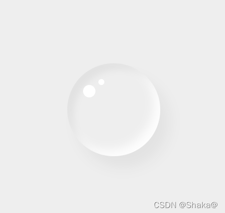
 这篇博客展示了如何利用CSS实现逼真的水滴视觉特效,并在水滴内添加图标。HTML部分创建了一个带有-ion-icon类的<div>元素,CSS部分通过伪元素::before和::after精心设计了阴影、边框半径和定位,从而营造出水滴的立体感。这个技巧可用于前端开发中的图形设计和交互元素装饰。
CSS写水滴特效,里面可加图标
代码如下(示例):
HTML部分
<!DOCTYPE html>
<html lang="en">
<head>
    <meta charset="UTF-8">
    <meta http-equiv="X-UA-Compatible" content="IE=edge">
    <meta name="viewport" content="width=device-width, initial-scale=1.0">
    <title>Document</title>
    <link rel="stylesheet" href="drop.css">
    </head>
<body>
    <div class="drop"><ion-icon></ion-icon></div>
    //里面可以自己加icon

</body>
</html>
CSS部分
* {
    margin: 0;
    padding: 0;
    box-sizing: border-box;
}

body {
    display: flex;
    justify-content: center;
    align-items: center;
    min-height: 100vh;
    min-width: 100vw;
    background: #eee;
}

.drop {
    position: relative;
    width: 150px;
    height: 150px;
    box-shadow: inset 10px 10px 10px rgba(0, 0, 0, .05),
        15px 25px 10px rgba(255, 255, 255, .05),
        15px 20px 20px rgba(0, 0, 0, .05),
        inset -10px -10px 15px rgba(255, 255, 255, .9);
    border-radius: 50%;
    display: flex;
    justify-content: center;
    align-items: center;
}

.drop::before {
    content: '';
    position: absolute;
    top: 35px;
    left: 25px;
    width: 20px;
    height: 20px;
    border-radius: 50%;
    background: #fff;
}

.drop::after {
    content: '';
    position: absolute;
    top: 25px;
    left: 50px;
    width: 10px;
    height: 10px;
    border-radius: 50%;
    background: #fff;
}


 扫一扫
扫一扫


 5454
5454

 被折叠的 条评论
为什么被折叠?
被折叠的 条评论
为什么被折叠?
 到【灌水乐园】发言


