


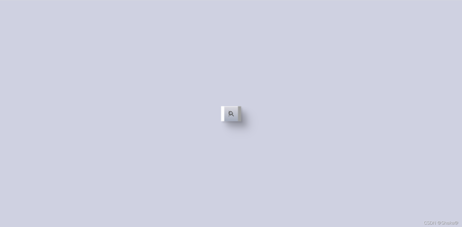
用HTML、CSS写一个酷炫的动态搜索框
可伸展的动态搜索框!
复制粘贴即可用!

HTML部分:
<!DOCTYPE html>
<html lang="en">
<head>
    <meta charset="UTF-8">
    <meta http-equiv="X-UA-Compatible" content="IE=edge">
    <meta name="viewport" content="width=device-width, initial-scale=1.0">
    <title>Serach</title>
    <link rel="stylesheet" href="./style.css">
</head>
<body>
    <div class="searchBox">
        <div class="shadow"></div>
        <input type="text" placeholder="Serach Anything You want">
        <ion-icon name="search"></ion-icon>
    </div>
    <script src="https://unpkg.com/ionicons@4.5.10-0/dist/ionicons.js"></script>
</body>
</html>
CSS部分:
* {
    margin: 0;
    padding: 0;
    box-sizing: border-box;
    font-family: consolas;
}

body {
    display: flex;
    justify-content: center;
    align-items: center;
    min-height: 100vh;
    background: #cfd1e1;
    overflow: hidden;
}

.searchBox {
    position: relative;
    width: 65px;
    height: 50px;
    display: flex;
    justify-content: center;
    align-items: center;
    transition: 0.5s;
}

.searchBox:hover {
    width: 400px;
}

.searchBox::before {
    content: '';
    position: absolute;
    top: 0;
    left: 0;
    width: 10px;
    height: 100%;
    background: linear-gradient(#fff, #fff, #fff);
    z-index: 1;
    filter: blur(1px);
}

.searchBox::after {
    content: '';
    position: absolute;
    top: 0;
    right: -1px;
    width: 10px;
    height: 100%;
    background: #9d9d9d;
    z-index: 1;
    filter: blur(1px);
}

.shadow {
    position: absolute;
    top: 0;
    left: -50px;
    width: calc(100% + 50px);
    height: 300px;
    background: linear-gradient(180dge, rgba(0, 0, 0, 0.1), transparent, transparent);
    transform-origin: top;
    transform: skew(45deg);
    pointer-events: none;
}

.shadow::before {
    content: '';
    position: absolute;
    width: 50px;
    height: 50px;
    background: #cfd1e1;

}

.searchBox input {
    position: relative;
    width: 100%;
    height: 100%;
    border: none;
    padding: 10px 25px;
    outline: none;
    font-size: 1.1em;
    color: #555;
    background: linear-gradient(#dbdae1, #a3aaba);
    box-shadow: 5px 5px 5px rgba(0, 0, 0, 0.1),
        15px 15px 15px rgba(0, 0, 0, 0.1),
        20px 20px 20px rgba(0, 0, 0, 0.1),
        30px 30px 30px rgba(0, 0, 0, 0.1),
        inset 1px 1px 2px #fff;
}

.searchBox input::placeholder .searchBox input {
    color: transparent;
}

.searchBox:hover input::placeholder .searchBox:hover input {
    color: #555;
}

ion-icon {
    position: absolute;
    right: 20px;
    color: #555;
    font-size: 1.5em;
    cursor: pointer;
}


 5万+
5万+


 被折叠的 条评论
为什么被折叠?
被折叠的 条评论
为什么被折叠?
 到【灌水乐园】发言


