


弹性盒子(Flex Box)
弹性盒子是CSS3的一种新的布局模式,是一种页面需要适应不同的屏幕大小,但仍保留当前页面的布局方式。
一、 flex布局中的基本概念
- 什么是容器
采用flex布局的元素被称作容器
.container{
	display:flex; /*容器*/
}
- 什么叫项目
容器中的子元素被称为项目
.container{
	display:flex; /*容器*/
	.project{
		/*项目*/
	}
}
- 容器默认存在俩根轴:水平的主轴(main axis)和垂直的交叉轴(cross axis)

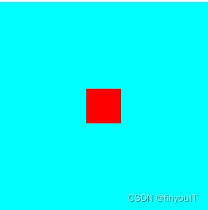
二、快速上手
.container{
     display: flex;
     justify-content: center; /*水平居中*/
     align-items: center;  /*垂直居中*/
     height: 300px;
     width: 300px;
     background-color: aqua;

     .item{
         width: 50px;
         height: 50px;
         background-color: red;
     }
 }
 /*现在主流浏览器适应css嵌套了*/
- 效果
三、容器属性
1.justify-content(默认:水平轴)
-
start(默认:左对齐)
-
center(居中)
-
end(右对齐)

-
space-around (每个项目两侧间距相等)

-
space-between(俩端对齐)

-
space-evenly(项目之间与俩端间距相等)

2.align-item(默认:垂直轴)
- start

- center

- end

3.flex-direction(改变轴的方向:确定just-content是水平还是垂直)
.container{
     display: flex;
     align-items: center;
     justify-content: space-evenly;
     height: 300px;
     width: 300px;
     background-color: aqua;

     .item{
         width: 50px;
         height: 50px;
         background-color: red;
     }
 }
- row(默认)

- row-reverse

- column

- column-reverse

3.flex-wrap(是否换行,默认不换行)
.container{
     display: flex;
     align-items: center;
     justify-content: space-evenly;
     height: 300px;
     width: 300px;
     background-color: aqua;
     .item{
         width: 90px;
         height: 90px;
         background-color: red;
     }
 }
- now-wrap(默认)
- wrap

- wrap-reverse
4.flex-flow(flex-deriction和flex-wrap的组合简写)
flex-flow: row wrap;
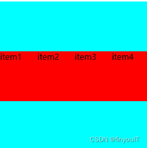
5.align-content
align-content属性定义了多根轴线的对齐方式。如果项目只有一根轴线,该属性不起作用。参数与justify-content类似
.container{
   display: flex;
   align-content: space-between;
   justify-content: space-evenly;
   height: 300px;
   width: 300px;
   background-color: aqua;
   flex-flow: row wrap;
   .item{
       width: 90px;
       height: 90px;
       background-color: red;
   }
}
<div class="container">
     <div class="item">
         item1
     </div>
     <div class="item">
         item2
     </div>
     <div class="item">
         item3
     </div>
     <div class="item">
         item4
     </div>
 </div>

四、项目属性
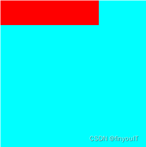
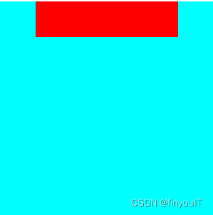
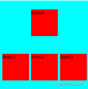
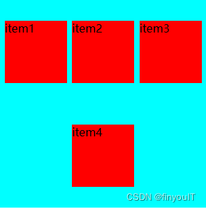
1.order属性
order属性设置项目排序问题,数值越小排在前面(默认都是0)
.item{
	order:int
}
- 正常情况

- 使用后

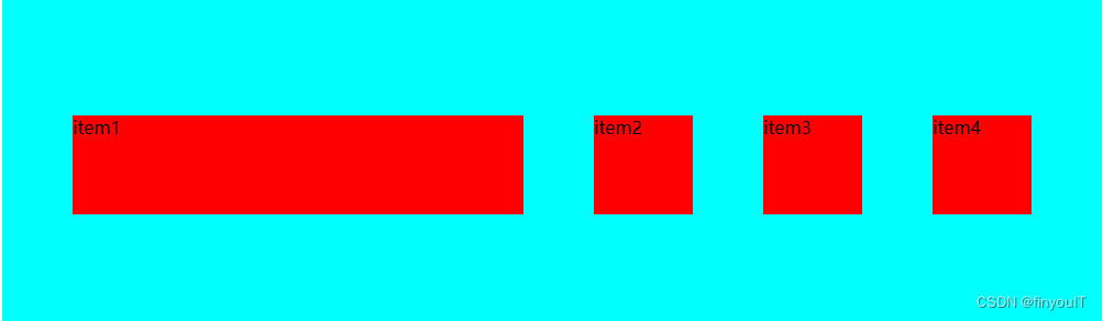
2.flex-grow属性
增加width的长度
.item{
	flex-grow:<number [0,∞]>
}
3.flex-shrink属性
flex-shrink 属性指定了 flex 元素的收缩规则。项目宽度之和大于容器的时候才会发生收缩,其收缩的大小是依据 flex-shrink 的值。
每个项目收缩大小等 各项目的长度-(项目宽度之和-容器之和)/总的flex-shrink* 各项目的flex-shrink
.container{
    display: flex;
    align-items: center;

    height: 300px;
    width: 300px;
    background-color: aqua;

    .item1{
        width: 90px;
        height: 90px;
        background-color: red;
        align-self: flex-end;
        flex-shrink: 1;
    }
    .item2{
        width: 90px;

        height: 90px;
        background-color: red;
        flex-shrink: 1;
    }
    .item3{
        width: 90px;
        height: 90px;
        background-color: red;
        flex-shrink: 1;
    }
    .item4{
        width: 90px;
        height: 90px;
        background-color: red;
        flex-shrink: 1;
    }
}
每个item为90-(360-300)/4*1 = 75px
4.flex属性
flex属性是 flex-grow属性、flex-shrink属性、flex-basis属性的简写。默认值为:0 1 auto;
.item{
    flex:(0 1 auto) | auto(1 1 auto) | none (0 0 auto)
}
5.flex-basic
flex-basic属性表示表示项目占据主轴空间的值。默认为auto,表示项目当前默认的大小。如果设置为一个固定的值,则该项目在容器中占据固定的大小。
.item{
	flex-basic:200px
}
6.align-self
改变父元素的对齐方式

.item{
    align-self: start | end | center
}


 1万+
1万+


 被折叠的 条评论
为什么被折叠?
被折叠的 条评论
为什么被折叠?
 到【灌水乐园】发言


