


Navigation 组件一般作为页面布局的根容器,它提供了一系列属性方法来设置页面的标题栏、工具栏以及菜单栏的各种展示样式。 Navigation 除了提供了默认的展示样式属性外,它还提供了 CustomBuilder 模式来自定义展示样式,本节将介绍一下 Navigation 各属性的简单用法以及使用 CustomBuilder 实现自定义样式。
Navigation定义介绍
interface NavigationInterface {
  (): NavigationAttribute;
}
Navigation 的定义不需要传递相关参数,我们先看下 Navigation 的最简单样例:
Navigation() {                         // Navigation只能包含一个子组件
  Text('title')
    .textAlign(TextAlign.Center)
    .fontSize(30)
    .width('100%')
    .backgroundColor('#aabbcc')
}
.size({width: '100%', height: '100%'}) // Navigation只设置了size,没有设置任何其它属性
样例运行结果如下图所示:
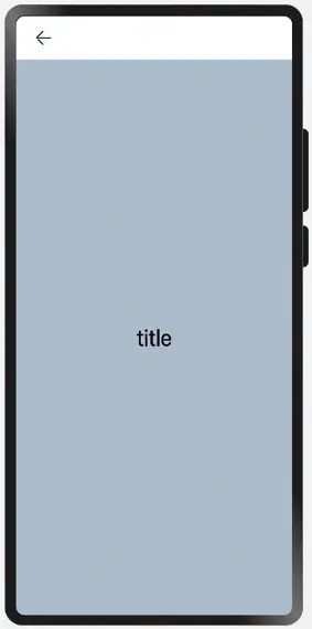
由运行结果可知,在默认情况下, Navigation 的样式是一个带有返回箭头的标题栏加子控件组成的。
Navigation属性介绍
declare class NavigationAttribute extends CommonMethod<NavigationAttribute> {
  title(value: string | CustomBuilder): NavigationAttribute;
  subTitle(value: string): NavigationAttribute;
  hideTitleBar(value: boolean): NavigationAttribute;
  hideBackButton(value: boolean): NavigationAttribute;
  titleMode(value: NavigationTitleMode): NavigationAttribute;
  menus(value: Array<NavigationMenuItem> | CustomBuilder): NavigationAttribute;
  toolBar(value: object | CustomBuilder): NavigationAttribute;
  hideToolBar(value: boolean): NavigationAttribute;
  onTitleModeChange(callback: (titleMode: NavigationTitleMode) => void): NavigationAttribute;
}
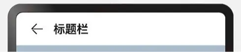
- title:设置导航栏的标题,当参数类型为
string时,可以直接设置标题,但样式不支修改;当参数为CustomBuilder时,可以自定义标题样式。- 参数类型为
string,简单样例如下所示:
- 参数类型为
        Navigation() {
          Text('title')
            .textAlign(TextAlign.Center)
            .fontSize(30)
            .size({width: '100%', height: '100%'})
            .backgroundColor('#aabbcc')
        }
        .size({width: '100%', height: '100%'})
        .title("标题栏")// 设置title,此时不支持修改文字大小,颜色等样式
样例运行结果如下图所示:
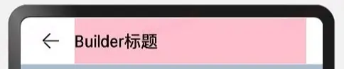
- 参数类型为
CustomBuilder,简单样例如下所示:
        @Entry @Component struct ComponentTest {

          @Builder title() {// 通过Builder自定义标题栏,可以灵活的设置标题样式
            Row() {
              Text('Builder标题')
                .fontSize(20)
            }
            .width('100%')
            .height(55)
            .backgroundColor(Color.Pink)
          }

          build() {
            Navigation() {
              Text('title')
                .textAlign(TextAlign.Center)
                .fontSize(30)
                .size({width: '100%', height: '100%'})
                .backgroundColor('#aabbcc')
            }
            .size({width: '100%', height: '100%'})
            .title(this.title())// 使用自定义的标题栏
          }
        }
样例运行结果如下图所示:
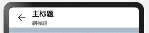
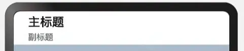
- subTitle:设置页面的副标题,简单样例如下所示:
    Navigation() {
      Text('title')
        .textAlign(TextAlign.Center)
        .fontSize(30)
        .size({width: '100%', height: '100%'})
        .backgroundColor('#aabbcc')
    }
    .size({width: '100%', height: '100%'})
    .title("主标题")
    .subTitle("副标题")
样例运行结果如下图所示:
- hideBackButton:是否隐藏返回按钮,默认情况下不隐藏,简单样例如下所示:
    Navigation() {
      Text('title')
        .textAlign(TextAlign.Center)
        .fontSize(30)
        .size({width: '100%', height: '100%'})
        .backgroundColor('#aabbcc')
    }
    .size({width: '100%', height: '100%'})
    .title("主标题")
    .subTitle("副标题")
    .hideBackButton(true)
样例运行结果如下图所示:
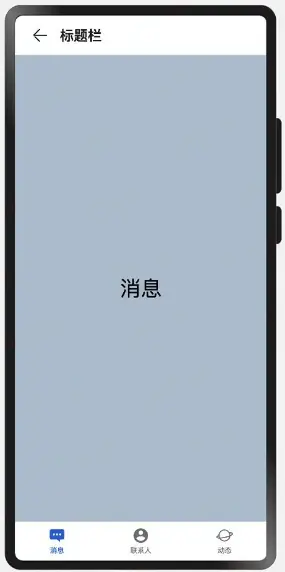
- toolBar:设置工具栏,当参数类型为
object时,可以直接设置工具栏选项,但样式不支修改;当参数为CustomBuilder时,可以自定义标题栏。-
当参数为
object类型时,参数需要按照如下格式定义:- value:工具栏单个选项的显示文本。
- icon:工具栏单个选项的图标资源路径。
- action:当前选项被选中时的事件回调。
简单样例如下所示:
-
        build() {
          Navigation() {
            Text('title')
              .textAlign(TextAlign.Center)
              .fontSize(30)
              .size({width: '100%', height: '100%'})
              .backgroundColor('#aabbcc')
          }
          .size({width: '100%', height: '100%'})
          .title("标题栏")
          .toolBar({ items: [                 // toolBar接收一个数组
            {
              value: "消息",                   // 文本
              icon: "pages/icon_message.png", // 图片
              action: () => {                 // 事件
                console.log("点击了消息")
              }
            },
            {
              value: "联系人",
              icon: "pages/icon_contract.png",
              action: () => {
                console.log("点击了首页")
              }
            },
            {
              value: "动态",
              icon: "pages/icon_dynamic.png",
              action: () => {
                console.log("点击了首页")
              }
            }
          ]})
        }
样例运行结果如下图所示:
- 当参数为
CustomBuilder类型时,可以自定义样式,简单样例如下所示:
        @Entry @Component struct ComponentTest {

          @State index: number = 0;// 选项卡下标,默认为第一个

          @Builder toolbar() {// 通过builder自定义toolbar
            Row() {
              Column() {
                Image(this.index == 0 ? 'pages/icon_message_selected.png' : 'pages/icon_message_normal.png')
                  .size({width: 25, height: 25})
                Text('消息')
                  .fontSize(16)
                  .fontColor(this.index == 0 ? "#2a58d0" : "#6b6b6b")
              }
              .alignItems(HorizontalAlign.Center)
              .height('100%')
              .layoutWeight(1)
              .onClick(() => {
                this.index = 0;
              })

              Column() {
                Image(this.index == 1 ? 'pages/icon_contract_selected.png' : 'pages/icon_contract_normal.png')
                  .size({width: 25, height: 25})
                Text('联系人')
                  .fontSize(16)
                  .fontColor(this.index == 1 ? "#2a58d0" : "#6b6b6b")
              }
              .alignItems(HorizontalAlign.Center)
              .height('100%')
              .layoutWeight(1)
              .onClick(() => {
                this.index = 1;
              })

              Column() {
                Image(this.index == 2 ? 'pages/icon_dynamic_selected.png' : 'pages/icon_dynamic_normal.png')
                  .size({width: 25, height: 25})
                Text('动态')
                  .fontSize(16)
                  .fontColor(this.index == 2 ? "#2a58d0" : "#6b6b6b")
              }
              .alignItems(HorizontalAlign.Center)
              .height('100%')
              .layoutWeight(1)
              .onClick(() => {
                this.index = 2;
              })
            }
            .width('100%')
            .height(60)
          }

          build() {
            Navigation() {
              Text(this.index == 0 ? "消息" : this.index == 1 ? "联系人" : "动态")
                .textAlign(TextAlign.Center)
                .fontSize(30)
                .size({width: '100%', height: '100%'})
                .backgroundColor('#aabbcc')
            }
            .size({width: '100%', height: '100%'})
            .title("标题栏")
            .toolBar(this.toolbar())
          }
        }
- hideTitleBar、hideToolBar:设置是否显示或者隐藏标题栏、工具栏,简单样例如下所示:
    @Entry @Component struct ComponentTest {

      @State index: number = 0;
      @State hideToolBar: boolean = false;
      @State hideTitleBar: boolean = false;

      @Builder toolbar() {
        Row() {
          Column() {
            Image(this.index == 0 ? 'pages/icon_message_selected.png' : 'pages/icon_message_normal.png')
              .size({width: 25, height: 25})
            Text('消息')
              .fontSize(16)
              .fontColor(this.index == 0 ? "#2a58d0" : "#6b6b6b")
          }
          .alignItems(HorizontalAlign.Center)
          .height('100%')
          .layoutWeight(1)
          .onClick(() => {
            this.index = 0;
          })

          Column() {
            Image(this.index == 1 ? 'pages/icon_contract_selected.png' : 'pages/icon_contract_normal.png')
              .size({width: 25, height: 25})
            Text('联系人')
              .fontSize(16)
              .fontColor(this.index == 1 ? "#2a58d0" : "#6b6b6b")
          }
          .alignItems(HorizontalAlign.Center)
          .height('100%')
          .layoutWeight(1)
          .onClick(() => {
            this.index = 1;
          })

          Column() {
            Image(this.index == 2 ? 'pages/icon_dynamic_selected.png' : 'pages/icon_dynamic_normal.png')
              .size({width: 25, height: 25})
            Text('动态')
              .fontSize(16)
              .fontColor(this.index == 2 ? "#2a58d0" : "#6b6b6b")
          }
          .alignItems(HorizontalAlign.Center)
          .height('100%')
          .layoutWeight(1)
          .onClick(() => {
            this.index = 2;
          })
        }
        .width('100%')
        .height(60)
      }

      build() {
        Navigation() {
          Column({space: 10}) {
            Text(this.index == 0 ? "消息" : this.index == 1 ? "联系人" : "动态")
              .textAlign(TextAlign.Center)
              .fontSize(30)

            Button(this.hideTitleBar ? "显示TitleBar" : "隐藏TitleBar")
              .onClick(() => {
                this.hideTitleBar = !this.hideTitleBar;
              })

            Button(this.hideToolBar ? "显示ToolBar" : "隐藏ToolBar")
              .onClick(() => {
                this.hideToolBar = !this.hideToolBar;
              })
          }
          .backgroundColor('#aabbcc')
          .size({width: '100%', height: '100%'})
        }
        .size({width: '100%', height: '100%'})
        .title("标题栏")
        .toolBar(this.toolbar())
        .hideToolBar(this.hideToolBar)
        .hideTitleBar(this.hideTitleBar)
      }
    }
- menus:设置标题栏右上角的菜单项,当参数为
CustomBuilder时可以自定义菜单项。- 当参数为
NavigationMenuItem数组时,参数说明如下:- value:菜单项的显示文本。
- icon:菜单项的显示图标路径。
- action:点击菜单项的事件回调。
- 当参数为
简单样例如下所示:
        @Entry @Component struct ComponentTest {

          @State index: number = 0;
          @State hideToolBar: boolean = false;
          @State hideTitleBar: boolean = false;

          @Builder toolbar() {
            Row() {
              Column() {
                Image(this.index == 0 ? 'pages/icon_message_selected.png' : 'pages/icon_message_normal.png')
                  .size({width: 25, height: 25})
                Text('消息')
                  .fontSize(16)
                  .fontColor(this.index == 0 ? "#2a58d0" : "#6b6b6b")
              }
              .alignItems(HorizontalAlign.Center)
              .height('100%')
              .layoutWeight(1)
              .onClick(() => {
                this.index = 0;
              })

              Column() {
                Image(this.index == 1 ? 'pages/icon_contract_selected.png' : 'pages/icon_contract_normal.png')
                  .size({width: 25, height: 25})
                Text('联系人')
                  .fontSize(16)
                  .fontColor(this.index == 1 ? "#2a58d0" : "#6b6b6b")
              }
              .alignItems(HorizontalAlign.Center)
              .height('100%')
              .layoutWeight(1)
              .onClick(() => {
                this.index = 1;
              })

              Column() {
                Image(this.index == 2 ? 'pages/icon_dynamic_selected.png' : 'pages/icon_dynamic_normal.png')
                  .size({width: 25, height: 25})
                Text('动态')
                  .fontSize(16)
                  .fontColor(this.index == 2 ? "#2a58d0" : "#6b6b6b")
              }
              .alignItems(HorizontalAlign.Center)
              .height('100%')
              .layoutWeight(1)
              .onClick(() => {
                this.index = 2;
              })
            }
            .width('100%')
            .height(60)
          }

          build() {
            Navigation() {
              Column({space: 10}) {
                Text(this.index == 0 ? "消息" : this.index == 1 ? "联系人" : "动态")
                  .textAlign(TextAlign.Center)
                  .fontSize(30)

                Button(this.hideTitleBar ? "显示TitleBar" : "隐藏TitleBar")
                  .onClick(() => {
                    this.hideTitleBar = !this.hideTitleBar;
                  })

                Button(this.hideToolBar ? "显示ToolBar" : "隐藏ToolBar")
                  .onClick(() => {
                    this.hideToolBar = !this.hideToolBar;
                  })
              }
              .backgroundColor('#aabbcc')
              .size({width: '100%', height: '100%'})
            }
            .size({width: '100%', height: '100%'})
            .title("标题栏")
            .toolBar(this.toolbar())
            .hideToolBar(this.hideToolBar)
            .hideTitleBar(this.hideTitleBar)
            .menus([
              {
                value: "搜索",
                icon: "pages/icon_search.png",
                action: () => {
                  prompt.showToast({message: "搜索"})
                }
              },
              {
                value: "扫码",
                icon: "pages/icon_scan.png",
                action: () => {
                  prompt.showToast({message: "扫码"})
                }
              }
            ])
          }
        }
Navigation事件介绍
declare class NavigationAttribute extends CommonMethod<NavigationAttribute> {
  onTitleModeChange(callback: (titleMode: NavigationTitleMode) => void): NavigationAttribute;
}
- onTitleModeChange:当
titleMode为 NavigationTitleMode.Free 时,随着可滚动组件的滑动标题栏模式发生变化时触发此回调。
小结
本节通过简单的样例向读者介绍了 Navigation 组件的基本使用,读者掌握了该组件的使用后可以开发更丰富的 UI 界面了。
码牛课堂也为了积极培养鸿蒙生态人才,让大家都能学习到鸿蒙开发最新的技术,针对一些在职人员、0基础小白、应届生/计算机专业、鸿蒙爱好者等人群,整理了一套纯血版鸿蒙(HarmonyOS Next)全栈开发技术的学习路线。大家可以进行参考学习:https://qr21.cn/FV7h05

①全方位,更合理的学习路径:
路线图包括ArkTS基础语法、鸿蒙应用APP开发、鸿蒙能力集APP开发、次开发多端部署开发、物联网开发等九大模块,六大实战项目贯穿始终,由浅入深,层层递进,深入理解鸿蒙开发原理!②多层次,更多的鸿蒙原生应用:
路线图将包含完全基于鸿蒙内核开发的应用,比如一次开发多端部署、自由流转、元服务、端云一体化等,多方位的学习内容让学生能够高效掌握鸿蒙开发,少走弯路,真正理解并应用鸿蒙的核心技术和理念。③实战化,更贴合企业需求的技术点:
学习路线图中的每一个技术点都能够紧贴企业需求,经过多次真实实践,每一个知识点、每一个项目,都是码牛课堂鸿蒙研发团队精心打磨和深度解析的成果,注重对学生的细致教学,每一步都确保学生能够真正理解和掌握。
为了能让大家更好的学习鸿蒙(HarmonyOS NEXT)开发技术,这边特意整理了《鸿蒙开发学习手册》(共计890页),希望对大家有所帮助:https://qr21.cn/FV7h05
《鸿蒙开发学习手册》:https://qr21.cn/FV7h05
如何快速入门:
- 基本概念
- 构建第一个ArkTS应用
- ……

开发基础知识:https://qr21.cn/FV7h05
- 应用基础知识
- 配置文件
- 应用数据管理
- 应用安全管理
- 应用隐私保护
- 三方应用调用管控机制
- 资源分类与访问
- 学习ArkTS语言
- ……

基于ArkTS 开发:https://qr21.cn/FV7h05
- Ability开发
- UI开发
- 公共事件与通知
- 窗口管理
- 媒体
- 安全
- 网络与链接
- 电话服务
- 数据管理
- 后台任务(Background Task)管理
- 设备管理
- 设备使用信息统计
- DFX
- 国际化开发
- 折叠屏系列
- ……

鸿蒙开发面试真题(含参考答案):https://qr21.cn/FV7h05

大厂鸿蒙面试题::https://qr18.cn/F781PH

鸿蒙开发面试大盘集篇(共计319页):https://qr18.cn/F781PH
1.项目开发必备面试题
2.性能优化方向
3.架构方向
4.鸿蒙开发系统底层方向
5.鸿蒙音视频开发方向
6.鸿蒙车载开发方向
7.鸿蒙南向开发方向


 扫一扫
扫一扫


 1736
1736

 被折叠的 条评论
为什么被折叠?
被折叠的 条评论
为什么被折叠?
 到【灌水乐园】发言


