


一、媒体查询
为不同尺寸的屏幕设定不同的css样式(常用于移动端)。
案例1
<style>
        .content{
            width: 400px;
            height: 400px;
            border: 1px solid;
        }
        @media screen and (min-device-width:200px) and (min-device-width:300px) {
            .content{
                background: rebeccapurple;
            }
        }
        @media screen and (min-device-width:301px) and (min-device-width:600px) {
            .content{
                background: yellowgreen;
            }
        }
    </style>
<div class="content"></div>
案例2
div {
            width: 400px;
            height: 400px;
            border: 1px solid;
        }
        @media screen and (min-width:200px) and (max-width:400px) {
            div{
                background-color: rebeccapurple;
            }
        }
        @media screen and (min-width:401px) and (max-width:600px) {
            div{
                background-color: red;
            }
        }
<div></div>
案例 3
.father {
            width: 500px;
            height: 100px;
            background-color: aquamarine;
        }

        .father > div {
            height: 100px;
            float: left;
        }

        .father :nth-child(1) {
            background-color: red;
        }

        .father :nth-child(2) {
            background-color: yellow;
        }

        .father :nth-child(3) {
            background-color: blue;
        }
        /* 显示3个 */
        @media screen and (min-device-width:500px) and (max-device-width:600px) {
            .father > div {
                width: 33.33%;
            }
        }
        /* 显示2个 */
        @media screen and (min-device-width:300px) and (max-device-width:400px) {
            .father > div {
                width: 50%;
            }
        }
        /* 线上1个 */
        @media screen and (min-device-width:100px) and (max-device-width:200px) {
            .father > div {
                width: 100%;
            }
        }
<div class="father">
        <div></div>
        <div></div>
        <div></div>
</div>
| 属性名称 | 作用 |
|---|---|
| width、height | 浏览器可视宽度、高度 |
| device-width、device-height | 设备屏幕的宽度、高度 |
二、媒体查询其他引入方式
1、style内部引入
<!DOCTYPE html>
<html lang="en">

<head>
    <meta charset="UTF-8">
    <meta name="viewport" content="width=device-width, initial-scale=1.0">
    <title>Document</title>
    <style>
        .father {
            width: 500px;
            height: 100px;
            background-color: aquamarine;
        }

        .father>div {
            height: 100px;
            float: left;
        }

        .father :nth-child(1) {
            background-color: red;
        }

        .father :nth-child(2) {
            background-color: yellow;
        }

        .father :nth-child(3) {
            background-color: blue;
        }
    </style>
    <style media="(min-device-width:500px) and (max-device-width:600px) ">
        .father>div {
            width: 33.33%;
        }
    </style>
    <style media="(min-device-width:300px) and (max-device-width:400px)">
        .father>div {
            width: 50%;
        }
    </style>
    <style media="(min-device-width:100px) and (max-device-width:200px)">
        .father>div {
            width: 100%;
        }
    </style>
</head>

<body>
    <div class="father">
        <div></div>
        <div></div>
        <div></div>
    </div>
</body>

</html>
2、link引入
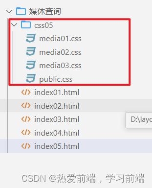
创建css05文件夹,并创建以下文件,如下图所示,
公共样式
public.css内容
.father {
    width: 500px;
    height: 100px;
    background-color: aquamarine;
}

.father>div {
    height: 100px;
    float: left;
}

.father :nth-child(1) {
    background-color: red;
}

.father :nth-child(2) {
    background-color: yellow;
}

.father :nth-child(3) {
    background-color: blue;
}
media01.css内容
.father>div {
    width: 33.33%;
}
media02.css内容
.father>div {
    width: 50%;
}
media03.css内容
.father>div {
    width: 100%;
}
<!DOCTYPE html>
<html lang="en">

<head>
    <meta charset="UTF-8">
    <meta name="viewport" content="width=device-width, initial-scale=1.0">
    <title>Document</title>
    <link rel="stylesheet" href="./css05/public.css">
    <link rel="stylesheet" href="./css05/media01.css" media="(min-device-width:500px) and (max-device-width:600px)">
    <link rel="stylesheet" href="./css05/media02.css" media="(min-device-width:300px) and (max-device-width:400px)">
    <link rel="stylesheet" href="./css05/media03.css" media="(min-device-width:100px) and (max-device-width:200px)">
</head>

<body>
    <div class="father">
        <div></div>
        <div></div>
        <div></div>
    </div>
</body>

</html>


 102
102


 被折叠的 条评论
为什么被折叠?
被折叠的 条评论
为什么被折叠?
 到【灌水乐园】发言


