


🌟 所属专栏:前端只因变凤凰之路
🐔 作者简介:rchjr——五带信管菜只因一枚
😮 前言:该系列将持续更新前端的相关学习笔记,欢迎和我一样的小白订阅,一起学习共同进步~
👉 文章简介:本文介绍CSS的一个品优购新闻快报实例。知识学习内容来自b站的 @黑马程序员 的视频
🔥布局思路
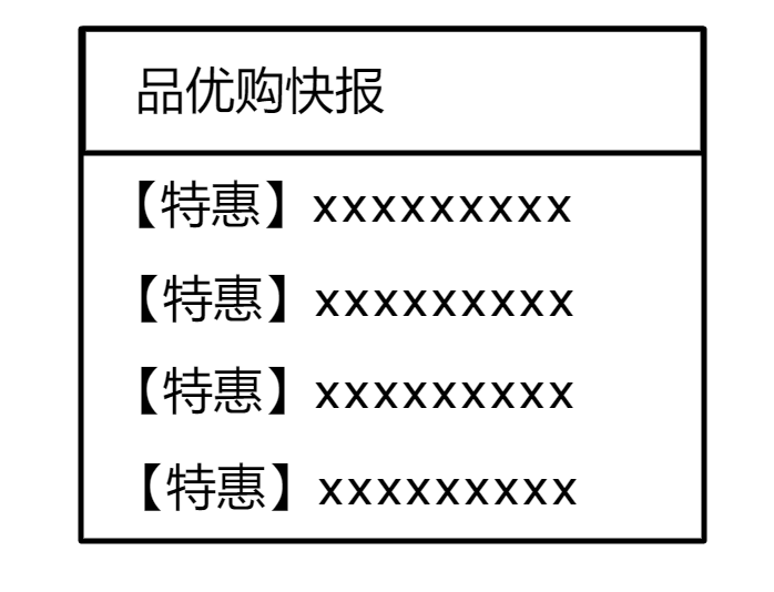
一个大盒子,一个小盒子放标题并设置下边框实现横线。无序列表存放新闻
🔥CSS代码数据
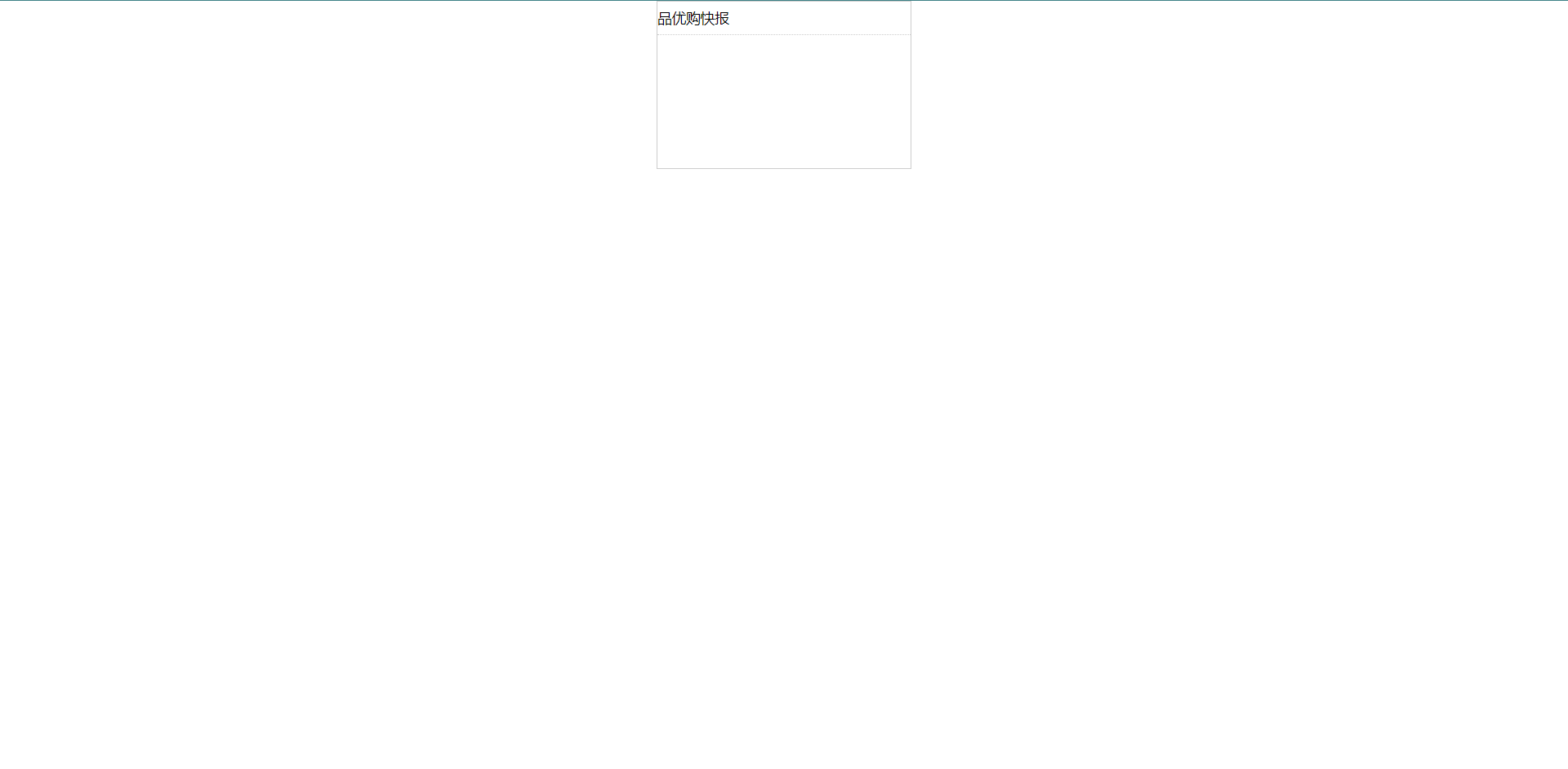
大盒子
宽度:248;高度163
小盒子高度32
🔥CSS代码思路
首先清除内外边距,然后为大盒子设定宽哥并让它居中
<style>
        * {
            padding: 0;
            margin: 0;
        }

        .box {
            width: 248px;
            height: 163px;
            margin: 0 auto;
        }
    </style>
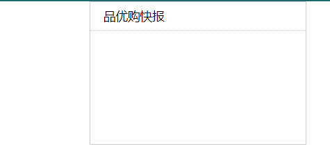
然后设置大盒子中的小盒子用于装h3标题,并为大小盒子设置边框
 * {
            padding: 0;
            margin: 0;
        }

        .box {
            width: 248px;
            height: 163px;
            margin: 0 auto;
            border: 1px solid #ccc;
        }

        .box h3 {
            height: 32px;
            font-size: 14px;
            font-weight: normal;
            border-bottom: 1px dotted #ccc;
        }
然后让小盒子水平居中,即设置行高等于盒子的高度
* {
            padding: 0;
            margin: 0;
        }

        .box {
            width: 248px;
            height: 163px;
            margin: 0 auto;
            border: 1px solid #ccc;
        }

        .box h3 {
            height: 32px;
            font-size: 14px;
            font-weight: normal;
            border-bottom: 1px dotted #ccc;
            line-height: 32px;
        }
为小盒子设定padding,使左边有空格
    * {
            padding: 0;
            margin: 0;
        }

        .box {
            width: 248px;
            height: 163px;
            margin: 0 auto;
            border: 1px solid #ccc;
        }

        .box h3 {
            height: 32px;
            font-size: 14px;
            font-weight: normal;
            border-bottom: 1px dotted #ccc;
            line-height: 32px;
            padding-left: 15px;
        }
创建无序标签放置5条新闻
<div class="box">
        <h3>品优购快报</h3>
        <ul>
            <li><a href="#">【特惠】111111111111</a></li>
            <li><a href="#">【特惠】222222222222</a></li>
            <li><a href="#">【特惠】333333333333</a></li>
            <li><a href="#">【特惠】444444444444</a></li>
            <li><a href="#">【特惠】555555555555</a></li>
        </ul>
    </div>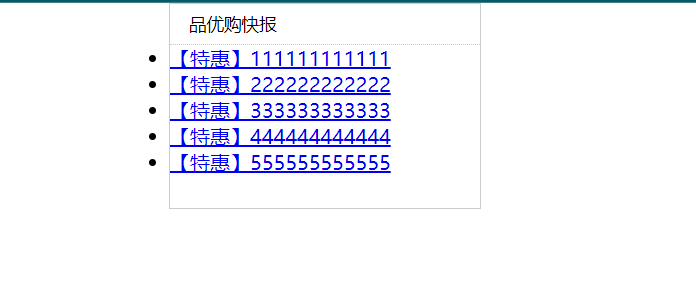
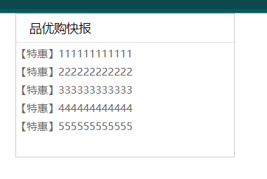
为新闻设置样式,具体包括去除li标签的小圆点,设置文字颜色和大小
 * {
            padding: 0;
            margin: 0;
        }

        .box {
            width: 248px;
            height: 163px;
            margin: 0 auto;
            border: 1px solid #ccc;
        }

        .box h3 {
            height: 32px;
            font-size: 14px;
            font-weight: normal;
            border-bottom: 1px dotted #ccc;
            line-height: 32px;
            padding-left: 15px;
        }

        .box ul li a {
            font-size: 12px;
            color: #666;
            text-decoration: none;
        }

        li {
            list-style: none;
        }
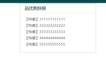
最后为新闻设置左边,上边的距离。设置左边的距离的具体方法就是为每个li标签设定一个padding-left值;而设置上边距离的具体方法就是为ul标签设定一个margin-top。当然还加了一个选中标签时出现横线的效果
   * {
            padding: 0;
            margin: 0;
        }

        .box {
            width: 248px;
            height: 163px;
            margin: 0 auto;
            border: 1px solid #ccc;
        }

        .box h3 {
            height: 32px;
            font-size: 14px;
            font-weight: normal;
            border-bottom: 1px dotted #ccc;
            line-height: 32px;
            padding-left: 15px;
        }

        .box ul li a {
            font-size: 12px;
            color: #666;
            text-decoration: none;
            padding-left: 15px;
        }

        .box ul li a:hover {
            text-decoration: underline;
        }

        .box ul {
            margin-top: 7px;
        }

        /* 去掉li标签的小圆点 */
        li {
            list-style: none;
        }
🔥整体代码
<!DOCTYPE html>
<html lang="en">

<head>
    <meta charset="UTF-8">
    <meta http-equiv="X-UA-Compatible" content="IE=edge">
    <meta name="viewport" content="width=device-width, initial-scale=1.0">
    <title>Document</title>
    <style>
        * {
            padding: 0;
            margin: 0;
        }

        .box {
            width: 248px;
            height: 163px;
            margin: 0 auto;
            border: 1px solid #ccc;
        }

        .box h3 {
            height: 32px;
            font-size: 14px;
            font-weight: normal;
            border-bottom: 1px dotted #ccc;
            line-height: 32px;
            padding-left: 15px;
        }

        .box ul li a {
            font-size: 12px;
            color: #666;
            text-decoration: none;
            padding-left: 15px;
        }

        .box ul li a:hover {
            text-decoration: underline;
        }

        .box ul {
            margin-top: 7px;
        }

        /* 去掉li标签的小圆点 */
        li {
            list-style: none;
        }
    </style>
</head>

<body>
    <div class="box">
        <h3>品优购快报</h3>
        <ul>
            <li><a href="#">【特惠】111111111111</a></li>
            <li><a href="#">【特惠】222222222222</a></li>
            <li><a href="#">【特惠】333333333333</a></li>
            <li><a href="#">【特惠】444444444444</a></li>
            <li><a href="#">【特惠】555555555555</a></li>
        </ul>
    </div>
</body>

</html>


 746
746


 被折叠的 条评论
为什么被折叠?
被折叠的 条评论
为什么被折叠?
 到【灌水乐园】发言


