


微信小程序自定义底部导航栏,原生实现,不包含其他任何第三方组件,比较干净,开箱即用
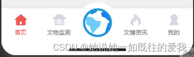
效果预览:
功能
可自定义底部导航栏列表样式
可自定义每个菜单的默认、激活后的图标和文字样式
可自定义是否添加中间的大图标菜单,当然也可自定义大图标的默认与激活样式
可自定义激活动画,默认这个心跳过渡动画
可获取到底部导航栏高度,存在app全局变量中,其他页面有特殊需求需要动态计算页面高度时可能需要用到此属性
解决点击导航菜单时,激活的菜单貌似并不同步的问题
底部根据是否有安全距离自动调整
源码
不废话,直接贴上完整源码
.tabbar {
  position: fixed;
  bottom: 0;
  width: 100%;
  height: 120rpx;
  background: rgba(255, 255, 255, 1);
  box-shadow: 0 2px 16px rgba(184, 184, 210, 0.5);
  /* 利用ios新增的 env() 和 constant() 特性,自动计算底部安全距离 */
  padding-bottom: constant(safe-area-inset-bottom);
  padding-bottom: env(safe-area-inset-bottom);

  display: flex;
  justify-content: space-evenly;
}

.tab {
  width: 100%;
  height: 100%;
  flex: 1;
  display: flex;
  justify-content: center;
  align-items: center;
  flex-direction: column;
  position: relative;
}

.tab-icon {
  width: 68rpx;
  height: 68rpx;
}

.tab-icon-center {
  width: 160rpx;
  height: 160rpx;
  position: absolute;
  top: -24rpx;
  padding: 12rpx;
  box-sizing: border-box;
  border-radius: 80rpx;
}

.beat {
  animation: beat 0.8s both;
}

@keyframes beat {
  0% {
    transform: scale3d(1, 1, 1);
  }
  30% {
    transform: scale3d(1.05, 0.95, 1);
  }
  40% {
    transform: scale3d(0.85, 1.15, 1);
  }
  50% {
    transform: scale3d(1.15, 0.85, 1);
  }
  65% {
    transform: scale3d(0.95, 1.05, 1);
  }
  75% {
    transform: scale3d(1.05, 0.95, 1);
  }
  100% {
    transform: scale3d(1, 1, 1);
  }
}
<view class="tabbar" style="background-color: {{backgroundColor}};" id="tabbar">
  <view class="{{'tab'}} {{selected == index ? 'beat' : ''}}" wx:for="{{list}}" wx:key="item" catchtap="switchTab" data-index="{{index}}" data-url="{{item.pagePath}}">
    <view class="{{'tab-icon'}} {{item.center ? 'tab-icon-center' : ''}}" style="background-color: {{backgroundColor}};">
      <image style="width:100%;height:100%;" src="{{selected == index ? item.iconActive : item.icon}}" mode="" />
    </view>
    <view style="font-size:24rpx;color:{{selected == index ? selectedColor : color}}">
      {{item.text}}
    </view>
  </view>
</view>


 2978
2978


 被折叠的 条评论
为什么被折叠?
被折叠的 条评论
为什么被折叠?
 到【灌水乐园】发言


