


步骤
1.配置项目app.json里面tabBar属性:注意(tabBar.custom :true)
(即便是自定义tabBar,也需要去app.json里进行配置文件的声明,
也就是iconPath、pagePath、selectedIconPath、text这些。)
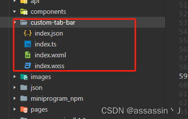
2.编写自己的custom-tab-bar组件:json,js(ts),wxml,wxss
(渲染tabBar)
3.每个页面加上getTabBar去控制选中的突破颜色字体变化
1.配置项目app.json里面tabBar属性:
注意(tabBar.custom :true)
不想改配置就要注意文件夹名称和位置:与components,pages同级,命名必须custon-tab-bar
//  app.json 替换tabBar属性,如果已经根据微信自带的写好了tabBar,直接改custom=true即可

"tabBar": {
    "custom": true,
    "color": "#666666",
    "selectedColor": "#63c00d",
    "backgroundColor": "#ffffff",
    "borderStyle": "black",
    "list": [
      {
        "pagePath": "pages/charger/home/home",
        "text": "首页",
        "iconPath": "/images/icon/home.png",
        "selectedIconPath": "/images/icon/home_select.png"
      },
      {
        "pagePath": "pages/charger/message/message",
        "text": "消息",
        "iconPath": "/images/icon/message.png",
        "selectedIconPath": "/images/icon/message_select.png"
      },
      {
        "pagePath": "pages/charger/order/order",
        "text": "订单",
        "iconPath": "/images/icon/order.png",
        "selectedIconPath": "/images/icon/order_select.png"
      },
      {
        "pagePath": "pages/charger/user/user",
        "text": "我的",
        "iconPath": "/images/icon/user.png",
        "selectedIconPath": "/images/icon/user_select.png"
      }
    ]
  },
2.编写自己的custom-tab-bar组件:json,js(ts),wxml,wxss
## index.json

{
  "component": true,
  "usingComponents": {}
}
// index.js(ts)
Component({
data: {
select: 0,
list: [
{
"pagePath": "../home/home",
"text": "首页",
"iconPath": "../images/icon/home.png",
"selectedIconPath": "../images/icon/home_select.png",
type: 0
},
{
"pagePath": "../message/message",
"text": "消息",
"iconPath": "../images/icon/message.png",
"selectedIconPath": "../images/icon/message_select.png",
type: 0
},
{
type: 1,
},
{
"pagePath": "../order/order",
"text": "订单",
"iconPath": "../images/icon/order.png",
"selectedIconPath": "../images/icon/order_select.png",
type: 0
},
{
"pagePath": "../user/user",
"text": "我的",
"iconPath": "../images/icon/user.png",
"selectedIconPath": "../images/icon/user_select.png",
type: 0
}
]
},
methods: {
selectPage(e) {
const { index, page, type } = e.currentTarget.dataset;
console.log("ee", e)
if (index !== this.data.select && type === 0) {
wx.switchTab({
url: page,
})
}
},
/**
* 扫码
*/
scan() {
wx.scanCode({
success: (res) => {
wx.navigateTo({
url: res.result
})
},
fail: (res) => {
console.log(res);
}
})
},
}
})
<!-- index.wxml -->
<view class="tabbar">
<view
class="tabbar-item {{ select === index ? 'tabbar-select' : '' }}" wx:for="{{ list }}"
wx:key="index"
data-page="{{ item.pagePath }}"
data-index="{{ index }}"
data-type="{{ item.type }}"
bindtap="selectPage"
>
<block wx:if="{{ item.type === 0 }}">
<image class="tabbar-img" src="{{ select === index ? item.selectedIconPath : item.iconPath }}"></image>
<text class="fontText">{{ item.text }}</text>
</block>
<block wx:else>
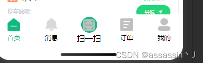
<view class="publish" bindtap="scan">
<image class="tabbar-img" src="../images/icon/sao.png"></image>
</view>
<view>扫一扫</view>
</block>
</view>
</view>
/*  index.wxss  */
.tabbar {
  width: 100%;
  display: flex;
  background-color: #fff;
  position: fixed;
  bottom: 0;
  padding-bottom: env(safe-area-inset-bottom);
  padding-top: 10rpx;
  z-index: 9999;
}

.tabbar-item {
  flex: 1;
  display: flex;
  flex-direction: column;
  justify-content: center;
  align-items: center;
}

.tabbar-item .tabbar-img {
  width: 50rpx;
  height: 50rpx;
}

.tabbar-item .fontText {
  font-size: 26rpx;
  margin-top: 10rpx;
}

.tabbar-item .publish {
  width: 65rpx;
  height: 65rpx;
  font-size: 26rpx;
  background-color: #10B981;
  border-radius: 50%;
  display: flex;
  align-items: center;
  justify-content: center;
  margin-bottom: auto;
}

.tabbar-select {
  color: #10B981;
}
3.每个页面加上getTabBar去控制选中的突破颜色字体变化
//  home.js(ts)
onShow(){
    if (typeof this.getTabBar === 'function' && this.getTabBar()) {
      this.getTabBar().setData({
        select: 0
      })
    }
}


//  user.js(ts)
onShow(){
    if (typeof this.getTabBar === 'function' && this.getTabBar()) {
      this.getTabBar().setData({
        select: 1
      })
    }
}
最后


 5829
5829


 被折叠的 条评论
为什么被折叠?
被折叠的 条评论
为什么被折叠?
 到【灌水乐园】发言


