CSS转圈动画
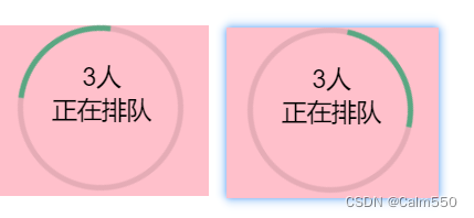
html
<div class="rotateCircle">
      <div class="donut"></div>
      <div class="rtext" style="text-align: center">
        <div>{{ person }}人</div>
        <span>正在排队</span>
      </div>
    </div>
</div>
js
 data() {
    return {
      person: 3,
    };
  },
css
/* 转圈圆样式 */
.rotateCircle {
  width: 10%;
  background-color: pink;
  padding-left: 1%;
  position: relative;
}
.rtext{
  font-size: 18px;
  position: absolute;
  top: 20%;
  left: 26%;
}
/* 圆转圈 */
@keyframes donut-spin {
  0% {
    transform: rotate(0deg);
  }

  100% {
    transform: rotate(360deg);
  }
}

.donut {
  display: inline-block;
  border: 4px solid rgba(0, 0, 0, 0.1);
  border-left-color: #59a782;
  border-radius: 50%;
  width: 120px;
  height: 120px;
  animation: donut-spin 1.2s linear infinite;
}
Progress 圆形进度条
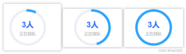
html
<div class="circleBox">
      <el-progress
        type="circle"
        :show-text="false"
        :percentage="percentage"
        :stroke-width="8"
        stroke-linecap="square"
      />
      <div class="textCenter">
        <div>{{ person }}人</div>
        <span>正在排队</span>
      </div>
    </div>
js
<script>
export default {
  data() {
    return {
      percentage: 0, // 默认加载进度为0%
    };
  },
  mounted() {
    this.animateProgress(); // 在组件挂载后启动动画
  },
  methods: {
    animateProgress() {
      const interval = setInterval(() => {
        if (this.percentage >= 100) {
          clearInterval(interval); // 达到100%时停止动画
        } else {
          this.percentage += 1; // 每隔一段时间增加1%的加载进度
        }
      }, 10);
    },
  },
};
</script>
css
.circleBox {
  position: relative;
  text-align: center;
  width: 200px;
  margin: 40px 0;
}

.circleBox .textCenter {
  position: absolute;
  top: 50%;
  left: 50%;
  transform: translate(-50%, -50%);
}

.circleBox .textCenter div {
  font-size: 26px;
  color: #1360fb;
  font-weight: 600;
  margin-bottom: 5px;
}

.circleBox .textCenter span {
  font-size: 14px;
  color: #999999;
}


 858
858


 被折叠的 条评论
为什么被折叠?
被折叠的 条评论
为什么被折叠?
 到【灌水乐园】发言


