


-
css的元素
-
元素的显示与隐藏
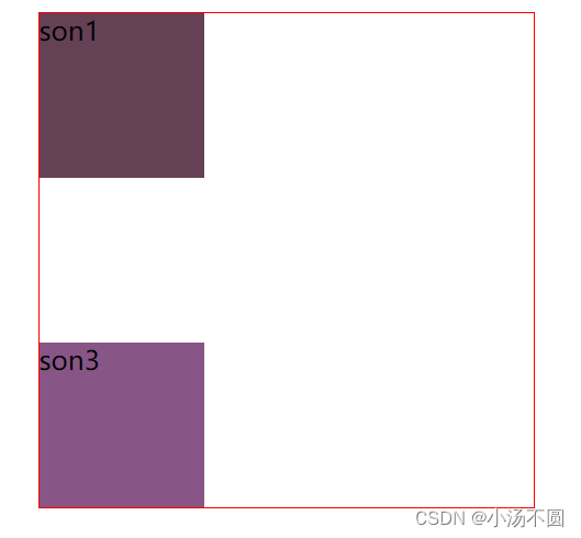
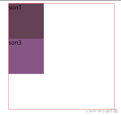
display 设置或检索对象是否及如何显示。display: none 隐藏对象 与它相反的是 display:block 除了转换为块级元素之外,同时还有显示元素的意思,特点: 隐藏之后,不再保留位置。
visibility 可见性,visible: 对象可视,hidden: 对象隐藏,特点: 隐藏之后,继续保留原有位置。
<style>
        .fa {
            width: 300px;
            height: 300px;
            margin: 0 auto;
            border: 1px solid red;
        }

        .fa div {
            width: 100px;
            height: 100px;
        }

        .son1 {
            background-color: #654156;
        }

        .son2 {
            background-color: yellowgreen;
            display: none;
            /* 隐藏之后不在占位 */
            visibility: hidden;
            /* 隐藏保留位置 */
        }

        .son3 {
            background-color: #875686;
        }
    </style>
<body>
    <div class="fa">
        <div class="son1">son1</div>
        <div class="son2">son2</div>
        <div class="son3">son3</div>
    </div>
</body> 
-
结构性伪类选择器
:nth-child(n)对指定序号的子元素设置样式(从前往后数)。参数可以使数字(1、2、3)、关键字(odd(奇数),even(偶数))、公式(2n、2n+3 :使用公式时,n从0开始),参数的索引起始值时1,而不是0。
·:nth-ast-child(n)对指定序号的子元素设置样式(从后往前数)。参数同上。
·:nth-of-type(n)匹配指定序号的同一种类型的子元素(从前往后数)。参数同上。
:nth-last-of-type(n) 匹配 指定序号的同一种类型的子元素(从后往前数)。参数同上。
    <style>
        .nav li:nth-child(3) {
            /* :nth-child(n)对指定序号的子元素设置样式(从前往后数)。参数可以使数字(1、2、3)、关键字(odd.
            even)、公式(2n、2n+3 :使用公式时,n从0开始),参数的索引起始值时1,而不是0。 */
            color: tomato;
        }
        /*
        .nav li:nth-child(odd) {
            color: blue;
        }

        li:nth-child(even) {
            color: aquamarine;
        }
         */

        .nav li:nth-child(2n+1) {
            color: chartreuse;
        }
        /* .main p:nth-child(4) {
            color: pink;
        }
         */

        .main p:nth-of-type(3) {
            /* 匹配指定序号的同一种类型的子元素(从前往后数)。 */
            color: pink;
        }
    </style>
<body>
    <ul class="nav">
        <li>li元素</li>
        <li>li元素</li>
        <li>li元素</li>
        <li>li元素</li>
        <li>li1</li>
        <li>li2</li>
        <li>li3</li>
        <li>li4</li>
    </ul>

    <div class="main">
        <span>
            你好
        </span>
        <p>p元素1</p>
        <p>p元素2</p>
        <!-- p元素3是目标元素 -->
        <p>p元素3</p>
        <p>p元素4</p>
        <p>p元素5</p>
    </div>
</body>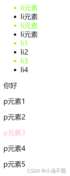
-
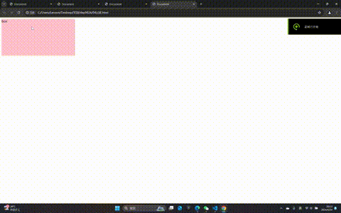
过渡
过渡(transition)是cSS3中具有颠覆性的特征之一,我们可以在不使用 Flash 动画或JavaScript 的情况下,当元素从一种样式变换为另一种样式时为元素添加效果,要过渡的属性 花费时间 运动曲线 何时开始:如果有多组属性变化,还是用逗号隔开。
    <style>
        .box {
            width: 200px;
            height: 100px;
            background-color: pink;
            /* 要过渡的属性 花费时间 运动曲线(ease 缓慢动画) 何时开始: */
            /* 多种形式 用逗号隔开 width 1s,height 1s */
            transition: all 2s linear;
        }

        .box:hover {
            width: 1000px;
            height: 500px;
        }
    </style>
<body>
    <div class="box">box</div>
</body>
-
2D变形 transfrom
-
移动transform: translate
translate(x,y)水平方向和垂直方向同时移动(也就是X轴和y轴同时移动)
<style>
        .box {
            width: 200px;
            height: 100px;
            background-color: pink;
            transition: all .2s linear;
            margin: 100px auto;
        }

        .box:hover {
            /* width: 1000px;
            height: 500px; */
            /* 平移水平垂直 */
            /* transform: translate(50px, 50px); */
            /* 垂直y轴 移动 */
            transform: translateY(-50px);
        }
    </style>
<body>
    <div class="box">box</div>
</body>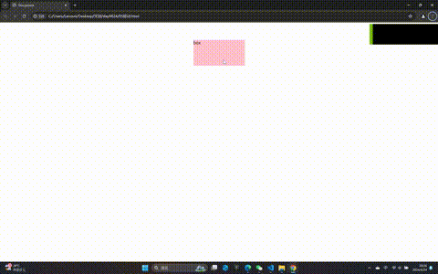
-
缩放 scale(x,y)
scale()的取值默认的值为1,当值设置为0.01到0.99之间的任何值,作用使一个元素缩小;而 任何大于1的值,作用是让元素放大。注意大小的变化。
<style>
    .box {
        width: 200px;
        height: 100px;
        background-color: pink;
        transition: all .2s linear;
        margin: 100px auto;
    }

    .box:hover {
        /* width: 1000px;
        height: 500px; */
        /* 平移水平垂直 */
        /* transform: translate(50px, 50px); */
        /* 垂直y轴 移动 */
        /* transform: translateY(-50px); */
        /* 缩小:[0-1) 1不变大不缩小  扩大大于1 */
        /* transform: scale(2, 0.5); */
        /* 如果书写一个值,那么x,y都是这个值 */
        transform: scale(2);
    }
</style>
<body>
    <div class="box">box</div>
</body>
-
旋转 rotate(deg)
rotate( angle),可以对元素进行旋转,正值为顺时针,负值为逆时针。
    <style>
        .box {
            width: 200px;
            height: 100px;
            background-color: pink;
            margin: 100px auto;
            /* 要过渡的属性 花费时间 运动曲线(ease 缓慢动画) 何时开始: */
            /* 多种形式 用逗号隔开 width 1s,height 1s */
            transition: all 2s linear;
        }

        .box:hover {
            transform: rotate(-3600deg);
        }
    </style>
<body>
    <div class="box">box</div>
</body>
-
动画
动画是c5S3中具有颠性的特征之一,可通过设置多个节点来精确控制一个或一组动画,常用来实现复杂的动画效果。
定义动画
@keyframe 动画名{
from(0%){开始位置}
to(100%){结束位置}
}
调用动画(在选择器中使用)
animation;动画名称 动画时间 运动曲线 何时开始 播放次数 是否反方问:
<style>
        /* 元素移动 */
        /* 1.transform:translateX() 2.margin-left 3.定位
         */

        @keyframes move {
            0% {
                /* transform: translateX(0); */
            }
            49.9% {
                transform: translateX(1000px);
            }
            50% {
                transform: translateX(1000px) rotateY(180deg);
            }
            99% {
                transform: translateX(0px) rotateY(180deg);
            }
            100% {
                transform: rotate(0px);
            }
        }

        .car {
            /* 调用动画 */
            /* infinite:无限 */
            animation: move 7s linear;
            /* 规定动画之外的状态
             forwards:动画完成后,保持最后状态 */
            animation-fill-mode: forwards;
            /* animation-direction: alternate; */
            position: absolute;
            left: 0;
            top: 0;
        }
    </style>
<body>
    <!-- animation:动画名称 动画时间 运动曲线 何时开始 播放次数 是否反方向: -->
    <img src="img/lengte.png" alt="" class="car" width="100" height="100">
</body>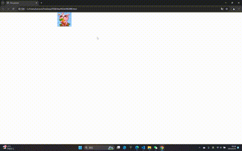
-
弹性盒子布局 flex布局
-
flex布局
Flex 是 Flexible Box 的缩写,意为"弹性布局",用来为盒状模型提供最大的灵活性。任何一个容器都可以指定为 Flex 布局。(芸芸众生皆平等),采用 Flex 布局的元素,称为 Flex 容器(flex container),简称"容器"。它的所有子元素自动成为容器成员,称为Flex项目(flexitem),简称“项目"。
<style>
        .wrap {
            width: 300px;
            height: 200px;
            border: 1px solid red;
            margin: 100px auto;
            display: flex;
            /* 使我们wrap元素成为弹性元素 */
            /* 如果子元素的宽度不够将会自动缩小 */
            /* 如果父元素宽度剩余,子元素按照自身的大小进行显示 */
        }

        .wrap span {
            width: 100px;
            height: 150px;
            background-color: pink;
            margin-left: 10px;
        }
    </style>
<body>
    <div class="wrap">
        <span class="item1">item元素1</span>
        <span class="item2">item元素2</span>
        <span class="item3">item元素3</span>
        <span class="item4">item元素4</span>
        <span class="item5">item元素5</span>
        <span class="item6">item元素6</span>
    </div>
</body> 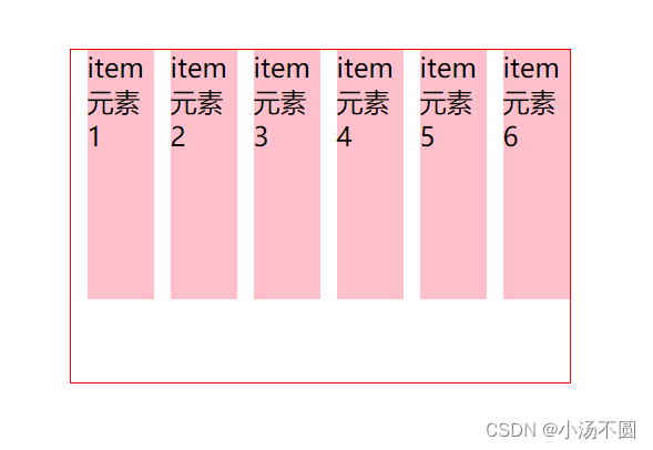
-
弹性盒子的方向
主轴的方向 默认row 水平,clumn 垂直
<style>
        .wrap {
            width: 600px;
            height: 600px;
            border: 1px solid red;
            margin: 100px auto;
            display: flex;
            /* 主轴的方向  默认row 水平,clumn 垂直*/
            flex-direction: column;
        }

        .wrap div {
            width: 100px;
            height: 150px;
            background-color: pink;
            margin-left: 10px;
        }
    </style>
<body>
    <div class="wrap">
        <div class="tiem1">item元素1</div>
        <div class="tiem2">item元素2</div>
        <div class="tiem3">item元素3</div>
        <div class="tiem4">item元素4</div>
        <div class="tiem5">item元素5</div>
        <div class="tiem6">item元素6</div>
    </div>
</body> 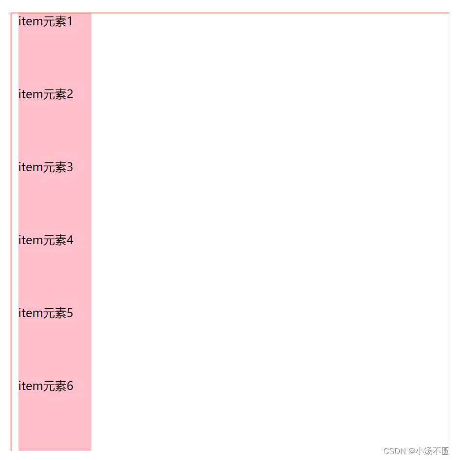
-
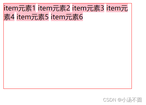
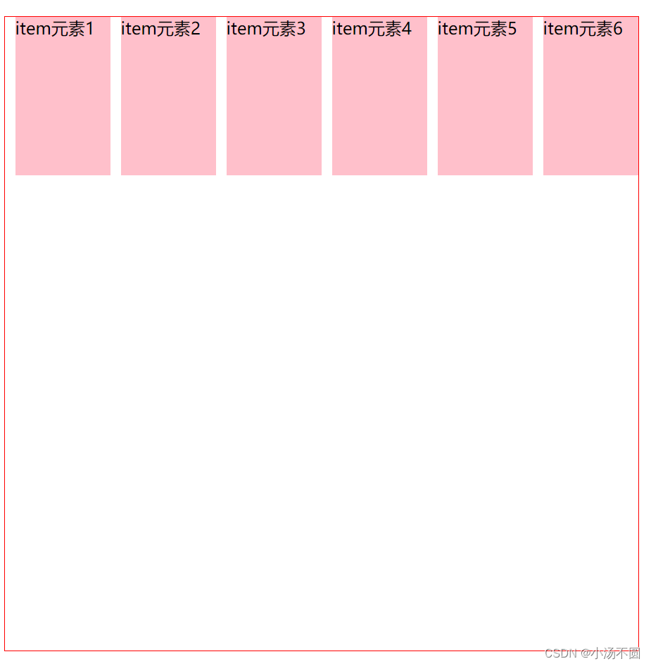
弹性盒子的换行
flex-wrap属性,默认情况下,项目都排在一条线(又称"轴线")上。flex-wrap属性定义,如果一条轴线排不下如何换行。
 <style>
        .wrap {
            width: 600px;
            height: 600px;
            border: 1px solid red;
            margin: 100px auto;
            display: flex;
            /* 换行 */
            flex-wrap: wrap;
        }

        .wrap div {
            width: 200px;
            height: 150px;
            background-color: pink;
            margin-left: 10px;
        }
    </style>
<body>
    <div class="wrap">
        <div class="tiem1">item元素1</div>
        <div class="tiem2">item元素2</div>
        <div class="tiem3">item元素3</div>
        <div class="tiem4">item元素4</div>
        <div class="tiem5">item元素5</div>
        <div class="tiem6">item元素6</div>
    </div>
</body>
-
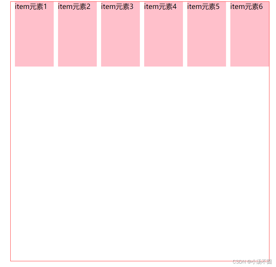
主轴的对齐方式
justify-content属性定义了项目在主轴上的对齐方式。
flex-start(默认值):左对齐
flex-end:右对产
center:居中
space-between:两端对齐,项目之间的间隔都相等.space-around:每个项目两侧的间隔相等。所以,项目之间的间隔比项目与边框的间隔大一倍。
 <style>
        .wrap {
            width: 800px;
            height: 250px;
            border: 1px solid red;
            margin: 100px auto;
            display: flex;
            /* 主轴上的对齐方式 */
            /* flex-start左对齐 ,flex-end右对齐 */
            /* justify-content: flex-end; */
            /* 居中对齐 只是主轴上的对齐居中 */
            /* justify-content: center; */
            /* 两端对齐 */
            justify-content: space-between;
            /* 两侧相等对齐 */
            /* justify-content: space-around; */
        }

        .wrap div {
            width: 180px;
            height: 200px;
            background-color: pink;
            border: 1px solid #ccc;
        }
    </style>
<body>
    <div class="wrap">
        <div class="tiem1">item元素1</div>
        <div class="tiem2">item元素2</div>
        <div class="tiem3">item元素3</div>
        <div class="tiem4">item元素4</div>
    </div>
</body>
这里的对齐方式很多,我就不一一展示了,大家可以自己去实验。
-
弹性盒子的交叉对齐
flex-start:交叉轴的起点对齐。
flex-end:交叉轴的终点对齐
·center:交叉轴的中点对齐。
·baseline:项目的第一行文字的基线对齐
·stretch(默认值):如果项目未设置高度或设为auto,将占满整个容器的高度,元素被拉伸以适应容器。
<style>
        .wrap {
            width: 800px;
            height: 250px;
            border: 1px solid red;
            margin: 100px auto;
            display: flex;
            justify-content: center;
            /* 交叉轴的对齐方式 */
            /* 居中对齐 */
            align-items: center;
        }

        .wrap div {
            width: 180px;
            height: 200px;
            background-color: pink;
            border: 1px solid #ccc;
        }
    </style>
<body>
    <div class="wrap">
        <div class="tiem1">item元素1</div>
        <!-- <div class="tiem2">item元素2</div>
        <div class="tiem3">item元素3</div>
        <div class="tiem4">item元素4</div> -->
    </div>
</body>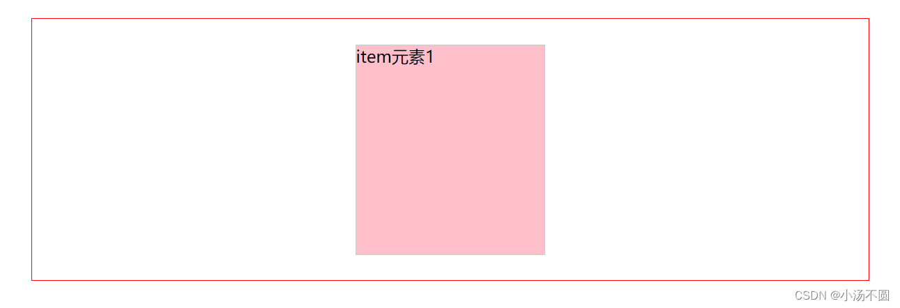
对齐方式很重要的不像之前的很繁琐。
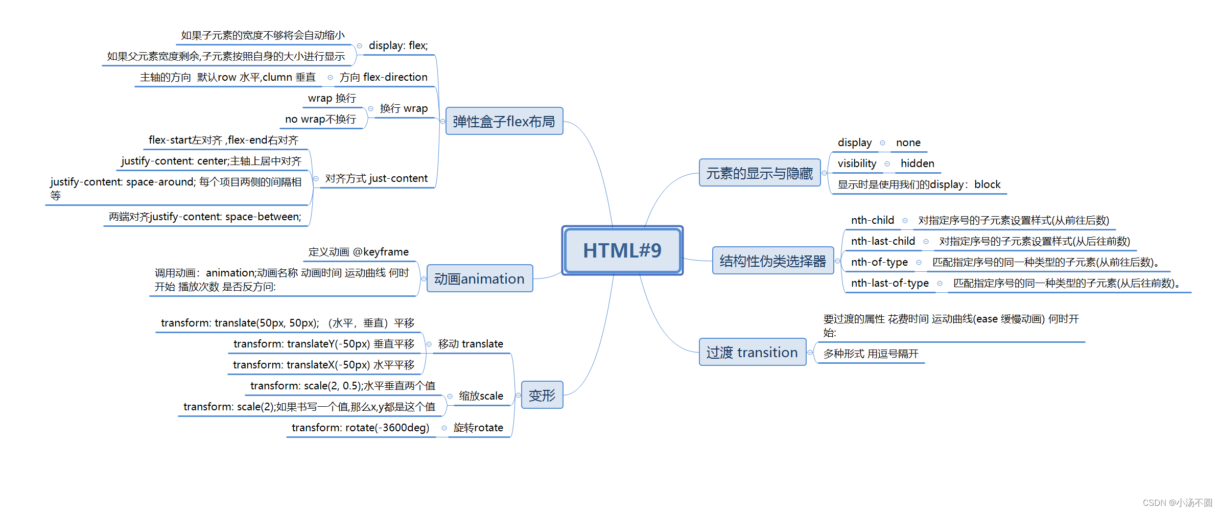
最后上我们的思维导图。


 1万+
1万+


 被折叠的 条评论
为什么被折叠?
被折叠的 条评论
为什么被折叠?
 到【灌水乐园】发言


