


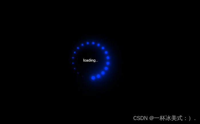
 效果图如上:
代码如下:
<!DOCTYPE html>
<html>
<head>
<meta charset="utf-8">
<title>加载特效</title>
<style type="text/css">
*{
margin: 0;
padding: 0;
/* 将border和padding计算到内容中 */
box-sizing: border-box;
}
section{
/* 弹性布局 */
display: flex;
/* 横向居中 */
justify-content: center;
/* 纵向居中 */
align-items: center;
/* 窗口最低高度 */
min-height: 100vh;
background: #000000;
animation: animateBg 5s linear infinite;
}
section div{
/* 相对定位 */
position: relative;
width: 120px;
height: 120px;
}
section div span{
/* 绝对定位 */
position: absolute;
top: 0;
left: 0;
width: 100%;
height: 100%;
/* calc()函数 动态计算 var()获取style中的--i的值*/
transform: rotate(calc(18deg * var(--i)));
}
section div span::before{
content: "";
position: absolute;
top: 0;
left: 0;
width: 15px;
height: 15px;
border-radius: 50%;
background: red;
box-shadow: 0 0 10px red,0 0 20px red,0 0 40px red,0 0 60px red,0 0 70px red,0 0 100px red;
animation: move 2s linear infinite;
/* 让当前动画延时运行 */
animation-delay: calc(0.1s * var(--i));
}
@keyframes move{
0%{
transform: scale(1);
}
100%{
transform: scale(0);
}
}
@keyframes animateBg{
0%{
filter: hue-rotate(0deg);
}
100%{
filter: hue-rotate(360deg);
}
}
section div p{
color: #F0FFFF;
margin-top: 50px;
margin-left: 30px;
}
</style>
</head>
<body>
<section>
<div id="">
<p>loading...</p>
<span style="--i:1"></span>
<span style="--i:2"></span>
<span style="--i:3"></span>
<span style="--i:4"></span>
<span style="--i:5"></span>
<span style="--i:6"></span>
<span style="--i:7"></span>
<span style="--i:8"></span>
<span style="--i:9"></span>
<span style="--i:10"></span>
<span style="--i:11"></span>
<span style="--i:12"></span>
<span style="--i:13"></span>
<span style="--i:14"></span>
<span style="--i:15"></span>
<span style="--i:16"></span>
<span style="--i:17"></span>
<span style="--i:18"></span>
<span style="--i:19"></span>
<span style="--i:20"></span>
</div>
</section>
</body>
</html>


 275
275


 被折叠的 条评论
为什么被折叠?
被折叠的 条评论
为什么被折叠?
 到【灌水乐园】发言


