


底部tabBar自定义
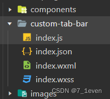
第一步,在代码根目录下添加入口文件:
第二步,编写tabBar代码,用自定义组件的方式编写即可,该自定义组件完全接管 tabBar 的渲染。另外,自定义组件新增 getTabBar 接口,可获取当前页面下的自定义 tabBar 组件实例。
//index.wxml
<cover-view class="tab-bar">
  <cover-view class="tab-bar-border"></cover-view>
  <cover-view wx:for="{{list}}" wx:key="index" class="tab-bar-item" data-path="{{item.pagePath}}" data-index="{{index}}" data-type="{{item.type}}" bindtap="switchTab">
    <block wx:if="{{item.type===0}}">
      <cover-image class="cover-image" src="{{select===index?item.selectedIconPath:item.iconPath}}"></cover-image>
      <cover-view class="{{select===index?'active':'cover-view'}}">{{item.text}}</cover-view>
    </block>
    <block wx:else="{{item.type===1}}">
      <cover-image class="add" src="../images/add-a.png"></cover-image>
    </block>
  </cover-view>
</cover-view>
//index.js
Component({
  data:{
    select:0,
    list: [
      {
        iconPath: "/images/index.png",
        pagePath: "/pages/index/index",
        selectedIconPath: "/images/index-a.png",
        text: "首页",
        type:0
      },
      {
        iconPath: "/images/class.png",
        pagePath: "/pages/classify/classify",
        selectedIconPath: "/images/class-a.png",
        text: "分类",
        type:0
      },
      {
        type:1,
        pagePath: "/pages/publish/publish",
      },
      {
        iconPath: "/images/talk.png",
        pagePath: "/pages/talk/talk",
        selectedIconPath: "/images/talk-a.png",
        text: "消息",
        type:0
      },
      {
        iconPath: "/images/my.png",
        pagePath: "/pages/my/my",
        selectedIconPath: "/images/my-a.png",
        text: "我的",
        type:0
      }
    ]
  },
  methods:{
    selectIcon(e){
// console.log(e)
const{index,path,type}=e.currentTarget.dataset
if(index!==this.data.select&&type===0){
  wx.switchTab({
    url: path,
  })
}else{
  wx.navigateTo({
    url: path,
  })
}
    }
  }
})
//index.json
{
  "component": true
}
//index.wxss
/* custom-tab-bar/index.wxss */
.tab-bar {
  position: fixed;
  bottom: 0;
  left: 0;
  right: 0;
  height: 100rpx;
  background: white;
  display: flex;
  padding-top: 10rpx;
  padding-bottom: env(safe-area-inset-bottom);
}

.tab-bar-border {
  background-color: rgba(0, 0, 0, 0.33);
  position: absolute;
  left: 0;
  top: 0;
  width: 100%;
  height: 1px;
  transform: scaleY(0.5);
}
.tab-bar-item {
  flex: 1;
  text-align: center;
  display: flex;
  justify-content: center;
  align-items: center;
  flex-direction: column;
}

.tab-bar-item cover-image {
  width: 50rpx;
  height: 50rpx;
  margin-bottom: 10rpx;
}

.tab-bar-item cover-view {
  font-size: 26rpx;
  color: gray;
}
.tab-bar-item cover-image .add {
  width: 70rpx;
  height: 70rpx;
  margin-bottom: auto;
}

.tab-bar-item .active {
  color: #3399FF;
}
在需要tabBar显示的页面中添加getTabBar 回调函数
onShow: function () {
    if(typeof this.getTabBar==='function'&&this.getTabBar()){
      this.getTabBar().setData({
        select:0
      })
    }
  },


 718
718


 被折叠的 条评论
为什么被折叠?
被折叠的 条评论
为什么被折叠?
 到【灌水乐园】发言


