


顶部固定用于侧边栏低于屏幕高度----左侧边栏
底部固定用于侧边栏高于屏幕高度----右侧边栏
vue页面方法
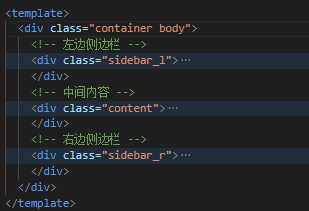
页面布局
页面样式,因为内容比较多, 只展示主要代码
* {
    margin: 0;
    padding: 0;
    text-align: center;
}
.head {
    width: 100%;
    height: 88px;
    background-color: pink
    position: sticky;
    top: 0;
    left: 0;
    z-index: 999;
}
.body {
    display: flex;
    /**必须加这个属性才可以获取到dom的真实高度*/
    align-items: flex-start;
    width: 1200px;
    margin: 0 auto;
}
.sidebar_l {
    width: 200px;
    height: 100%;
    background-color: blue
    margin-top: 50px;
    position: sticky;
    /* 定位到导航栏下面 */
    top: 88px;
    left: 0;
}
.content {
    width: 600px;
    margin: 50px;
    background-color: #ccc
}
.sidebar_r {
    width: 300px;
    margin-top: 50px;
}
js
注意生命周期
onMounted(() => {
  // 获取元素
  let sidebar_r: any = document.querySelector('.sidebar_r');
  // 获取元素高度
  let r_h = sidebar_r.offsetHeight;
  // 获取屏幕宽度
  var window_w = window.innerWidth;
  // 获取屏幕高度
  var window_h = window.innerHeight;
  // 宽度至少1200
  window_w < 1200 ? window_w = 1200 : window_w;
  // 获取的屏幕宽度加了滚动条的宽度9px,中间内容的左边加中间是910 - 9,所以加901
  sidebar_r.style.left = ((window_w - 1200) / 2) + 901 + "px";
  // 监听页面滚动
  window.addEventListener("scroll", () => {
    // 获取滚动高度
    let scrollTop = window.pageYOffset || document.documentElement.scrollTop;
    // 判断高度是否超过屏幕高度 超过就底部固定没有就顶部固定
    if (window_h < r_h) {
      // 判断滚动高度是否超过侧边栏高度(判断侧边栏是否滚动到了底部 侧边栏高度-屏幕高度+头部高度88+上下边距50+20)
      if (scrollTop >= r_h - window_h + 88 + 50 + 20) {
        sidebar_r.style.position = "fixed";
        sidebar_r.style.bottom = "20px";
        sidebar_r.style.top = "auto";
        sidebar_r.style.height = "auto";
      } else {
        sidebar_r.style.position = "";
      }
    } else {
      sidebar_r.style.position = "sticky";
      sidebar_r.style.top = "88px";
      sidebar_r.style.height = "100%";
      sidebar_r.style.bottom = "auto";
    }
  })
  // 监听页面大小变化
  window.addEventListener("resize", () => {
    // 获取屏幕高度宽度
    window_w = window.innerWidth;
    window_h = window.innerHeight;
    window_w < 1200 ? window_w = 1200 : window_w;
    sidebar_r.style.left = ((window_w - 1200) / 2) + 901 + "px";
  });
})
html原生方法
需要手动计算右边侧边栏高度,可以直接复制运行看效果
<!DOCTYPE html>
<html lang="en">

<head>
    <meta charset="UTF-8">
    <meta name="viewport" content="width=device-width, initial-scale=1.0">
    <title>Document</title>
    <style>
        * {
            margin: 0;
            padding: 0;
            text-align: center;
        }

        .head {
            width: 100%;
            height: 88px;
            background-color: pink;
            position: sticky;
            top: 0;
            left: 0;
            z-index: 999;
        }

        .body {
            display: flex;
            /**必须加这个属性才可以获取到dom的真实高度*/
            align-items: flex-start;
            width: 1200px;
            margin: 0 auto;
        }

        .sidebar_l {
            width: 150px;
            height: 100%;
            background-color: blue;
            margin-top: 50px;
            position: sticky;
            /* 定位到导航栏下面 */
            top: 88px;
            left: 0;
        }

        .content {
            width: 660px;
            margin: 50px;
            background-color: #ccc;
        }

        .sidebar_r {
            width: 290px;
            margin-top: 50px;
        }

        .box1 {
            width: 100%;
            height: 600px;
            background-color: #0bf349;
        }

        .box2 {
            width: 100%;
            height: 6000px;
            background-color: #27d8f0;
        }

        .box3 {
            width: 100%;
            height: 2000px;
            background-color: #ed9a15;
            position: relative;
        }

        .bottom {
            position: absolute;
            bottom: 0;
        }
    </style>
</head>

<body>
    <!-- 导航栏 -->
    <div class="head">头部</div>
    <!-- 内容区域 -->
    <div class="body">
        <div class="sidebar_l">
            <div class="box1">左边侧边栏</div>
        </div>
        <div class="content">
            <!-- 内容 -->
            <div class="box2">中间内容</div>
        </div>
        <div class="sidebar_r">
            <!-- 内容 -->
            <div class="box3">
                <p>右边侧边栏</p>
                <p class="bottom">右边侧边栏底部</p>
            </div>
        </div>
    </div>
</body>
<script>
    // 获取元素
    let sidebar_r = document.querySelector('.sidebar_r');
    let r_h = sidebar_r.offsetHeight;
    console.log("右边侧边栏高度:", r_h);
    // 获取屏幕宽度
    var window_w = window.innerWidth;
    // 获取屏幕高度
    var window_h = window.innerHeight;
    // 宽度至少1200
    window_w < 1200 ? window_w = 1200 : window_w;
    // 获取的屏幕宽度加了滚动条的宽度9px,中间内容的左边加中间是910 - 9,所以加901
    sidebar_r.style.left = ((window_w - 1200) / 2) + 901 + "px";
    // 监听页面滚动
    window.addEventListener("scroll", () => {
        // 获取滚动高度
        let scrollTop = window.pageYOffset || document.documentElement.scrollTop;
        // 判断高度是否超过屏幕高度 超过就底部固定没有就顶部固定
        if (window_h < r_h) {
            // 判断滚动高度是否超过侧边栏高度(判断侧边栏是否滚动到了底部 侧边栏高度-屏幕高度+头部高度88+上下边距50+20)
            if (scrollTop >= r_h - window_h + 88 + 50 + 20) {
                sidebar_r.style.position = "fixed";
                sidebar_r.style.bottom = "20px";
                sidebar_r.style.top = "auto";
                sidebar_r.style.height = "auto";
            } else {
                sidebar_r.style.position = "";
            }
        } else {
            sidebar_r.style.position = "sticky";
            sidebar_r.style.top = "88px";
            sidebar_r.style.height = "100%";
            sidebar_r.style.bottom = "auto";
        }
    })
    // 监听页面大小变化
    window.addEventListener("resize", () => {
        // 获取屏幕高度宽度
        window_w = window.innerWidth;
        window_h = window.innerHeight;
        window_w < 1200 ? window_w = 1200 : window_w;
        sidebar_r.style.left = ((window_w - 1200) / 2) + 901 + "px";
    });
</script>

</html>
计算思路:
高度判断:屏幕高度 - 元素高度 + 顶部离边框的距离
左边定位:屏幕宽度 - 左边元素宽度和间距 + 滚动条宽度
注意:获取元素高度 html元素因为父元素使用了flex让子元素的高度都变成了一样高,必须设置align-items: flex-start;还原dom的真实高度
自动判断二边顶部固定还是底部固定
onMounted(() => {
  /**获取元素*/
  let sidebar_l: any = document.querySelector('.sidebar_l');
  let content: any = document.querySelector('.content');
  let sidebar_r: any = document.querySelector('.sidebar_r');
  /**获取元素高度*/
  let l_h = sidebar_l.offsetHeight;
  let r_h = sidebar_r.offsetHeight;
  /**获取屏幕宽度*/
  var window_w = window.innerWidth;
  /**获取屏幕高度*/
  var window_h = window.innerHeight;
  /**宽度至少1200*/
  window_w < 1200 ? window_w = 1200 : window_w;
  /**获取的屏幕宽度加了滚动条的宽度9px,所以 -9*/
  sidebar_l.style.left = ((window_w - 1200) / 2) - 9 + "px";
  /**获取的屏幕宽度加了滚动条的宽度9px,中间内容的左边加中间是910 - 9,所以加901*/
  sidebar_r.style.left = ((window_w - 1200) / 2) + 901 + "px";
  /**监听页面滚动*/
  window.addEventListener("scroll", () => {
    /**获取滚动高度*/
    let scrollTop = document.documentElement.scrollTop;
    /**判断高度是否超过屏幕高度 120是距离顶部的距离 超过就底部固定没有就顶部固定*/
    if (window_h < r_h + 120) {
      /**判断滚动高度是否超过侧边栏高度(判断侧边栏是否滚动到了底部 侧边栏高度-屏幕高度+头部高度88+上下边距50+20)*/
      if (scrollTop >= r_h - window_h + 88 + 50 + 20) {
        sidebar_r.style.position = "fixed";
        sidebar_r.style.bottom = "20px";
        sidebar_r.style.top = "auto";
        sidebar_r.style.height = "auto";
      } else {
        sidebar_r.style.position = "static";
      }
    } else {
      sidebar_r.style.position = "sticky";
      sidebar_r.style.top = "88px";
      sidebar_r.style.height = "100%";
      sidebar_r.style.bottom = "auto";
    }
    if (window_h < l_h + 120) {
      /**判断滚动高度是否超过侧边栏高度(判断侧边栏是否滚动到了底部 侧边栏高度-屏幕高度+头部高度88+上下边距50+20)*/
      if (scrollTop >= l_h - window_h + 88 + 50 + 20) {
        sidebar_l.style.position = "fixed";
        sidebar_l.style.bottom = "20px";
        sidebar_l.style.top = "auto";
        sidebar_l.style.height = "auto";
        /**设置中间的左外边距 因为左边的侧边栏设置为固定定位 中间的内容会向左边走 边距是侧边栏的内容和间距 150+50=200 */
        content.style.marginLeft = "200px";
      } else {
        sidebar_l.style.position = "";
        //**还原定位设置 外边距改为0 */
        content.style.marginLeft = "0px";
      }
    } else {
      sidebar_l.style.position = "sticky";
      sidebar_l.style.top = "88px";
      sidebar_l.style.height = "100%";
      sidebar_l.style.bottom = "auto";
    }
  })
  /**监听页面大小变化*/
  window.addEventListener("resize", () => {
    /**获取屏幕高度宽度*/
    window_w = window.innerWidth;
    window_h = window.innerHeight;
    window_w < 1200 ? window_w = 1200 : window_w;
    sidebar_r.style.left = ((window_w - 1200) / 2) + 901 + "px";
    sidebar_l.style.left = ((window_w - 1200) / 2) - 9 + "px";
  });
})
方法封装
新建utils.ts文件
/**
 * @param margin_top 上面距离边界的距离 = 头部导航栏整体高度 + 与内容的间隙高度
 * @param margin_bottom 下面距离边界的距离 = 底部栏高度 + 与内容的间隙高度
 * @param left_w 左侧边栏宽度加右边距
 * @param content_w 中间内容宽度加右边距
 * @param 注意:传一个表示右侧边栏,二个表示左侧边栏,三个表示二边侧边栏,至少传一个dom
 * @param dom1 左侧边栏元素
 * @param dom2 中间内容
 * @param dom3 右侧边栏元素
 */
export function scroll(margin_top: number, margin_bottom: number, left_w: number, content_w: number, dom1: Element, dom2?: Element, dom3?: Element) {
    /**内容等腰线宽度 个人设置1200 */
    const body = 1200;
    /**获取滚动高度*/
    let scrollTop = 0
    /**获取屏幕宽度 宽度至少1200*/
    var window_w = window.innerWidth < body ? body : window.innerWidth;
    /**获取屏幕高度*/
    var window_h = window.innerHeight;
    if (dom1 && dom2 && dom3) {
        // 二边侧边栏
        /**获取元素*/
        let sidebar_l: any = dom1;
        let content: any = dom2;
        let sidebar_r: any = dom3;
        /**获取元素高度*/
        let l_h = sidebar_l.offsetHeight;
        let r_h = sidebar_r.offsetHeight;
        /**获取的屏幕宽度加了滚动条的宽度9px,所以 -9*/
        sidebar_l.style.left = ((window_w - body) / 2) - 9 + "px";
        /**获取的屏幕宽度加了滚动条的宽度9px,所以 - 9*/
        sidebar_r.style.left = ((window_w - body) / 2) + left_w + content_w - 9 + "px";
        /**监听页面滚动*/
        window.addEventListener("scroll", () => {
            /**获取滚动高度*/
            scrollTop = document.documentElement.scrollTop;
            // 设置元素定位
            fixed(sidebar_l, l_h, content)
            fixed(sidebar_r, r_h)
        })
        /**监听页面大小变化*/
        window.addEventListener("resize", () => {
            /**获取屏幕高度宽度*/
            window_w = window.innerWidth < body ? body : window.innerWidth;
            window_h = window.innerHeight;
            sidebar_r.style.left = ((window_w - body) / 2) + left_w + content_w - 9 + "px";
            sidebar_l.style.left = ((window_w - body) / 2) - 9 + "px";
        });
    } else if (dom1 && dom2) {
        // 左侧边栏
        /**获取元素*/
        let sidebar_l: any = dom1;
        let content: any = dom2;
        /**获取元素高度*/
        let l_h = sidebar_l.offsetHeight;
        /**获取的屏幕宽度加了滚动条的宽度9px,所以 -9*/
        sidebar_l.style.left = ((window_w - body) / 2) - 9 + "px";
        /**监听页面滚动*/
        window.addEventListener("scroll", () => {
            /**获取滚动高度*/
            scrollTop = document.documentElement.scrollTop;
            // 设置元素定位
            fixed(sidebar_l, l_h, content)
        })
        /**监听页面大小变化*/
        window.addEventListener("resize", () => {
            /**获取屏幕高度宽度*/
            window_w = window.innerWidth < body ? body : window.innerWidth;
            window_h = window.innerHeight;
            sidebar_l.style.left = ((window_w - body) / 2) - 9 + "px";
        });
    } else if (dom1) {
        // 右侧边栏
        let sidebar_r: any = dom1;
        /**获取元素高度*/
        let r_h = sidebar_r.offsetHeight;
        /**获取的屏幕宽度加了滚动条的宽度9px,所以 -9*/
        sidebar_r.style.left = ((window_w - body) / 2) + left_w + content_w - 9 + "px";
        /**监听页面滚动*/
        window.addEventListener("scroll", () => {
            /**获取滚动高度*/
            scrollTop = document.documentElement.scrollTop;
            // 设置元素定位
            fixed(sidebar_r, r_h)
        })
        /**监听页面大小变化*/
        window.addEventListener("resize", () => {
            /**获取屏幕高度宽度*/
            window_w = window.innerWidth < body ? body : window.innerWidth;
            window_h = window.innerHeight;
            sidebar_r.style.left = ((window_w - body) / 2) + left_w + content_w - 9 + "px";
        });

    }
    // 封装元素固定顶部还是底部位置
    function fixed(dom: any, dom_h: number, content?: any) {
        /**判断高度是否超过屏幕高度  超过就底部固定没有就顶部固定*/
        if (dom_h + margin_top + margin_bottom > window_h) {
            /**判断滚动高度是否超过侧边栏高度(判断侧边栏是否滚动到了底部 侧边栏高度-屏幕高度+头部高度+上下边距)*/
            if (scrollTop >= dom_h - window_h + margin_top + margin_bottom) {
                dom.style.position = "fixed";
                dom.style.bottom = "20px";
                dom.style.top = "auto";
                dom.style.height = "auto";
                /**设置中间的左外边距 因为左边的侧边栏设置为固定定位 中间的内容会向左边走 边距是侧边栏的内容和间距 */
                if (content) {
                    content.style.marginLeft = left_w - 9 + "px";
                }
            } else {
                dom.style.position = "";
                //**还原定位设置 外边距改为0 */
                if (content) {
                    content.style.marginLeft = "0px";
                }
            }
        } else {
            dom.style.position = "sticky";
            dom.style.top = margin_top + "px";
            dom.style.height = "100%";
            dom.style.bottom = "auto";
        }
    }
}
引入使用
// 引入
import { scroll } from "~/utils/utils";
onMounted(() => {
  /**获取元素*/
  let sidebar_l: any = document.querySelector('.sidebar_l');
  let content: any = document.querySelector('.content');
  let sidebar_r: any = document.querySelector('.sidebar_r');
  // 调用方法,注意参数
  scroll(138, 20, 200, 710, sidebar_l, content, sidebar_r)
})
封装优化
根据不同需求分开调用,方便维护
添加了三个单独的方法,左边,右边,二边
/**
 * @param margin_top 上面距离边界的距离 = 头部导航栏整体高度 + 与内容的间隙高度
 * @param margin_bottom 下面距离边界的距离 = 底部栏高度 + 与内容的间隙高度
 * @param left_w 左侧边栏宽度加右边距
 * @param content_w 中间内容宽度加右边距
 * @param 注意:传一个表示右侧边栏,二个表示左侧边栏,三个表示二边侧边栏
 * @param dom1 左侧边栏元素
 * @param dom2 中间内容
 * @param dom3 右侧边栏元素
 */
export function scroll(margin_top: number, margin_bottom: number, left_w: number, content_w: number, dom1: Element, dom2?: Element, dom3?: Element) {
    /**内容等腰线宽度 个人设置1200 */
    const body = 1200;
    /**获取滚动高度*/
    let scrollTop = 0
    /**获取屏幕宽度 宽度至少1200*/
    var window_w = window.innerWidth < body ? body : window.innerWidth;
    /**获取屏幕高度*/
    var window_h = window.innerHeight;
    if (dom1 && dom2 && dom3) {
        /**二边侧边栏*/
        /**获取元素*/
        let sidebar_l: any = dom1;
        let content: any = dom2;
        let sidebar_r: any = dom3;
        /**获取元素高度*/
        let l_h = sidebar_l.offsetHeight;
        let r_h = sidebar_r.offsetHeight;
        /**获取的屏幕宽度加了滚动条的宽度9px,所以 -9*/
        // 如果屏幕宽度小于内容宽度就保持在左边不减滚动条宽度
        sidebar_l.style.left = window_w > body ? ((window_w - body) / 2) - 9 + "px" : "0px";
        /**获取的屏幕宽度加了滚动条的宽度9px,所以 - 9*/
        sidebar_r.style.left = window_w > body ? ((window_w - body) / 2) + left_w + content_w - 9 + "px" : ((window_w - body) / 2) + left_w + content_w + "px";
        /**监听页面大小变化*/
        window.addEventListener("resize", () => {
            /**获取屏幕高度宽度*/
            window_w = window.innerWidth < body ? body : window.innerWidth;
            window_h = window.innerHeight;
            /**设置定位距离*/
            sidebar_r.style.left = window_w > body ? ((window_w - body) / 2) + left_w + content_w - 9 + "px" : ((window_w - body) / 2) + left_w + content_w + "px";
            // 如果屏幕宽度小于内容宽度就保持在左边不减滚动条宽度
            sidebar_l.style.left = window_w > body ? ((window_w - body) / 2) - 9 + "px" : "0px";
            /**设置元素定位*/
            fixed(sidebar_l, l_h, content)
            fixed(sidebar_r, r_h)
        });
        /**监听页面滚动*/
        window.addEventListener("scroll", () => {
            /**获取滚动高度*/
            scrollTop = document.documentElement.scrollTop;
            /**设置定位距离*/
            sidebar_r.style.left = window_w > body ? ((window_w - body) / 2) + left_w + content_w - 9 + "px" : ((window_w - body) / 2) + left_w + content_w + "px";
            // 如果屏幕宽度小于内容宽度就保持在左边不减滚动条宽度
            sidebar_l.style.left = window_w > body ? ((window_w - body) / 2) - 9 + "px" : "0px";
            /**设置元素定位*/
            fixed(sidebar_l, l_h, content)
            fixed(sidebar_r, r_h)
        })
    } else if (dom1 && dom2) {
        /**左侧边栏*/
        /**获取元素*/
        let sidebar_l: any = dom1;
        let content: any = dom2;
        /**获取元素高度*/
        let l_h = sidebar_l.offsetHeight;
        /**获取的屏幕宽度加了滚动条的宽度9px,所以 -9*/
        // 如果屏幕宽度小于内容宽度就保持在左边不减滚动条宽度
        sidebar_l.style.left = window_w > body ? ((window_w - body) / 2) - 9 + "px" : "0px";
        /**监听页面滚动*/
        window.addEventListener("scroll", () => {
            /**获取滚动高度*/
            scrollTop = document.documentElement.scrollTop;
            /**设置元素定位*/
            fixed(sidebar_l, l_h, content)
            // 如果屏幕宽度小于内容宽度就保持在左边不减滚动条宽度
            sidebar_l.style.left = window_w > body ? ((window_w - body) / 2) - 9 + "px" : "0px";
        })
        /**监听页面大小变化*/
        window.addEventListener("resize", () => {
            /**获取屏幕高度宽度*/
            window_w = window.innerWidth < body ? body : window.innerWidth;
            window_h = window.innerHeight;
            // 如果屏幕宽度小于内容宽度就保持在左边不减滚动条宽度
            sidebar_l.style.left = window_w > body ? ((window_w - body) / 2) - 9 + "px" : "0px";
        });
    } else if (dom1) {
        /**右侧边栏*/
        let sidebar_r: any = dom1;
        /**获取元素高度*/
        let r_h = sidebar_r.offsetHeight;
        /**获取的屏幕宽度加了滚动条的宽度9px,所以 -9*/
        sidebar_r.style.left = window_w > body ? ((window_w - body) / 2) + left_w + content_w - 9 + "px" : ((window_w - body) / 2) + left_w + content_w + "px";
        /**监听页面滚动*/
        window.addEventListener("scroll", () => {
            /**获取滚动高度*/
            scrollTop = document.documentElement.scrollTop;
            /**设置元素定位*/
            fixed(sidebar_r, r_h)
            sidebar_r.style.left = window_w > body ? ((window_w - body) / 2) + left_w + content_w - 9 + "px" : ((window_w - body) / 2) + left_w + content_w + "px";
        })
        /**监听页面大小变化*/
        window.addEventListener("resize", () => {
            /**获取屏幕高度宽度*/
            window_w = window.innerWidth < body ? body : window.innerWidth;
            window_h = window.innerHeight;
            sidebar_r.style.left = window_w > body ? ((window_w - body) / 2) + left_w + content_w - 9 + "px" : ((window_w - body) / 2) + left_w + content_w + "px";
        });

    }
    /**封装元素固定顶部还是底部位置*/
    function fixed(dom: any, dom_h: number, content?: any) {
        /**判断高度是否超过屏幕高度  超过就底部固定没有就顶部固定*/
        if (dom_h + margin_top + margin_bottom > window_h) {
            /**判断滚动高度是否超过侧边栏高度(判断侧边栏是否滚动到了底部 侧边栏高度-屏幕高度+头部高度+上下边距)*/
            if (scrollTop >= dom_h - window_h + margin_top + margin_bottom) {
                dom.style.position = "fixed";
                dom.style.bottom = "20px";
                dom.style.top = "auto";
                dom.style.height = "auto";
                /**设置中间的左外边距 因为左边的侧边栏设置为固定定位 中间的内容会向左边走 边距是侧边栏的内容和间距 */
                if (content) {
                    content.style.marginLeft = left_w - 9 + "px";
                }
            } else {
                dom.style.position = "";
                //**还原定位设置 外边距改为0 */
                if (content) {
                    content.style.marginLeft = "0px";
                }
            }
        } else {
            dom.style.position = "sticky";
            dom.style.top = margin_top + "px";
            dom.style.height = "100%";
            dom.style.bottom = "auto";
            //**还原定位设置 外边距改为0 */
            if (content) {
                content.style.marginLeft = "0px";
            }
        }
    }
}
/**左边侧边栏固定*/
export function scroll_l(margin_top: number, margin_bottom: number, left_w: number, dom1: Element, dom2: Element) {
    /**内容等腰线宽度 个人设置1200 */
    const body = 1200;
    /**获取滚动高度*/
    let scrollTop = 0
    /**获取屏幕宽度 宽度至少1200*/
    var window_w = window.innerWidth < body ? body : window.innerWidth;
    /**获取屏幕高度*/
    var window_h = window.innerHeight;
    /**获取元素*/
    let sidebar_l: any = dom1;
    let content: any = dom2;
    /**获取元素高度*/
    let l_h = sidebar_l.offsetHeight;
    /**获取的屏幕宽度加了滚动条的宽度9px,所以 -9*/
    // 如果屏幕宽度小于内容宽度就保持在左边不减滚动条宽度
    sidebar_l.style.left = window_w > body ? ((window_w - body) / 2) - 9 + "px" : "0px";
    /**监听页面滚动*/
    window.addEventListener("scroll", () => {
        /**获取滚动高度*/
        scrollTop = document.documentElement.scrollTop;
        /**设置元素定位*/
        fixed(sidebar_l, l_h, content)
    })
    /**监听页面大小变化*/
    window.addEventListener("resize", () => {
        /**获取屏幕高度宽度*/
        window_w = window.innerWidth < body ? body : window.innerWidth;
        window_h = window.innerHeight;
    });
    /**封装元素固定顶部还是底部位置*/
    function fixed(dom: any, dom_h: number, content?: any) {
        /**判断高度是否超过屏幕高度  超过就底部固定没有就顶部固定*/
        if (dom_h + margin_top + margin_bottom > window_h) {
            /**判断滚动高度是否超过侧边栏高度(判断侧边栏是否滚动到了底部 侧边栏高度-屏幕高度+头部高度+上下边距)*/
            if (scrollTop >= dom_h - window_h + margin_top + margin_bottom) {
                dom.style.position = "fixed";
                dom.style.bottom = "20px";
                dom.style.top = "auto";
                dom.style.height = "auto";
                /**设置中间的左外边距 因为左边的侧边栏设置为固定定位 中间的内容会向左边走 边距是侧边栏的内容和间距 */
                if (content) {
                    content.style.marginLeft = left_w - 9 + "px";
                }
            } else {
                dom.style.position = "";
                //**还原定位设置 外边距改为0 */
                content.style.marginLeft = "0px";
            }
        } else {
            dom.style.position = "sticky";
            dom.style.top = margin_top + "px";
            dom.style.height = "100%";
            dom.style.bottom = "auto";
            //**还原定位设置 外边距改为0 */
            content.style.marginLeft = "0px";
        }
        // 如果屏幕宽度小于内容宽度就保持在左边不减滚动条宽度
        sidebar_l.style.left = window_w > body ? ((window_w - body) / 2) - 9 + "px" : "0px";
    }
}
/**右边侧边栏固定*/
export function scroll_r(margin_top: number, margin_bottom: number, left_w: number, content_w: number, dom1: Element) {
    /**内容等腰线宽度 个人设置1200 */
    const body = 1200;
    /**获取滚动高度*/
    let scrollTop = 0
    /**获取屏幕宽度 宽度至少1200*/
    var window_w = window.innerWidth < body ? body : window.innerWidth;
    /**获取屏幕高度*/
    var window_h = window.innerHeight;
    /**右侧边栏*/
    let sidebar_r: any = dom1;
    /**获取元素高度*/
    let r_h = sidebar_r.offsetHeight;
    /**获取的屏幕宽度加了滚动条的宽度9px,所以 -9*/
    sidebar_r.style.left = window_w > body ? ((window_w - body) / 2) + left_w + content_w - 9 + "px" : ((window_w - body) / 2) + left_w + content_w + "px";
    /**监听页面滚动*/
    window.addEventListener("scroll", () => {
        /**获取滚动高度*/
        scrollTop = document.documentElement.scrollTop;
        /**设置元素定位*/
        fixed(sidebar_r, r_h)
    })
    /**监听页面大小变化*/
    window.addEventListener("resize", () => {
        /**获取屏幕高度宽度*/
        window_w = window.innerWidth < body ? body : window.innerWidth;
        window_h = window.innerHeight;
    });
    /**封装元素固定顶部还是底部位置*/
    function fixed(dom: any, dom_h: number, content?: any) {
        /**判断高度是否超过屏幕高度  超过就底部固定没有就顶部固定*/
        if (dom_h + margin_top + margin_bottom > window_h) {
            /**判断滚动高度是否超过侧边栏高度(判断侧边栏是否滚动到了底部 侧边栏高度-屏幕高度+头部高度+上下边距)*/
            if (scrollTop >= dom_h - window_h + margin_top + margin_bottom) {
                dom.style.position = "fixed";
                dom.style.bottom = "20px";
                dom.style.top = "auto";
                dom.style.height = "auto";
                /**设置中间的左外边距 因为左边的侧边栏设置为固定定位 中间的内容会向左边走 边距是侧边栏的内容和间距 */
                if (content) {
                    content.style.marginLeft = left_w - 9 + "px";
                }
            } else {
                dom.style.position = "";
                //**还原定位设置 外边距改为0 */
                if (content) {
                    content.style.marginLeft = "0px";
                }
            }
        } else {
            dom.style.position = "sticky";
            dom.style.top = margin_top + "px";
            dom.style.height = "100%";
            dom.style.bottom = "auto";
            //**还原定位设置 外边距改为0 */
            if (content) {
                content.style.marginLeft = "0px";
            }
        }
        sidebar_r.style.left = window_w > body ? ((window_w - body) / 2) + left_w + content_w - 9 + "px" : ((window_w - body) / 2) + left_w + content_w + "px";
    }
}
/**二边侧边栏固定*/
export function scroll_all(margin_top: number, margin_bottom: number, left_w: number, content_w: number, dom1: Element, dom2: Element, dom3: Element) {
    /**二边侧边栏*/
    /**获取元素*/
    let sidebar_l: any = dom1;
    let content: any = dom2;
    let sidebar_r: any = dom3;
    /**内容等腰线宽度 个人设置1200 */
    const body = 1200;
    /**获取滚动高度*/
    let scrollTop = 0
    /**获取屏幕宽度 宽度至少1200*/
    var window_w = window.innerWidth < body ? body : window.innerWidth;
    /**获取屏幕高度*/
    var window_h = window.innerHeight;
    /**获取元素高度*/
    let l_h = sidebar_l.offsetHeight;
    let r_h = sidebar_r.offsetHeight;
    /**获取的屏幕宽度加了滚动条的宽度9px,所以 -9*/
    // 如果屏幕宽度小于内容宽度就保持在左边不减滚动条宽度
    sidebar_l.style.left = window_w > body ? ((window_w - body) / 2) - 9 + "px" : "0px";
    /**获取的屏幕宽度加了滚动条的宽度9px,所以 - 9*/
    sidebar_r.style.left = window_w > body ? ((window_w - body) / 2) + left_w + content_w - 9 + "px" : ((window_w - body) / 2) + left_w + content_w + "px";
    /**监听页面大小变化*/
    window.addEventListener("resize", () => {
        /**获取屏幕高度宽度*/
        window_w = window.innerWidth < body ? body : window.innerWidth;
        window_h = window.innerHeight;
        /**设置元素定位*/
        fixed(sidebar_l, l_h, content)
        fixed(sidebar_r, r_h)
    });
    /**监听页面滚动*/
    window.addEventListener("scroll", () => {
        /**获取滚动高度*/
        scrollTop = document.documentElement.scrollTop;
        /**设置元素定位*/
        fixed(sidebar_l, l_h, content)
        fixed(sidebar_r, r_h)
    })
    /**封装元素固定顶部还是底部位置*/
    function fixed(dom: any, dom_h: number, content?: any) {
        /**判断高度是否超过屏幕高度  超过就底部固定没有就顶部固定*/
        if (dom_h + margin_top + margin_bottom > window_h) {
            /**判断滚动高度是否超过侧边栏高度(判断侧边栏是否滚动到了底部 侧边栏高度-屏幕高度+头部高度+上下边距)*/
            if (scrollTop >= dom_h - window_h + margin_top + margin_bottom) {
                dom.style.position = "fixed";
                dom.style.bottom = "20px";
                dom.style.top = "auto";
                dom.style.height = "auto";
                /**设置中间的左外边距 因为左边的侧边栏设置为固定定位 中间的内容会向左边走 边距是侧边栏的内容和间距 */
                if (content) {
                    content.style.marginLeft = left_w - 9 + "px";
                }
            } else {
                dom.style.position = "";
                //**还原定位设置 外边距改为0 */
                if (content) {
                    content.style.marginLeft = "0px";
                }
            }
        } else {
            dom.style.position = "sticky";
            dom.style.top = margin_top + "px";
            dom.style.height = "100%";
            dom.style.bottom = "auto";
            //**还原定位设置 外边距改为0 */
            if (content) {
                content.style.marginLeft = "0px";
            }
        }
        /**设置定位距离*/
        // 如果屏幕宽度小于内容宽度就保持在左边不减滚动条宽度
        sidebar_r.style.left = window_w > body ? ((window_w - body) / 2) + left_w + content_w - 9 + "px" : ((window_w - body) / 2) + left_w + content_w + "px";
        sidebar_l.style.left = window_w > body ? ((window_w - body) / 2) - 9 + "px" : "0px";
    }
}
优化兼容小窗口拉动左右滚动条跟随滚动
/**
 * @param margin_top 上面距离边界的距离 = 头部导航栏整体高度 + 与内容的间隙高度
 * @param margin_bottom 下面距离边界的距离 = 底部栏高度 + 与内容的间隙高度
 * @param left_w 左侧边栏宽度加右边距
 * @param content_w 中间内容宽度加右边距
 * @param 注意:传一个表示右侧边栏,二个表示左侧边栏,三个表示二边侧边栏
 * @param dom1 左侧边栏元素
 * @param dom2 中间内容
 * @param dom3 右侧边栏元素
 */
export function scroll(margin_top: number, margin_bottom: number, left_w: number, content_w: number, dom1: Element, dom2?: Element, dom3?: Element) {
    /**内容等腰线宽度 个人设置1200 */
    const body = 1200;
    /**获取滚动高度*/
    let scrollTop = 0
    let scrollLeft = 0
    /**获取屏幕宽度 宽度至少1200*/
    var window_w = window.innerWidth - 18 < body ? body : window.innerWidth;
    /**获取屏幕高度*/
    var window_h = window.innerHeight;
    if (dom1 && dom2 && dom3) {
        /**二边侧边栏*/
        /**获取元素*/
        let sidebar_l: any = dom1;
        let content: any = dom2;
        let sidebar_r: any = dom3;
        /**获取元素高度*/
        let l_h = sidebar_l.offsetHeight;
        let r_h = sidebar_r.offsetHeight;
        /**获取的屏幕宽度加了滚动条的宽度9px,所以 -9*/
        // 如果屏幕宽度小于内容宽度就保持在左边不减滚动条宽度
        /**获取的屏幕宽度加了滚动条的宽度9px,所以 - 9*/
        sidebar_l.style.left = ((window_w - body) / 2) - scrollLeft - (window_w > body ? 9 : 0) + "px";
        sidebar_r.style.left = ((window_w - body) / 2) + left_w + content_w - (window_w > body ? 9 : 0) - scrollLeft + "px";
        /**监听页面大小变化*/
        window.addEventListener("resize", () => {
            /**获取屏幕高度宽度*/
            window_w = window.innerWidth - 18 < body ? body : window.innerWidth;
            window_h = window.innerHeight;
            /**设置定位距离*/
            // 如果屏幕宽度小于内容宽度就保持在左边不减滚动条宽度
            sidebar_l.style.left = ((window_w - body) / 2) - scrollLeft - (window_w > body ? 9 : 0) + "px";
            sidebar_r.style.left = ((window_w - body) / 2) + left_w + content_w - (window_w > body ? 9 : 0) - scrollLeft + "px";
            /**设置元素定位*/
            fixed(sidebar_l, l_h, content)
            fixed(sidebar_r, r_h)
        });
        /**监听页面滚动*/
        window.addEventListener("scroll", () => {
            /**获取滚动高度*/
            scrollTop = document.documentElement.scrollTop;
            scrollLeft = document.documentElement.scrollLeft;
            /**设置定位距离*/
            // 如果屏幕宽度小于内容宽度就保持在左边不减滚动条宽度
            sidebar_l.style.left = ((window_w - body) / 2) - scrollLeft - (window_w > body ? 9 : 0) + "px";
            sidebar_r.style.left = ((window_w - body) / 2) + left_w + content_w - (window_w > body ? 9 : 0) - scrollLeft + "px";
            /**设置元素定位*/
            fixed(sidebar_l, l_h, content)
            fixed(sidebar_r, r_h)
        })
    } else if (dom1 && dom2) {
        /**左侧边栏*/
        /**获取元素*/
        let sidebar_l: any = dom1;
        let content: any = dom2;
        /**获取元素高度*/
        let l_h = sidebar_l.offsetHeight;
        /**获取的屏幕宽度加了滚动条的宽度9px,所以 -9*/
        // 如果屏幕宽度小于内容宽度就保持在左边不减滚动条宽度
        sidebar_l.style.left = ((window_w - body) / 2) - scrollLeft - (window_w > body ? 9 : 0) + "px";
        /**监听页面滚动*/
        window.addEventListener("scroll", () => {
            /**获取滚动高度*/
            scrollTop = document.documentElement.scrollTop;
            scrollLeft = document.documentElement.scrollLeft;
            /**设置元素定位*/
            fixed(sidebar_l, l_h, content)
            // 如果屏幕宽度小于内容宽度就保持在左边不减滚动条宽度
            sidebar_l.style.left = ((window_w - body) / 2) - scrollLeft - (window_w > body ? 9 : 0) + "px";
        })
        /**监听页面大小变化*/
        window.addEventListener("resize", () => {
            /**获取屏幕高度宽度*/
            window_w = window.innerWidth - 18 < body ? body : window.innerWidth;
            window_h = window.innerHeight;
            /**设置元素定位*/
            fixed(sidebar_l, l_h, content)
            // 如果屏幕宽度小于内容宽度就保持在左边不减滚动条宽度
            sidebar_l.style.left = ((window_w - body) / 2) - scrollLeft - (window_w > body ? 9 : 0) + "px";
        });
    } else if (dom1) {
        /**右侧边栏*/
        let sidebar_r: any = dom1;
        /**获取元素高度*/
        let r_h = sidebar_r.offsetHeight;
        /**获取的屏幕宽度加了滚动条的宽度9px,所以 -9*/
        sidebar_r.style.left = ((window_w - body) / 2) + left_w + content_w - (window_w > body ? 9 : 0) - scrollLeft + "px";
        /**监听页面滚动*/
        window.addEventListener("scroll", () => {
            /**获取滚动高度*/
            scrollTop = document.documentElement.scrollTop;
            scrollLeft = document.documentElement.scrollLeft;
            /**设置元素定位*/
            fixed(sidebar_r, r_h)
            sidebar_r.style.left = ((window_w - body) / 2) + left_w + content_w - (window_w > body ? 9 : 0) - scrollLeft + "px";
        })
        /**监听页面大小变化*/
        window.addEventListener("resize", () => {
            /**获取屏幕高度宽度*/
            window_w = window.innerWidth - 18 < body ? body : window.innerWidth;
            window_h = window.innerHeight;
            /**设置元素定位*/
            fixed(sidebar_r, r_h)
            sidebar_r.style.left = ((window_w - body) / 2) + left_w + content_w - (window_w > body ? 9 : 0) - scrollLeft + "px";
        });

    }
    /**封装元素固定顶部还是底部位置*/
    function fixed(dom: any, dom_h: number, content?: any) {
        /**判断高度是否超过屏幕高度  超过就底部固定没有就顶部固定*/
        if (dom_h + margin_top + margin_bottom > window_h) {
            /**判断滚动高度是否超过侧边栏高度(判断侧边栏是否滚动到了底部 侧边栏高度-屏幕高度+头部高度+上下边距)*/
            if (scrollTop >= dom_h - window_h + margin_top + margin_bottom) {
                dom.style.position = "fixed";
                dom.style.bottom = "20px";
                dom.style.top = "auto";
                dom.style.height = "auto";
                /**设置中间的左外边距 因为左边的侧边栏设置为固定定位 中间的内容会向左边走 边距是侧边栏的内容和间距 */
                if (content) {
                    content.style.marginLeft = left_w + "px";
                }
            } else {
                dom.style.position = "";
                //**还原定位设置 外边距改为0 */
                if (content) {
                    content.style.marginLeft = "0px";
                }
            }
        } else {
            dom.style.position = "sticky";
            dom.style.top = margin_top + "px";
            dom.style.height = "100%";
            dom.style.bottom = "auto";
            //**还原定位设置 外边距改为0 */
            if (content) {
                content.style.marginLeft = "0px";
            }
        }
    }
}
/**左边侧边栏固定*/
export function scroll_l(margin_top: number, margin_bottom: number, left_w: number, dom1: Element, dom2: Element) {
    /**内容等腰线宽度 个人设置1200 */
    const body = 1200;
    /**获取滚动高度*/
    let scrollTop = 0
    let scrollLeft = 0
    /**获取屏幕宽度 宽度至少1200*/
    var window_w = window.innerWidth - 18 < body ? body : window.innerWidth;
    /**获取屏幕高度*/
    var window_h = window.innerHeight;
    /**获取元素*/
    let sidebar_l: any = dom1;
    let content: any = dom2;
    /**获取元素高度*/
    let l_h = sidebar_l.offsetHeight;
    /**获取的屏幕宽度加了滚动条的宽度9px,所以 -9*/
    // 如果屏幕宽度小于内容宽度就保持在左边不减滚动条宽度
    sidebar_l.style.left = ((window_w - body) / 2) - scrollLeft - (window_w > body ? 9 : 0) + "px";
    /**监听页面滚动*/
    window.addEventListener("scroll", () => {
        /**获取滚动高度*/
        scrollTop = document.documentElement.scrollTop;
        scrollLeft = document.documentElement.scrollLeft;
        /**设置元素定位*/
        fixed(sidebar_l, l_h, content)
    })
    /**监听页面大小变化*/
    window.addEventListener("resize", () => {
        /**获取屏幕高度宽度*/
        window_w = window.innerWidth - 18 < body ? body : window.innerWidth;
        window_h = window.innerHeight;
        /**设置元素定位*/
        fixed(sidebar_l, l_h, content)
    });
    /**封装元素固定顶部还是底部位置*/
    function fixed(dom: any, dom_h: number, content?: any) {
        /**判断高度是否超过屏幕高度  超过就底部固定没有就顶部固定*/
        if (dom_h + margin_top + margin_bottom > window_h) {
            /**判断滚动高度是否超过侧边栏高度(判断侧边栏是否滚动到了底部 侧边栏高度-屏幕高度+头部高度+上下边距)*/
            if (scrollTop >= dom_h - window_h + margin_top + margin_bottom) {
                dom.style.position = "fixed";
                dom.style.bottom = "20px";
                dom.style.top = "auto";
                dom.style.height = "auto";
                /**设置中间的左外边距 因为左边的侧边栏设置为固定定位 中间的内容会向左边走 边距是侧边栏的内容和间距 */
                if (content) {
                    content.style.marginLeft = left_w + "px";
                }
            } else {
                dom.style.position = "";
                //**还原定位设置 外边距改为0 */
                content.style.marginLeft = "0px";
            }
        } else {
            dom.style.position = "sticky";
            dom.style.top = margin_top + "px";
            dom.style.height = "100%";
            dom.style.bottom = "auto";
            //**还原定位设置 外边距改为0 */
            content.style.marginLeft = "0px";
        }
        // 如果屏幕宽度小于内容宽度就保持在左边不减滚动条宽度
        sidebar_l.style.left = ((window_w - body) / 2) - scrollLeft - (window_w > body ? 9 : 0) + "px";
    }
}
/**右边侧边栏固定*/
export function scroll_r(margin_top: number, margin_bottom: number, left_w: number, content_w: number, dom1: Element) {
    /**内容等腰线宽度 个人设置1200 */
    const body = 1200;
    /**获取滚动高度*/
    let scrollTop = 0
    let scrollLeft = 0
    /**获取屏幕宽度 宽度至少1200*/
    var window_w = window.innerWidth - 18 < body ? body : window.innerWidth;
    /**获取屏幕高度*/
    var window_h = window.innerHeight;
    /**右侧边栏*/
    let sidebar_r: any = dom1;
    /**获取元素高度*/
    let r_h = sidebar_r.offsetHeight;
    /**获取的屏幕宽度加了滚动条的宽度9px,所以 -9*/
    sidebar_r.style.left = ((window_w - body) / 2) + left_w + content_w - (window_w > body ? 9 : 0) - scrollLeft + "px";
    /**监听页面滚动*/
    window.addEventListener("scroll", () => {
        /**获取滚动高度*/
        scrollTop = document.documentElement.scrollTop;
        scrollLeft = document.documentElement.scrollLeft;
        /**设置元素定位*/
        fixed(sidebar_r, r_h)
    })
    /**监听页面大小变化*/
    window.addEventListener("resize", () => {
        /**获取屏幕高度宽度*/
        window_w = window.innerWidth - 18 < body ? body : window.innerWidth;
        window_h = window.innerHeight;
        /**设置元素定位*/
        fixed(sidebar_r, r_h)
    });
    /**封装元素固定顶部还是底部位置*/
    function fixed(dom: any, dom_h: number, content?: any) {
        /**判断高度是否超过屏幕高度  超过就底部固定没有就顶部固定*/
        if (dom_h + margin_top + margin_bottom > window_h) {
            /**判断滚动高度是否超过侧边栏高度(判断侧边栏是否滚动到了底部 侧边栏高度-屏幕高度+头部高度+上下边距)*/
            if (scrollTop >= dom_h - window_h + margin_top + margin_bottom) {
                dom.style.position = "fixed";
                dom.style.bottom = "20px";
                dom.style.top = "auto";
                dom.style.height = "auto";
                /**设置中间的左外边距 因为左边的侧边栏设置为固定定位 中间的内容会向左边走 边距是侧边栏的内容和间距 */
                if (content) {
                    content.style.marginLeft = left_w + "px";
                }
            } else {
                dom.style.position = "";
                //**还原定位设置 外边距改为0 */
                if (content) {
                    content.style.marginLeft = "0px";
                }
            }
        } else {
            dom.style.position = "sticky";
            dom.style.top = margin_top + "px";
            dom.style.height = "100%";
            dom.style.bottom = "auto";
            //**还原定位设置 外边距改为0 */
            if (content) {
                content.style.marginLeft = "0px";
            }
        }
        sidebar_r.style.left = ((window_w - body) / 2) + left_w + content_w - (window_w > body ? 9 : 0) - scrollLeft + "px";
    }
}
/**二边侧边栏固定*/
export function scroll_all(margin_top: number, margin_bottom: number, left_w: number, content_w: number, dom1: Element, dom2: Element, dom3: Element) {
    /**二边侧边栏*/
    /**获取元素*/
    let sidebar_l: any = dom1;
    let content: any = dom2;
    let sidebar_r: any = dom3;
    /**内容等腰线宽度 个人设置1200 */
    const body = 1200;
    /**获取滚动高度*/
    let scrollTop = 0
    let scrollLeft = 0
    /**获取屏幕宽度 宽度至少1200 -18是滚动条的宽度的二倍*/
    var window_w = window.innerWidth - 18 < body ? body : window.innerWidth;
    /**获取屏幕高度*/
    var window_h = window.innerHeight;
    /**获取元素高度*/
    let l_h = sidebar_l.offsetHeight;
    let r_h = sidebar_r.offsetHeight;
    /**获取的屏幕宽度加了滚动条的宽度9px,所以 -9*/
    // 如果屏幕宽度小于内容宽度就保持在左边不减滚动条宽度
    sidebar_l.style.left = ((window_w - body) / 2) - scrollLeft - (window_w > body ? 9 : 0) + "px";
    /**获取的屏幕宽度加了滚动条的宽度9px,所以 - 9*/
    sidebar_r.style.left = ((window_w - body) / 2) + left_w + content_w - (window_w > body ? 9 : 0) - scrollLeft + "px";
    /**监听页面大小变化*/
    window.addEventListener("resize", () => {
        /**获取屏幕高度宽度*/
        window_w = window.innerWidth - 18 < body ? body : window.innerWidth;
        window_h = window.innerHeight;

        /**设置元素定位*/
        fixed(sidebar_l, l_h, content)
        fixed(sidebar_r, r_h)
    });
    /**监听页面滚动*/
    window.addEventListener("scroll", () => {
        /**获取滚动高度*/
        scrollTop = document.documentElement.scrollTop;
        scrollLeft = document.documentElement.scrollLeft;

        /**设置元素定位*/
        fixed(sidebar_l, l_h, content)
        fixed(sidebar_r, r_h)
    })
    /**封装元素固定顶部还是底部位置*/
    function fixed(dom: any, dom_h: number, content?: any) {
        /**判断高度是否超过屏幕高度  超过就底部固定没有就顶部固定*/
        if (dom_h + margin_top + margin_bottom > window_h) {
            /**判断滚动高度是否超过侧边栏高度(判断侧边栏是否滚动到了底部 侧边栏高度-屏幕高度+头部高度+上下边距)*/
            if (scrollTop >= dom_h - window_h + margin_top + margin_bottom) {
                dom.style.position = "fixed";
                dom.style.bottom = "20px";
                dom.style.top = "auto";
                dom.style.height = "auto";
                /**设置中间的左外边距 因为左边的侧边栏设置为固定定位 中间的内容会向左边走 边距是侧边栏的内容和间距 */
                if (content) {
                    content.style.marginLeft = left_w + "px";
                }
            } else {
                dom.style.position = "";
                //**还原定位设置 外边距改为0 */
                if (content) {
                    content.style.marginLeft = "0px";
                }
            }
        } else {
            dom.style.position = "sticky";
            dom.style.top = margin_top + "px";
            dom.style.height = "100%";
            dom.style.bottom = "auto";
            //**还原定位设置 外边距改为0 */
            if (content) {
                content.style.marginLeft = "0px";
            }
        }
        /**设置定位距离*/
        // 如果屏幕宽度小于内容宽度 在左右滚动的时候设置left减向右边滚动的距离
        sidebar_l.style.left = ((window_w - body) / 2) - scrollLeft - (window_w > body ? 9 : 0) + "px";
        sidebar_r.style.left = ((window_w - body) / 2) + left_w + content_w - (window_w > body ? 9 : 0) - scrollLeft + "px";
    }
}
有问题欢迎提问!


 1171
1171


 被折叠的 条评论
为什么被折叠?
被折叠的 条评论
为什么被折叠?
 到【灌水乐园】发言


