


1.flex
Flex是flexible Box 的缩写,是弹性布局,用来为盒状模型提供最大得灵活性
任何一个容器都可以指定为Flex布局
.box{
display:flex;
}
行内元素也可以用
注意:设为Flex布局后子元素得float clear 和vertical-align属性将失效
2.j基本概念
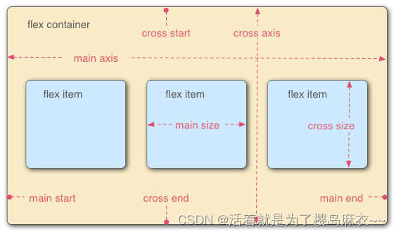
容器默认存在两个轴,水平得主轴和垂直得交叉轴。
一下6个属性设置在容器上
- flex-direction
- flex-wrap
- flex-flow
- justify-content
- align-items
- align-content
flex-direction决定主轴得方向
即项目排列方向
.box {
  flex-direction: row | row-reverse | column | column-reverse;
}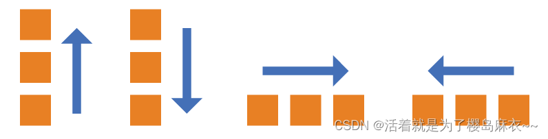
他可能有4个值
- row(默认值):主轴为水平方向,起点在左端。
- row-reverse:主轴为水平方向,起点在右端。
- column:主轴为垂直方向,起点在上沿。
- column-reverse:主轴为垂直方向,起点在下沿
flex-warp
默认情况下,项目都排在一条线上,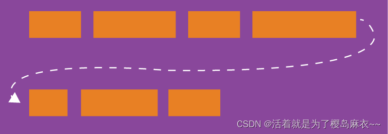
.box{
  flex-wrap: nowrap | wrap | wrap-reverse;
}
nowrap(默认):不换行。
wrap:换行,第一行在上方。
wrap-reverse:换行,第一行在下方。
flex-flow
flex-flow属性是flex-direction属性和flex-wrap属性的简写形式,默认值为row nowrap。
.box {
  flex-flow: <flex-direction> <flex-wrap>;
}
justify-content
ustify-content属性定义了项目在主轴上的对齐方式。
.box {
  justify-content: flex-start | flex-end | center | space-between | space-around;
}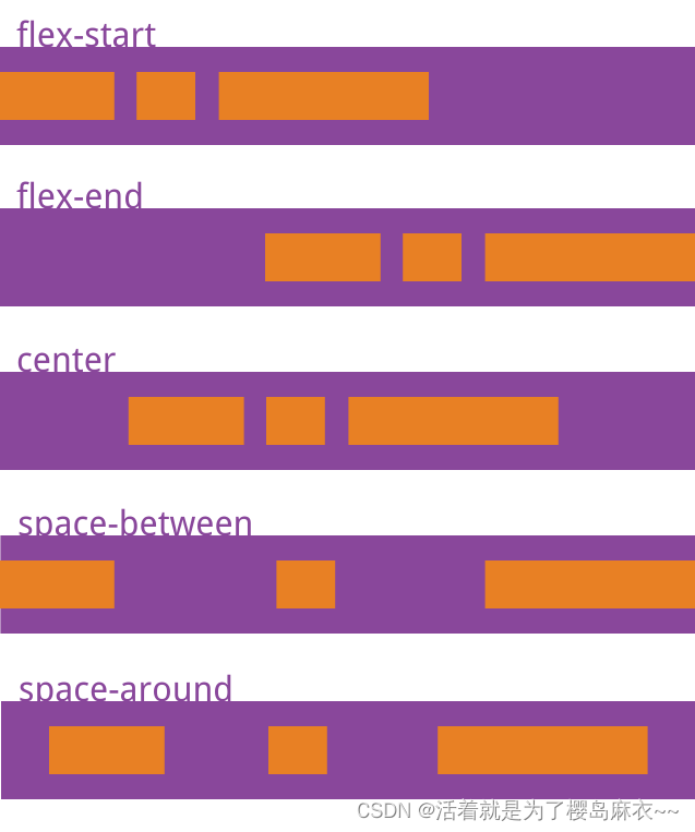
他可能有5个值
- flex-start(默认值):左对齐
- flex-end:右对齐
- center: 居中
- space-between:两端对齐,项目之间的间隔都相等。
- space-around:每个项目两侧的间隔相等。所以,项目之间的间隔比项目与边框的间隔大一倍。


 213
213


 被折叠的 条评论
为什么被折叠?
被折叠的 条评论
为什么被折叠?
 到【灌水乐园】发言


