


 本文总结了CSS中关于盒子居中、清除内外边距、图片宽度设置、文字加粗与不加粗、背景图片应用、列表样式移除、元素转换、定位与浮动效果、宽度处理、并集选择器、文本对齐、颜色代码、边框影响及修复方法等核心知识点,并通过实例演示了各种技巧的实际应用。
(内容持续更新中。。主要是博主自己看)
1.让标准流盒子在整个页面水平居中
选择器{
margin:0 auto;
}
(数字0也可换成其他数字,该位置控制上下外边距,例如写10px,则该盒子的上下外边距为10px)
2.做网页时,为了去掉整体页面中默认的外边距、内边距,CSS第一句话要写
*{
margin:0;
padding:0;
}
3.CSS中,如想让插入的图片宽度与父盒子一样宽
选择器{
width:100%;
}
4.文字加粗&不加粗
(1)文字加粗
选择器{
font-weight:700;
}
(2)文字不加粗
选择器{
font-weight:400;
}
5.CSS中替换盒子的背景颜色为一张图片
e.g.
选择器{
height:300px;
background:url(images/pic1.png) no-repeat top center;
}
其中url后面的()中是图片地址,no-repeat控制图片不重复,top center控制图片在盒子中靠上且居中。
6.CSS中使用ul套li布局网页,去除li前面的默认小点的方法
li{
list-style:none;
}
7.行内元素,块元素,行内块元素的转换
(1)CSS中行内元素转为块元素
e.g.
a{
display:block;
width:100px;
height:200px;
background-color:purple;
}
(2)CSS中块元素转为行内元素
e.g.
div{
display:inline;
width:100px;
height:200px;
background-color:purple;
}
(3)CSS中块元素/行内元素转为行内块元素
e.g.
选择器{
display:inline-block;
width:100px;
height:200px;
background-color:purple;
}
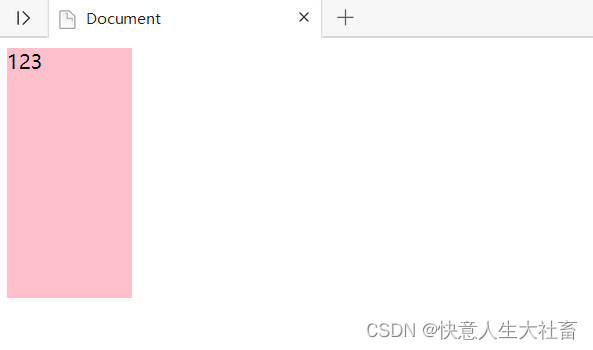
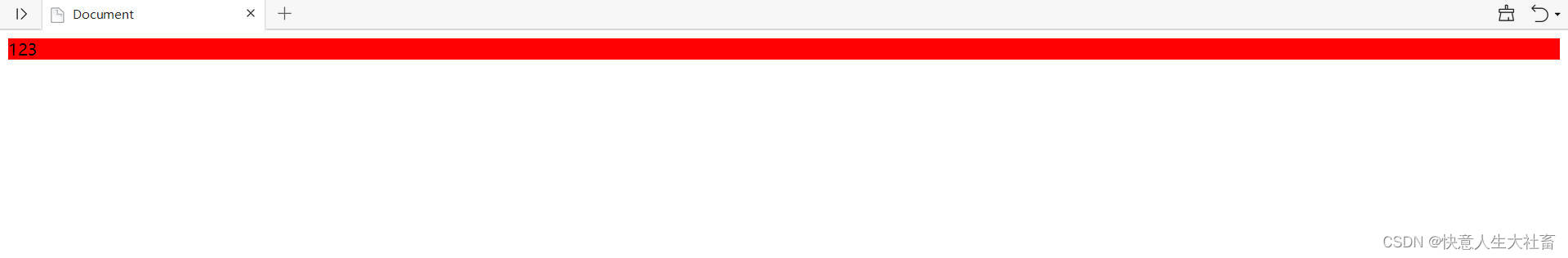
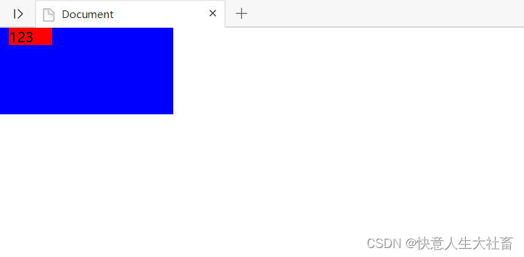
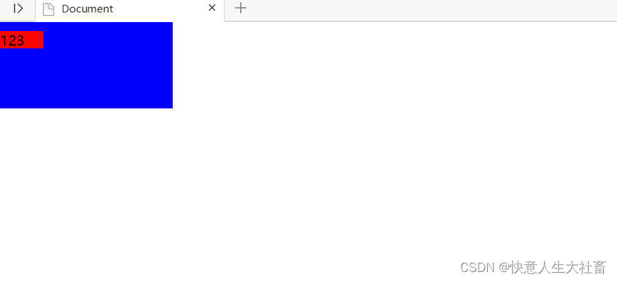
8.CSS行内元素加了绝对定位/固定定位/浮动之后,不用转换为行内块元素/块级元素,直接设置width/height有效
e.g.1行内元素span加绝对定位(position:absolute)设置width/height有效
<!DOCTYPE html>
<html lang="en">

<head>
    <meta charset="UTF-8">
    <meta http-equiv="X-UA-Compatible" content="IE=edge">
    <meta name="viewport" content="width=device-width, initial-scale=1.0">
    <title>Document</title>
</head>
<style>
    span {
        width: 100px;
        height: 200px;
        background-color: pink;
        position: absolute;
    }
</style>

<body>
    <span>123</span>
</body>

</html>
得到的结果是
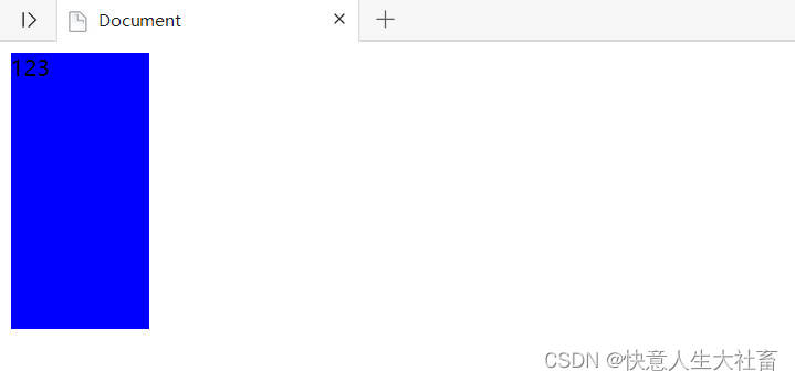
e.g.2行内元素span加固定定位(position:fixed)设置width/height有效
<!DOCTYPE html>
<html lang="en">

<head>
    <meta charset="UTF-8">
    <meta http-equiv="X-UA-Compatible" content="IE=edge">
    <meta name="viewport" content="width=device-width, initial-scale=1.0">
    <title>Document</title>
</head>
<style>
    span {
        width: 100px;
        height: 200px;
        background-color: blue;
        position: fixed;
    }
</style>

<body>
    <span>123</span>
</body>

</html>
得到的结果是
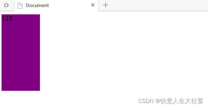
e.g.3行内元素span加浮动(float:left/right)设置width/height有效
<!DOCTYPE html>
<html lang="en">

<head>
    <meta charset="UTF-8">
    <meta http-equiv="X-UA-Compatible" content="IE=edge">
    <meta name="viewport" content="width=device-width, initial-scale=1.0">
    <title>Document</title>
</head>
<style>
    span {
        width: 100px;
        height: 200px;
        background-color: purple;
        float: left;
    }
</style>

<body>
    <span>123</span>
</body>

</html>
得到的结果是
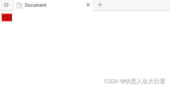
9.CSS块级元素加了绝对定位/固定定位/浮动之后,如没有设置width,则默认width=内容宽度
VS
CSS块级元素没加绝对定位/固定定位/浮动,如没有设置width,则默认width=父级盒子宽度(如无就是浏览器)
e.g.1块级元素div加绝对定位(position:absolute),没有设置width
<!DOCTYPE html>
<html lang="en">

<head>
    <meta charset="UTF-8">
    <meta http-equiv="X-UA-Compatible" content="IE=edge">
    <meta name="viewport" content="width=device-width, initial-scale=1.0">
    <title>Document</title>
</head>
<style>
    div {
        background-color: red;
        position: absolute;
    }
</style>

<body>
    <div>123</div>
</body>

</html>
得到的结果是width=内容宽度
e.g.1块级元素div没加绝对定位(position:absolute),没有设置width
<!DOCTYPE html>
<html lang="en">

<head>
    <meta charset="UTF-8">
    <meta http-equiv="X-UA-Compatible" content="IE=edge">
    <meta name="viewport" content="width=device-width, initial-scale=1.0">
    <title>Document</title>
</head>
<style>
    div {
        background-color: red;

    }
</style>

<body>
    <div>123</div>
</body>

</html>
得到的结果是width=父级盒子(如无就是浏览器)宽度
10.CSS 中加了浮动的盒子之间没有缝隙
11.CSS 中,让文字去掉下划线(常用于修改<a href="#">文字</a>这样的超链接里面的文字)
选择器{
text-decoration:none;
)
12.圆角边框
(1)CSS中设置圆角边框
选择器{
border-radius:数值(e.g.10px指圆角的半径)/百分比;
}
(2)CSS中用圆角边框制作小圆点
e.g.用块级元素做半径是4px白色圆点(8X50%=4)
选择器{
border-radius:50% ;
background-color:#fff;
width:8px;
height:8px;
}
13.CSS中,如果一个盒子既有left属性,又有right属性,则默认执行left属性;如果一个盒子既有top属性,又有bottom属性,则默认执行top属性
e.g.1给子盒子.box设置绝对定位(position: absolute),它的父级盒子.father有相对定位(position: relative)来现在里面的子盒子.box以父级盒子.father为移动参考,给子盒子.box既加left:10px又加right:10px
<!DOCTYPE html>
<html lang="en">

<head>
    <meta charset="UTF-8">
    <meta http-equiv="X-UA-Compatible" content="IE=edge">
    <meta name="viewport" content="width=device-width, initial-scale=1.0">
    <title>Document</title>
</head>
<style>
    * {
        padding: 0;
        margin: 0;
    }

    .father {

        position: relative;
        background-color: blue;
        width: 200px;
        height: 100px;

    }

    .box {
        background-color: red;
        position: absolute;
        width: 50px;
        height: 20px;
        left: 10px;
        right: 10px;
    }
</style>

<body>
    <div class="father">
        <div class="box">123</div>
    </div>
</body>

</html>
得到的结果是子盒子.box 最终执行的left:10px
e.g.2给子盒子.box设置绝对定位(position: absolute),它的父级盒子.father有相对定位(position: relative)来现在里面的子盒子.box以父级盒子.father为移动参考,给子盒子.box既加top:10px又加bottom:10px
<!DOCTYPE html>
<html lang="en">

<head>
    <meta charset="UTF-8">
    <meta http-equiv="X-UA-Compatible" content="IE=edge">
    <meta name="viewport" content="width=device-width, initial-scale=1.0">
    <title>Document</title>
</head>
<style>
    * {
        padding: 0;
        margin: 0;
    }

    .father {

        position: relative;
        background-color: blue;
        width: 200px;
        height: 100px;

    }

    .box {
        background-color: red;
        position: absolute;
        width: 50px;
        height: 20px;
        top: 10px;
        bottom: 10px;
    }
</style>

<body>
    <div class="father">
        <div class="box">123</div>
    </div>
</body>

</html>
得到的结果是子盒子.box 最终执行的top:10px
14.CSS常用并集选择器归纳相同的代码
15.VScode中,文本默认左对齐,如果要文本右对齐,在CSS中
选择器{
text-align:right;
}
16.黑色#333/rgba(0,0,0)
白色#fff/rgba(255,255,255)
17.CSS中给盒子设置border/padding会撑大盒子
e.g.1
给width:200px;height:300px;的粉色盒子加了一个四个边都是10px的蓝色实线边框
<!DOCTYPE html>
<html lang="en">

<head>
    <meta charset="UTF-8">
    <meta http-equiv="X-UA-Compatible" content="IE=edge">
    <meta name="viewport" content="width=device-width, initial-scale=1.0">
    <title>Document</title>
    <style>
        div {
            width: 200px;
            height: 300px;
            background-color: pink;
            border: 10px solid blue;
        }
    </style>
</head>

<body>
    <div>123</div>
</body>

</html>
得到的结果是盒子大小变成了width:220px;height:320px;
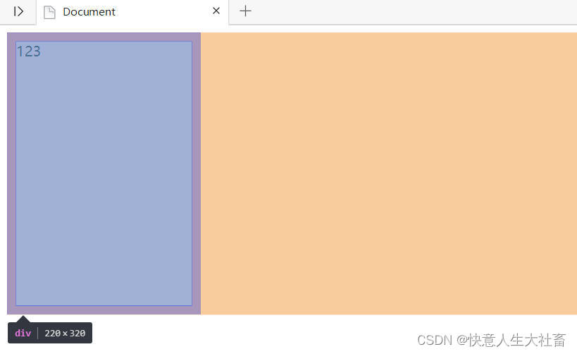
e.g.2
给width:200px;height:300px;的粉色盒子加了一个四个边都是10px的蓝色实线border,和四个边都是20px的padding
<!DOCTYPE html>
<html lang="en">

<head>
    <meta charset="UTF-8">
    <meta http-equiv="X-UA-Compatible" content="IE=edge">
    <meta name="viewport" content="width=device-width, initial-scale=1.0">
    <title>Document</title>
    <style>
        div {
            width: 200px;
            height: 300px;
            background-color: pink;
            border: 10px solid blue;
            padding: 20px;
        }
    </style>
</head>

<body>
    <div>123</div>
</body>

</html>
得到的结果是盒子大小变成了width:260px;height:360px;
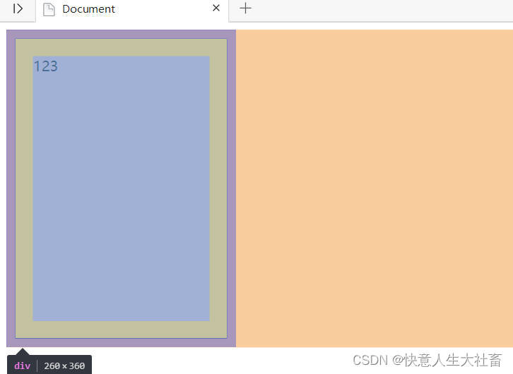
所以如果要保证盒子加border后最终占位大小和加border之前一样,
解决方法1:加了border后,原盒子尺寸设置的width和height要减去对应的边框距离
解决方法2:开始按模板测量盒子直接就量边框内的大小
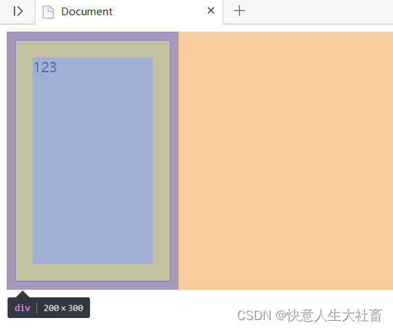
解决方法3(针对CSS3):还是按之前的写,然后CSS中加一行
e.g.
div{
width:200px;
height:300px;
background-color: pink;
border: 10px solid blue;
padding: 20px;
box-sizing:border-box;
}
则盒子仍是之前的width200px;height:300px;


 扫一扫
扫一扫


 1万+
1万+

 被折叠的 条评论
为什么被折叠?
被折叠的 条评论
为什么被折叠?
 到【灌水乐园】发言


