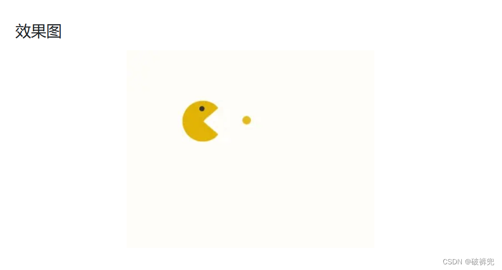
CSS过渡效果 持续吃小球 (源代码)
代码如下:
<!DOCTYPE html>
<html lang="en">

<head>
    <meta charset="UTF-8">
    <meta http-equiv="X-UA-Compatible" content="IE=edge">
    <meta name="viewport" content="width=device-width, initial-scale=1.0">
    <title>Document</title>
    <style>
        .pacMan {
            display: inline-block;
            position: relative;
            margin: 120px;
        }

        /* 使用伪元素创建吃豆人的眼睛 */
        .pacMan::before {
            content: '';
            width: 0.4em;
            height: 0.4em;
            border-radius: 50%;
            background-color: #333;
            position: absolute;
            top: 6px;
            left: 21px;
            z-index: 2000;
        }

        /* mouth1搭配mouth2组成吃豆人张嘴闭嘴的动画 */
        .mouth1 {
            width: 0;
            height: 0;
            border: 25px solid #E1B204;
            border-radius: 50%;
            border-right-color: transparent;
            animation: upup .32s 0s infinite;
            position: relative;
            z-index: 3;
        }

        @keyframes upup {
            0% {
                transform: rotate(270deg);
            }

            50% {
                transform: rotate(1turn);
            }

            100% {
                transform: rotate(270deg);
            }
        }

        .mouth2 {
            width: 0;
            height: 0;
            border: 25px solid #E1B204;
            border-right-color: transparent;
            border-radius: 25px;
            margin-top: -50px;
            animation: downdown .32s 0s infinite;
            position: relative;
            z-index: 3;
        }

        @keyframes downdown {
            0% {
                transform: rotate(90deg);
            }

            50% {
                transform: rotate(0);
            }

            100% {
                transform: rotate(90deg);
            }
        }

        /* 豆子不断移动 */
        .beanOne {
            background-color: #E1B204;
            border-radius: 50%;
            width: 10px;
            height: 10px;
            position: absolute;
            transform: translateY(-6px);
            top: 25px;
            left: 100px;
            animation: beanAnimation 1s linear .52s infinite;
        }

        .beanTwo {
            background-color: #E1B204;
            border-radius: 50%;
            width: 10px;
            height: 10px;
            position: absolute;
            transform: translateY(-6px);
            top: 25px;
            left: 100px;
            animation: beanAnimation 1s linear 1.1s infinite;
        }


        @keyframes beanAnimation {
            75% {
                opacity: .72;
            }

            100% {
                transform: translate(-100px, -6px);
            }
        }
    </style>
</head>

<body>
    <div class="pacMan">
        <div class="eye"></div>
        <div class="mouth1"></div>
        <div class="mouth2"></div>
        <div class="beanOne"></div>
        <div class="beanTwo"></div>
    </div>
</body>

</html>


 3491
3491


 被折叠的 条评论
为什么被折叠?
被折叠的 条评论
为什么被折叠?
 到【灌水乐园】发言


