


一、伸缩布局
CSS3在布局方面做了非常大的改进,使得我们对块级元素的布局排列变得十分灵活,适应性非常强,其强大的伸缩性,在响应式开发中可以发挥极大的作用。
- 主轴:Flex容器的主轴主要用来配置Flex项目,默认是水平方向
- 侧轴:与主轴垂直的轴称作侧轴,默认是垂直方向的
- 方向:默认主轴从左向右,侧轴默认从上到下
主轴和侧轴并不是固定不变的,通过flex-direction可以互换。

Flex布局的语法规范经过几年发生了很大的变化,也给Flexbox的使用带来一定的局限性,因为语法规范版本众多,浏览器支持不一致,致使Flexbox布局使用不多
采用Flex布局的元素,称为Flex容器(flex container),简称”容器”。它的所有子元素自动成为容器成员,称为Flex项目(flex item),简称”项目”。
注意: 设为Flex布局以后,子元素的float、clear和vertical-align属性将失效。
语法:
display:flex;

传统三等份布局
<!doctype html>
<html lang="en">
	<head>
		<meta charset="UTF-8">
		<title>Document</title>
		<style>
			section {
				width: 80%;
				height: 200px;
				border: 1px solid red;
				margin: 100px auto;
			}

			section div {
				width: 33.33%;
				height: 100%;
				float: left;
			}

			section div:nth-child(1) {
				background-color: orange;
			}

			section div:nth-child(2) {
				background-color: purple;
			}

			section div:nth-child(3) {
				background-color: yellow;
			}
		</style>
	</head>
	<body>
		<section>
			<div></div>
			<div></div>
			<div></div>
		</section>
	</body>
</html>

伸缩布局三等份
<!doctype html>
<html lang="en">
	<head>
		<meta charset="UTF-8">
		<title>Document</title>
		<style>
			section {
				width: 80%;
				height: 200px;
				border: 1px solid red;
				margin: 100px auto;
				/*父盒子添加 flex*/
				display: flex;	/*伸缩布局模式*/
			}

			section div {
				height: 100%;
			}

			section div:nth-child(1) {
				background-color: orange;
				/*子盒子添加份数 flex:1 不加单位*/
				flex: 1;
			}

			section div:nth-child(2) {
				background-color: purple;
				margin: 0 5px;
				/*子盒子添加份数*/
				flex: 2;
			}

			section div:nth-child(3) {
				background-color: yellow;
				/*子盒子添加份数*/
				flex: 3;
			}
		</style>
	</head>
	<body>
		<section>
			<div></div>
			<div></div>
			<div></div>
		</section>
	</body>
</html>

伸缩布局固定宽度
<!doctype html>
<html lang="en">
	<head>
		<meta charset="UTF-8">
		<title>Document</title>
		<style>
			section {
				width: 80%;
				height: 200px;
				border: 1px solid red;
				margin: 100px auto;
				/*父盒子添加 flex*/
				display: flex;	/*伸缩布局模式*/
				min-width: 500px;	/* 最小缩放宽度为500px 小于500px就不缩放 */
			}

			section div {
				height: 100%;
			}

			section div:nth-child(1) {
				background-color: orange;
				width: 100px;
			}

			section div:nth-child(2) {
				background-color: mediumpurple;
				margin: 0 5px;
				/*子盒子添加份数*/
				flex: 2;
			}

			section div:nth-child(3) {
				background-color: yellow;
				width: 200px;
			}

			section div:nth-child(4) {
			    background-color: skyblue;
			    flex: 1;/*子盒子添加分数*/
			}
		</style>
	</head>
	<body>
		<section>
			<div>1</div>
			<div>2</div>
			<div>3</div>
			<div>4</div>
		</section>
	</body>
</html>
1号和3号盒子固定宽度,剩下的2号和4号盒子分,可视窗口变化时1号和3号不进行缩放

伸缩布局排列方式
1. flex子项目在主轴的缩放比例
不指定flex属性,则不参与伸缩分配
min-width 最小值 min-width: 280px; 最小宽度 不能小于 280
max-width 最大值 max-width: 1280px; 最大宽度 不能大于 1280
2.flex-direction (项目排列方向)
调整主轴方向(默认为水平方向)
flex-direction: row;			/* 主轴为水平方向,起点在左端(默认) */
flex-direction: row-reverse;	/* 主轴为水平方向,起点在右端 */
flex-direction: column;			/* 主轴为垂直方向,起点在上端 */
flex-direction: column-reverse;	/* 主轴为垂直方向,起点在下端 */
<!doctype html>
<html lang="en">
	<head>
		<meta charset="UTF-8">
		<title>Document</title>
		<style>
			p {
				text-align: center;
			}
			section {
				width: 400px;
				height: 100px;
				border: 1px solid red;
				margin: 25px auto;
				display: flex;
				min-width: 500px;
			}

			section:nth-of-type(2) {
				flex-direction: row-reverse;
			}
			section:nth-of-type(3) {
				/* width: 200px;
				height: 800px; */
				flex-direction: column;
			}
			section:nth-of-type(4) {
				flex-direction: column-reverse;
			}
			section div {
				height: 100%;
			}

			section div:nth-child(1) {
				background-color: orange;
				flex: 1;
			}

			section div:nth-child(2) {
				background-color: mediumpurple;
				flex: 1;
			}

			section div:nth-child(3) {
				background-color: yellow;
				flex: 1;
			}

			section div:nth-child(4) {
			    background-color: skyblue;
				flex: 1;
			}
		</style>
	</head>
	<body>
		<p> row </p>
		<section>
			<div>1</div>
			<div>2</div>
			<div>3</div>
			<div>4</div>
		</section>
		<p> row-reverse </p>
		<section>
			<div>1</div>
			<div>2</div>
			<div>3</div>
			<div>4</div>
		</section>
		<p> column </p>
		<section>
			<div>1</div>
			<div>2</div>
			<div>3</div>
			<div>4</div>
		</section>
		<p> column-reverse </p>
		<section>
			<div>1</div>
			<div>2</div>
			<div>3</div>
			<div>4</div>
		</section>
	</body>
</html>

3. justify-content (水平对齐)
项目在Y轴上的对齐方式

<!doctype html>
<html lang="en">
	<head>
		<meta charset="UTF-8">
		<title>Document</title>
		<style>
			p {
				text-align: center;
			}
			section {
				width: 800px;
				height: 100px;
				border: 1px solid red;
				margin: 25px auto;
				display: flex;
				min-width: 500px;
			}
			div {
				width: 200px;
				height: 100%;
			}

			section:nth-of-type(2) {
				justify-content: flex-end;
			}
			section:nth-of-type(3) {
				justify-content: center;
			}
			section:nth-of-type(4) {
				justify-content: space-between;
			}
			section:nth-of-type(5) {
				justify-content: space-around;
			}
			section:nth-of-type(6) {
				justify-content: space-evenly;
			}

			section div:nth-child(1) {
				background-color: orange;
			}

			section div:nth-child(2) {
				background-color: mediumpurple;
			}

			section div:nth-child(3) {
				background-color: yellow;
			}

		</style>
	</head>
	<body>
		<p> flex-start </p>
		<section>
			<div>1</div><div>2</div><div>3</div>
		</section>
		<p> flex-end </p>
		<section>
			<div>1</div><div>2</div><div>3</div>
		</section>
		<p> center </p>
		<section>
			<div>1</div><div>2</div><div>3</div>
		</section>
		<p> space-between </p>
		<section>
			<div>1</div><div>2</div><div>3</div>
		</section>
		<p> space-around </p>
		<section>
			<div>1</div><div>2</div><div>3</div>
		</section>
		<p> space-evenly </p>
		<section>
			<div>1</div><div>2</div><div>3</div>
		</section>
	</body>
</html>

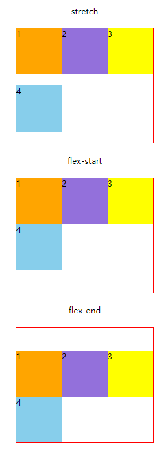
4. align-items (水平对齐)
定义了项目在X轴上的对齐方式,针对单行使用

<!doctype html>
<html lang="en">
	<head>
		<meta charset="UTF-8">
		<title>Document</title>
		<style>
			p {
				text-align: center;
			}
			section {
				width: 600px;
				height: 200px;
				border: 1px solid red;
				margin: 25px auto;
				display: flex;
				min-width: 500px;
			}
			div {
				width: 200px;
				height: 100px;
			}

			section:nth-of-type(2) {
				align-items: flex-end;
			}
			section:nth-of-type(3) {
				align-items: center;
			}
			section:nth-of-type(4) {
				align-items: baseline;
			}
			section:nth-of-type(5) {
				height: auto;
				align-items: stretch;
			}


			section div:nth-child(1) {
				background-color: orange;
			}

			section div:nth-child(2) {
				background-color: mediumpurple;
			}

			section div:nth-child(3) {
				background-color: yellow;
			}

		</style>
	</head>
	<body>
		<p> flex-start </p>
		<section>
			<div>1</div><div>2</div><div>3</div>
		</section>
		<p> flex-end </p>
		<section>
			<div>1</div><div>2</div><div>3</div>
		</section>
		<p> center </p>
		<section>
			<div>1</div><div>2</div><div>3</div>
		</section>
		<p> baseline </p>
		<section>
			<div>1</div><div>2</div><div>3</div>
		</section>
		<p> stretch </p>
		<section>
			<div>1</div><div>2</div><div>3</div>
		</section>
	</body>
</html>

5. flex-wrap (项目换行)
flex-flow:flex-direction属性和flex-wrap属性的简写形式,默认值为row nowrap
写法:
.box {
	flex-flow: <flex-direction> <flex-wrap>;
}
6. align-content (定义多行项目的对齐方式)
align-content是针对flex容器里面多轴(多行)的情况,align-items是针对一行的情况进行排列
必须对父元素设置自由盒属性display:flex;并且设置排列方式为横向排列flex-direction:row;并且设置换行,flex-wrap:wrap;这样这个属性的设置才会起作用

<!doctype html>
<html lang="en">
	<head>
		<meta charset="UTF-8">
		<title>Document</title>
		<style>

			p {
				text-align: center;
			}
			section {
				width: 300px;
				height: 250px;
				border: 1px solid red;
				margin: 25px auto;
				display: flex;
				flex-flow: row wrap;  /* 这句话必须有 否则下面的不起效果 */
			}
			section div {
				width: 100px;
				height: 100px;
			}

			section:nth-of-type(2) {
				align-content: flex-start;
			}
			section:nth-of-type(3) {
				align-content: flex-end;
			}
			section:nth-of-type(4) {
				align-content: space-between;
			}
			section:nth-of-type(5) {
				align-content: space-around;
			}


			section div:nth-child(1) {
				background-color: orange;
			}

			section div:nth-child(2) {
				background-color: mediumpurple;
			}

			section div:nth-child(3) {
				background-color: yellow;
			}

			section div:nth-child(4) {
			    background-color: skyblue;
			}
		</style>
	</head>
	<body>
		<p> stretch </p>
		<section>
			<div>1</div>
			<div>2</div>
			<div>3</div>
			<div>4</div>
		</section>
		<p> flex-start </p>
		<section>
			<div>1</div>
			<div>2</div>
			<div>3</div>
			<div>4</div>
		</section>
		<p> flex-end </p>
		<section>
			<div>1</div>
			<div>2</div>
			<div>3</div>
			<div>4</div>
		</section>
		<p> space-between </p>
		<section>
			<div>1</div>
			<div>2</div>
			<div>3</div>
			<div>4</div>
		</section>
		<p> space-around </p>
		<section>
			<div>1</div>
			<div>2</div>
			<div>3</div>
			<div>4</div>
		</section>
	</body>
</html>

7. order、flex-grow和 align-self
7.1 order 控制盒子的前后顺序
控制盒子的前后顺序
用整数值来定义排列顺序,数值小的排在前面。可以为负值。 默认值是 0
order: 1;
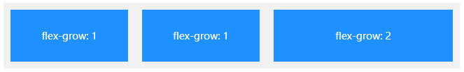
7.2 flex-grow:定义项目的放大比例
flex-grow 属性规定某个 flex 项目相对于其余 flex 项目将增长多少
默认为0,即如果存在剩余空间,也不放大
flex-grow: 1
- 如果所有项目的flex-grow属性都为1,则它们将等分剩余空间。
- 如果一个项目的flex-grow属性为2,其他项目都为1,则前者占据的剩余空间将比其他项多一倍。
7.3 align-self:规定所选项目的对齐方式
允许单个项目有与其他项目不一样的对齐方式,align-self 属性将覆盖容器的 align-items 属性所设置的默认对齐方式,默认值为auto,表示继承父元素的align-items属性,如果没有父元素,则等同于stretch。


 3854
3854


 被折叠的 条评论
为什么被折叠?
被折叠的 条评论
为什么被折叠?
 到【灌水乐园】发言


