


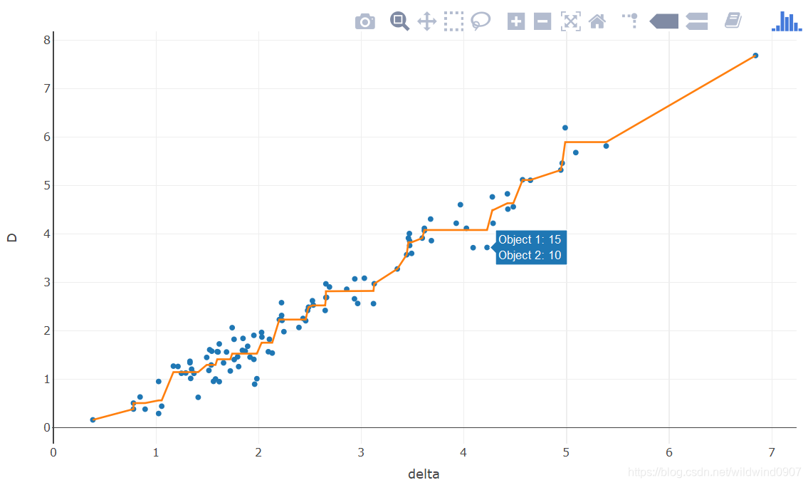
MDS 的 Shepard plot
比较多维度数据分析(multidimensional scaling,MDS)的好坏可用Shepard plot【不知道怎么翻译】展示。作图后,折线越趋近于一条平滑的斜线表明MDS降维的效果越好。
R代码:
library(MASS)
library(plotly)
# 由于数据不好,只取iris的前15位,取多了会有距离位0的情况
data <- scale(iris[1:15,1:4])
d <- dist(data, method = "minkowski", p=2)     # 就是欧式距离
res <- isoMDS(d, k=2)                    # 目标维度为二
coords <- res$points                   # 降下后的二维坐标

sh <- Shepard(d, coords)
delta <-as.numeric(d)                         # 高维距离
D<- dist(coords, method = "euclidean")    # 低维距离

n <- nrow(coords)                           # 用于显示点信息
index <- matrix(1:n, nrow=n, ncol=n)
index1 <- as.numeric(index[lower.tri(index)])
index <- matrix(1:n, nrow=n, ncol=n, byrow = T)
index2 <- as.numeric(index[lower.tri(index)])

plot_ly()%>%
  add_markers(x=~delta, y=~D, hoverinfo = 'text',
              text = ~paste('Object 1: ', rownames(data)[index1],
                            '<br> Object 2: ', rownames(data)[index2]))%>%
  add_lines(x=~sh$x, y=~sh$yf, showlegend=F)
图中每一个点代表这每两个观察量的距离,横坐标使高维距离,纵坐标是低维距离。理论上,低维距离越大,高维也会越大,反之亦然。图中离折线非常远的点可认为是异常值(outlier)。


 被折叠的 条评论
为什么被折叠?
被折叠的 条评论
为什么被折叠?
 到【灌水乐园】发言


