


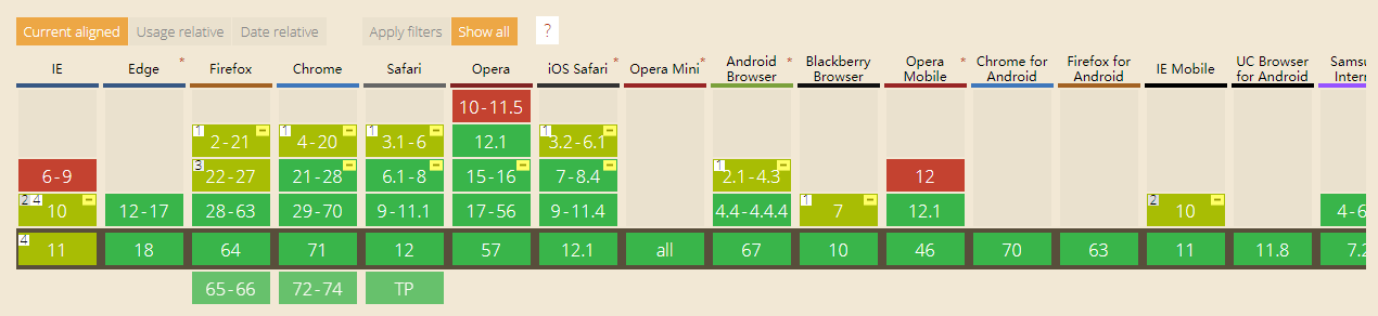
浏览器支持程度
flex box 弹性盒模型
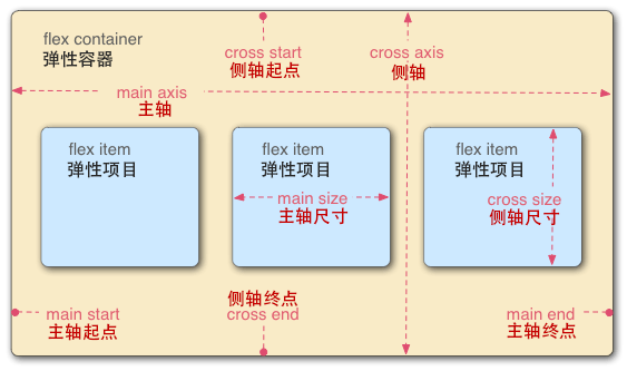
弹性容器
使用弹性盒模型时父元素必须要加 display: flex | inline-flex
1、新版 and 旧版
.box {
	display: -webkit-flex; /* new: Chrome 21+ */
	display: flex;         /* new: Opera 12.1, Firefox 22+ */

	display: -webkit-box;  /* old */
    display: -moz-box;     /* old: Firefox */

    display: -ms-box;      /* IE 10 */

	/* 行内弹性盒 */
	display: -webkit-inline-flex;
	display: inline-flex;
}
容器属性
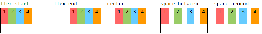
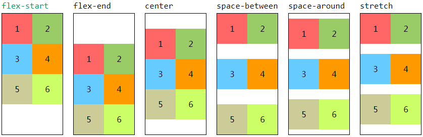
1、justify-content 主轴对齐
-
新版语法:
justify-content: flex-start | flex-end | center | space-between | space-around;
左对齐 | 右对齐 | 居中 | 两端对齐 | 分散对齐
-
旧版语法:
box-pack: start | end | center | justify
左对齐 | 右对齐 | 居中 | 两端对齐
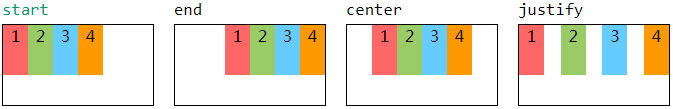
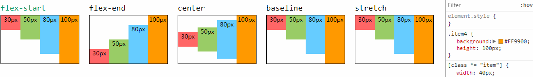
2、align-items 侧轴对齐(单行)
- 针对一行的情况进行排列
- 新版语法:
align-items: start | end | center | baseline | stretch
顶端对齐 | 底端对齐 | 垂直居中 | 基线对齐 | 填充(未设置 | auto,将占满整个容器的高度) - 旧版语法:
box-align: start | end | center | baseline | stretch(与新版行为一致)
3、align-content 侧轴对齐(多行)
- 针对多轴(多行)的情况进行排列
- 新版语法:
align-content: flex-start | flex-end | center | space-between | space-around | stretch
顶端对齐 | 底端对齐 | 垂直居中 | 垂直两端对齐 | 垂直分散对齐 | 分散对齐(贴合顶端)
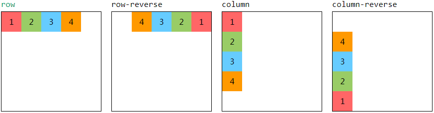
4、flex-direction 排列方向
-
新版语法:
flex-direction: row | row-reverse | column | column-reverse
行 | 行反转 | 列 | 列反转
-
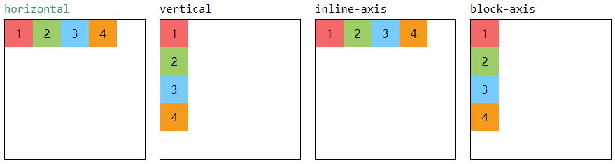
旧版语法:
box-orient: horizontal | vertical | inline-axis | block-axis
行 | 列 | 沿行轴排列 | 沿块轴排列
// 模拟行反转 flex-direction: row-reverse
.flex-direction(row-reverse) {
	-webkit-box-orient: horizontal;
    -moz-box-orient: horizontal;
    box-orient: horizontal;
}
// 模拟列反转 flex-direction: column-reverse
.flex-direction(column-reverse) {
	-webkit-box-orient: vertical;
    -moz-box-orient: vertical;
    box-orient: vertical;
}
.flex-direction(@_) {
    -webkit-box-direction: reverse;
    -moz-box-direction: reverse;
    box-direction: reverse; // 项目反转
    -webkit-box-pack: end;
    -moz-box-pack: end;
    box-pack: end; // 反向对齐
}
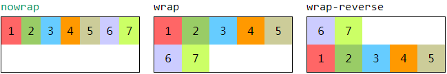
5、flex-wrap 换行方式
- 新版语法:
flex-wrap: nowrap | wrap | wrap-reverse
单行伸缩 | 断行 | 反向断行
6、flex-flow 复合简写
- 新版语法:
flex-flow: <flex-direction> <flex-wrap>
项目排版:排列方向 换行方式
项目属性
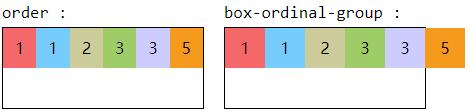
1、order 序列
- 定义项目的排列顺序(默认为
0),从小到大排列,只能是整数 - 新版语法:
order: <integer>
伸缩,不会溢出容器 - 旧版语法:
box-ordinal-group: <integer>
固定,会溢出容器
2、flex-grow 伸张因子
- 新版语法:
flex-grow: <number> - 定义项目的伸张比例,默认为0,如果容器盒子存在剩余空间,也不放大
<div class="box">
	<div class="item1">50px</div>
	<div class="item2">100px</div>
	<div class="item3">50px</div>
</div>
.box {
	width: 300px;
	display: flex;
}
.item1 { width: 50px }
.item2 { width: 100px }
.item3 { width: 50px }
- 伸张比率(
flex-grow)之和 小于1
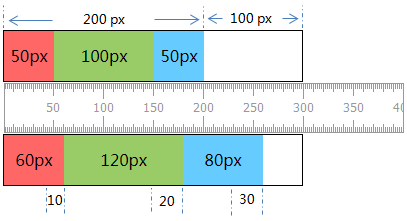
.item1 { flex-grow: .1 }
.item2 { flex-grow: .2 }
.item3 { flex-grow: .3 }
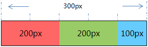
项目实际宽度 = 剩余空间 × 伸张比率 + 项目宽度
item1.width = 50 + 100 * 0.1 = 60px
item2.width = 100 + 100 * 0.2 = 120px
item3.width = 50 + 100 * 0.3 = 80px
- 伸张比率(
flex-grow)之和 大于1
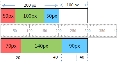
.item1 { flex-grow: 1 }
.item2 { flex-grow: 2 }
.item3 { flex-grow: 2 }
项目实际宽度 = 剩余空间 × ( 伸张比率 ÷ 比率总数 ) + 项目宽度
item1.width = 50 + 100 * (1 / 5) = 70px
item2.width = 100 + 100 * (2 / 5) = 140px
item3.width = 50 + 100 * (2 / 5) = 90px
3. flex-shrink 收缩因子
- 语法:
flex-shrink: <number> - 定义项目的收缩系数,默认为1,如果容器盒子空间不足,该项目将缩小
<div class="box">
	<div class="item1">150px</div>
	<div class="item2">100px</div>
	<div class="item3">150px</div>
</div>
.box {
	width: 300px;
	display: flex;
}
.item1 { width: 150px }
.item2 { width: 100px }
.item3 { width: 150px }
###项目收缩系数(flex-shrink)之和小于 1
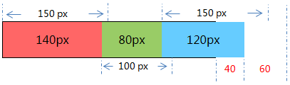
.item1 { flex-shrink: .1 }
.item2 { flex-shrink: .2 }
.item3 { flex-shrink: .3 }
- 首先计算溢出 = 容器宽度 - 各项目宽度之和
溢出 =300 - (150 + 100 + 150) = -100px - 项目实际宽度 = 项目宽度 - 溢出 × 收缩系数
item1.width = 150 - 100 * 0.1 = 140px
item2.width = 100 - 100 * 0.2 = 80px
item3.width = 150 - 100 * 0.3 = 120px
- 仅收缩 100 × (0.1 + 0.2 + 0.3) =
60px的宽度,仍会有 100 × 0.4 =40px的溢出
###项目收缩系数(flex-shrink)之和大于 1
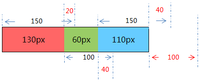
.item1 { flex-shrink: 1 }
.item2 { flex-shrink: 2 }
.item3 { flex-shrink: 2 }
- 项目实际宽度 = 项目宽度 - 溢出 × (收缩系数 ÷ 收缩总数)
item1.width = 150 - 100 × (1 / (1 + 2 + 2)) = 130px
item2.width = 100 - 100 × (2 / 5) = 60px
item3.width = 150 - 100 × (2 / 5) = 110px
4. flex-basis 伸缩基准值
- 语法:
flex-basis: auto | <length> flex-basis>width>content
a. 已设置flex-basis属性的情况下,width属性值会被忽略
b. 未设置flex-basis属性的情况下,flex-basis为width属性大小
c. 若width也未设置的情况下,则flex-basis为content的大小
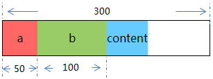
<div class="box">
	<div class="item1">a</div>
	<div class="item2">b</div>
	<div class="item3">content</div>
</div>
.box {
	width: 300px;
	display: flex;
}
.item1 { flex-basis : 100px; }
.item2 { width: 100px; }
.item3 { }
min-width和max-width会限制flex-basis值
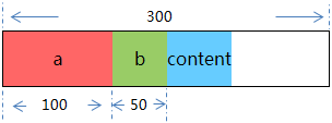
.item1 { flex-basis : 50px;  min-width: 100px; }
.item2 { flex-basis : 100px; max-width: 50px; }
- 基准值溢出盒子容器的情况下,则会按相对总值()所占比例进行收缩
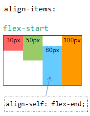
5. align-self 独立对齐
- 允许单个项目有与其他项目不一样的对齐方式,可覆盖
align-items属性 - 语法:
align-self: auto | flex-start | flex-end | center | baseline | stretch
对齐方式:同侧轴对齐(单行)align-items
6. flex 复合简写
- 新版语法:
flex: flex-grow[ flex-shrink[ flex-basis]],默认值为0 1 auto,后两个属性可选
兼容解决方案(LESS 封装)
//  弹性盒
.box() {
    display: -webkit-flex; // new: Chrome 21+
    display: flex;         // new: Opera 12.1, Firefox 22+
    display: -webkit-box;  // old
    display: -moz-box;     // old: Firefox
    display: -ms-box;      // IE 10
}
.box(inline) {
	display: -webkit-inline-flex;
    display: inline-flex;
}

//- 主轴对齐
.justify-content(flex-start) {
	// 左对齐
	-webkit-justify-content: flex-start;
	justify-content: flex-start;
	-webkit-box-pack: start;
	-moz-box-pack: start;
	box-pack: start;
}
.justify-content(flex-end) {
	// 右对齐
	-webkit-justify-content: flex-end;
	justify-content: flex-end;
	-webkit-box-pack: end;
	-moz-box-pack: end;
	box-pack: end;
}
.justify-content(center) {
	// 居中
	-webkit-justify-content: center;
	justify-content: center;
	-webkit-box-pack: center;
	-moz-box-pack: center;
	box-pack: center;
}
.justify-content(space-between) {
	// 两端对齐
	-webkit-justify-content: space-between;
	justify-content: space-between;
	-webkit-box-pack: justify;
	-moz-box-pack: justify;
	box-pack: justify;
}
.justify-content(space-around) {
	// 分散对齐
	-webkit-justify-content: space-around;
	justify-content: space-around;
}

// 侧轴对齐
// start(顶端对齐) end(底端对齐) center(垂直居中)
// baseline(基线对齐) stretch(拉伸填充)
.align-items(@args) {
	-webkit-align-items: @args;
	align-items: @args;
	-webkit-box-align: @args;
	-moz-box-align: @args;
	box-align: @args;
}

//- 侧轴多行对齐
// flex-start(顶端对齐) flex-end(底端对齐) center(垂直居中)
// space-between(垂直两端对齐) space-around(垂直分散对齐)
// stretch (分散对齐,贴合顶端)
.align-content(@args) {
	-webkit-align-content: @args;
	align-content: @args;
}

//- 排列方向
.flex-direction(row) {
	// 行
	-webkit-flex-direction: row;
	flex-direction: row;
	-webkit-box-orient: horizontal ;
	-moz-box-orient: horizontal ;
	box-orient: horizontal ;
}
.flex-direction(row-reverse) {
	// 行反转
	-webkit-box-orient: horizontal;
    -moz-box-orient: horizontal;
    box-orient: horizontal;
    -webkit-box-direction: reverse;
    -moz-box-direction: reverse;
    box-direction: reverse;
    -webkit-box-pack: end;
    -moz-box-pack: end;
    box-pack: end;
}
.flex-direction(column) {
	// 列
	-webkit-flex-direction: column;
	flex-direction: column;
	-webkit-box-orient: vertical;
	-moz-box-orient: vertical;
	box-orient: vertical;
}
.flex-direction(column-reverse) {
	// 列反转
	-webkit-box-orient: vertical;
    -moz-box-orient: vertical;
    box-orient: vertical;
    -webkit-box-direction: reverse;
    -moz-box-direction: reverse;
    box-direction: reverse;
    -webkit-box-pack: end;
    -moz-box-pack: end;
    box-pack: end;
}
.flex-direction(inline-axis) {
	// 沿行轴排列
	-webkit-box-orient: inline-axis;
	-moz-box-orient: inline-axis;
	box-orient: inline-axis;
}
.flex-direction(block-axis) {
	// 沿块轴排列
	-webkit-box-orient: block-axis;
	-moz-box-orient: block-axis;
	box-orient: block-axis;
}

//- 换行方式
.flex-wrap(nowrap) {
	// 单行
	-webkit-flex-wrap: nowrap;
	flex-wrap: nowrap;
}
.flex-wrap(wrap) {
	// 断行
	-webkit-flex-wrap: wrap;
	flex-wrap: wrap;
}
.flex-wrap(wrap-reverse) {
	// 反向断行
	-webkit-flex-wrap: wrap-reverse;
	flex-wrap: wrap-reverse;
}

//- flex-flow 简写
.flex-flow(@direction, @wrap) {
	.flex-direction(@direction);
	.flex-wrap(@wrap);
}

//- 排序
.order(@integer) {
	-webkit-order: @integer;
	order: @integer;
	-webkit-box-ordinal-group: @integer;
	-moz-box-ordinal-group: @integer;
	box-ordinal-group: @integer;
}

//- 伸张因子
.flex-grow(@number: 0) {
	-webkit-flex-grow: @number;
	flex-grow: @number;
}

//- 收缩因子
.flex-shrink(@number: 1) {
	-webkit-flex-shrink: @number;
	flex-shrink: @number;
}

//- 伸缩基准值
.flex-basis(@size) {
	-webkit-flex-basis: @size;
	flex-basis: @size;
}

//- 侧轴独立对齐
// start(顶端对齐) end(底端对齐) center(垂直居中)
// baseline(基线对齐) stretch(拉伸填充)
.align-self(@args) {
	-webkit-align-self: @args;
	align-self: @args;
}

//- flex 简写
.flex(@grow, @shrink, @basis) {
	-webkit-flex:@argument;
	flex:@argument;
	-webkit-box-flex:@grow;
	-moz-box-flex:@grow;
	box-flex:@grow;
}


 612
612


 被折叠的 条评论
为什么被折叠?
被折叠的 条评论
为什么被折叠?
 到【灌水乐园】发言


