


#【matplotlib】19.基本用法
2021.1.19 画figure图基本方法。参考:
https://m.runoob.com/matplotlib/matplotlib-pyplot.html
https://mofanpy.com/tutorials/data-manipulation/plt/figure
matplotlib 是python的画图包
19.1 基础使用
plot图,就是以点组成的图
- 知道x和方程
import matplotlib.pyplot as plt
import numpy as np

x = np.linspace(-3,3,50)
y1 = 2*x + 1
#定义个窗口
plt.figure()
plt.plot(x,y)
plt.show()

- 知道两个点
(-3,-5),(3,7)两点的x存到xpoint
plt.figure()
xpoint = np.array([-3,3])
ypoint = np.array([-5, 7])
plt.plot(xpoint,ypoint)
plt.show()

# 例2
xpoints = np.array([1, 2, 6, 8])
ypoints = np.array([3, 8, 1, 10])

plt.plot(xpoints, ypoints)
plt.show()

- 画多条图像,并且设着一些参数
num=:就是图像的编号figsize窗口尺寸linewidth线宽linestyle:‘‐’ 实线,‘‐‐’ 破折线,‘‐.’ 点划线,‘:’ 虚线。color:‘b’ 蓝色,‘m’ 洋红色,‘g’ 绿色,‘y’ 黄色,‘r’ 红色,‘k’ 黑色,‘w’ 白色,‘c’ 青绿色,‘#008000’ RGB 颜色符串。多条曲线不指定颜色时,会自动选择不同颜色。
# 方法1 单独设着
y2 = x**2 + 1

#num=3 尺寸
plt.figure(num= 3,figsize=(8,5))

plt.plot(x,y1)
plt.plot(x, y2, color = "red", linestyle = "--", linewidth = 1.0)
plt.show()

# 方法2

plt.figure()

plt.plot(x,y1,x,y2)
plt.show()

- 描绘坐标点
xpoints = np.array([1, 8])
ypoints = np.array([3, 10])

plt.plot(xpoints, ypoints, 'o')
plt.show()

19.2 设置坐标轴
- xlim(),ylim(),xlabel(),ylabel()
xlim(),ylim(): x,y范围xlabel(),ylabel():x,ylabal
plt.figure(num= 4,figsize=(8,5))

plt.xlim((-1,2))
plt.ylim((-2,3))

plt.xlabel("I am X")
plt.ylabel("I am Y")


plt.plot(x,y1)
plt.plot(x, y2, color = "red", linestyle = "--", linewidth = 1.0)

plt.show()

- 设置刻度 plt.xticks
- plt.xticks
- plt.xticks
plt.figure(num= 4,figsize=(8,5))
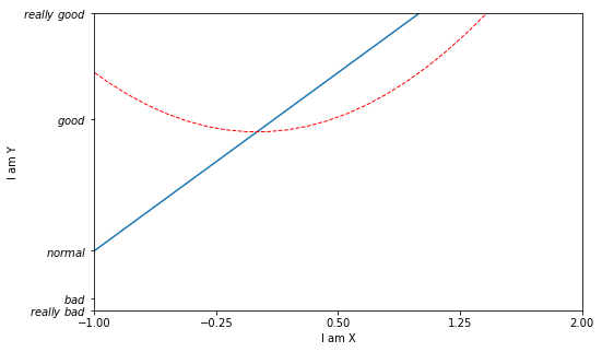
plt.xlim((-1,2))
plt.ylim((-2,3))
plt.xlabel("I am X")
plt.ylabel("I am Y")
plt.plot(x,y1)
plt.plot(x, y2, color = "red", linestyle = "--", linewidth = 1.0)
new_ticks = np.linspace(-1, 2, 5)
plt.xticks(new_ticks)
plt.yticks([-2, -1.8, -1, 1.22, 3],['$really\ bad$', r'$bad$', r'$normal$', r'$good$', r'$really\ good$'])
plt.show()
- 设置值边框用
.spines[]
- ① 获取坐标轴信息
plt.gca() - ② .spines[‘XXX’]设置边框,有“right”“left”“bottom”“top”
#数据准备
x = np.linspace(-3, 3, 50)
y1 = 2*x + 1
y2 = x**2

# 获得坐标信息
plt.figure()
plt.plot(x, y2)
plt.plot(x, y1, color='red', linewidth=1.0, linestyle='--')
plt.xlim((-1, 2))
plt.ylim((-2, 3))

#轴信息准备
new_ticks = np.linspace(-1, 2, 5)
plt.xticks(new_ticks)
plt.yticks([-2, -1.8, -1, 1.22, 3],['$really\ bad$', '$bad$', '$normal$', '$good$', '$really\ good$'])


#隐藏右侧和上次坐标轴
ax = plt.gca()
ax.spines['right'].set_color('none')
ax.spines['top'].set_color('none')
plt.show()

- 调整坐标轴
.xaxis.set_ticks_position设置x坐标刻度数字或名称的位置:bottom.(所有位置:top,bottom,both,default,none).set_position设置边框位置:y=0的位置;(位置所有属性:outward,axes,data)
#数据准备
x = np.linspace(-3, 3, 50)
y1 = 2*x + 1
y2 = x**2

# 获得坐标信息
plt.figure(num= 5,figsize=(8,5))
plt.plot(x, y2)
plt.plot(x, y1, color='red', linewidth=1.0, linestyle='--')
plt.xlim((-1, 2))
plt.ylim((-2, 3))

#轴信息准备
new_ticks = np.linspace(-1, 2, 5)
plt.xticks(new_ticks)
plt.yticks([-2, -1.8, -1, 1.22, 3],['$really\ bad$', '$bad$', '$normal$', '$good$', '$really\ good$'])


#隐藏右侧和上次坐标轴
ax = plt.gca()
ax.spines['right'].set_color('none')
ax.spines['top'].set_color('none')


# x坐标轴调整
ax.xaxis.set_ticks_position('top')
ax.spines['bottom'].set_position(('data', 0))


#y坐标轴调整
ax.yaxis.set_ticks_position('left')
ax.spines['left'].set_position(('data',0))
plt.show()

-
ax.xaxis.set_ticks_position('top'):x坐标轴刻度在哪里显示,我这里放到上面了 -
ax.spines['bottom'].set_position(('data', 0)):就是下坐标轴,放到了数据的0位置;axes应该是按比例,0.1就是10%的位置
19.3 Legend 图例
图例就是这个图 什么颜色的什么线段代表什么的注释
import matplotlib.pyplot as plt
import numpy as np

x = np.linspace(-3, 3, 50)
y1 = 2*x + 1
y2 = x**2

plt.figure()
#set x limits
plt.xlim((-1, 2))
plt.ylim((-2, 3))

# set new sticks
new_sticks = np.linspace(-1, 2, 5)
plt.xticks(new_sticks)
# set tick labels
plt.yticks([-2, -1.8, -1, 1.22, 3],
           [r'$really\ bad$', r'$bad$', r'$normal$', r'$good$', r'$really\ good$'])


# set line syles
l1, = plt.plot(x, y1, label='linear line')
l2, = plt.plot(x, y2, color='red', linewidth=1.0, linestyle='--', label='square line')


plt.legend(handles=[l1, l2], labels=['up', 'down'],  loc='best')
<matplotlib.legend.Legend at 0x20f0711b1c0>

- 我们以前有label,用了legend 可以将以前的覆盖到给与新的意义
- 如果想用legend,那么在返回值明明的时候 要加
,如l1,l2,,并在handles中引用 loc='best':表示显示的位置是最佳位置,也就是随着窗口变化,这个图示会自己调整位置,出现在数据最少的地方。其他还有
‘best’ : 0,
‘upper right’ : 1,
‘upper left’ : 2,
‘lower left’ : 3,
‘lower right’ : 4,
‘right’ : 5,
‘center left’ : 6,
‘center right’ : 7,
‘lower center’ : 8,
‘upper center’ : 9,
‘center’ : 10,
19.4 标注
19.4.1 Annotation
import matplotlib.pyplot as plt
import numpy as np

x = np.linspace(-3, 3, 50)
y = 2*x + 1

plt.figure(num=1, figsize=(8, 5),)
plt.plot(x, y,)

ax = plt.gca()
ax.spines['right'].set_color('none')
ax.spines['top'].set_color('none')
ax.xaxis.set_ticks_position('bottom')
ax.spines['bottom'].set_position(('data', 0))
ax.yaxis.set_ticks_position('left')
ax.spines['left'].set_position(('data', 0))


# 画辅助线
x0 = 1
y0 = 2*x0 + 1
plt.plot([x0, x0,], [0, y0,], 'k--', linewidth=2.5)
# set dot styles
plt.scatter([x0, ], [y0, ], s=50, color='b')


# 添加注释
plt.annotate(r'$2x+1=%s$' % y0, xy=(x0, y0), xycoords='data', xytext=(+30, -30),
             textcoords='offset points', fontsize=16,
             arrowprops=dict(arrowstyle='->', connectionstyle="arc3,rad=.2"))
Text(30, -30, '$2x+1=3$')

plt.plot([x0, x0,], [0, y0,], 'k--', linewidth=2.5):
- 我们确定了两点(x0,y0)和(0,y0).
- 两点间画了个虚线,k是黑色black
添加注释 annotate
-
r'$2x+1=%s$' % y0:就是显示的信息2x+1=y0 -
xy=就是此时的具体的值(x0,y0)
-
xycoords='data'是说基于数据的值来选位置, -
xytext=(+30, -30)和 对于标注位置的描述 一正一负就是线的右下角,30就是大概距离 -
textcoords='offset points': xy 偏差值, -
arrowprops是对图中箭头类型的一些设置.
19.4.2 tick
import matplotlib.pyplot as plt
import numpy as np

x = np.linspace(-3, 3, 50)
y = 0.1*x

plt.figure()
# 在 plt 2.0.2 或更高的版本中, 设置 zorder 给 plot 在 z 轴方向排序
plt.plot(x, y, linewidth=10, zorder=1)
plt.ylim(-2, 2)
ax = plt.gca()
ax.spines['right'].set_color('none')
ax.spines['top'].set_color('none')
ax.spines['top'].set_color('none')
ax.xaxis.set_ticks_position('bottom')
ax.spines['bottom'].set_position(('data', 0))
ax.yaxis.set_ticks_position('left')
ax.spines['left'].set_position(('data', 0))

数据会遮住坐标轴或刻度
plt.figure()
# 在 plt 2.0.2 或更高的版本中, 设置 zorder 给 plot 在 z 轴方向排序
plt.plot(x, y, linewidth=10, zorder=1)
plt.ylim(-2, 2)
ax = plt.gca()
ax.spines['right'].set_color('none')
ax.spines['top'].set_color('none')
ax.spines['top'].set_color('none')
ax.xaxis.set_ticks_position('bottom')
ax.spines['bottom'].set_position(('data', 0))
ax.yaxis.set_ticks_position('left')
ax.spines['left'].set_position(('data', 0))


for label in ax.get_xticklabels() + ax.get_yticklabels():
    label.set_fontsize(12)
    # 在 plt 2.0.2 或更高的版本中, 设置 zorder 给 plot 在 z 轴方向排序
    label.set_bbox(dict(facecolor='white', edgecolor='None', alpha=0.7, zorder=0.001))
plt.show()

label in ax.get_xticklabels() + ax.get_yticklabels():所有坐标艾格处理label.set_bbox(dict(facecolor='white', edgecolor='None', alpha=0.7, zorder=2)):坐标轴背景白色 不要边框 透明度;zorder指定绘图的各个组件相互叠加的顺序:https://cloud.tencent.com/developer/ask/sof/467726


 310
310

 被折叠的 条评论
为什么被折叠?
被折叠的 条评论
为什么被折叠?
 到【灌水乐园】发言


