这里是用jupyter notebook写的matplotlib的基本用法,使用的环境是python3+windows,代码上传到csdn资源啦:ABC of matplotlib
关于matplotlib学习还是强烈建议常去官方http://matplotlib.org/contents.html里查一查各种用法和toturial等。
下面是jupyter notebook代码导出的md文件。
Plotting and Visualization
from __future__ import division
from numpy.random import randn
import numpy as np
import os
import matplotlib.pyplot as plt
np.random.seed(12345)
plt.rc('figure', figsize=(10, 6))
from pandas import Series, DataFrame
import pandas as pd
np.set_printoptions(precision=4)
%matplotlib inline
matplotlib API 介绍
import matplotlib.pyplot as plt
fig = plt.figure()
ax1 = fig.add_subplot(2, 2, 1)
ax2 = fig.add_subplot(2, 2, 2)
ax3 = fig.add_subplot(2, 2, 3)
from numpy.random import randn
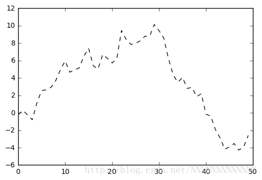
plt.plot(randn(50).cumsum(), 'k--')
[<matplotlib.lines.Line2D at 0x28e7668cb38>]
_ = ax1.hist(randn(100), bins=20, color='k', alpha=0.3)
ax2.scatter(np.arange(30), np.arange(30) + 3 * randn(30))
plt.close('all')
fig, axes = plt.subplots(2, 3)
axes
array([[<matplotlib.axes._subplots.AxesSubplot object at 0x0000028E76BAFF98>,
        <matplotlib.axes._subplots.AxesSubplot object at 0x0000028E76C047F0>,
        <matplotlib.axes._subplots.AxesSubplot object at 0x0000028E76C4CB00>],
       [<matplotlib.axes._subplots.AxesSubplot object at 0x0000028E76C89D30>,
        <matplotlib.axes._subplots.AxesSubplot object at 0x0000028E76CD7940>,
        <matplotlib.axes._subplots.AxesSubplot object at 0x0000028E76D0FFD0>]], dtype=object)

## 调整subplot间距
plt.subplots_adjust(left=None, bottom=None, right=None, top=None,
                wspace=None, hspace=None)
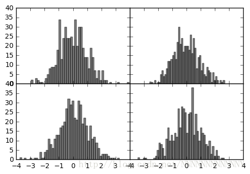
fig, axes = plt.subplots(2, 2, sharex=True, sharey=True)
for i in range(2):
    for j in range(2):
        axes[i, j].hist(randn(500), bins=50, color='k', alpha=0.5)
plt.subplots_adjust(wspace=0, hspace=0)
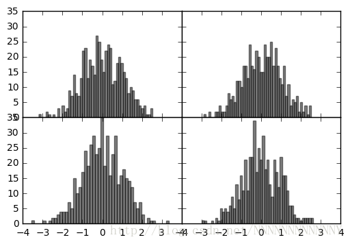
fig, axes = plt.subplots(2, 2, sharex=True, sharey=True)
for i in range(2):
    for j in range(2):
        axes[i, j].hist(randn(500), bins=50, color='k', alpha=0.5)
plt.subplots_adjust(wspace=0, hspace=0)
### 线条格式
plt.figure()
plt.plot(randn(30).cumsum(), 'ko--')
[<matplotlib.lines.Line2D at 0x28e7866a390>]
plt.close('all')
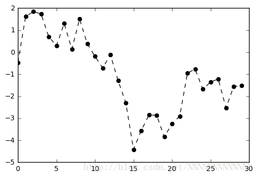
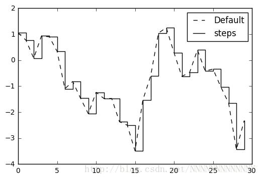
data = randn(30).cumsum()
plt.plot(data, 'k--', label='Default')
plt.plot(data, 'k-', drawstyle='steps-post', label='steps')
plt.legend(loc='best')
<matplotlib.legend.Legend at 0x28e781103c8>
### Ticks, labels, and legends #### Setting the title, axis labels, ticks, and ticklabels
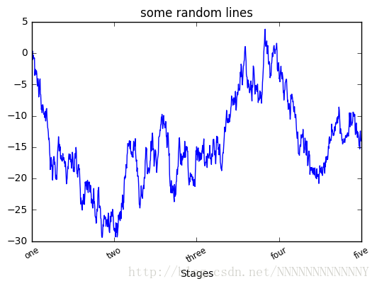
fig = plt.figure(); ax = fig.add_subplot(1, 1, 1)
ax.plot(randn(1000).cumsum())

ticks = ax.set_xticks([0, 250, 500, 750, 1000])
labels = ax.set_xticklabels(['one', 'two', 'three', 'four', 'five'],
                            rotation=30, fontsize='small')
ax.set_title('some random lines')
ax.set_xlabel('Stages')
<matplotlib.text.Text at 0x28e782525c0>
#### Adding legends
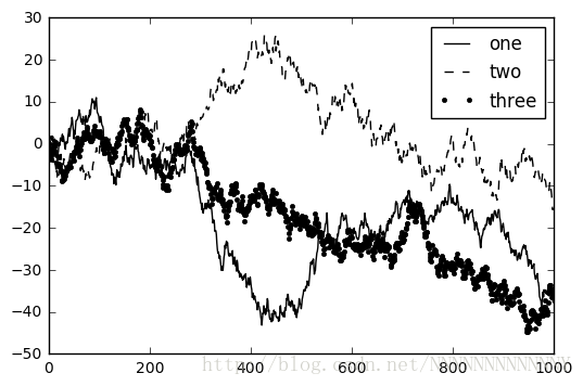
fig = plt.figure(); ax = fig.add_subplot(1, 1, 1)
ax.plot(randn(1000).cumsum(), 'k', label='one')
ax.plot(randn(1000).cumsum(), 'k--', label='two')
ax.plot(randn(1000).cumsum(), 'k.', label='three')

ax.legend(loc='best')
<matplotlib.legend.Legend at 0x28e7801e668>
### subplot 做标记
from datetime import datetime
fig = plt.figure()
ax = fig.add_subplot(1, 1, 1)
data = pd.read_csv('julyedu/spx.csv', index_col=0, parse_dates=True)
spx = data['SPX']
spx.plot(ax=ax, style='k-')
crisis_data = [
(datetime(2007, 10, 11), 'Peak of bull market'),
(datetime(2008, 3, 12), 'Bear Stearns Fails'),
(datetime(2008, 9, 15), 'Lehman Bankruptcy')
]
for date, label in crisis_data:
ax.annotate(label, xy=(date, spx.asof(date) + 50),
xytext=(date, spx.asof(date) + 200),
arrowprops=dict(facecolor='black'),
horizontalalignment='left', verticalalignment='top')
ax.set_xlim(['1/1/2007', '1/1/2011'])
ax.set_ylim([600, 1800])
ax.set_title('Important dates in 2008-2009 financial crisis')
- 1
- 2
- 3
- 4
- 5
- 6
- 7
- 8
- 9
- 10
- 11
- 12
- 13
- 14
- 15
- 16
- 17
- 18
- 19
- 20
- 21
- 22
- 23
- 24
- 25
- 26
- 27
<matplotlib.text.Text at 0x28e77fb7358>
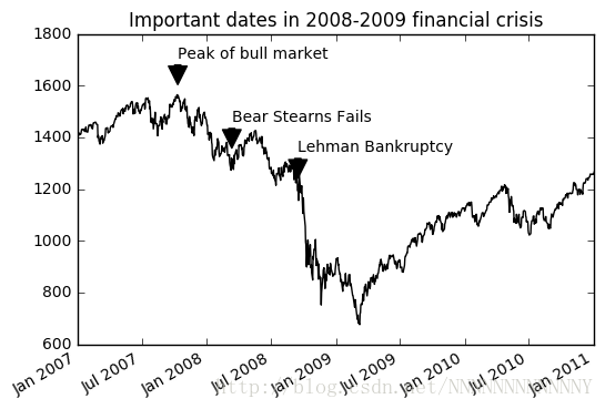
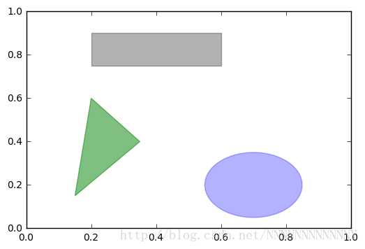
fig = plt.figure()
ax = fig.add_subplot(1, 1, 1)

rect = plt.Rectangle((0.2, 0.75), 0.4, 0.15, color='k', alpha=0.3)
circ = plt.Circle((0.7, 0.2), 0.15, color='b', alpha=0.3)
pgon = plt.Polygon([[0.15, 0.15], [0.35, 0.4], [0.2, 0.6]],
                   color='g', alpha=0.5)

ax.add_patch(rect)
ax.add_patch(circ)
ax.add_patch(pgon)
<matplotlib.patches.Polygon at 0x28e77ed76a0>
### Saving plots to file
fig

fig.savefig('figpath.svg')
fig.savefig('figpath.png', dpi=400, bbox_inches='tight')
from io import BytesIO
buffer = BytesIO()
plt.savefig(buffer)
plot_data = buffer.getvalue()
### matplotlib configuration
plt.rc('figure', figsize=(10, 10))
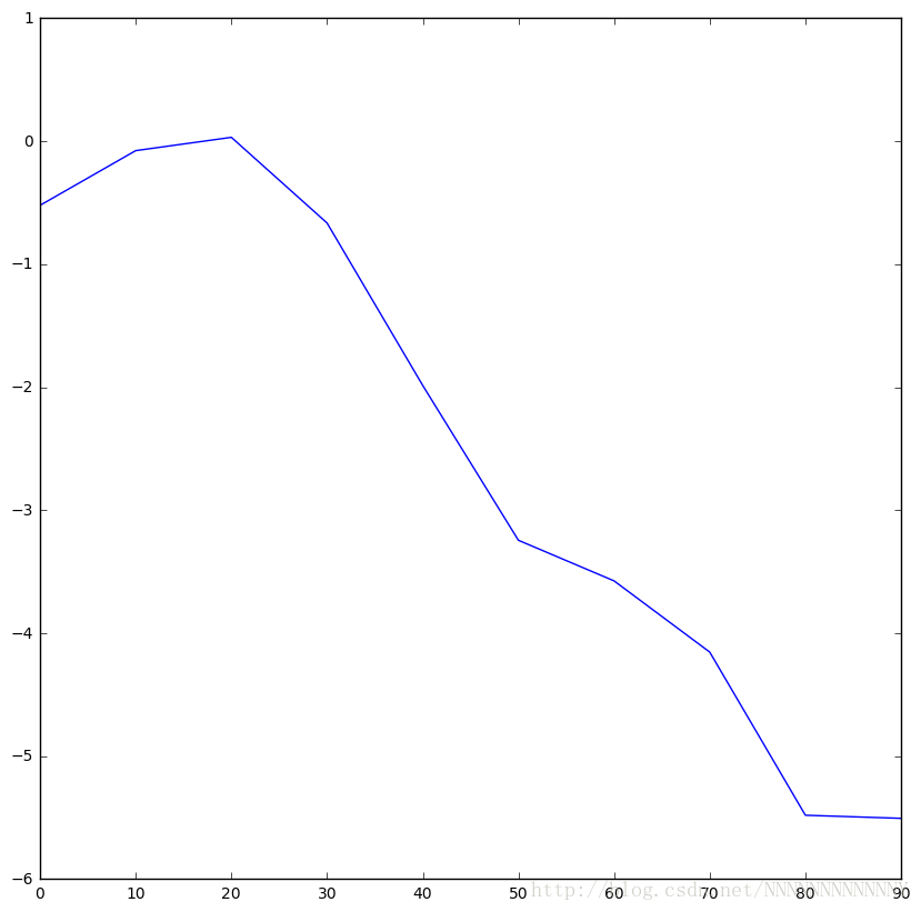
## Plotting functions in pandas ### Line plots
plt.close('all')
s = Series(np.random.randn(10).cumsum(), index=np.arange(0, 100, 10))
s.plot()
<matplotlib.axes._subplots.AxesSubplot at 0x28e781c0208>
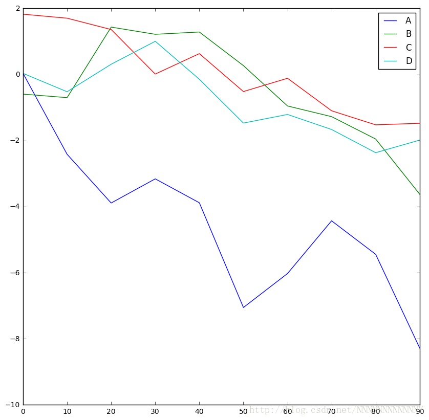
df = DataFrame(np.random.randn(10, 4).cumsum(0),
               columns=['A', 'B', 'C', 'D'],
               index=np.arange(0, 100, 10))
df.plot()
<matplotlib.axes._subplots.AxesSubplot at 0x28e7809d358>
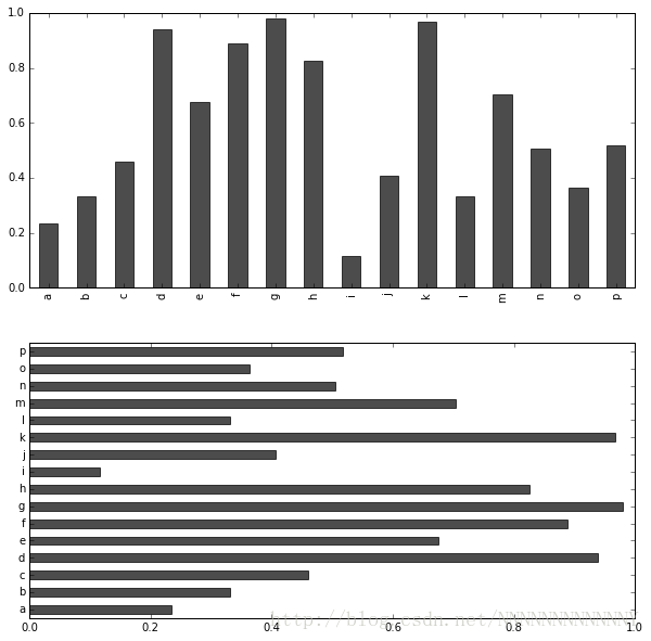
### Bar plots
fig, axes = plt.subplots(2, 1)
data = Series(np.random.rand(16), index=list('abcdefghijklmnop'))
data.plot(kind='bar', ax=axes[0], color='k', alpha=0.7)
data.plot(kind='barh', ax=axes[1], color='k', alpha=0.7)
<matplotlib.axes._subplots.AxesSubplot at 0x11fd02b50>
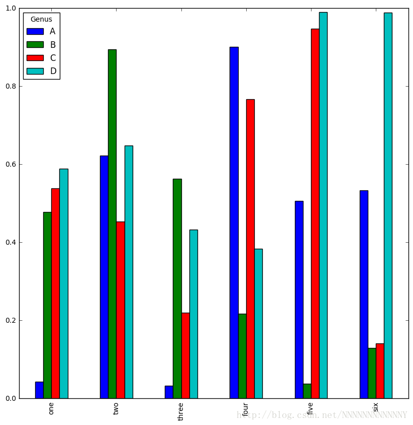
df = DataFrame(np.random.rand(6, 4),
               index=['one', 'two', 'three', 'four', 'five', 'six'],
               columns=pd.Index(['A', 'B', 'C', 'D'], name='Genus'))
df
df.plot(kind='bar')
<matplotlib.axes._subplots.AxesSubplot at 0x28e77f482e8>
plt.figure()
df.plot(kind='barh', stacked=True, alpha=0.5)
<matplotlib.axes._subplots.AxesSubplot at 0x28e77e05be0>
png
tips = pd.read_csv('julyedu/tips.csv')
party_counts = pd.crosstab(tips.day, tips.size)
print(party_counts)
party_counts = party_counts.ix[:, 2:5]
print(party_counts)
col_0 1708 day Fri 19 Sat 87 Sun 76 Thur 62 Empty DataFrame Columns: [] Index: [Fri, Sat, Sun, Thur] ### Histograms and density plots
plt.figure()
tips['tip_pct'] = tips['tip'] / tips['total_bill']
print(tips.head())
tips['tip_pct'].hist(bins=50)
   total_bill   tip     sex smoker  day    time  size   tip_pct
0       16.99  1.01  Female     No  Sun  Dinner     2  0.059447
1       10.34  1.66    Male     No  Sun  Dinner     3  0.160542
2       21.01  3.50    Male     No  Sun  Dinner     3  0.166587
3       23.68  3.31    Male     No  Sun  Dinner     2  0.139780
4       24.59  3.61  Female     No  Sun  Dinner     4  0.146808


<matplotlib.axes._subplots.AxesSubplot at 0x28e7997b390>
png
plt.figure()
tips['tip_pct'].plot(kind='kde')
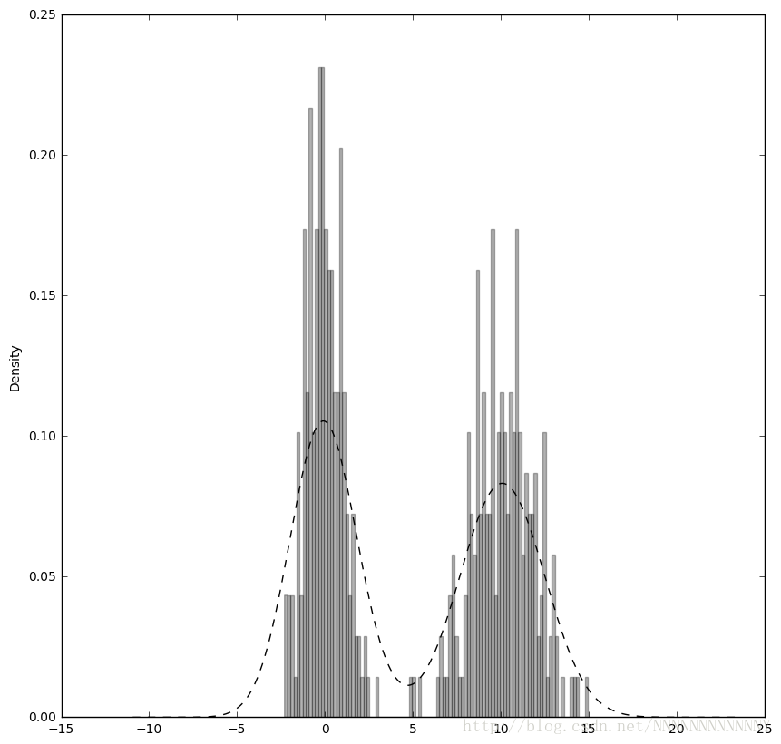
plt.figure()
comp1 = np.random.normal(0, 1, size=200)
comp2 = np.random.normal(10, 2, size=200)
values = Series(np.concatenate([comp1, comp2]))
values.hist(bins=100, alpha=0.3, color='k', normed=True)
values.plot(kind='kde', style='k--')
<matplotlib.axes._subplots.AxesSubplot at 0x28e79b24358>
### Scatter plots
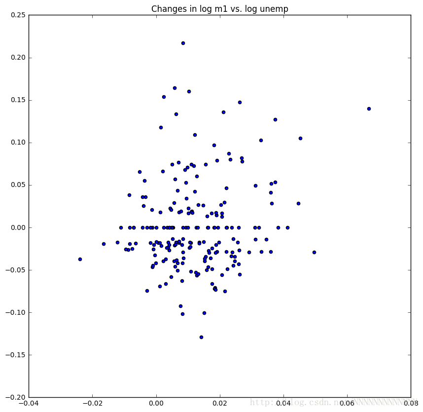
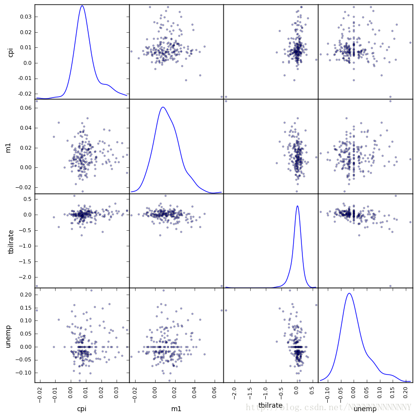
macro = pd.read_csv('julyedu/macrodata.csv')
data = macro[['cpi', 'm1', 'tbilrate', 'unemp']]
trans_data = np.log(data).diff().dropna()
trans_data[-5:]
| | cpi | m1 | tbilrate | unemp |
|---|
| 198 | -0.007904 | 0.045361 | -0.396881 | 0.105361 |
|---|
| 199 | -0.021979 | 0.066753 | -2.277267 | 0.139762 |
|---|
| 200 | 0.002340 | 0.010286 | 0.606136 | 0.160343 |
|---|
| 201 | 0.008419 | 0.037461 | -0.200671 | 0.127339 |
|---|
| 202 | 0.008894 | 0.012202 | -0.405465 | 0.042560 |
|---|
plt.figure()
plt.scatter(trans_data['m1'], trans_data['unemp'])
plt.title('Changes in log %s vs. log %s' % ('m1', 'unemp'))
<matplotlib.text.Text at 0x28e7bfebcc0>
pd.scatter_matrix(trans_data, diagonal='kde', alpha=0.3)
array([[<matplotlib.axes._subplots.AxesSubplot object at 0x0000028E7CA07EF0>,
        <matplotlib.axes._subplots.AxesSubplot object at 0x0000028E7C6E9128>,
        <matplotlib.axes._subplots.AxesSubplot object at 0x0000028E7DFEEBA8>,
        <matplotlib.axes._subplots.AxesSubplot object at 0x0000028E7C3DB3C8>],
       [<matplotlib.axes._subplots.AxesSubplot object at 0x0000028E7C9E5EB8>,
        <matplotlib.axes._subplots.AxesSubplot object at 0x0000028E7C9D0E10>,
        <matplotlib.axes._subplots.AxesSubplot object at 0x0000028E7BFE87B8>,
        <matplotlib.axes._subplots.AxesSubplot object at 0x0000028E7C732FD0>],
       [<matplotlib.axes._subplots.AxesSubplot object at 0x0000028E7C9704E0>,
        <matplotlib.axes._subplots.AxesSubplot object at 0x0000028E7CF63320>,
        <matplotlib.axes._subplots.AxesSubplot object at 0x0000028E7C8BB748>,
        <matplotlib.axes._subplots.AxesSubplot object at 0x0000028E7C820978>],
       [<matplotlib.axes._subplots.AxesSubplot object at 0x0000028E7C6BBB00>,
        <matplotlib.axes._subplots.AxesSubplot object at 0x0000028E7C3405F8>,
        <matplotlib.axes._subplots.AxesSubplot object at 0x0000028E7C874DA0>,
        <matplotlib.axes._subplots.AxesSubplot object at 0x0000028E7E036550>]], dtype=object)
- 1
- 2
- 3
- 4
- 5
- 6
- 7
- 8
- 9
- 10
- 11
- 12
- 13
- 14
- 15
- 16
- 17
## Plotting Maps: Visualizing Haiti Earthquake Crisis data
data = pd.read_csv('julyedu/Haiti.csv')
data.info()
data[['INCIDENT DATE', 'LATITUDE', 'LONGITUDE']][:10]
| | INCIDENT DATE | LATITUDE | LONGITUDE |
|---|
| 0 | 05/07/2010 17:26 | 18.233333 | -72.533333 |
|---|
| 1 | 28/06/2010 23:06 | 50.226029 | 5.729886 |
|---|
| 2 | 24/06/2010 16:21 | 22.278381 | 114.174287 |
|---|
| 3 | 20/06/2010 21:59 | 44.407062 | 8.933989 |
|---|
| 4 | 18/05/2010 16:26 | 18.571084 | -72.334671 |
|---|
| 5 | 26/04/2010 13:14 | 18.593707 | -72.310079 |
|---|
| 6 | 26/04/2010 14:19 | 18.482800 | -73.638800 |
|---|
| 7 | 26/04/2010 14:27 | 18.415000 | -73.195000 |
|---|
| 8 | 15/03/2010 10:58 | 18.517443 | -72.236841 |
|---|
| 9 | 15/03/2010 11:00 | 18.547790 | -72.410010 |
|---|
data['CATEGORY'][:6]
0 1. Urgences | Emergency, 3. Public Health, 1 1. Urgences | Emergency, 2. Urgences logistiqu… 2 2. Urgences logistiques | Vital Lines, 8. Autr… 3 1. Urgences | Emergency, 4 1. Urgences | Emergency, 5 5e. Communication lines down, Name: CATEGORY, dtype: object
data.describe()
| | Serial | LATITUDE | LONGITUDE |
|---|
| count | 3593.000000 | 3593.000000 | 3593.000000 |
|---|
| mean | 2080.277484 | 18.611495 | -72.322680 |
|---|
| std | 1171.100360 | 0.738572 | 3.650776 |
|---|
| min | 4.000000 | 18.041313 | -74.452757 |
|---|
| 25% | 1074.000000 | 18.524070 | -72.417500 |
|---|
| 50% | 2163.000000 | 18.539269 | -72.335000 |
|---|
| 75% | 3088.000000 | 18.561820 | -72.293570 |
|---|
| max | 4052.000000 | 50.226029 | 114.174287 |
|---|
data = data[(data.LATITUDE > 18) & (data.LATITUDE < 20) &
            (data.LONGITUDE > -75) & (data.LONGITUDE < -70)
            & data.CATEGORY.notnull()]
def to_cat_list(catstr):
    stripped = (x.strip() for x in catstr.split(','))
    return [x for x in stripped if x]

def get_all_categories(cat_series):
    cat_sets = (set(to_cat_list(x)) for x in cat_series)
    return sorted(set.union(*cat_sets))

def get_english(cat):
    code, names = cat.split('.')
    if '|' in names:
        names = names.split(' | ')[1]
    return code, names.strip()
get_english('2. Urgences logistiques | Vital Lines')
('2', 'Vital Lines')
all_cats = get_all_categories(data.CATEGORY)
english_mapping = dict(get_english(x) for x in all_cats)
english_mapping['2a']
english_mapping['6c']
'Earthquake and aftershocks'
def get_code(seq):
    return [x.split('.')[0] for x in seq if x]

all_codes = get_code(all_cats)
code_index = pd.Index(np.unique(all_codes))
dummy_frame = DataFrame(np.zeros((len(data), len(code_index))),
                        index=data.index, columns=code_index)
dummy_frame.ix[:, :6].info()
<class 'pandas.core.frame.DataFrame'>
Int64Index: 3569 entries, 0 to 3592
Data columns (total 6 columns):
1     3569 non-null float64
1a    3569 non-null float64
1b    3569 non-null float64
1c    3569 non-null float64
1d    3569 non-null float64
2     3569 non-null float64
dtypes: float64(6)
memory usage: 195.2 KB
for row, cat in zip(data.index, data.CATEGORY):
    codes = get_code(to_cat_list(cat))
    dummy_frame.ix[row, codes] = 1

data = data.join(dummy_frame.add_prefix('category_'))
data.ix[:, 10:15].info()
<class 'pandas.core.frame.DataFrame'>
Int64Index: 3569 entries, 0 to 3592
Data columns (total 5 columns):
category_1     3569 non-null float64
category_1a    3569 non-null float64
category_1b    3569 non-null float64
category_1c    3569 non-null float64
category_1d    3569 non-null float64
dtypes: float64(5)
memory usage: 167.3 KB
from mpl_toolkits.basemap import Basemap
import matplotlib.pyplot as plt
def basic_haiti_map(ax=None, lllat=17.25, urlat=20.25,
lllon=-75, urlon=-71):
m = Basemap(ax=ax, projection='stere',
lon_0=(urlon + lllon) / 2,
lat_0=(urlat + lllat) / 2,
llcrnrlat=lllat, urcrnrlat=urlat,
llcrnrlon=lllon, urcrnrlon=urlon,
resolution='f')
m.drawcoastlines()
m.drawstates()
m.drawcountries()
return m
- 1
- 2
- 3
- 4
- 5
- 6
- 7
- 8
- 9
- 10
- 11
- 12
- 13
- 14
- 15
- 16
- 17
---------------------------------------------------------------------------

ImportError                               Traceback (most recent call last)

<ipython-input-66-ec31ba3e955e> in <module>()
----> 1 from mpl_toolkits.basemap import Basemap
      2 import matplotlib.pyplot as plt
      3
      4 def basic_haiti_map(ax=None, lllat=17.25, urlat=20.25,
      5                     lllon=-75, urlon=-71):


ImportError: No module named 'mpl_toolkits.basemap'
fig, axes = plt.subplots(nrows=2, ncols=2, figsize=(12, 10))
fig.subplots_adjust(hspace=0.05, wspace=0.05)
to_plot = ['2a', '1', '3c', '7a']
lllat=17.25; urlat=20.25; lllon=-75; urlon=-71
for code, ax in zip(to_plot, axes.flat):
m = basic_haiti_map(ax, lllat=lllat, urlat=urlat,
lllon=lllon, urlon=urlon)
cat_data = data[data['category_%s' % code] == 1]
x, y = m(cat_data.LONGITUDE.values, cat_data.LATITUDE.values)
m.plot(x, y, 'k.', alpha=0.5)
ax.set_title('%s: %s' % (code, english_mapping[code]))
- 1
- 2
- 3
- 4
- 5
- 6
- 7
- 8
- 9
- 10
- 11
- 12
- 13
- 14
- 15
- 16
- 17
- 18
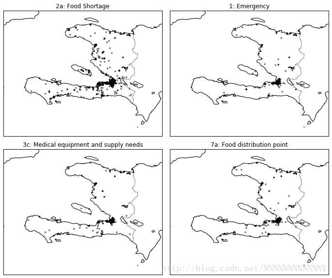
fig, axes = plt.subplots(nrows=2, ncols=2, figsize=(12, 10))
fig.subplots_adjust(hspace=0.05, wspace=0.05)
to_plot = ['2a', '1', '3c', '7a']
lllat=17.25; urlat=20.25; lllon=-75; urlon=-71
def make_plot():
for i, code in enumerate(to_plot):
cat_data = data[data['category_%s' % code] == 1]
lons, lats = cat_data.LONGITUDE, cat_data.LATITUDE
ax = axes.flat[i]
m = basic_haiti_map(ax, lllat=lllat, urlat=urlat,
lllon=lllon, urlon=urlon)
x, y = m(lons.values, lats.values)
m.plot(x, y, 'k.', alpha=0.5)
ax.set_title('%s: %s' % (code, english_mapping[code]))
- 1
- 2
- 3
- 4
- 5
- 6
- 7
- 8
- 9
- 10
- 11
- 12
- 13
- 14
- 15
- 16
- 17
- 18
- 19
- 20
- 21
- 22
- 23
make_plot()


 5007
5007

 被折叠的 条评论
为什么被折叠?
被折叠的 条评论
为什么被折叠?
 到【灌水乐园】发言


