


Matplotlib vs. Seaborn? 有什么区别,用哪个?
Matplotlib是Python中最常见的库,而Seaborn是在其基础上封装的高级库。
如果与R比较,类似于Base R和ggplot的区别。
那么应该如何学习和上手呢?
两个库的介绍
Matplotlib是Python中最常见的,提供了广泛的图形选项和定制功能,可以创建复杂的、高度定制化的可视化。
Seaborn是在Matplotlib的基础上开发的高级可视化库,它专注于数据可视化的美学设计和统计图形的绘制。Seaborn更加注重对数据的探索和分析,以及对美学风格的深入研究。谢邀,Seaborn的底层是基于Matplotlib的。
Matplotlib需要大量的代码创建细节;而Seaborn是高级的封装,更为美观,但缺点是一切都是固定的:
Seaborn是用户把自己常用到的可视化绘图过程进行了函数封装,形成的一个“快捷方式”,他相比Matplotlib的好处是代码更简洁,可以用一行代码实现一个清晰好看的可视化输出。主要的缺点则是定制化能力会比较差,只能实现固化的一些可视化模板类型。
代码案例
直方图的细节
# Importing required Libraries:
import numpy as np
import pandas as pd
import matplotlib.pyplot as plt
import seaborn as sns
%matplotlib inline

import warnings # Current version of Seaborn generates a bunch of warnings that we'll ignore in this tutorial
warnings.filterwarnings("ignore")

# Creating a randomly distributed dataset:
x = np.random.normal(size=100)
sns.distplot(x, bins=20, kde=True, rug=True)
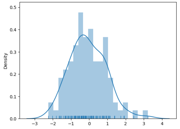 上图看起来很怪异
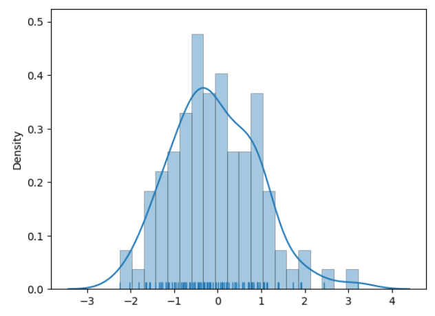
seaborn的默认直方图是没有分割的,传统的Matplotlib是有分割,需要增加关键字:
sns.distplot(x, bins=20, kde=True, rug=True, hist_kws=dict(edgecolor='k', linewidth=0.5))
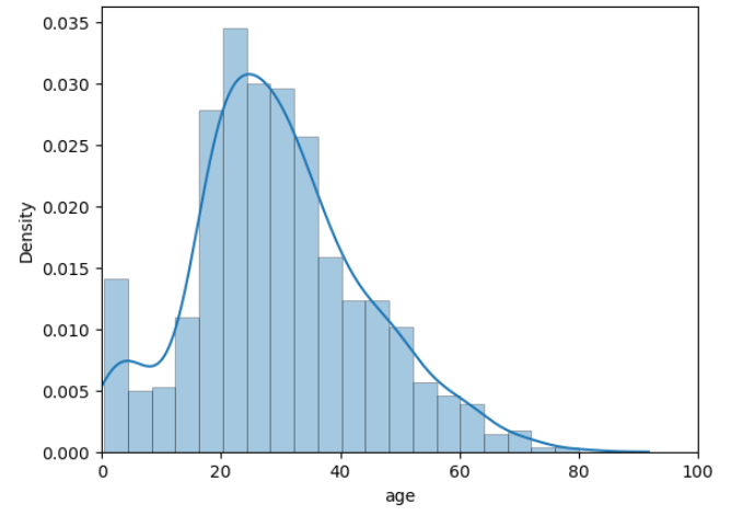
# Loading up built-in dataset:
titanic = sns.load_dataset("titanic")

# Creating a Distribution plot:
sns.distplot(titanic.age.dropna(), hist_kws=dict(edgecolor='k', linewidth=0.5))
-
在上面的图中,X轴并不是从最左下角的0开始的。 -
但出于某种原因,如果我们严格希望绘图以0开头,那么它需要额外的代码行,这也是Seaborn的不方便 -
本次使用的更改轴的歧视和重点,使用的Matplotlib中的 xlim()函数:
plt.xlim([0, 100])
sns.distplot(titanic.age.dropna(), hist_kws=dict(edgecolor='k', linewidth=0.5))
-
Matplotlib的 xlim()通过的列表定义了X轴的下限和上限。 -
如果需要,同样,我们也可以通过添加另一行代码来设置Y轴的限制: plt.ylim([lower,upper])
绘图代码对比
-
上述的图绘都是用Seaborn的代码,基本控制在1-2行之内,如果引入Matplotlib,开始变得复杂:
# Creating random datapoints:
x = [1,2,3,4,5,6,7,8,9,10]
y = [3,5,7,10,11,12,14,15,19,25] # Have tried to imbalance the fir

fit = np.polyfit(x,y,1)
# fit_fn is now a function which takes in x and returns an estimate for y
fit_fn = np.poly1d(fit)
plt.plot(x,y, 'yo', x, fit_fn(x), '--', color='C0')
plt.xlabel("Values of x")
plt.ylabel("Values of y")
plt.xlim(0, 11)
plt.ylim(0, 30)
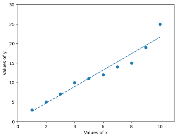
接下来尝试在Seaborn实现类似的功能:
tips = sns.load_dataset("tips")
sns.regplot(x="total_bill", y="tip", data=tips)
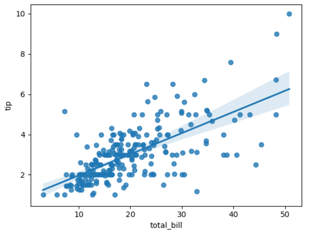
-
两个代码绘制了完全同类的图形,但不同的是Seaborn使用单行代码就可以了。 -
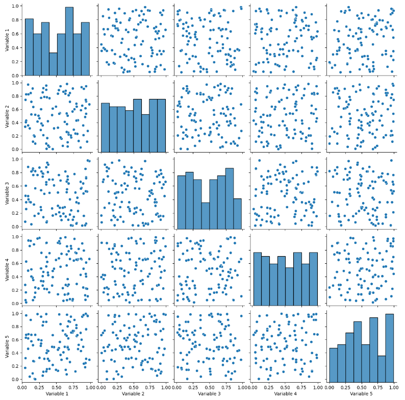
继续展示Seabron和Matplotlib绘制相同图的差异:
# Generate Data:
nobs, nvars = 100, 5
data = np.random.random((nobs, nvars))
columns = ['Variable {}'.format(i) for i in range(1, nvars + 1)]
df = pd.DataFrame(data, columns=columns)

# Making a simple pairplot using Seaborn:
sns.pairplot(df)
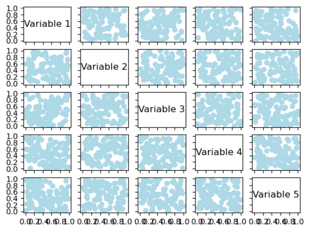
# Generatig Data:
nobs, nvars = 100, 5
data = np.random.random((nobs, nvars))
columns = ['Variable {}'.format(i) for i in range(1, nvars + 1)]

# Making a pairplot:
fig, axes = plt.subplots(ncols=nvars, nrows=nvars, sharex='col', sharey='row')
for (i, j), ax in np.ndenumerate(axes):
    if i == j:
        ax.annotate(columns[i], (0.5, 0.5), xycoords='axes fraction',
                    ha='center', va='center', size='large')
    else:
        ax.scatter(data[:,i], data[:,j], color='lightblue')
    ax.locator_params(nbins=6, prune='both')

plt.show()
-
我们可以在上面的两个图中观察到相当大的差异。即使在Matplotlib代码中有很大定制绘图细节的可能,但这需要更多的代码行或参数。 -
也许我们更需要Seaborn的灵活性,使我们能够以最少的代码行数实现同样的目标,而这种统计表示效率是科研中最重要的。
学习方法
根据上面的描述,学习方法也呼之欲出了: 非常优先推荐学习Seaborn,再慢慢学习Matplotlib细节修饰图绘。 有几个资源非常推荐:
-
Seaborn官方文档:https://seaborn.pydata.org/documentation.html -
Seaborn的GitHub页面:https://github.com/mwaskom/seaborn -
Coursera的数据可视化课程:https://www.coursera.org/learn/python-visualization -
DataCamp的数据可视化课程:https://www.datacamp.com/courses/introduction-to-data-visualization-with-seaborn -
《Python数据科学手册》一书,其中有关于Seaborn的章节:https://jakevdp.github.io/PythonDataScienceHandbook/04.14-visualization-with-seaborn.html
Seaborn官方文档是我经常翻阅的,有很多学习的资源: 
Python数据科学(python data science handbook)是非常经典的,其中有关于Seaborn绘图的章节,也有在线版: 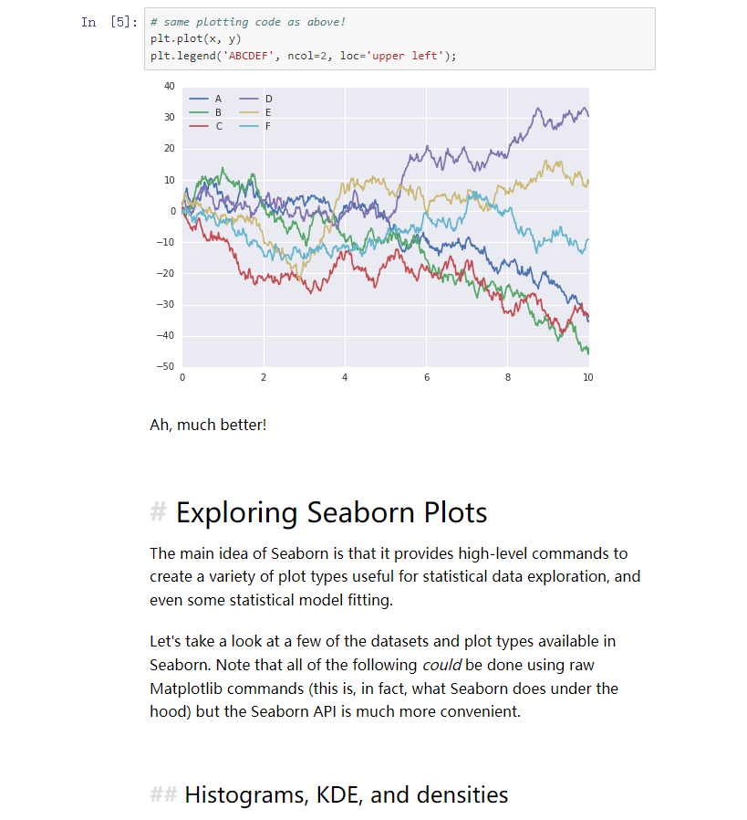 PDF版可以后台回复【python数据科学】
本文由 mdnice 多平台发布


 5740
5740

 被折叠的 条评论
为什么被折叠?
被折叠的 条评论
为什么被折叠?
 到【灌水乐园】发言


