


什么是浮动,我们真的用浮动布局吗?
A float is a box that is shifted to the left or right on the current line. The most interesting characteristic of a float (or “floated” or “floating” box) is that content may flow along its side (or be prohibited from doing so by the ‘clear’ property). Content flows down the right side of a left-floated box and down the left side of a right-floated box.
【译】一个浮动元素(浮动框)是在当前行向左或者右移动。浮动最有趣的特性是内容(一般指行内元素或者块元素中的行框等)可能环绕在该浮动元素周围。内容在左(右)浮动元素的右(左)边按照顺序依次排列。
这是w3c 官方文档上对浮动的定义,从这个定义中不难看出浮动的产生的最根本的原因是为了实现文字环绕效果。貌似作为布局总感觉差那么一些。原因是浮动具有很严重的破坏性,不仅仅对自身的布局可能严重破坏,同时对兄弟节点,特别是父元素的布局也带来破坏性,所以说,鄙人总感觉浮动作为布局总那么不妥。这可能导致后续代码维护和重构带来问题,因为对一个浮动元素进行更改可能影响的是他的附近的多个元素,然后这些元素也有浮动的话,那就JJ了。那么说回来了,用什么替代浮动来布局呢,其实我也不知道,但是我上网查了很多资料,同时对官方文档整理了一下发现某种意义上inline-block不错。后续博客会对inline-block也做详细介绍,同时也单独写一篇博客比较浮动和inline-block。本博客仅仅先探讨浮动的一些性质。
浮动元素是如何被格式化布局的?
A floated box is shifted to the left or right until its outer edge touches the containing block edge or the outer edge of another float. If there is a line box, the outer top of the floated box is aligned with the top of the current line box.
【译】一个浮动元素向左或者向右移动知道该浮动元素的外边界(即包含margin)接触到包含块(一般浮动元素的包含块是最近的祖先块级元素)的边界或者是另外的浮动元素的外边界。如果浮动元素处在一个行框里面的话,浮动元素的顶部和行框的顶部对其。
If there is not enough horizontal room for the float, it is shifted downward until either it fits or there are no more floats present.
【译】如果所处的同一行的位置没有足够的剩余空间分配给浮动元素,他就会向下一行移动知道有足够的空间能够容下它或者该位置没有过多的浮动元素。
这两段介绍了浮动元素的位置在文档中是如何布局。读者有没有这么一个感觉,浮动元素值为left情况下的布局和行元素比如img的布局很类似,都是先在当前行查看是否满足并且尽可能的想左边靠拢如果当前行没有足够的位置便被迫移动到下一行,同时在一个行框中,浮动元素的顶部要和行框对其,但是图片默认是baseline对其,只要对img的vertical-align改一下值诶top就可以。但是浮动元素对其他元素的影响这个却不能小瞧。
Floating, non-replaced elements
If ‘margin-left’, or ‘margin-right’ are computed as ‘auto’, their used value is ‘0’. If ‘width’ is computed as ‘auto’, the used value is the “shrink-to-fit” width.
【译】浮动非替代元素在水平方向上的布局:
如果’margin-left’, or ‘margin-right’ 被定义为auto,那么被0替代。如果width定义为auto,那么被使用的值“缩小到合适”为止。
Roughly: calculate the preferred width by formatting the content without breaking lines other than where explicit line breaks occur, and also calculate the preferred minimum width, e.g., by trying all possible line breaks. CSS 2.1 does not define the exact algorithm. Thirdly, find the available width: in this case, this is the width of the containing block minus the used values of ‘margin-left’, ‘border-left-width’, ‘padding-left’, ‘padding-right’, ‘border-right-width’, ‘margin-right’, and the widths of any relevant scroll bars.
Then the shrink-to-fit width is: min(max(preferred minimum width, available width), preferred width).
【译】通过在行没有折断的情况下计算首要的宽度,并且计算首要最小的宽度。比如通过尽可能的打断行(但是定义的行元素为一体不能打断,只能打断匿名行框)。Css2.1没有精确的定义。找可利用的宽度:在这种情况下,这个宽度就是包含块宽度减(’margin-left’, ‘border-left-width’, ‘padding-left’, ‘padding-right’, ‘border-right-width’, ‘margin-right’, and the widths of any relevant scroll bars. )
最终“缩小到合适”的值为:min(max(首要最小宽度,可利用的值),首要宽度).
Floating, replaced elements
If ‘margin-left’ or ‘margin-right’ are computed as ‘auto’, their used value is ‘0’. The used value of ‘width’ is determined as for inline replaced elements.
【译】对于浮动替代元素:
如果’margin-left’, or ‘margin-right’ 被定义为auto,那么被0替代。Width的值和行替换元素一样。
对于浮动元素对于自身的排版来说,一个元素浮动之后对自身的破坏力也是不少的,单核行内元素类似尽可能的收缩。
浮动元素对其他元素有哪些影响?
Since a float is not in the flow, non-positioned block boxes created before and after the float box flow vertically as if the float did not exist. However, the current and subsequent line boxes created next to the float are shortened as necessary to make room for the margin box of the float.
【译】由于一个浮动元素不在正常流中,对于浮动元素的兄弟块级元素会在正常流中垂直布局(flow vertically),这种布局方式就好像浮动元素节点不存在DOM树中一样。然而,和浮动元素在一行的行内元素(大多是匿名文本)后者在浮动元素之后的行内元素为了给该浮动元素腾出空间,它们的会尽可能的收缩。
If a shortened line box is too small to contain any content, then the line box is shifted downward (and its width recomputed) until either some content fits or there are no more floats present. Any content in the current line before a floated box is reflowed in the same line on the other side of the float. In other words, if inline-level boxes are placed on the line before a left float is encountered that fits in the remaining line box space, the left float is placed on that line, aligned with the top of the line box, and then the inline-level boxes already on the line are moved accordingly to the right of the float (the right being the other side of the left float) and vice versa for rtl and right floats.
【译】如果一个行框被迫的收缩的很小以至于不能包含任何内容(一般文字或者一个英文单词会断行的,但不能吧一个单词给断行)然后这个行框会被迫向下移动(在这个过程中宽度会自动计算的)直到位于浮动元素旁边的有足够空间的位置或者在浮动元素的下面的位置。在浮动元素之前的任意的内容行(匿名文本)会被重新绘制带浮动元素的旁边。换句话说,如果在左浮动元素前面的内联盒子所在的行有足够的遗留的空间,这个左浮动的元素就会放置在该行,与该行框顶部对齐,内联盒子就会移动到浮动元素的右边。
The border box of a table, a block-level replaced element, or an element in the normal flow that establishes a new block formatting context (such as an element with ‘overflow’ other than ‘visible’) must not overlap the margin box of any floats in the same block formatting context as the element itself. If necessary,implementations should clear the said element by placing it below any preceding floats, but may place it adjacent to such floats if there is sufficient space.
【译】表单元格、行替代元素或者在正常流中声明了BFC块元素的 border box 一定不能覆盖位于同一个BFC的浮动元素的margin box。如果在必要的情况下,浏览器应该声明这些元素放在浮动元素的下面,但如果在浮动元素旁边有足够的空间,那么应该放在该浮动元素的旁边。
由于浮动元素脱离了文档流。所以,对于兄弟节点为块元素来说位于浮动元素后面的元素可能会被浮动元素覆盖,同时父元素的宽度如果为auto的话也一定会发生改变。同时对浮动元素旁边的行内元素来说,他们会为了给浮动元素腾出位置会尽可能的收缩,这可能导致行内元素原本的布局会打乱会无效。对于声明了BFC的元素来说,布局也会发生改变。
总之,如果使用浮动元素,但是使用的作用并不是“文字环绕效果”的话,可能会对整体的布局产生一些影响,会使得一些元素的布局与本意事与愿违,增加了后期网页维护和重构的难度。##如何清理浮动带来的影响?
如何清理浮动带来的影响?
方式一:给浮动元素的父元素增加固定的height
这种方式仅仅解决了浮动对父元素的height带来的影响,但是对于对兄弟元素的影响并没有解决。方便适用于高度固定并且浮动元素之后没有块元素的布局。 应用的场景局限性大。
方式二:在父元素结尾处或者在浮动元素之后的任意一个不想被浮动元素覆盖的块元素前添加一个空div,并且添加clear:both属性。
    <div style="border:2px solid;width:400px;margin:20px">
        <div style="width:200px;height:200px;background-color:yellowgreen;float:left;">float</div>
        <div style="clear:both">-------------</div>
        <div style="width:200px;height:200px;background-color:red;">normal</div>
    </div>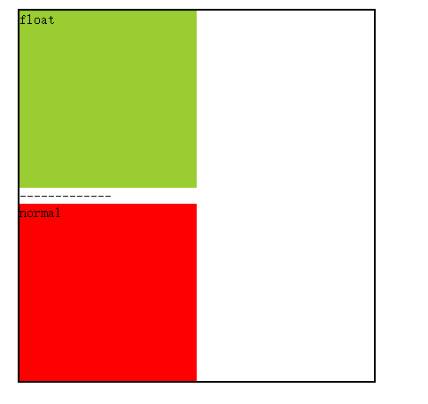
这种方式的缺点也是很明显的,要多加一个空的div,影响了布局,对js代码操纵DOM带来了不便。同时也不符合语义化的构造方式。
方式三:在父元素末尾通过after伪类的方式添加一个块级元素并且应用clear:both;或者在一个想要不被浮动元素覆盖的兄弟元素中添加clear:both。
总结如下:
<!DOCTYPE html>
<html lang="en">
<head>
    <meta charset="UTF-8">
    <title>Document</title>
    <style>
        .clearfloatbef:after {  /*兼容IE8以上和标准浏览器*/
            content: "";
            display: block;
            clear: both;
            visibility: hidden; /*浏览器渲染但是不显示*/
            height: 0;
        }
        .clearfloatbef {    /*兼容IE67*/
            zoom: 1;
            clear: both; /*为了能够使得兄弟节点也可以清浮动,比如如下红色的div*/
        }
    </style>
</head>
<body>
    <div id="box" class="clearfloatbef"  style="border:2px solid;width:400px;margin:20px"><div style="width:200px;height:200px;background-color:yellowgreen;float:left;">float</div><div class="clearfloatbef" style="width:200px;height:200px;background-color:red;">normal</div></div>
</body>
<script>
    alert(document.getElementById("box").childNodes.length);
    /*2 很明显通过伪类定义的内容是不影响js的获取```
*/
</script>
</html>
这是当下清理浮动最理想的方式,我想了想好处就是不在显示的定义一个元素了。
方式四:为父元素或者兄弟元素设置BFC
<!DOCTYPE html>
<html lang="en">
<head>
    <meta charset="UTF-8">
    <title>Document</title>
    <style>
        .BFC {
            display: table-cell;
            zoom: 1;  /*兼容IE67*/
        }
    </style>
</head>
<body>
    <div id="box" class="BFC"  style="border:2px solid;width:400px;margin:20px">
    <div style="width:200px;height:200px;background-color:yellowgreen;float:left;">float</div>
    <div class="BFC" style="width:200px;height:200px;background-color:red;">normal</div>
    </div>
</body>
</html>
缺点也看出来了,一是给父元素或者兄弟元素添加多个属性,同时对兄弟元素来说,根据前面浮动元素对BFC元素影响描述的可能会影响兄弟元素布局。


 538
538

 被折叠的 条评论
为什么被折叠?
被折叠的 条评论
为什么被折叠?
 到【灌水乐园】发言


