


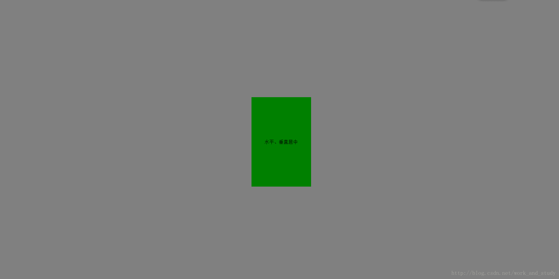
1.法一
<!DOCTYPE html>
<html lang="en">
<head>
    <meta charset="UTF-8">
    <title>居中</title>
    <style>
        .parent{
            position: absolute;
            height:100%;
            width:100%;

            background: grey;
        }
        .child{
            height:300px;
            width: 200px;
            position: relative;
            /*position: absolute;也可*/
            top:50%;
            left:50%;
            margin: -150px 0 0 -100px;

            /*块内文字水平垂直居中*/
            text-align: center;
            line-height: 300px;/*与height保持同值*/

            background:green;
        }
    </style>
</head>
<body>

 <div class="parent">
     <div class="child">水平、垂直居中</div>
 </div>

</body>
</html>
执行:
2.法二
将.child中的margin: -150px 0 0 -100px;
换成transform: translate(-50%,-50%);
transform为CSS3属性,它可以向元素使用2D 或 3D 转换,进行旋转、缩放、移动或倾斜。
translate(x,y)定义了 2D 转换。
3.法三
使用flex
        justify-content:center;定义容器中项目在主轴上(即水平方向上)居中。
        align-items:center;定义容器中项目在交叉轴上(即垂直方向上)居中。
        .parent{
            position: absolute;
            height:100%;
            width:100%;

            display: flex;
            justify-content:center;
            align-items:center;

            background: grey;
        }
        .child{
            height:300px;
            width: 200px;

            /*!*块内文字水平垂直居中*!*/
            text-align: center;
            line-height: 300px;/*与height保持同值*/

            background:green;
        }
4.法四
使用定位与margin
        .parent{
            position: absolute;
            height:100%;
            width:100%;

            background: grey;
        }
        .child{
            height:300px;
            width: 200px;

            position: absolute;
            top: 0;
            bottom:0;
            right:0;
            left:0;;
            margin:  auto;

            /*!*块内文字水平垂直居中*!*/
            text-align: center;
            line-height: 300px;/*与height保持同值*/

            background:green;
        }


 扫一扫
扫一扫
 2万+
2万+

 被折叠的 条评论
为什么被折叠?
被折叠的 条评论
为什么被折叠?
 到【灌水乐园】发言


