


3D文字
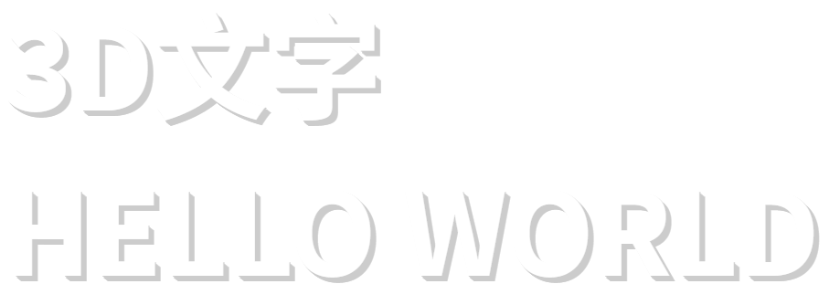
方式一:使用text-shadow
通过text-shadow属性,对文字逐层设置多个阴影,达到3D效果:
<style>
.hollow-text {
  font-size: 100px;
  font-weight: bold;
  color: #fff;
  text-shadow:
	1px 1px 0 #ccc,
	2px 2px 0 #ccc,
	3px 3px 0 #ccc,
	4px 4px 0 #ccc,
	5px 5px 0 #ccc;
}
</style>

<body>
<div class="hollow-text">3D文字</div>
<div class="hollow-text">HELLO WORLD</div>
</body>
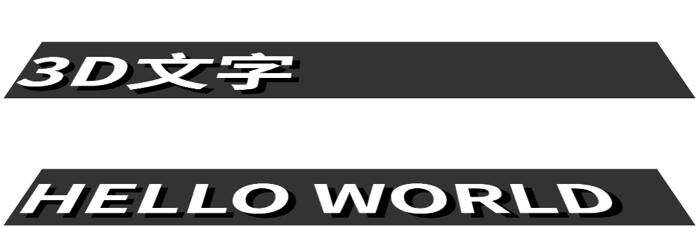
方式二:使用 transform
通过transform属性进行3D变换,达到视觉上的3D效果:
<style>
.hollow-text {
	font-size: 100px;
	font-weight: bold;
	color: #fff;
	background: #333;
	transform: perspective(1000px) rotateX(60deg); /* 增加透视距离和旋转角度 */
	transform-origin: 50% 100%; /* 设置变换原点 */
	text-shadow: 10px 10px 0 #000; /* 增加一点阴影,使效果更明显 */
}
</style>

<body>
<div class="hollow-text">3D文字</div>
<div class="hollow-text">HELLO WORLD</div>
</body>
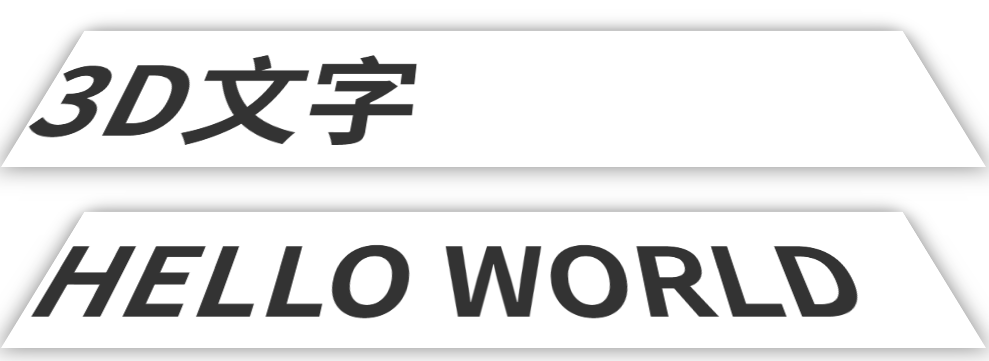
方式三:使用box-shadow
使用box-shadow属性,可以模拟文字投影,再结合 transform 进行 3D 变换,也可以达到3D效果:
<style>
.hollow-text {
	font-size: 100px;
	font-weight: bold;
	color: #333;
	transform: perspective(300px) rotateX(25deg);
	transform-origin: 50% 100%;
	box-shadow: 0 0 20px rgba(0, 0, 0, 0.5);
}
</style>

<body>
<div class="hollow-text">3D文字</div>
<div class="hollow-text">HELLO WORLD</div>
</body>


 扫一扫
扫一扫


 被折叠的 条评论
为什么被折叠?
被折叠的 条评论
为什么被折叠?
 到【灌水乐园】发言


