


为什么要自定义下拉框?因为要好看一点的。为什么要封装?因为方便复用。记录一下方便以后看看。
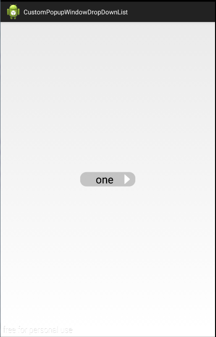
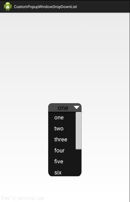
1、好啦,先看一下效果:
2、然后要怎么使用呢?挺简单,只需要设置数据就可以了
这是主界面
package com.zzw.customdropdownlist;

import java.util.ArrayList;
import java.util.List;

import android.app.Activity;
import android.os.Bundle;

public class MainActivity extends Activity {

    @Override
    protected void onCreate(Bundle savedInstanceState) {
        super.onCreate(savedInstanceState);
        setContentView(R.layout.activity_main);

        String[] str = {"one","two","three","four","five","six","seven","eight","nine","ten"};
        List<CharSequence> mList = new ArrayList<>();
        for (int i = 0; i < str.length; i++) {
            mList.add(str[i]);
        }

        //获取对象
        DropDownList downList = (DropDownList) findViewById(R.id.ddl);
        //初始化数据
        downList.init(this,mList);

    }
}
主界面布局:
<RelativeLayout xmlns:android="http://schemas.android.com/apk/res/android"
    xmlns:tools="http://schemas.android.com/tools"
    xmlns:custom="http://schemas.android.com/apk/res/com.zzw.customdropdownlist"
    android:layout_width="match_parent"
    android:layout_height="match_parent"
    >

    <com.zzw.customdropdownlist.DropDownList
        android:id="@+id/ddl"
        android:layout_width="wrap_content"
        android:layout_height="wrap_content"
        android:layout_centerInParent="true"
        android:textColor="#000000"
        android:textSize="30sp"
        android:gravity="center"
        android:paddingLeft="20dp"
        android:paddingRight="10dp"
        custom:offIcon="@drawable/soaktime_icon_off"
        custom:onIcon="@drawable/soaktime_icon_on"
        custom:offBackground="@drawable/soaktime_bg"
        custom:onBackground="@drawable/soaktime_drop_btn_bg"
        custom:dropBackground="@drawable/soaktime_drop_popupwindow_bg"
        custom:itemTextSize="20sp"
        custom:itemTextColor="#fff"
        custom:itemPaddingLeft="30dp"
        custom:dropListLength="300dp"
        custom:direction="RIGHT"
        />

</RelativeLayout>
布局不复杂吧?都封装好了,只需要设置相关属性就可以了
3、布局那些属性都是什么意思呢?比如我想增加一些属性,封装得更好(毕竟这是我按项目需求封装),那就来看看自定义属性吧
<resources>

<!--     自定义下拉框 -->
    <declare-styleable name="dropdownlist">
        <!--         按钮没下拉的指示图标和下拉的指示图片-->
        <attr name = "offIcon" format = "reference"></attr>
        <attr name = "onIcon" format = "reference"></attr>
        <!--         按钮没下拉的背景和下拉的背景-->
        <attr name = "offBackground" format = "reference"></attr>
        <attr name = "onBackground" format = "reference"></attr>
        <!--         下拉框背景-->
        <attr name = "dropBackground" format = "reference"></attr>
        <!--         下拉框内容字体-->
        <attr name = "itemTextSize" format = "dimension"></attr>
        <attr name = "itemTextColor" format = "color"></attr>
        <attr name = "itemPaddingLeft" format = "dimension"></attr>
        <!--         下拉框长度-->
        <attr name = "dropListLength" format = "dimension"></attr>
        <!--         按钮指示图标在左边或右边-->
        <attr name = "direction">
            <enum name = "LEFT" value = "0"></enum>
            <enum name = "RIGHT" value = "1"></enum>
        </attr>
    </declare-styleable>

</resources>
自定义属性在valuse文件夹下
4、那到底是怎么弄成的?,就是自定义View中一类:组合控件。自定义DropList继承Button,然后监听Button的单击事件,单击时弹窗PopupWindow,让我们看看自定义的View吧
package com.zzw.customdropdownlist;

import java.util.List;

import android.content.Context;
import android.content.res.TypedArray;
import android.graphics.drawable.Drawable;
import android.util.AttributeSet;
import android.view.View;
import android.widget.AdapterView;
import android.widget.AdapterView.OnItemClickListener;
import android.widget.Button;
import android.widget.ListView;
import android.widget.PopupWindow;
import android.widget.PopupWindow.OnDismissListener;


public class DropDownList extends Button {

    private PopupWindow mPopupWindow;
    private Context context;
    //显示数据的集合
    private List<CharSequence> mList;
    //默认显示的Item值
    private int mCurrentItem = 0;
    //按钮的指示图标图片
    private Drawable offIcon,onIcon;
    //按钮没下拉和下拉时背景图片
    private Drawable offBackground,onBackground;
    //下拉框背景
    private Drawable dropBackground;
    //下拉item字体设置
    private float itemTextSize;
    private int itemTextColor;
    private int itemPaddingLeft;
    //下拉框长度
    private int dropListLength;
    //指示图标的位置
    private String direction;
    private static final String LEFT= "0";
    private static final String RIGHT= "1";

    public DropDownList(Context context) {
        this(context,null);
    }
    public DropDownList(Context context, AttributeSet attrs) {
        this(context, attrs,0);
    }
    public DropDownList(Context context, AttributeSet attrs, int defStyleAttr) {
        super(context, attrs, defStyleAttr);

         TypedArray mTypedArray = context.obtainStyledAttributes(attrs, R.styleable.dropdownlist);
         offIcon = mTypedArray.getDrawable(R.styleable.dropdownlist_offIcon);
         onIcon = mTypedArray.getDrawable(R.styleable.dropdownlist_onIcon);
         offBackground = mTypedArray.getDrawable(R.styleable.dropdownlist_offBackground);
         onBackground = mTypedArray.getDrawable(R.styleable.dropdownlist_onBackground);
         dropBackground = mTypedArray.getDrawable(R.styleable.dropdownlist_dropBackground);
         itemTextSize = mTypedArray.getDimension(R.styleable.dropdownlist_itemTextSize, 20);
         itemTextColor = mTypedArray.getColor(R.styleable.dropdownlist_itemTextColor, 0xfff);
         itemPaddingLeft = (int) mTypedArray.getDimension(R.styleable.dropdownlist_itemPaddingLeft, 30);
         dropListLength = mTypedArray.getDimensionPixelOffset(R.styleable.dropdownlist_dropListLength, 250);
         direction = mTypedArray.getString(R.styleable.dropdownlist_direction);

         mTypedArray.recycle();

        initView();
    }

    private void initView() {
        //设置图标向右
        offIcon.setBounds(0, 0, offIcon.getMinimumWidth(), offIcon.getMinimumHeight());
        if (LEFT.equals(direction)) {
            this.setCompoundDrawables(offIcon, null, null, null);
        }else if (RIGHT.equals(direction)) {
            this.setCompoundDrawables(null, null, offIcon, null);
        }
        this.setBackground(offBackground);
        //设置监听器
        this.setOnClickListener(new OnClickListener() {

            public void onClick(View v) {
                startDropDownList();
            }
        });
    }

    /**
     * 初始化
     * @param context
     * @param list
     */
    public void init(Context context,List<CharSequence> list) {
        this.context = context;
        this.mList = list;
        this.setText(mList.get(mCurrentItem));
    }
    /**
     * 初始化PopupWindow
     * @param button
     */
    private void initPopupWindow(final Button button) {
        //设置图标向下
        onIcon.setBounds(0, 0, onIcon.getMinimumWidth(), onIcon.getMinimumHeight());
        if (LEFT.equals(direction)) {
            button.setCompoundDrawables(onIcon, null, null, null);
        }else if (RIGHT.equals(direction)) {
            button.setCompoundDrawables(null, null, onIcon, null);
        }
        button.setBackground(onBackground);

        View pv_layout = View.inflate(context, R.layout.popupwindow_layout, null);
        //通过view 和宽·高,构造PopopWindow
        mPopupWindow = new PopupWindow(pv_layout, button.getWidth(), dropListLength, true);
        //此处为popwindow 设置背景
        mPopupWindow.setBackgroundDrawable(dropBackground);
        //设置PopupWindow不获取焦点,其父容器获取焦点
        mPopupWindow.setFocusable(true);
        //设置popupWindow以外的区域可以触摸
        mPopupWindow.setOutsideTouchable(false);
        //设置显示位置
        mPopupWindow.showAsDropDown(button);
        //消失监听事件
        mPopupWindow.setOnDismissListener(new OnDismissListener() {
            public void onDismiss() {
                if (mPopupWindow != null) {
                    mPopupWindow = null;
                }
                //设置图标向右
                offIcon.setBounds(0, 0, offIcon.getMinimumWidth(), offIcon.getMinimumHeight());
                if (LEFT.equals(direction)) {
                    button.setCompoundDrawables(offIcon, null, null, null);
                }else if (RIGHT.equals(direction)) {
                    button.setCompoundDrawables(null, null, offIcon, null);
                }
                button.setBackground(offBackground);
            }
        });

        ListView lv = (ListView) pv_layout.findViewById(R.id.lvPopupWindow);
        ListViewAdapter mAdapter = new ListViewAdapter(context, mList);
        mAdapter.setTextSize(itemTextSize);
        mAdapter.setTextColor(itemTextColor);
        mAdapter.setTextPaddingLeft(itemPaddingLeft);
        lv.setAdapter(mAdapter);
        lv.setOnItemClickListener(new OnItemClickListener() {
            @Override
            public void onItemClick(AdapterView<?> parent, View view,
                    int position, long id) {
                ((Button) button).setText(mList.get(position));
                mCurrentItem = position;
                button.setText(mList.get(position));
                //关闭PopupWindow
                mPopupWindow.dismiss();
                mPopupWindow = null;
            }
        });
    }

    /**
     * 打开下拉框
     */
    public void startDropDownList() {
        initPopupWindow(this);
    }
    /**
     * 获取当前Item
     */
    public int getCurrentItem() {
        return mCurrentItem;
    }
    /**
     * 设置当前Item
     */
    public void setCurrentItem(int currentItem) {
        this.mCurrentItem = currentItem;
    }

}
5、那么弹出来的是什么东西?就是一个ListView啦,你看布局
<?xml version="1.0" encoding="utf-8"?>
<LinearLayout xmlns:android="http://schemas.android.com/apk/res/android"
    android:layout_width="match_parent"
    android:layout_height="match_parent"
    android:orientation="vertical"
    android:background="@drawable/soaktime_drop_popupwindow_bg"
    >
    <ListView
        android:id="@+id/lvPopupWindow"
        android:layout_width="match_parent"
        android:layout_height="wrap_content"
        android:scrollbarSize="30dp"
        android:scrollbarThumbVertical="@drawable/soaktime_scrollbar"
        />
</LinearLayout>
这是ListView的Item布局就是一个TextView
<?xml version="1.0" encoding="utf-8"?>
<LinearLayout xmlns:android="http://schemas.android.com/apk/res/android"
    android:layout_width="wrap_content"
    android:layout_height="wrap_content"
    android:orientation="vertical"
    >

    <TextView
        android:id="@+id/tvPopupWindowListViewItem"
        android:layout_width="wrap_content"
        android:layout_height="50dp"
        android:textSize="20sp"
        android:textColor="#ffffff"
        android:gravity="center_vertical|left"
        android:paddingLeft="40dp"
        />

</LinearLayout>
ListView的适配器类,都是很经常用的,所以注释都没有
package com.zzw.customdropdownlist;

import java.util.List;

import android.content.Context;
import android.view.View;
import android.view.ViewGroup;
import android.widget.BaseAdapter;
import android.widget.TextView;

/**
 * Created by FLST-YF-ZZW on 2015/12/29.
 */
public class ListViewAdapter extends BaseAdapter {

    Context context;
    List<CharSequence> mList;
    private float mTextSize;
    private int mTextColor;
    private int mPadddintLeft;

    public ListViewAdapter(Context context, List<CharSequence> mList) {
        this.context = context;
        this.mList = mList;
    }

    @Override
    public int getCount() {
        return mList.size();
    }

    @Override
    public CharSequence getItem(int position) {
        return mList.get(position);
    }

    @Override
    public long getItemId(int position) {
        return position;
    }

    @Override
    public View getView(int position, View convertView, ViewGroup parent) {
        TextView mTextView = null;
        if (convertView == null) {
            mTextView = new TextView(context);
            convertView = View.inflate(context,R.layout.listview_item, null);
            mTextView = (TextView) convertView.findViewById(R.id.tvPopupWindowListViewItem);
            convertView.setTag(mTextView);
        }else {
            mTextView = (TextView)convertView.getTag();
        }
        mTextView.setText(mList.get(position));
        mTextView.setTextSize(mTextSize);
        mTextView.setTextColor(mTextColor);
        mTextView.setPadding(mPadddintLeft, 0, 0, 0);

        return convertView;
    }

    public void setTextSize(float textsize) {
        this.mTextSize = textsize;
    }
    public void setTextColor(int textcolor) {
        this.mTextColor = textcolor;
    }
    public void setTextPaddingLeft(int paddingleft) {
        this.mPadddintLeft = paddingleft;
    }

}
6、基本上就这样啦,当然那些背景图片什么的你可以换成自己的,最后还是源码地址:


 扫一扫
扫一扫

 被折叠的 条评论
为什么被折叠?
被折叠的 条评论
为什么被折叠?
 到【灌水乐园】发言


