


1. TabBar + TabBarView 来实现顶部导航
2. PageView + BottomNavigationBar 底部导航
3.利用 Drawer 实现侧拉菜单
4. PageView
实现导航需要用到 Scaffold 和 BottomNavigationBar ,PageView 和 PageController。
Scaffold widget 是实现了基本的 material design 的布局结构。里面包括了常用的标题 appBar ,内容 body,侧拉 drawer。
1.TabBar + TabBarView 来实现顶部导航
首先实现像 Android 中 ViewPager + Fragment 的效果,效果图如下:
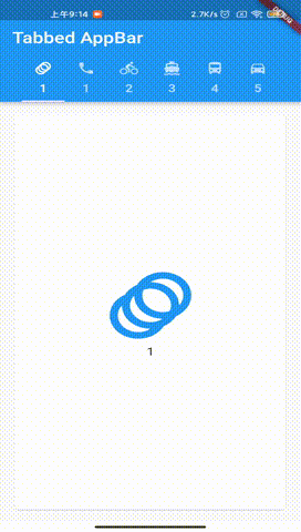
利用 TabBar + TabBarView 来实现,示例代码:
void main() {
  runApp(MyApp());
}

class MyApp extends StatefulWidget {
  @override
  _MyHomePageState createState() => _MyHomePageState();
}

class _MyHomePageState extends State<MyApp> {
  @override
  Widget build(BuildContext context) {
    return MaterialApp(
      home: DefaultTabController(
        length: choices.length,
        child: Scaffold(
          appBar: AppBar(
            title: const Text('Tabbed AppBar'),
            bottom: TabBar(
              isScrollable: true,
              tabs: choices.map((Choice choice) {
                return Tab(
                  text: choice.title,
                  icon: Icon(choice.icon),
                );
              }).toList(),
            ),
          ),
          body: TabBarView(
            children: choices.map((Choice choice) {
              return Padding(
                padding: const EdgeInsets.all(16.0),
                child: ChoiceCard(choice: choice),
              );
            }).toList(),
          ),
        ),
      ),
    );
  }
}

class Choice{
  const Choice({required this.title,required this.icon});
  final String title;
  final IconData icon;
}

const List<Choice> choices = const <Choice>[
  const Choice(title: '1', icon: Icons.animation),
  const Choice(title: '1', icon: Icons.phone),
  const Choice(title: '2', icon: Icons.directions_bike),
  const Choice(title: '3', icon: Icons.directions_boat),
  const Choice(title: '4', icon: Icons.directions_bus),
  const Choice(title: '5', icon: Icons.directions_car),
];

class ChoiceCard extends StatelessWidget{
  const ChoiceCard({Key ? key ,required this.choice}):super(key: key);

  final Choice choice;

  @override
  Widget build(BuildContext context) {
    return Card(
      color: Colors.white,
      child: Center(
        child: Column(
          mainAxisSize: MainAxisSize.min,
          crossAxisAlignment: CrossAxisAlignment.center,
          children: [
            Icon(choice.icon,size:128.0,color: Colors.blue,),
            Text(choice.title)
          ],
        ),
      ),
    );
  }
}
2. PageView + BottomNavigationBar 底部导航
在 Android 中,实现常用底部导航栏,用 Fragment 即可,来控制显示隐藏。
Flutter 中,要用 PageView + BottomNavigationBar 来实现。
效果图如下:
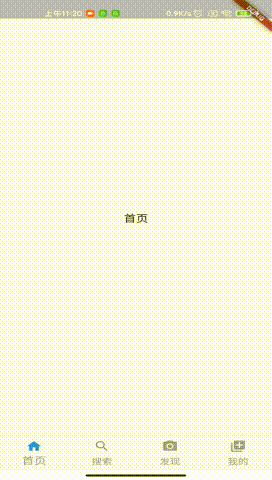
示例代码,代码中有注释,并不难理解:
void main() {
  runApp(MyApp());
}

class MyApp extends StatefulWidget {
  @override
  _MyHomePageState createState() => _MyHomePageState();
}

class _MyHomePageState extends State<MyApp>
    with SingleTickerProviderStateMixin {
  final _defaultColor = Colors.grey; //未选中
  final _activeColor = Colors.blue; //选中
  int _currentIndex = 0; //默认选中第一个
  var _controller = PageController(
    initialPage: 0,
  );

  @override
  Widget build(BuildContext context) {
    return new MaterialApp(
        home: Scaffold(
      body: PageView(
        controller: _controller,
        children: [
          Center(child: Text("首页")),
          Center(child: Text("搜索")),
          Center(child: Text("发现")),
          Center(child: Text("我的"))
        ],
        physics: NeverScrollableScrollPhysics(),
      ),
      //底部导航菜单
      bottomNavigationBar: BottomNavigationBar(
        //默认显示第几个页面
        currentIndex: _currentIndex,
        onTap: (index) {
          //点击跳转指定页面
          _controller.jumpToPage(index);
          //改变当前页面
          setState(() {
            _currentIndex = index;
          });
        },
        //fixed永远显示底部lab(文字),shifting只有被选中才会显示底部文字
        type: BottomNavigationBarType.fixed,
        items: [
          BottomNavigationBarItem(
              //设置默认图标和颜色
              icon: Icon(
                Icons.home,
                color: _defaultColor,
              ),
              //设置选中图标和颜色
              activeIcon: Icon(
                Icons.home,
                color: _activeColor,
              ),
              title: Text(
                '首页',
                style: TextStyle(
                  color: _defaultColor,
                ),
              )),
          BottomNavigationBarItem(
            icon: Icon(
              Icons.search,
              color: _defaultColor,
            ),
            activeIcon: Icon(
              Icons.search,
              color: _activeColor,
            ),
            title: Text('搜索',
                style: TextStyle(
                  color: _currentIndex != 1 ? _defaultColor : _activeColor,
                )),
          ),
          BottomNavigationBarItem(
            icon: Icon(
              Icons.camera_alt,
              color: _defaultColor,
            ),
            activeIcon: Icon(
              Icons.camera_alt,
              color: _activeColor,
            ),
            title: Text('发现',
                style: TextStyle(
                  color: _currentIndex != 2 ? _defaultColor : _activeColor,
                )),
          ),
          BottomNavigationBarItem(
            icon: Icon(
              Icons.my_library_add,
              color: _defaultColor,
            ),
            activeIcon: Icon(
              Icons.my_library_add,
              color: _activeColor,
            ),
            title: Text('我的',
                style: TextStyle(
                  color: _currentIndex != 3 ? _defaultColor : _activeColor,
                )),
          )
        ],
      ),
    ));
  }
}
3.利用 Drawer 实现侧拉菜单
如 QQ,网易云的侧拉菜单效果。在 Flutter 中,用 Drawer 就可以实现;
效果图:
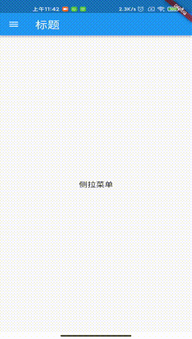
示例代码,代码中有注释,并不难理解:
void main() {
  runApp(MyApp());
}

/**
 * 侧拉菜单
 */
class MyApp extends StatelessWidget {
  const MyApp({Key? key}) : super(key: key);

  @override
  Widget build(BuildContext context) {
    return MaterialApp(
      title: 'Flutter Demo',
      theme: ThemeData(
        primarySwatch: Colors.blue,
      ),
      home: HomePage(),
    );
  }
}

class HomePage extends StatefulWidget {
  @override
  _MyHomePageState createState() => _MyHomePageState();
}

class _MyHomePageState extends State<HomePage> {
  @override
  Widget build(BuildContext context) {
    return Scaffold(
          appBar: AppBar(
            title: Text('标题'),
          ),
          body: Center(
            child: Text('侧拉菜单'),
          ),
          drawer: Drawer(
            child: ListView(
              padding: EdgeInsets.zero,
              children: [
                //侧拉菜单头部
                DrawerHeader(
                  child: Text('侧拉菜单头部标题'),
                  decoration: BoxDecoration(color: Colors.blue),
                ),
                ListTile(
                  title: Text('内容1'),
                  onTap: () {
                    Navigator.pop(context);
                  },
                ),
                ListTile(
                  title: Text('内容2'),
                  onTap: () {
                    Navigator.pop(context);
                  },
                ),
              ],
            ),
          ),
        );
  }
}
4. PageView
PageView 在 Fultter 中最常用的 widget 之一。它可以完成水平和垂直方向的滚动。
它里面有许多参数:
  PageView({
    Key? key,
    this.scrollDirection = Axis.horizontal, //滚动方向,垂直或水平
    this.reverse = false, //是否反向滚动
    PageController? controller, //PageView控制器
    this.physics, //手势滚动逻辑
    this.pageSnapping = true, //false禁止页面捕捉,实现自定义滚动
    this.onPageChanged, //页面切换被调用
    List<Widget> children = const <Widget>[],
    this.dragStartBehavior = DragStartBehavior.start,
    this.allowImplicitScrolling = false, //是否显示滚动条
    this.restorationId, //回到顶部
    this.clipBehavior = Clip.hardEdge,
    this.scrollBehavior,
    this.padEnds = true,
  }) : assert(allowImplicitScrolling != null),
       assert(clipBehavior != null),
       controller = controller ?? _defaultPageController,
       childrenDelegate = SliverChildListDelegate(children),
       super(key: key);


 185
185


 被折叠的 条评论
为什么被折叠?
被折叠的 条评论
为什么被折叠?
 到【灌水乐园】发言


