


官网: https://matplotlib.org
一、版本
# 01 matplotlib安装情况
import matplotlib
matplotlib.__version__
二、图表主题设置
三、一次函数
import numpy as np
from matplotlib import pyplot as plt
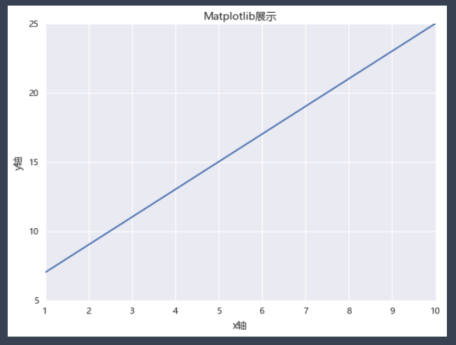
# 如何使用中文标题
plt.rcParams['font.sans-serif']=['Microsoft YaHei'] # 使用微软雅黑的字体
x = np.arange(1,11)
y = 2 * x + 5 # 图片显示的是这个公式
plt.title("Matplotlib展示")
plt.xlabel("x轴")
plt.ylabel("y轴")
plt.plot(x,y)
plt.show()
四、多个一次函数
创建一个关于电影票房的图表:
films=['穿过寒冬拥抱你','反贪风暴5:最终章','李茂扮太子','误杀2','以年为单位的恋爱','黑客帝国:矩阵重启','雄狮少年','魔法满屋','汪汪队立大功大电影','爱情神话']
regions=['中国','英国','澳大利亚','美国','美国','中国','英国','澳大利亚','美国','美国']
bos=['61,181','44,303','42,439','22,984','13,979','61,181','44,303','41,439','20,984','19,979']
persons=['31','23','56','17','9','31','23','56','17','9']
prices=['51','43','56','57','49','51','43','56','57','49']
showdate=['2022-12-03','2022-12-05','2022-12-01','2022-12-02','2022-11-05','2022-12-03','2022-12-05','2022-12-01','2022-12-02','2022-11-05']
ftypes=['剧情','动作','喜剧','剧情','剧情','爱情','动作','动画','动画','动画']
points=['8.1','9.0','7.9','6.7','3.8','8.1','9.0','7.9','6.7','3.8']
filmdescript={
    'ftypes':ftypes,
    'bos':bos,
    'prices':prices,
    'persons':persons,
    'regions':regions,
    'showdate':showdate,
    'points':points
}
import numpy as np
import pandas as pd
cnbo2021top5=pd.DataFrame(filmdescript,index=films)
cnbo2021top5[['prices','persons']]=cnbo2021top5[['prices','persons']].astype(int)
cnbo2021top5['bos']=cnbo2021top5['bos'].str.replace(',','').astype(int)
cnbo2021top5['showdate']=cnbo2021top5['showdate'].astype('datetime64')
cnbo2021top5['points']=cnbo2021top5['points'].apply(lambda x:float(x) if x!='' else 0)
关于cnboo1.xlsx,我放在我的码云里,需要的朋友自行下载:cnboo1.xlsx
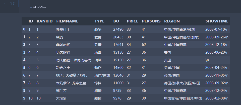
# 读取并初步整理数据集
import pandas as pd
cnbodf=pd.read_excel('cnboo1.xlsx')
cnbodfsort=cnbodf.sort_values(by=['BO'],ascending=False)
def mkpoints(x,y): # 编写points评分
    return len(str(x))*(y/25)-3

cnbodfsort['points']=cnbodfsort.apply(lambda x:mkpoints(x.BO,x.PERSONS),axis=1)
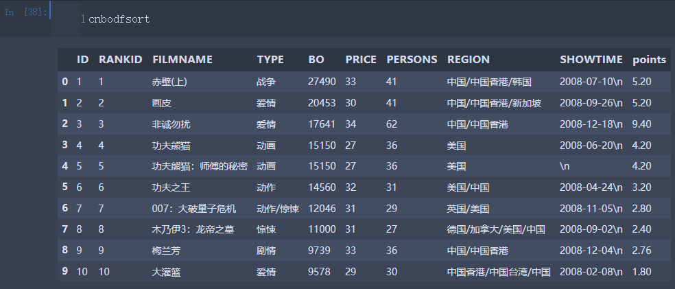
cnbodfsort.to_excel("cnbodfsort.xlsx",index=False) # 创建一个Excel文件
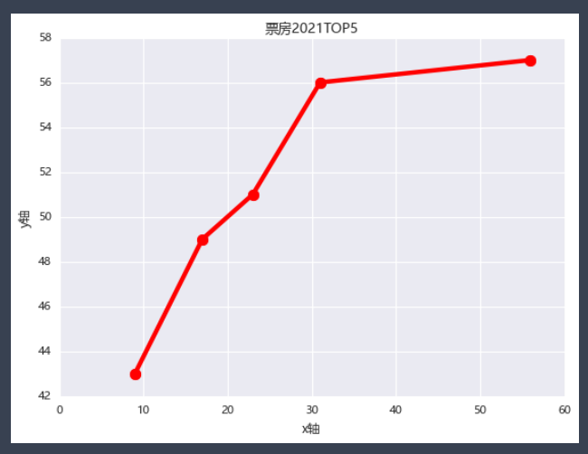
from matplotlib import pyplot as plt
plt.rcParams['font.sans-serif']=['Microsoft YaHei'] # 使用微软雅黑的字体
plt.title("票房2021TOP5")
plt.xlabel("x轴")
plt.ylabel("y轴")
x=cnbo2021top5.persons.sort_values()
y=cnbo2021top5.prices.sort_values()
plt.plot(x,y,marker=".",markersize=20,color='red',linewidth=4,markeredgecolor='blue')
plt.show()
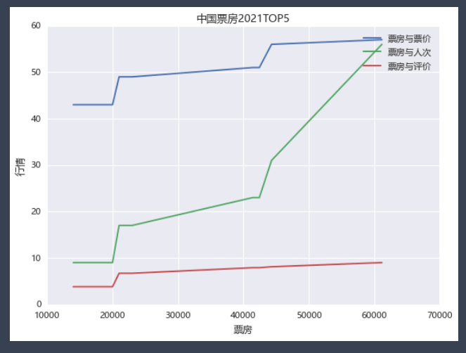
# 折线图进阶
from matplotlib import pyplot as plt
plt.rcParams['font.sans-serif']=['Microsoft YaHei'] # 使用微软雅黑的字体
plt.title("中国票房2021TOP5")
plt.plot(bo,prices,label='票房与票价')
plt.plot(bo,persons,label='票房与人次')
plt.plot(bo,points,label='票房与评价')
plt.legend() # 显示标签
plt.xlabel('票房') # 横坐标轴
plt.ylabel('行情') # 纵坐标轴
plt.show()
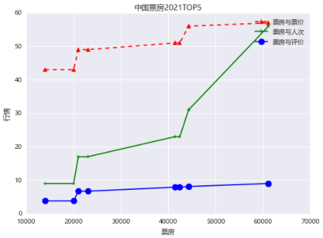
更改一下版式
# 折线图进阶
from matplotlib import pyplot as plt
plt.rcParams['font.sans-serif']=['Microsoft YaHei'] # 使用微软雅黑的字体
plt.title("中国票房2021TOP5")
plt.plot(bo,prices,'r^--',label='票房与票价')
plt.plot(bo,persons,'g*-',label='票房与人次')
plt.plot(bo,points,color='blue',marker='o',markersize=10,label='票房与评价')
plt.legend() # 显示标签
plt.xlabel('票房') # 横坐标轴标题
plt.ylabel('行情') # 纵坐标轴标题
plt.show()
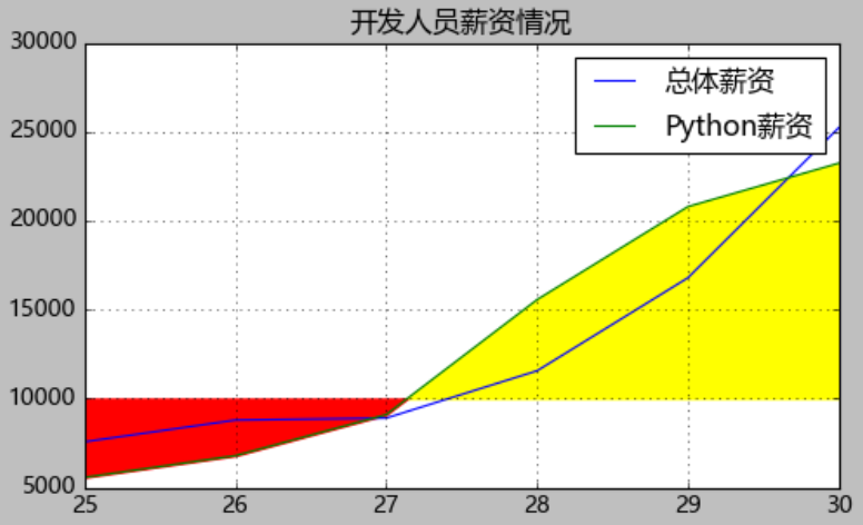
五、填充折线图
填充折线图:当确定一条数据线上面的一点的时候,能够将该点的上下两部分分别使用不同的颜色填充。
dev_x=[25,26,27,28,29,30] # 开发者的年龄
dev_y=[7567,8789,8900,11560,16789,25231] #收入情况
py_dev_y=[5567,6789,9098,15560,20789,23231] # python开发者
js_dev_y=[6567,7789,8098,12356,14789,20231] # java开发者
devsalary=pd.DataFrame([dev_x,dev_y,py_dev_y,js_dev_y])
devsalaryT=pd.DataFrame(devsalary.values.T,columns=["Age","Dev","Python","Java"])
# 绘制带阴影的折线图
from matplotlib import pyplot as plt
plt.style.use('classic')
plt.figure(figsize=(7,4))
plt.rcParams['font.sans-serif']=['Microsoft YaHei'] # 使用微软雅黑的字体
plt.title("开发人员薪资情况")

baseline=10000

plt.plot(devsalaryT["Age"],devsalaryT["Dev"],label="总体薪资")
plt.plot(devsalaryT["Age"],devsalaryT["Python"],label="Python薪资") # 如果没有label是不会显示legend的数据标签的

plt.fill_between(devsalaryT["Age"],devsalaryT["Python"],baseline,where=(devsalaryT["Python"]>baseline),interpolate=True,color='yellow')
plt.fill_between(devsalaryT["Age"],devsalaryT["Python"],baseline,where=(devsalaryT["Python"]<=baseline),interpolate=True,color='red')

plt.grid()
plt.legend()
plt.show()
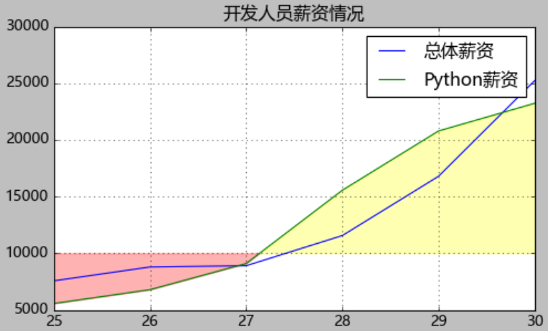
# 绘制带阴影的折线图
from matplotlib import pyplot as plt
plt.style.use('classic')
plt.figure(figsize=(7,4))
plt.rcParams['font.sans-serif']=['Microsoft YaHei'] # 使用微软雅黑的字体
plt.title("开发人员薪资情况")

baseline=10000

plt.plot(devsalaryT["Age"],devsalaryT["Dev"],label="总体薪资")
plt.plot(devsalaryT["Age"],devsalaryT["Python"],label="Python薪资") # 如果没有label是不会显示legend的数据标签的

plt.fill_between(devsalaryT["Age"],devsalaryT["Python"],baseline,where=(devsalaryT["Python"]>baseline),interpolate=True,color='yellow',alpha=0.3)
plt.fill_between(devsalaryT["Age"],devsalaryT["Python"],baseline,where=(devsalaryT["Python"]<=baseline),interpolate=True,color='red',alpha=0.3) # alpha=0.3调整透明度

plt.grid()
plt.legend()
plt.show()
# 绘制带阴影的折线图
from matplotlib import pyplot as plt
plt.style.use('classic')
plt.figure(figsize=(7,4))
plt.rcParams['font.sans-serif']=['Microsoft YaHei'] # 使用微软雅黑的字体
plt.title("开发人员薪资情况")

baseline=10000

plt.plot(devsalaryT["Age"],devsalaryT["Dev"],label="总体薪资")
plt.plot(devsalaryT["Age"],devsalaryT["Python"],label="Python薪资") # 如果没有label是不会显示legend的数据标签的

plt.fill_between(devsalaryT["Age"],devsalaryT["Python"],baseline,where=(devsalaryT["Python"]>baseline),interpolate=True,color='pink',alpha=0.7,label="高于10000元")
plt.fill_between(devsalaryT["Age"],devsalaryT["Python"],baseline,where=(devsalaryT["Python"]<=baseline),interpolate=True,color='purple',alpha=0.7,label="低于或等于10000元") # alpha=0.3调整透明度

plt.grid()
plt.legend()
plt.show()
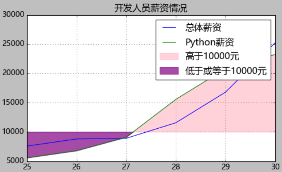
interpolate=True:将交叉的位置进行填充
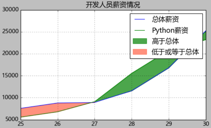
# 绘制带阴影的折线图
from matplotlib import pyplot as plt
plt.style.use('classic')
plt.figure(figsize=(7,4))
plt.rcParams['font.sans-serif']=['Microsoft YaHei'] # 使用微软雅黑的字体
plt.title("开发人员薪资情况")

plt.plot(devsalaryT["Age"],devsalaryT["Dev"],label="总体薪资")
plt.plot(devsalaryT["Age"],devsalaryT["Python"],label="Python薪资") # 如果没有label是不会显示legend的数据标签的

plt.fill_between(devsalaryT["Age"],devsalaryT["Python"],devsalaryT["Dev"],where=(devsalaryT["Python"]>baseline),interpolate=True,color='green',alpha=0.7,label="高于总体")
plt.fill_between(devsalaryT["Age"],devsalaryT["Python"],devsalaryT["Dev"],where=(devsalaryT["Python"]<=baseline),interpolate=True,color='tomato',alpha=0.7,label="低于或等于总体") # alpha=0.3调整透明度

plt.grid()
plt.legend()
plt.show()


 1480
1480


 被折叠的 条评论
为什么被折叠?
被折叠的 条评论
为什么被折叠?
 到【灌水乐园】发言


