


作用于父容器
| 作用于父容器 | 解释 | 取值 |
|---|---|---|
| grid-template-rows | 占据几行、每行的高 | 像素、fr,用空格分开;repeat() |
| grid-template-columns | 占据几列,每列的宽 | 像素、fr,用空格分开;repeat() |
| grid-template-areas | 划分区域 | 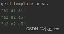 |
| grid-template | grid-template-rows、grid-template-columns、grid-template-areas的复合写法 | 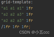 |
| grid-row-gap | 行间隙 | 像素 |
| grid-column-gap | 列间隙 | 像素 |
| grid-gap | 间隙复合写法 | |
| justify-content | 网格的水平方向对齐方式 | stretch、start、center、end、space-between、space-around、space-evenly |
| align-content | 网格的垂直方向对齐方式 | stretch、start、center、end、space-between、space-around、space-evenly |
| place-content | justify-content、align-content复合写法 | |
| justify-items | 网格内元素的水平对齐方式 | stretch、start、center、end |
| align-items | 网格内元素的垂直对齐方式 | stretch、start、center、end |
| place-items | justify-items、align-items复合写法 |
作用于子容器
| 作用于子容器 | 解释 | 取值 |
|---|---|---|
| grid-area | 指定所属区域,搭配grid-template-areas使用 | |
| justify-self | 某一个网格的水平对齐方式 | start、center、end |
| align-self | 某一个网格的垂直对齐方式 | start、center、end |
| place-self | justify-self、align-selft复合写法 |


 244
244


 被折叠的 条评论
为什么被折叠?
被折叠的 条评论
为什么被折叠?
 到【灌水乐园】发言


