


饼图 (Pie Chart)
引言
饼图,或称饼状图,是一种圆形统计图表,用于展示各部分占整体的比例。每个扇形的弧长、圆心角和面积大小表示该种类占总体的比例,所有扇形合在一起刚好是一个完整的圆形。饼图最显著的功能在于表现“占比”,但需要注意的是,由于人类对角度的感知不如长度准确,因此在需要精确表达数值时,建议使用柱状图或其他类型的图表。
定义:
- 饼图:一个划分为若干扇形的圆形统计图表。
- 用途:展示各部分占整体的比例。
关键元素:
- 扇形:表示各部分的比例。
- 标签:标注各部分的名称和比例。
图表属性:
- 形状:圆形
- 图类:统计图表
- 功能:组成 • 比较
饼图的应用场景
- 占比分析:展示各部分占整体的比例。
- 成分构成:分析整体由哪些部分组成。
- 市场细分:展示市场份额分布。
示例代码详解
为了更好地理解和使用饼图,下面通过三个不同的图表库(Matplotlib、Seaborn、ECharts)来展示如何绘制饼图。
使用 Matplotlib 绘制简单饼图
import matplotlib.pyplot as plt
import numpy as np
fig, ax = plt.subplots(figsize=(6, 3), subplot_kw=dict(aspect="equal"))
recipe = ["375 g flour",
          "75 g sugar",
          "250 g butter",
          "300 g berries"]
data = [float(x.split()[0]) for x in recipe]
ingredients = [x.split()[-1] for x in recipe]
def func(pct, allvals):
    absolute = int(np.round(pct/100.*np.sum(allvals)))
    return f"{pct:.1f}%\n({absolute:d} g)"
wedges, texts, autotexts = ax.pie(data, autopct=lambda pct: func(pct, data),
                                  textprops=dict(color="w"))
ax.legend(wedges, ingredients,
          title="Ingredients",
          loc="center left",
          bbox_to_anchor=(1, 0, 0.5, 1))
plt.setp(autotexts, size=8, weight="bold")
ax.set_title("Matplotlib Bakery: A Pie Chart")
plt.show()
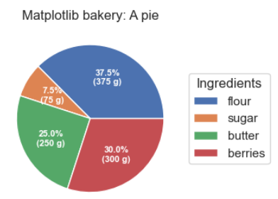
- 使用
numpy处理数据。 - 使用
matplotlib.pyplot创建饼图。 - 设置每个扇形的标签和百分比。
- 添加图例以标识各部分。
- 设置标题和文本属性,使图表更清晰易读。
使用 Seaborn 绘制饼图
虽然 Seaborn 主要用于高级统计图表,但它可以通过 matplotlib 的底层功能来绘制饼图。这里我们直接使用 matplotlib 来展示饼图。
import seaborn as sns
import matplotlib.pyplot as plt
# 设置主题样式
sns.set_theme(style="whitegrid")
# 数据准备
data = [1548, 775, 679, 1048, 335, 310, 251, 234, 147, 135, 102]
labels = [
    'Search Engine',
    'Direct',
    'Marketing',
    'Baidu',
    'Google',
    'Email',
    'Union Ads',
    'Bing',
    'Video Ads',
    'Others',
    'Unknown'  # 添加一个额外的标签以匹配数据长度
]
# 创建饼图
plt.figure(figsize=(8, 6))
plt.pie(data, labels=labels, autopct='%1.1f%%', startangle=90, colors=sns.color_palette("Set2"))
plt.axis('equal')  # Equal aspect ratio ensures that pie is drawn as a circle.
plt.title("Seaborn Bakery: A Pie Chart")
plt.show()
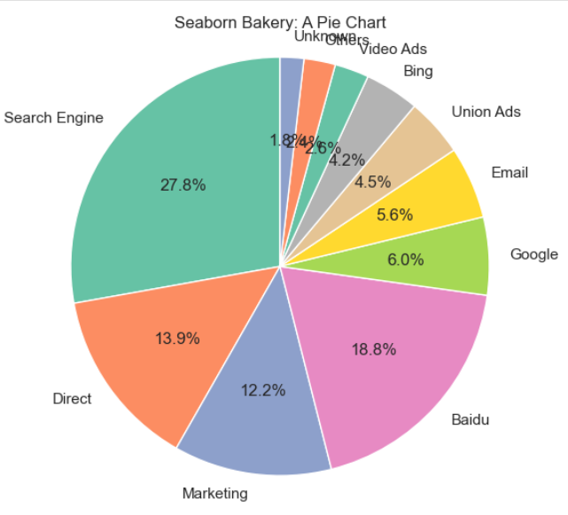
- 使用
seaborn设置主题样式。 - 准备数据和标签。
- 使用
matplotlib.pyplot绘制饼图。 - 设置自动百分比显示、起始角度和颜色调色板。
- 设置标题和等比例显示,确保饼图为圆形。
使用 Seaborn 和 Matplotlib 结合绘制饼图
在这个示例中,我们将使用 Seaborn 的配色方案,并结合 Matplotlib 来绘制一个更复杂的饼图,包含内环和外环。
代码:
import seaborn as sns
import matplotlib.pyplot as plt
# 设置主题样式
sns.set_theme(style="whitegrid")
# 数据准备
data_inner = [1548, 775, 679]
labels_inner = ['Search Engine', 'Direct', 'Marketing']
data_outer = [1048, 335, 310, 251, 234, 147, 135, 102]
labels_outer = ['Baidu', 'Google', 'Email', 'Union Ads', 'Bing', 'Video Ads', 'Others', 'Unknown']
# 创建饼图
fig, ax = plt.subplots(figsize=(10, 8), subplot_kw=dict(aspect="equal"))
# 内环
wedges_inner, texts_inner, autotexts_inner = ax.pie(
    data_inner,
    radius=0.7,
    wedgeprops=dict(width=0.3, edgecolor='w'),
    startangle=90,
    colors=sns.color_palette("Set2")[:3],
    labels=labels_inner,
    autopct='%1.1f%%',
    textprops=dict(color="w")
)
# 外环
wedges_outer, texts_outer, autotexts_outer = ax.pie(
    data_outer,
    radius=1,
    wedgeprops=dict(width=0.3, edgecolor='w'),
    startangle=90,
    colors=sns.color_palette("Set2")[3:],
    labels=labels_outer,
    autopct='%1.1f%%',
    textprops=dict(color="w")
)
# 设置标题
ax.set_title("Seaborn & Matplotlib Combined Pie Chart")
# 显示图例
ax.legend(wedges_inner + wedges_outer, labels_inner + labels_outer,
          title="Categories",
          loc="center left",
          bbox_to_anchor=(1, 0, 0.5, 1))
# 显示图表
plt.show()
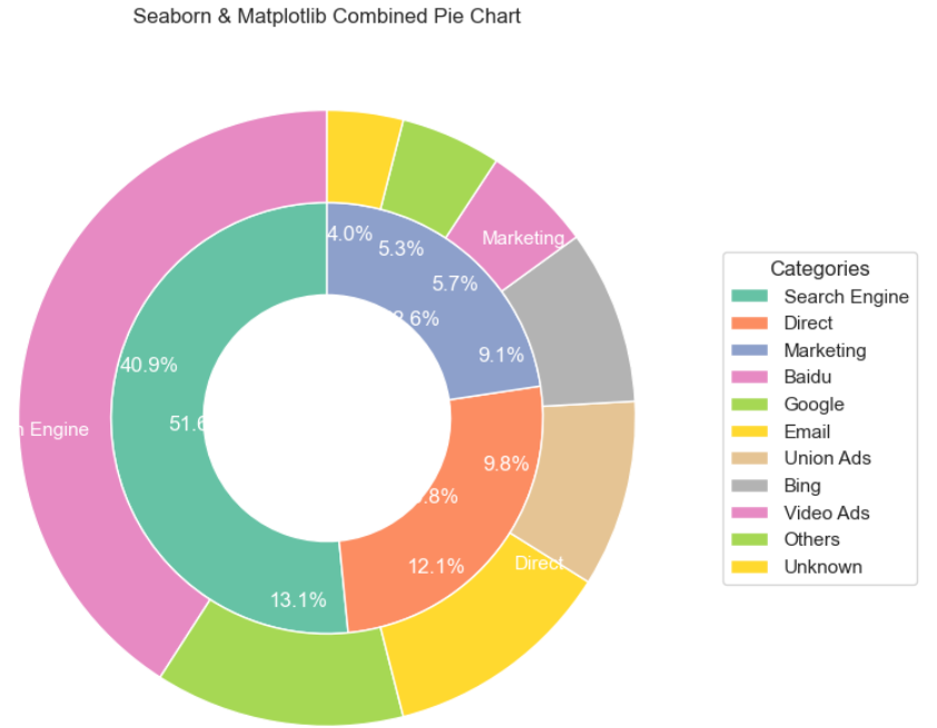
- 使用
seaborn设置主题样式。 - 准备内环和外环的数据和标签。
- 使用
matplotlib.pyplot绘制内环和外环。 - 设置每个环的半径、宽度和颜色。
- 设置自动百分比显示、起始角度和颜色调色板。
- 设置标题和图例,确保图表清晰易读。
使用 ECharts 绘制动态饼图
import * as echarts from 'echarts';
var chartDom = document.getElementById('main');
var myChart = echarts.init(chartDom);
var option;
option = {
  tooltip: {
    trigger: 'item',
    formatter: '{a} <br/>{b}: {c} ({d}%)'
  },
  legend: {
    orient: 'vertical',
    left: 'left',
    data: [
      'Direct',
      'Marketing',
      'Search Engine',
      'Email',
      'Union Ads',
      'Video Ads',
      'Baidu',
      'Google',
      'Bing',
      'Others'
    ]
  },
  series: [
    {
      name: 'Access From',
      type: 'pie',
      radius: '50%',
      center: ['50%', '60%'],
      data: [
        { value: 1548, name: 'Search Engine' },
        { value: 775, name: 'Direct' },
        { value: 679, name: 'Marketing' },
        { value: 1048, name: 'Baidu' },
        { value: 335, name: 'Google' },
        { value: 310, name: 'Email' },
        { value: 251, name: 'Union Ads' },
        { value: 147, name: 'Bing' },
        { value: 135, name: 'Video Ads' },
        { value: 102, name: 'Others' }
      ],
      emphasis: {
        itemStyle: {
          shadowBlur: 10,
          shadowOffsetX: 0,
          shadowColor: 'rgba(0, 0, 0, 0.5)'
        }
      }
    }
  ]
};
option && myChart.setOption(option);
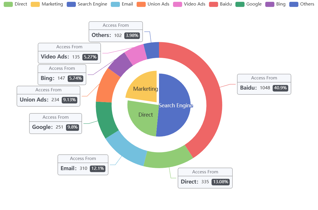
- 使用
ECharts库加载数据集。 - 初始化图表并设置选项。
- 配置
tooltip显示详细信息。 - 设置
legend标签,便于识别各部分。 - 配置
series属性,设置饼图的数据和样式。 - 添加高亮效果,提升图表的交互性和可读性。
总结
通过上述四个示例,我们可以看到不同图表库在绘制饼图方面的强大功能和灵活性。选择合适的工具和方法,可以使数据可视化更加直观和有效。


 5258
5258

 被折叠的 条评论
为什么被折叠?
被折叠的 条评论
为什么被折叠?
 到【灌水乐园】发言


