


相关文档:
http://blog.sina.com.cn/s/blog_877284510101jo5d.html
http://www.cnblogs.com/dojo-lzz/p/3999013.html
http://www.cnblogs.com/lhb25/p/inside-block-formatting-ontext.html
BFC(Block Formatting CoFSADntext)直译为“块级格式化范围”
1.是 W3C CSS 2.1 规范中的一个概念,它决定了元素如何对其内容进行定位,以及与其他元素的关系和相互作用。当涉及到可视化布局的时候,Block Formatting Context提供了一个环境,HTML元素在这个环境中按照一定规则进行布局。一个环境中的元素不会影响到其它环境中的布局。比如浮动元素会形成BFC,浮动元素内部子元素的主要受该浮动元素影响,两个浮动元素之间是互不影响的。这里有点类似一个BFC就是一个独立的行政单位的意思。也可以说BFC就是一个作用范围。可以把它理解成是一个独立的容器,并且这个容器的里box的布局,与这个容器外的毫不相干。
2.另一个通俗点的解释是:在普通流中的 Box(框) 属于一种 formatting context(格式化上下文) ,类型可以是 block ,或者是 inline ,但不能同时属于这两者。并且, Block boxes(块框) 在 block formatting context(块格式化上下文) 里格式化, Inline boxes(块内框) 则在 inline formatting context(行内格式化上下文) 里格式化。任何被渲染的元素都属于一个 box ,并且不是 block ,就是 inline 。即使是未被任何元素包裹的文本,根据不同的情况,也会属于匿名的 block boxes 或者 inline boxes。所以上面的描述,即是把所有的元素划分到对应的 formatting context 里。
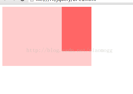
DEMO1:
<html>
<head>
<meta charset="utf-8">
<meta http-equiv="X-UA-Compatible" content="IE=edge,chrome=1">
<title>Examples</title>
<meta name="description" content="">
<meta name="keywords" content="">
<link href="" rel="stylesheet">
<style>
body {
width: 300px;
position: relative;
}
.aside {
width: 100px;
height: 150px;
float: right;
background: #f66;
}
.main {
height: 200px;
background: #fcc;
}
</style>
</head>
<body>
<div class="aside"></div>
<div class="main"></div>
</body>
</html>
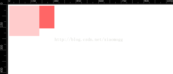
<html>
<head>
<meta charset="utf-8">
<meta http-equiv="X-UA-Compatible" content="IE=edge,chrome=1">
<title>Examples</title>
<meta name="description" content="">
<meta name="keywords" content="">
<link href="" rel="stylesheet">
<style>
body {
width: 300px;
position: relative;
}
.aside {
width: 100px;
height: 150px;
float: right;
background: #f66;
}
.main {
height: 200px;
background: #fcc;
overflow: hidden;
}
</style>
</head>
<body>
<div class="aside"></div>
<div class="main"></div>
</body>
</html>
<html>
<head>
<meta charset="utf-8">
<meta http-equiv="X-UA-Compatible" content="IE=edge,chrome=1">
<title>Examples</title>
<meta name="description" content="">
<meta name="keywords" content="">
<style>
.par {
border: 5px solid #fcc;
width: 300px;
}
.child {
border: 5px solid #f66;
width:100px;
height: 100px;
float: left;
}
</style>
</head>
<body>
<div class="par">
<div class="child"></div>
<div class="child"></div>
</div>
</body>
</html>

<html>
<head>
<meta charset="utf-8">
<meta http-equiv="X-UA-Compatible" content="IE=edge,chrome=1">
<title>Examples</title>
<meta name="description" content="">
<meta name="keywords" content="">
<style>
.par {
border: 5px solid #fcc;
width: 300px;
overflow: hidden;;
}
.child {
border: 5px solid #f66;
width:100px;
height: 100px;
float: left;
}
</style>
</head>
<body>
<div class="par">
<div class="child"></div>
<div class="child"></div>
</div>
</body>
</html>

<!DOCTYPE html>
<html>
<head>
<meta http-equiv="Content-Type" content="text/html; charset=utf-8">
<!--The viewport meta tag is used to improve the presentation and behavior of the samples
on iOS devices-->
<meta name="viewport" content="initial-scale=1, maximum-scale=1,user-scalable=no"/>
<title></title>
<style>
html, body { height: 100%; width: 100%; margin: 0; padding: 0; }
.left{
background:pink;
float: left;
width:180px;
height:200px;
}
.center{
background:lightyellow;
overflow:hidden;
height:200px;
}
.right{
background: lightblue;
width:180px;
height:200px;
float:right;
}
</style>
</head>
<body>
<div class="container">
<div class="right">right</div>
<div class="left">left</div>
<div class="center">center</div>
</div>
</html>

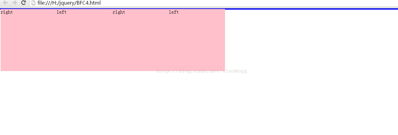
<html>
<head>
<meta http-equiv="Content-Type" content="text/html; charset=utf-8">
<!--The viewport meta tag is used to improve the presentation and behavior of the samples
on iOS devices-->
<meta name="viewport" content="initial-scale=1, maximum-scale=1,user-scalable=no"/>
<title></title>
<style>
html, body { height: 100%; width: 100%; margin: 0; padding: 0; }
.main{border:2px blue solid;}
.left{
background:pink;
float: left;
width:180px;
height:200px;
}
</style>
</head>
<body>
<div class="main">
<div class="c">
<div class="left">right</div>
<div class="left">left</div>
</div>
<div class="c">
<div class="left">right</div>
<div class="left">left</div>
</div>
</div>
</html>
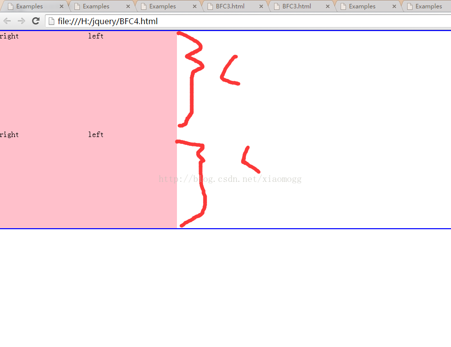
<html>
<head>
<meta http-equiv="Content-Type" content="text/html; charset=utf-8">
<!--The viewport meta tag is used to improve the presentation and behavior of the samples
on iOS devices-->
<meta name="viewport" content="initial-scale=1, maximum-scale=1,user-scalable=no"/>
<title></title>
<style>
html, body { height: 100%; width: 100%; margin: 0; padding: 0; }
.main{border:2px blue solid;}
.c{overflow: hidden;;}
.left{
background:pink;
float: left;
width:180px;
height:200px;
}
</style>
</head>
<body>
<div class="main">
<div class="c">
<div class="left">right</div>
<div class="left">left</div>
</div>
<div class="c">
<div class="left">right</div>
<div class="left">left</div>
</div>
</div>
</html>


 267
267


 被折叠的 条评论
为什么被折叠?
被折叠的 条评论
为什么被折叠?
 到【灌水乐园】发言


