


 这篇博客介绍了如何创建一个具有深度交互效果的手风琴下拉列表,展示了其打开状态,并提供了CSS、HTML和JS代码示例,允许读者根据个人喜好进行定制。
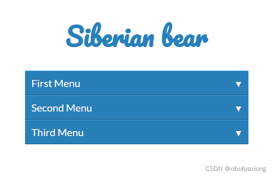
首先它是长这个样子
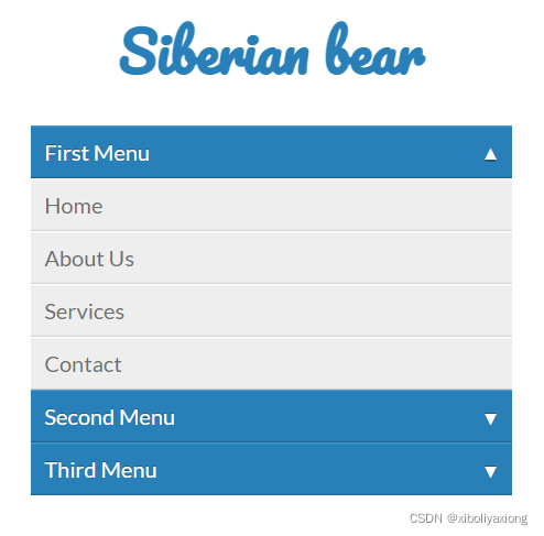
打开后是这样
有兴趣可以试下,不喜欢这个样式的可以稍加修改
CSS部分
<style>
@import url("https://fonts.googleapis.com/css?family=Lato:300,400,700,900");
@import url(https://fonts.googleapis.com/css?family=Pacifico);
body {
  font-family: "Lato", Helvetica, Arial;
  font-size: 16px;
}

*, *:before, *:after {
  -webkit-border-sizing: border-box;
  -moz-border-sizing: border-box;
  border-sizing: border-box;
}

.container {
  width: 350px;
  margin: 50px auto;
}
.container > ul {
  list-style: none;
  padding: 0;
  margin: 0 0 20px 0;
}

.title {
  font-family: 'Pacifico';
  font-weight: norma;
  font-size: 40px;
  text-align: center;
  line-height: 1.4;
  color: #2980B9;
}

.dropdown a {
  text-decoration: none;
}
.dropdown [data-toggle="dropdown"] {
  position: relative;
  display: block;
  color: white;
  background: #2980B9;
  -moz-box-shadow: 0 1px 0 #409ad5 inset, 0 -1px 0 #20638f inset;
  -webkit-box-shadow: 0 1px 0 #409ad5 inset, 0 -1px 0 #20638f inset;
  box-shadow: 0 1px 0 #409ad5 inset, 0 -1px 0 #20638f inset;
  text-shadow: 0 -1px 0 rgba(0, 0, 0, 0.3);
  padding: 10px;
}
.dropdown [data-toggle="dropdown"]:hover {
  background: #2c89c6;
}
.dropdown .icon-arrow {
  position: absolute;
  display: block;
  font-size: 0.7em;
  color: #fff;
  top: 14px;
  right: 10px;
}
.dropdown .icon-arrow.open {
  -moz-transform: rotate(-180deg);
  -ms-transform: rotate(-180deg);
  -webkit-transform: rotate(-180deg);
  transform: rotate(-180deg);
  -moz-transition: -moz-transform 0.6s;
  -o-transition: -o-transform 0.6s;
  -webkit-transition: -webkit-transform 0.6s;
  transition: transform 0.6s;
}
.dropdown .icon-arrow.close {
  -moz-transform: rotate(0deg);
  -ms-transform: rotate(0deg);
  -webkit-transform: rotate(0deg);
  transform: rotate(0deg);
  -moz-transition: -moz-transform 0.6s;
  -o-transition: -o-transform 0.6s;
  -webkit-transition: -webkit-transform 0.6s;
  transition: transform 0.6s;
}
.dropdown .icon-arrow:before {
  content: '\25BC';
}
.dropdown .dropdown-menu {
  max-height: 0;
  overflow: hidden;
  list-style: none;
  padding: 0;
  margi
最低0.47元/天 解锁文章


 扫一扫
扫一扫


 1435
1435

 被折叠的 条评论
为什么被折叠?
被折叠的 条评论
为什么被折叠?
 到【灌水乐园】发言


