


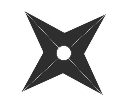
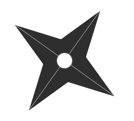
根据 纯CSS3绘制的小猫笑脸动画 和 使用CSS3实现一个3D相册 2个案例 绘制的自动旋转的手里剑模型。
-------------------效果截图------------------

-------------------代码案例------------------
<!DOCTYPE HTML>
<html>
<head>
<meta charset="utf-8">
<title>纯CSS3手里剑模型绘制</title>
<style type="text/css">
#box {
height: 400px;
width: 400px;
transform-style: preserve-3d;
animation: rotateZ360 10s ease-in infinite;
margin-top: 100px;
margin-right: auto;
margin-left: auto;
}
/*想要让这个相册动起来,加一个动画就好了*/
@keyframes rotateZ360 {
from {
transform: rotateZ(0deg);
}
to {
transform: rotateZ(360deg);
}
}
/*中心拼接盒子*/
#content {
background-color: #2e2e2e;
height: 102px;
width: 102px;
position:absolute;
left:50%;/*盒子左上角点距离左边框50%*/
top:50%;/*盒子左上角点距离上边框50%*/
transform:translate(-50%,-50%);/*整个盒子向左移动50%,向上移动50%*/
}
/*中心孔*/
#center {
background-color: #FFF;
height: 50px;
width: 50px;
position:relative;
left:50%;/*盒子左上角点距离左边框50%*/
top:50%;/*盒子左上角点距离上边框50%*/
transform:translate(-50%,-50%);/*整个盒子向左移动50%,向上移动50%*/
border-radius: 50%;
border: solid 2px #2e2e2e;
overflow: hidden;
}
#d1 {
width: 0;
height: 0;
border-left: 50px solid transparent;
border-right: 50px solid transparent;
border-bottom: 150px solid #2e2e2e;
position: relative;
left: 150px;
}
#d2 {
width: 0;
height: 0;
border-top: 50px solid transparent;
border-right: 150px solid #2e2e2e;
border-bottom: 50px solid transparent;
position: relative;
}
#d3 {
width: 0;
height: 0;
border-left: 50px solid transparent;
border-right: 50px solid transparent;
border-top: 150px solid #2e2e2e;
position: relative;
left: 150px;
}
#d4 {
width: 0;
height: 0;
border-top: 50px solid transparent;
border-left: 150px solid #2e2e2e;
border-bottom: 50px solid transparent;
position: relative;
left: 250px;
bottom: 250px;
}
/*水平中间线*/
#top {
width: 390px;
border-bottom-width: 1px;
border-bottom-style: solid;
border-bottom-color: #FFF;
position: relative;
bottom: 300px;
left: 5px;
}
/*垂直中间线*/
#foot {
height: 390px;
border-left-width: 1px;
border-left-style: solid;
border-left-color: #FFF;
position: relative;
left: 200px;
bottom: 495px;
}
</style>
</head>
<body>
<div id="box">
<div id="d1"></div>
<div id="d2"></div>
<div id="content">
<div id="center"></div>
</div>
<div id="d3"></div>
<div id="d4"></div>
<div id="top"></div>
<div id="foot"></div>
</div>
</body>
</html>


 被折叠的 条评论
为什么被折叠?
被折叠的 条评论
为什么被折叠?
 到【灌水乐园】发言


