


compile 'com.android.support:design:24.0.0'CoordinatorLayout作为“super-powered FrameLayout”本质是个帧布局FrameLayout
基本实现两个功能:
1、作为顶层布局; 其子控件可以通过layout_gravity控制自身位置
2、调度协调子布局.
CoordinatorLayout使用新的思路通过协调调度子布局的形式实现触摸影响布局的形式产生动画效果。CoordinatorLayout通过设置子View的Behaviors来调
度子View。在CoordinatorLayout的子view中有需要滑动的view时候可以必须设置app:layout_behavior="@string/appbar_scrolling_view_behavior"来实现滑动效果,这个behavior是系统内置的类,如果还需要实现自定义的效果可以自定义behavior类AppBarLayout就是一个垂直的线性布局,该布局具有很多材料设计的特性,尤其是滚动特性.
如果子视图想要实现滚动行为,可以通过setScrollFlags(int)方法或者在xml中设置
app:layout_scrollFlags.属性.AppBarLayout应该被作为CoordinatorLayout的一个子视图来使用,如果在别的ViewGroup中来使用的话,可能AppBarLayout的很多特性都无效了.
在AppBarLayout里面的View,通过app:layout_scrollFlags属性来控制,滚动时候的表现.其中有4种Flag的类型.1⃣️.scroll: 表示向上滚动时,这个View会被滚出屏幕范围直到隐藏.没有设置这个flag的view将被固定在屏幕顶部。例如,TabLayout 没有设置这个值,将会停留在屏幕顶部。
2⃣️.enterAlways: 表示向下滚动时,这个View会随着滚动手势出现,直到恢复原来的位置,启用快速“返回模式”。
3⃣️.enterAlwaysCollapsed: 当你的视图已经设置minHeight属性又使用此标志时,你的视图只能已最小高度进入,只有当滚动视图到达顶部时才扩大到完整高度。 4⃣️.exitUntilCollapsed: 滚动退出屏幕,最后折叠在顶端。CollapseToolbarLayout 作用是提供了一个可以折叠的Toolbar,它继承自FrameLayout,给它设置常用属性及方法:
CollapsingToolbarLayout可实现Toolbar的折叠效果。CollapsingToolbarLayout的子视图类似于LinearLayout的垂直方向排放。
CollapsingToolbarLayout 提供以下属性和方法: 1⃣️.Collapsing title:ToolBar的标题,当CollapsingToolbarLayout没有全屏折叠时,title显示的是大字体,在折叠的过程中,title不断变小直到一定大小的效果。以调用setTitle(CharSequence)方法设置title。 2⃣️. Content scrim:ToolBar被折叠到顶部固定时候的背景,可以调用setContentScrim(Drawable)方法改变背景或者 在属性中使用 app:contentScrim=”?attr/colorPrimary”来改变背景。 3⃣️. Status bar scrim:状态栏的背景,调用方法setStatusBarScrim(Drawable)。不过这个只能在Android5.0以上系统有效果。 4⃣️. Parallax scrolling children:CollapsingToolbarLayout滑动时,子视图的视觉差,可以通过属性app:layout_collapseParallaxMultiplier="0.6"改变。值的范围[0.0,1.0],值越大视差越大。 5⃣️. CollapseMode:子视图的折叠模式,在子视图设置,有两种“pin”:固定模式,在折叠的时候最后固定在顶端;“parallax”:视差模式,在折叠的时候会有个视差折叠的效果。我们可以在布局中使用属性app:layout_collapseMode=”parallax”来改变,实现视差滚动效果,通常和layout_collapseParallaxMultiplier(设置视差因子)搭配使用。 6⃣️.layout_collapseParallaxMultiplier(视差因子) - 设置视差滚动因子,值为:0~1。
7⃣️.CoordinatorLayout 还提供了一个 layout_anchor 的属性,连同 layout_anchorGravity 一起,可以用来放置与其他视图关联在一起的悬浮视图(如 FloatingActionButton)。本例中使用FloatingActionButton。
8⃣️.contentScrim - 设置当CollapsingToolbarLayout完全折叠(收缩)后的背景颜色。
9⃣️.expandedTitleMarginStart - 设置扩张时候(还没收缩时)title向左填充的距离。下面是个实现可折叠Toolbar的案例 案例中有许多要注意的点上面的NoListView是自定义的ListView来解决滑动冲突的这个解决方法如下<?xml version="1.0" encoding="utf-8"?> <!--CoordinatorLayout本质是个FrameLayout--> <android.support.design.widget.CoordinatorLayout xmlns:android="http://schemas.android.com/apk/res/android" xmlns:tools="http://schemas.android.com/tools" xmlns:app="http://schemas.android.com/apk/res-auto" android:id="@+id/activity_main" android:layout_width="match_parent" android:layout_height="match_parent" android:fitsSystemWindows="true" tools:context="xixirupan.tmgp.com.newdesign.MainActivity"> <!-- android:fitsSystemWindows="true"必须加上否则toolbar名称设置不上 AppBarLayout本质是一个LinearLayout vertical --> <android.support.design.widget.AppBarLayout android:layout_width="match_parent" android:layout_height="wrap_content" android:fitsSystemWindows="true" > <!-- layout_scrollFlags是AppBar需要滚动的子元素设置的属性 有四个值exitUntilCollapse,enterAlaways,enterAlwaysUtilCollapse scroll 要想实现滚动scroll必加 其他三个可以根据需要的效果选择 CollapsingToolbarLayout通常只包裹TooLbar 有时候也包裹一张图片作为Toolbar的背景图片 造成一定的视觉效果 CollapsingToolbarLayout本质也是一个FrameLayout --> <android.support.design.widget.CollapsingToolbarLayout android:layout_width="match_parent" android:layout_height="200dp" android:background="#66ff0000" app:contentScrim="#6600ff00" app:layout_scrollFlags="scroll|exitUntilCollapsed" > <ImageView android:layout_width="match_parent" android:layout_height="match_parent" android:background="@drawable/agin7" /> <!--Toolbar的高必须设置明确的值否则就不会收缩在上面 原因我想很简单就是toolbar没有明确高不知道该收缩多少这样的话系统将什么也不做 --> <android.support.v7.widget.Toolbar android:id="@+id/toolbar" app:title=" " android:layout_width="match_parent" android:layout_height="?attr/actionBarSize" app:layout_collapseMode="pin" > </android.support.v7.widget.Toolbar> </android.support.design.widget.CollapsingToolbarLayout> <android.support.design.widget.TabLayout android:id="@+id/tabLayout" android:layout_width="match_parent" android:layout_height="wrap_content"> </android.support.design.widget.TabLayout> </android.support.design.widget.AppBarLayout> <!--app:layout_behavior="@string/appbar_scrolling_view_behavior" 该属性是CoordinatorLayout中的需要滚动的子元素设置的属性 --> <android.support.v4.widget.NestedScrollView app:layout_behavior="@string/appbar_scrolling_view_behavior" android:layout_width="match_parent" android:layout_height="wrap_content"> <xixirupan.tmgp.com.newdesign.view.NoListView android:id="@+id/noListView" android:layout_width="match_parent" android:layout_height="match_parent" android:entries="@array/items" > </xixirupan.tmgp.com.newdesign.view.NoListView> </android.support.v4.widget.NestedScrollView> </android.support.design.widget.CoordinatorLayout>public class NoListView extends ListView { public NoListView(Context context) { super(context); } public NoListView(Context context, AttributeSet attrs) { super(context, attrs); } public NoListView(Context context, AttributeSet attrs, int defStyleAttr) { super(context, attrs, defStyleAttr); } @Override public void onMeasure(int widthMeasureSpec, int heightMeasureSpec) { int expandSpec = MeasureSpec.makeMeasureSpec(Integer.MAX_VALUE >> 2, MeasureSpec.AT_MOST); super.onMeasure(widthMeasureSpec, expandSpec); } }
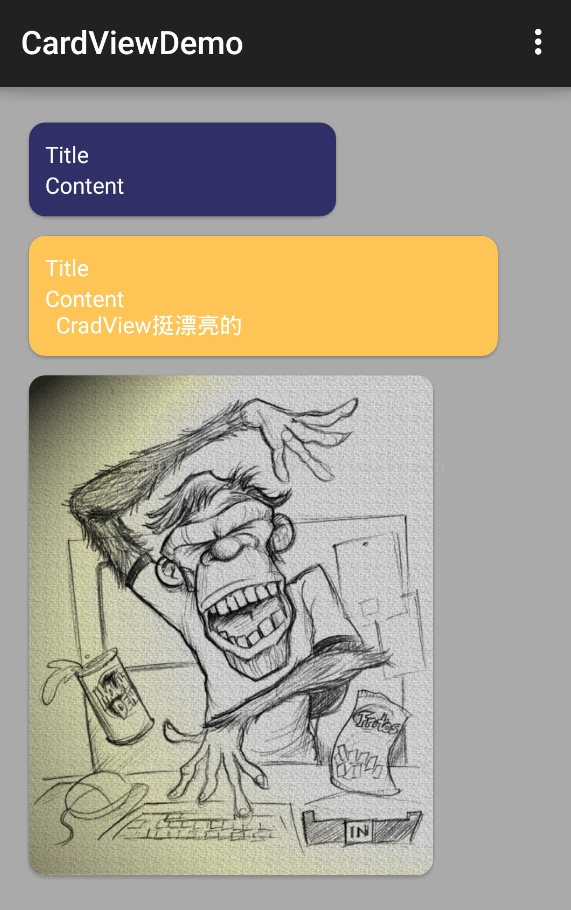
其他的design包下的控件简介:一.简介:CardView则是Google提供的一个卡片式视图组件,继承自FrameLayout类,可以在一个卡片布局中一致性地显示内容,卡片可以包含圆角和阴影。CardView被包装为一种布局,可以布局其他View,并且经常在ListView和RecyclerView的Item布局中,作为一种容器使用。CardView应该被使用在显示层次性的内容时;在显示列表或网格时更应该被选择,因为这些边缘可以使得用户更容易去区分这些内容。所以当我们要进行特殊的UI显示时,比如:
1.边框圆角;
2.有阴影Shadow.
等用来突出个性,比如展览,相册等时,都可以考虑使用CardView.
二.常用属性:
app:cardElevation阴影的大小app:cardMaxElevation阴影最大高度app:cardBackgroundColor卡片的背景色app:cardCornerRadius卡片的圆角大小app:contentPadding卡片内容于边距的间隔- app:contentPaddingBottom
- app:contentPaddingTop
- app:contentPaddingLeft
- app:contentPaddingRight
- app:contentPaddingStart
- app:contentPaddingEnd
app:cardUseCompatPadding设置内边距,V21+的版本和之前的版本仍旧具有一样的计算方式.
app:cardPreventConrerOverlap在V20和之前的版本中添加内边距,这个属性为了防止内容和边角的重叠.
注:在gradle的dependencies中添加:
compile 'com.android.support:cardview-v7:24.0.0'CardView提供了一个默认的elevation(意为CardView的Z轴阴影)和圆角角度,所以每一个卡片都能够在不同的设备上保持相同的外观。然而,你也可以根据自己的需求去定制这些值。注意:cardElevation属性被用来决定阴影的大小以及柔和度,以至于可以逼真的模拟出对于深度效果的描述。
添加波纹点击效果:
默认情况,CardView是不可点击的,并且没有任何的触摸反馈效果。触摸反馈动画在用户点击CardView时可以给用户以视觉上的反馈。为了实现这种行为,你必须提供一下属性:
<android.support.v7.widget.CardView ... android:clickable="true" android:foreground="?android:attr/selectableItemBackground"> ... </android.support.v7.widget.CardView>使用android:foreground=”?android:attr/selectableItemBackground”可以使CardView点击产生波纹的效果,有触摸点向外扩散。
对更早的版本的支持:
在AndroidL之前的设备上,CardView为了支持圆角的效果加上了padding,圆角剪裁操作可以算是很昂贵的操作。相似的,对阴影效果来说,在AndroidL之前,也会提供padding去绘制阴影面积,这些内容的padding是和elevation属性相关的,按照文档:
padding值为:
左右两边的值为:maxCardElevation + (1 - cos45) * cornerRadius
上下两边的值为:maxCardElevation * 1.5 + (1 - cos45) * cornerRadius因此,如果你需要给自己的内容加上padding的话,需要使用新的属性:card_view:contentPadding
相似的,如果改变CardView的背景,也需要使用新的属性:card_view:cardBackgroundColor
示例效果:
TextInputLayout只能包含一一个EditText因此比较麻烦 因此出现了InputTextEditText该控件是用于包裹EditView输入框的,主要解决之前EditView在获得焦点编辑时hint属性提示语消失,这一点在一个页面有多个EditView输入框的时候不是很好,因为很多可能用户在输入多个EditView之后,不知道当前EditView需要输入什么内容。为了解决这一问题,TextInputLayout就此诞生了。TextInputLayout是继承自LinearLayout容器布局,因此我们需要将EditView包含在TextInputLayout之内才可以使用,言外之意:TextInputLayout不能单独使用。TextInputLayout是一个用来包裹EditText的布局,本质上就是一个LinearLayout.它可以在EditText的hint提示信息消失后,用来给用户展示一个浮动的label标签.并且该控件支持展示错误提示信息.
.TextInputEditText:和TextInputLayout类似,Design包还有一个组件TextInputEditText,继承AppCompatEditText,可以在右侧显示出错误信息的小弹窗.用法和TextInputLayout类似,可以直接使用TextInputEditText控件.而且不用设置错误信息消除,重新在TextInputEditText输出会自动取消,什么是 FAB?
FAB 全称:Floating Action Button,是浮动操作按钮,一般作为进阶操作的开关,在用户界面中通常是一个漂浮的小圆圈,它有自身独特的动态效果,比如变形、弹出、位移等等,代表着在当前页面上用户的特定的操作。
App的标准导航菜单实现方式.导航菜单的内容由菜单menu资源文件来填充.
NavigationView通常被放置于一个
DrawerLayout内部.在Material Design中,Navigation drawer导航抽屉,被设计用于应用导航,提供了一种通用的导航方式,体现了设计的一致性。而NavigationView的典型用途就是配合之前v4包的DrawerLayout,作为其中的Drawer部分,即导航菜单的本体部分。NavigationView是一个导航菜单框架,使用menu资源填充数据,使我们可以更简单高效的实现导航菜单。它提供了不错的默认样式、选中项高亮、分组单选、分组子标题、以及可选的Header。
<android.support.v4.widget.DrawerLayoutxmlns:android="http://schemas.android.com/apk/res/android" xmlns:app="http://schemas.android.com/apk/res-auto" android:id="@+id/drawer_layout" android:layout_width="match_parent" android:layout_height="match_parent" android:fitsSystemWindows="true"> <!-- Your contents --> <android.support.design.widget.NavigationView android:id="@+id/navigation" android:layout_width="wrap_content" android:layout_height="match_parent" android:layout_gravity="start" app:menu="@menu/my_navigation_items"/></android.support.v4.widget.DrawerLayout>典型的布局文件如下,外层是DrawerLayout,它的第一个child将作为content,
第二个child作为Drawer.
注意其中NavigationView的两个自定义属性:
1⃣️.app:headerLayout接收一个layout,作为导航菜单顶部的Header,可选项。
2⃣️.app:menu接收一个menu,作为导航菜单的菜单项,几乎是必选项,不然这个控件就失去意义了。但也可以在运行时动态改变menu属性。
我们可以用
setNavigationItemSelectedListener方法来设置当导航项被点击时的回调。
OnNavigationItemSelectedListener会提供给我们被选中的
MenuItem,这与Activity的onOptionsItemSelected非常类似。通过这个回调方法,我们可以处理点击事件,改变item的选中状态,更新页面内容,关闭导航菜
单,以及任何我们需要的操作。示例代码如下:
mNavigationView.setNavigationItemSelectedListener(newNavigationView.OnNavigationItemSelectedListener() {@OverridepublicbooleanonNavigationItemSelected(MenuItem menuItem){if (sNavigationMap.containsKey(menuItem.getItemId())) {menuItem.setChecked(true);// 改变item选中状态setTitle(menuItem.getTitle()); // 改变页面标题,标明导航状态currentNavigationId = menuItem.getItemId();mDrawerLayout.closeDrawers(); // 关闭导航菜单returntrue;} else {returnfalse; } } });关于NavigationView中item的字体颜色和icon选中状态颜色是去当前主题theme中
的
<--正常状态下字体颜色和icon颜色--> <item name="android:textColorPrimary">@android:color/darker_gray</item> <--选中状态icon的颜色和字体颜色--> <item name="colorPrimary">@color/accent_material_light</item>当然你可以通过如下方法或者属性来改变这一状态:
1⃣️.setItemBackgroundResource(int):给menu设置背景资源,对应的属性app:itemBackground.2⃣️.setItemIconTintList(ColorStateList):给menu的icon设置颜色,对应的属性app:itemIconTint.3⃣️.setItemTextColor(ColorStateList):给menu的item设置字体颜色,对应的属性app:itemTextColor.


 扫一扫
扫一扫
 2477
2477

 被折叠的 条评论
为什么被折叠?
被折叠的 条评论
为什么被折叠?
 到【灌水乐园】发言


