


前言
CSS3的滤镜真的是一个非常强大的功能,如果我们能够很好的利用它,并充分发挥我们的想象力,想要制作出非常惊艳的动效也是没有问题的哦。比如:接下来我要跟大家分享的一个巧妙使用CSS滤镜绘制出来的android手机电池充电动效,还是老规矩,小凡我依然分享的是uni-app|view组件版哦。(* ̄︶ ̄) 本文的设计思路参考与【掘金大佬chokcocol的文章】
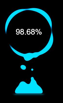
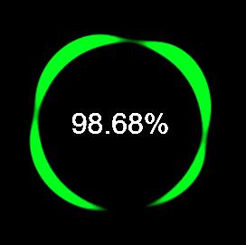
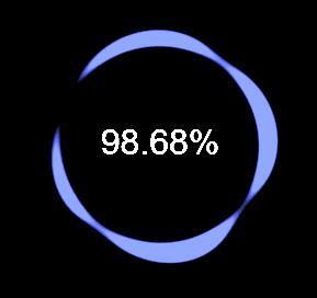
一、效果展示及思路分析
1.效果展示
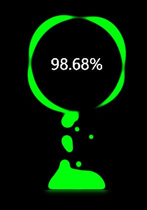
2.思路分析
我们可以将该动效拆成三部分来理解:
第一部分 最上面的圆环以及中间的充电电量百分比,第二部分 中间大小不一的不断上升的气泡,第三部分 最下面的一大块产生气泡的气泡池

二、实现步骤
1.准备工作
在正式开始写代码之前,需要先下载相应的IDE,以及进行必要的配置工作。
小凡在【uni-app项目|vue组件形式实现的科技感loading纯CSS动效】文章中详细讲解过如何进行必要的配置工作,这里就不再重复讲解了,大家可以点击右侧链接查看→科技感Loading动效详解
2.代码实现
(1)在home.vue应用启动页中添加一个布局,引入并注册自定义vue组件,在模版中使用自定义vue组件
<template>
	<view class="container">
		<view><battery></battery></view>
	</view>
</template>

<script>
	import Battery from '@/components/Battery.vue'
	export default {
		components:{
			Battery
		}
	}
</script>

<style>
    /*引入的样式*/
	.container{
		position: relative;
		display: flex;
		justify-content: center;
		align-items: center;
		height: 100vh;
		background-color: #000;
	}
</style>
(4)编写自定义vue组件Battery.vue
说明:样式代码并没有考虑浏览器兼容问题,本代码的测试环境是谷歌浏览器。
- 在模版代码块中,添加相应的view元素
<template>
	<!-- 充电效果最外层容器 -->
	<view class="battery">
		<!-- 旋转的圆环和中间显示的充电量百分比 -->
		<text class="number">98.68%</text>
		<view class="circle"></view>
		<!-- 底层的气泡池 -->
		<view class="bubble-pool"></view>
		<!-- 产生的气泡 -->
		<view class="bubble"></view>
		<view class="bubble"></view>
		<view class="bubble"></view>
		<view class="bubble"></view>
		<view class="bubble"></view>
		<view class="bubble"></view>
		<view class="bubble"></view>
		<view class="bubble"></view>
		<view class="bubble"></view>
		<view class="bubble"></view>
		<view class="bubble"></view>
		<view class="bubble"></view>
		<view class="bubble"></view>
		<view class="bubble"></view>
		<view class="bubble"></view>
		<view class="bubble"></view>
	</view>
</template>- 设置class属性为battery的view元素的样式(充电效果最外层容器),并添加变色动效(容器中所有包含的元素都会添加当前的变色动效)
    /*电池充电效果容器样式及变色动效*/
	.battery{
		position: relative;
		width: 300px;
		height: 400px;
		background-color: #000;
        /*设置元素图像的对比度*/
		filter: contrast(15);
        /*添加变色动效*/
		animation: hueRotate 5s linear infinite;
	}

    /*通过改变元素的色相旋转值,实现颜色的不断变化*/
	@keyframes hueRotate{
		0%{
			filter: contrast(15) hue-rotate(0);
		}
		100%{
			filter: contrast(15) hue-rotate(360deg);
		}
	}
- 绘制旋转的圆环以及充电量百分比文字
    /*设置充电量百分比样式*/
	.number{
		position: absolute;
		top: 12%;
		left: 50%;
		margin-left: -100px;
		width: 200px;
		height: 200px;
		font-size: 32px;
		font-family: Helvetica, 'Hiragino Sans GB', 'Microsoft Yahei', '微软雅黑', Arial, sans-serif;
		line-height: 200px;
		text-align: center;
		color: #fff;
		z-index: 1;
	}
	/*设置圆环容器样式*/
	.circle{
		position: absolute;
		left: 50%;
		top: 0;
		margin-left: -150px;
		width: 300px;
		height: 300px;
        /*设置元素高斯模糊效果*/
		filter: blur(7px);
        /*设置旋转动效*/
		animation: circleRotate 5s linear infinite;
	}

    /*绘制圆环,设置两个伪元素的公共样式*/
	.circle::before,
	.circle::after{
		content: '';
		position: absolute;
		top: 50%;
		left: 50%;
		transform: translate(-50%, -50%);
	}
    /*通过设置两个伪元素不同的大小、背景色以及边框圆角值,再结合元素的高斯模糊和对比度*/
    /*从而绘制出我们想要的圆环图形*/
	.circle::before{
		width: 200px;
		height: 200px;
		background-color: #4CD964;
		border-radius: 42% 38% 62% 49%/45%;
	}
	.circle::after{
		width: 176px;
		height: 178px;
		background-color: #000;
		border-radius: 50%;
	}
    /*设置圆环的旋转动效*/
	@keyframes circleRotate{
		0%{
			transform: rotate(0);
		}
		100%{
			transform: rotate(360deg);
		}
	}
- 重点:绘制气泡池以及不断上升的气泡动效(这里用到了一点点sass方面的知识)
    /*气泡池*/
	.bubble-pool{
		position: absolute;
		bottom: 0;
		left: 50%;
		transform: translate(-50%, 0%);
		width: 120px;
		height: 40px;
		background-color: #4CD964;
		border-radius: 150px 150px 0 0;
        /*设置元素高斯模糊效果,当气泡从这里生成时会产生融合分离的奇妙特效*/
		filter: blur(5px);
	}
	/*气泡*/
	.bubble{
		position: absolute;
		background-color: #4CD964;
		border-radius: 50%;
		transform: translate(-50%, -50%);
        /*设置元素高斯模糊效果,会产生融合分析的奇妙特效*/
		filter: blur(5px);
        /*设置气泡不断上升的动效*/
		animation: bubbleMoveUp 5s ease-in-out infinite;
	}
	/*通过sass的for循环产生随机大小的气泡和动效*/
	@for $i from 0 through 15 {
	    .bubble:nth-child(#{$i}) {
	        $width: 15 + random(15) + px;
			left: 40% + random()*20;
	        width: $width;
	        height: $width;
	        animation: bubbleMoveUp #{random(6) + 3}s ease-in-out -#{random(5000)/1000}s infinite;
	    }
	}
	@keyframes bubbleMoveUp{
		0%{
			bottom: 0;
		}
		100%{
            /*调整气泡结束的位置,将结束位置设置在刚刚到达圆环处*/
			bottom: calc(100% - 260px);
		}
	}

>>点击下载源码
如果喜欢小凡的这篇文章,记得点赞、收藏和分享哦!也欢迎大家在评论区留言。

相关文章推荐:
干货分享|纯CSS绘制电池充电水波纹动效(uni-app|view组件版)
干货分享|三个纯CSS绘制图标的案例带你重新认识CSS的魅力
详细解析:uni-app|vue组件实现会撒娇的旗帜徽章纯CSS动效


 655
655


 被折叠的 条评论
为什么被折叠?
被折叠的 条评论
为什么被折叠?
 到【灌水乐园】发言


