


我们总是为了太多遥不可及的东西去拼命,却忘了人生真正的幸福不过是灯火阑珊处的温暖,柴米油盐的充实,人生无论你赚的钱,是多还是少,经历的事情是好还是坏,都不如过好当下的每一天!
目录
一,定义
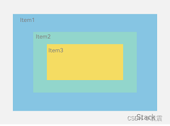
层叠布局(StackLayout)用于在屏幕上预留一块区域来显示组件中的元素,提供元素可以重叠的布局。层叠布局通过Stack容器组件实现位置的固定定位与层叠,容器中的子元素依次入栈,后一个子元素覆盖前一个子元素,子元素可以叠加,也可以设置位置。
层叠布局具有较强的页面层叠、位置定位能力,其使用场景有广告、卡片层叠效果等。
二,开发布局
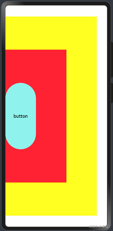
Stack组件为容器组件,容器内可包含各种子元素。其中子元素默认进行居中堆叠。子元素被约束在Stack下,进行自己的样式定义以及排列。
@Entry
@Component
struct StackTest {

  build() {
    Stack(){
      Column(){}.width('90%').height('90%').backgroundColor('#ff2')
      Text('text').width('60%').height('60%').backgroundColor('#f23')
      Button('button').width('30%').height('30%').backgroundColor('#ff8ff3eb').fontColor('#000')
    }.width('100%')
    .height('100%')
  }
}
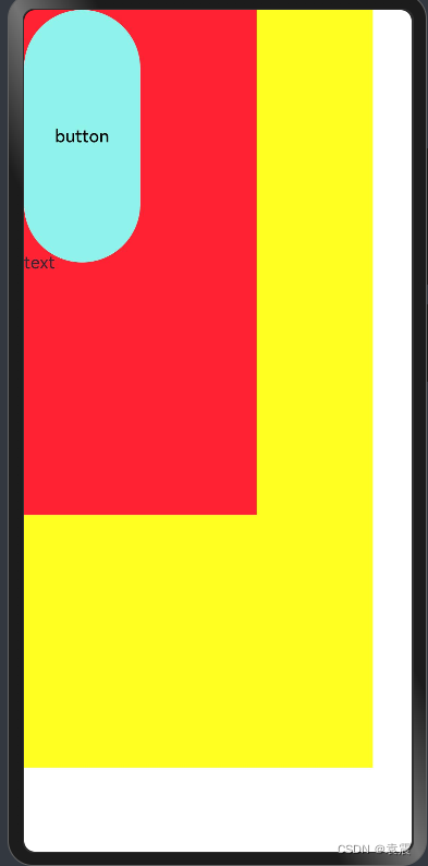
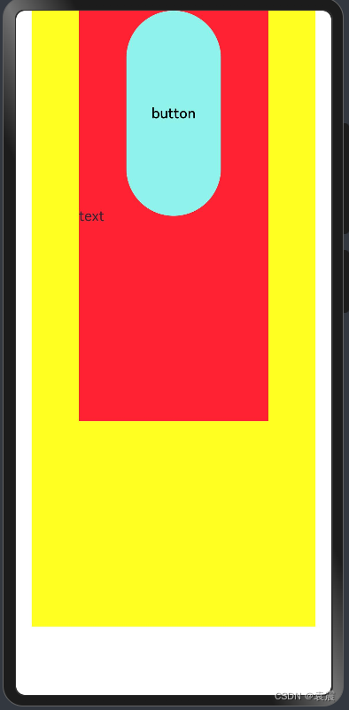
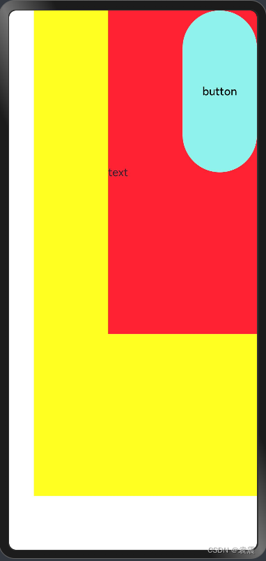
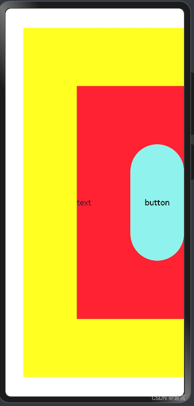
三,对齐方式
3.1 TopStart顶部起始端
@Entry
@Component
struct StackTest {

  build() {
    Stack({alignContent:Alignment.TopStart}){
      Column(){}.width('90%').height('90%').backgroundColor('#ff2')
      Text('text').width('60%').height('60%').backgroundColor('#f23')
      Button('button').width('30%').height('30%').backgroundColor('#ff8ff3eb').fontColor('#000')
    }.width('100%')
    .height('100%')
  }
}
3.2 Top顶部横向居中
@Entry
@Component
struct StackTest {

  build() {
    Stack({alignContent:Alignment.Top}){
      Column(){}.width('90%').height('90%').backgroundColor('#ff2')
      Text('text').width('60%').height('60%').backgroundColor('#f23')
      Button('button').width('30%').height('30%').backgroundColor('#ff8ff3eb').fontColor('#000')
    }.width('100%')
    .height('100%')
  }
}
3.3 TopEnd顶部尾端
@Entry
@Component
struct StackTest {

  build() {
    Stack({alignContent:Alignment.TopEnd}){
      Column(){}.width('90%').height('90%').backgroundColor('#ff2')
      Text('text').width('60%').height('60%').backgroundColor('#f23')
      Button('button').width('30%').height('30%').backgroundColor('#ff8ff3eb').fontColor('#000')
    }.width('100%')
    .height('100%')
  }
}
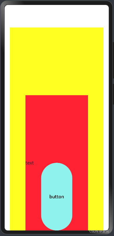
3.4 Start起始端纵向居中
@Entry
@Component
struct StackTest {

  build() {
    Stack({alignContent:Alignment.Start}){
      Column(){}.width('90%').height('90%').backgroundColor('#ff2')
      Text('text').width('60%').height('60%').backgroundColor('#f23')
      Button('button').width('30%').height('30%').backgroundColor('#ff8ff3eb').fontColor('#000')
    }.width('100%')
    .height('100%')
  }
}
3.5 Center横向和纵向居中
@Entry
@Component
struct StackTest {

  build() {
    Stack({alignContent:Alignment.Center}){
      Column(){}.width('90%').height('90%').backgroundColor('#ff2')
      Text('text').width('60%').height('60%').backgroundColor('#f23')
      Button('button').width('30%').height('30%').backgroundColor('#ff8ff3eb').fontColor('#000')
    }.width('100%')
    .height('100%')
  }
}
3.6 End尾端纵向居中
@Entry
@Component
struct StackTest {

  build() {
    Stack({alignContent:Alignment.End}){
      Column(){}.width('90%').height('90%').backgroundColor('#ff2')
      Text('text').width('60%').height('60%').backgroundColor('#f23')
      Button('button').width('30%').height('30%').backgroundColor('#ff8ff3eb').fontColor('#000')
    }.width('100%')
    .height('100%')
  }
}
3.7 BottomStart底部起始端
@Entry
@Component
struct StackTest {

  build() {
    Stack({alignContent:Alignment.BottomStart}){
      Column(){}.width('90%').height('90%').backgroundColor('#ff2')
      Text('text').width('60%').height('60%').backgroundColor('#f23')
      Button('button').width('30%').height('30%').backgroundColor('#ff8ff3eb').fontColor('#000')
    }.width('100%')
    .height('100%')
  }
}
3.8 Bottom底部横向居中
@Entry
@Component
struct StackTest {

  build() {
    Stack({alignContent:Alignment.Bottom}){
      Column(){}.width('90%').height('90%').backgroundColor('#ff2')
      Text('text').width('60%').height('60%').backgroundColor('#f23')
      Button('button').width('30%').height('30%').backgroundColor('#ff8ff3eb').fontColor('#000')
    }.width('100%')
    .height('100%')
  }
}
3.9 BottomEnd底部尾端
@Entry
@Component
struct StackTest {

  build() {
    Stack({alignContent:Alignment.BottomEnd}){
      Column(){}.width('90%').height('90%').backgroundColor('#ff2')
      Text('text').width('60%').height('60%').backgroundColor('#f23')
      Button('button').width('30%').height('30%').backgroundColor('#ff8ff3eb').fontColor('#000')
    }.width('100%')
    .height('100%')
  }
}
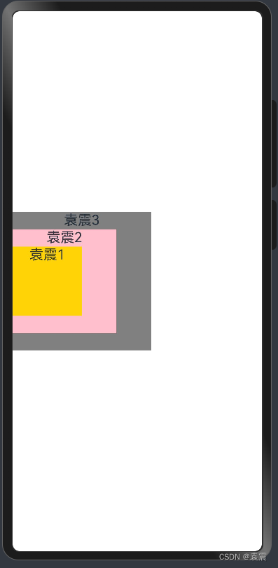
四,Z序控制
Stack容器中兄弟组件显示层级关系可以通过Z序控制的zIndex属性改变。zIndex值越大,显示层级越高,即zIndex值大的组件会覆盖在zIndex值小的组件上方。
在层叠布局中,如果后面子元素尺寸大于前面子元素尺寸,则前面子元素完全隐藏。
@Entry
@Component
struct StackTest {

  build() {
    Stack({alignContent:Alignment.Start}){
      Column() {
        Text('袁震1').textAlign(TextAlign.End).fontSize(20)
      }.width(100).height(100).backgroundColor(0xffd306)

      Column() {
        Text('袁震2').fontSize(20)
      }.width(150).height(150).backgroundColor(Color.Pink)

      Column() {
        Text('袁震3').fontSize(20)
      }.width(200).height(200).backgroundColor(Color.Grey)
    }.width('100%')
    .height('100%')
  }
}
因为袁震3在最上面,且大于袁震1和袁震2,所以只显示袁震3
然后改变Z序:
@Entry
@Component
struct StackTest {

  build() {
    Stack({alignContent:Alignment.Start}){
      Column() {
        Text('袁震1').textAlign(TextAlign.End).fontSize(20)
      }.width(100).height(100).backgroundColor(0xffd306).zIndex(2)

      Column() {
        Text('袁震2').fontSize(20)
      }.width(150).height(150).backgroundColor(Color.Pink).zIndex(1)

      Column() {
        Text('袁震3').fontSize(20)
      }.width(200).height(200).backgroundColor(Color.Grey)
    }.width('100%')
    .height('100%')
  }
}
这样就都显示出来了


 671
671


 被折叠的 条评论
为什么被折叠?
被折叠的 条评论
为什么被折叠?
 到【灌水乐园】发言


