


Flutter按钮控件小结
在 Flutter 中,按钮控件是非常重要的一类控件,它们用于触发事件和操作。以下是一些常见的按钮控件及其简单示例:
ElevatedButton
ElevatedButton 是一个带有阴影效果的按钮,通常用于强调主要操作。
属性解析
const ElevatedButton({
    super.key,
    required super.onPressed,
    super.onLongPress,
    super.onHover,
    super.onFocusChange,
    super.style,
    super.focusNode,
    super.autofocus = false,
    super.clipBehavior = Clip.none,
    super.statesController,
    required super.child,
  })
- key: 控件的唯一标识符,用于在 Widget 树中区分不同控件。
- onPressed: 按钮被点击时触发的回调函数,必需字段。
- onLongPress: 按钮被长按时触发的回调函数。
- onHover: 当鼠标悬停在按钮上时触发的回调函数,只在支持指针设备的平台上有效(如 Web)。
- onFocusChange: 当按钮获得或失去焦点时触发的回调函数。
- style: 用于自定义按钮外观的样式,例如颜色、大小、形状等。
- focusNode: 按钮的焦点节点,用于管理焦点。
- autofocus: 一个布尔值,指示按钮是否应该自动获得焦点,默认值为 false。
- clipBehavior: 决定子控件如何被剪裁,默认值为 Clip.none,选值包括 Clip.none、Clip.hardEdge、Clip.antiAlias 和 Clip.antiAliasWithSaveLayer。
- statesController: 控制按钮状态的对象。
- child: 按钮的子控件,通常是一个文本或图标,必需字段。
示例
class ButtonDemo extends StatelessWidget {
  @override
  Widget build(BuildContext context) {
    return Scaffold(
      appBar: AppBar(title: Text('Button Example')),
      body: Center(
        child: ElevatedButton(
          key: ValueKey('elevated_button'),
          onPressed: () {
            print('Button Pressed');
          },
          onLongPress: () {
            print('Button Long Pressed');
          },
          onHover: (isHovering) {
            print(isHovering ? 'Hovering' : 'Not Hovering');
          },
          onFocusChange: (hasFocus) {
            print(hasFocus ? 'Focused' : 'Not Focused');
          },
          style: ButtonStyle(
            backgroundColor: MaterialStateProperty.all<Color>(Colors.blue),
            foregroundColor: MaterialStateProperty.all<Color>(Colors.white),
            padding: MaterialStateProperty.all<EdgeInsets>(
              EdgeInsets.symmetric(horizontal: 24.0, vertical: 12.0),
            ),
            shape: MaterialStateProperty.all<RoundedRectangleBorder>(
              RoundedRectangleBorder(borderRadius: BorderRadius.circular(8.0)),
            ),
          ),
          focusNode: FocusNode(),
          autofocus: true,
          clipBehavior: Clip.antiAlias,
          statesController: MaterialStatesController(),
          child: Row(
            mainAxisSize: MainAxisSize.min,
            children: [
              Icon(Icons.thumb_up),
              SizedBox(width: 8.0),
              Text('Like'),
            ],
          ),
        ),
      ),
    );
  }
}

TextButton
TextButton 是一个没有阴影和边框的扁平按钮,适合次要操作或在工具栏中使用。
属性解析
const TextButton({
    super.key,
    required super.onPressed,
    super.onLongPress,
    super.onHover,
    super.onFocusChange,
    super.style,
    super.focusNode,
    super.autofocus = false,
    super.clipBehavior = Clip.none,
    super.statesController,
    super.isSemanticButton,
    required Widget super.child,
  })
- key: 控件的唯一标识符,用于在 Widget 树中区分不同控件。
- onPressed: 按钮被点击时触发的回调函数,必需字段。
- onLongPress: 按钮被长按时触发的回调函数。
- onHover: 当鼠标悬停在按钮上时触发的回调函数,只在支持指针设备的平台上有效(如 Web)。
- onFocusChange: 当按钮获得或失去焦点时触发的回调函数。
- style: 用于自定义按钮外观的样式,例如颜色、大小、形状等。
- focusNode: 按钮的焦点节点,用于管理焦点。
- autofocus: 一个布尔值,指示按钮是否应该自动获得焦点,默认值为 false。
- clipBehavior: 决定子控件如何被剪裁,默认值为 Clip.none。
- statesController: 控制按钮状态的对象。
- isSemanticButton: 指定按钮是否应被视为语义按钮,这对于辅助功能非常有用。
- child: 按钮的子控件,通常是一个文本或图标,必需字段。
示例
class ButtonDemo extends StatelessWidget {
@override
Widget build(BuildContext context) {
  return Scaffold(
    appBar: AppBar(title: Text('Button Example')),
    body: Center(
      child: TextButton(
        key: ValueKey('text_button'),
        onPressed: () {
          print('Button Pressed');
        },
        onLongPress: () {
          print('Button Long Pressed');
        },
        onHover: (isHovering) {
          print(isHovering ? 'Hovering' : 'Not Hovering');
        },
        onFocusChange: (hasFocus) {
          print(hasFocus ? 'Focused' : 'Not Focused');
        },
        style: ButtonStyle(
          backgroundColor:
              MaterialStateProperty.all<Color>(Colors.blue.withOpacity(0.1)),
          foregroundColor: MaterialStateProperty.all<Color>(Colors.blue),
          padding: MaterialStateProperty.all<EdgeInsets>(
            EdgeInsets.symmetric(horizontal: 24.0, vertical: 12.0),
          ),
          shape: MaterialStateProperty.all<RoundedRectangleBorder>(
            RoundedRectangleBorder(borderRadius: BorderRadius.circular(8.0)),
          ),
        ),
        focusNode: FocusNode(),
        autofocus: true,
        clipBehavior: Clip.antiAlias,
        statesController: MaterialStatesController(),
        isSemanticButton: true,
        child: Row(
          mainAxisSize: MainAxisSize.min,
          children: [
            Icon(Icons.thumb_up),
            SizedBox(width: 8.0),
            Text('Like'),
          ],
        ),
      ),
    ),
  );
}
}

OutlinedButton
OutlinedButton 是一个带有边框的按钮,在强调操作但不至于抢眼时使用。
属性解析
const OutlinedButton({
    super.key,
    required super.onPressed,
    super.onLongPress,
    super.onHover,
    super.onFocusChange,
    super.style,
    super.focusNode,
    super.autofocus = false,
    super.clipBehavior = Clip.none,
    super.statesController,
    required super.child,
  })
- key: 控件的唯一标识符,用于在 Widget 树中区分不同控件。
- onPressed: 按钮被点击时触发的回调函数,必需字段。
- onLongPress: 按钮被长按时触发的回调函数。
- onHover: 当鼠标悬停在按钮上时触发的回调函数,只在支持指针设备的平台上有效(如 Web)。
- onFocusChange: 当按钮获得或失去焦点时触发的回调函数。
- style: 用于自定义按钮外观的样式,例如颜色、大小、形状等。
- focusNode: 按钮的焦点节点,用于管理焦点。
- autofocus: 一个布尔值,指示按钮是否应该自动获得焦点,默认值为 false。
- clipBehavior: 决定子控件如何被剪裁,默认值为 Clip.none。
- statesController: 控制按钮状态的对象。
- child: 按钮的子控件,通常是一个文本或图标,必需字段。
示例
class ButtonDemo extends StatelessWidget {
  @override
  Widget build(BuildContext context) {
    return Scaffold(
      appBar: AppBar(title: Text('Button Example')),
      body: Center(
        child: OutlinedButton(
          key: ValueKey('outlined_button'),
          onPressed: () {
            print('Button Pressed');
          },
          onLongPress: () {
            print('Button Long Pressed');
          },
          onHover: (isHovering) {
            print(isHovering ? 'Hovering' : 'Not Hovering');
          },
          onFocusChange: (hasFocus) {
            print(hasFocus ? 'Focused' : 'Not Focused');
          },
          style: ButtonStyle(
            side: MaterialStateProperty.all<BorderSide>(
              BorderSide(color: Colors.blue, width: 2.0),
            ),
            padding: MaterialStateProperty.all<EdgeInsets>(
              EdgeInsets.symmetric(horizontal: 24.0, vertical: 12.0),
            ),
            shape: MaterialStateProperty.all<RoundedRectangleBorder>(
              RoundedRectangleBorder(borderRadius: BorderRadius.circular(8.0)),
            ),
            foregroundColor: MaterialStateProperty.all<Color>(Colors.blue),
          ),
          focusNode: FocusNode(),
          autofocus: true,
          clipBehavior: Clip.antiAlias,
          statesController: MaterialStatesController(),
          child: Row(
            mainAxisSize: MainAxisSize.min,
            children: [
              Icon(Icons.thumb_up, color: Colors.blue),
              SizedBox(width: 8.0),
              Text('Like'),
            ],
          ),
        ),
      ),
    );
  }
}

IconButton
IconButton 是一个只包含图标的按钮,适用于需要紧凑空间的地方,如工具栏和导航栏。
属性解析
const IconButton({
    super.key,
    this.iconSize,
    this.visualDensity,
    this.padding,
    this.alignment,
    this.splashRadius,
    this.color,
    this.focusColor,
    this.hoverColor,
    this.highlightColor,
    this.splashColor,
    this.disabledColor,
    required this.onPressed,
    this.mouseCursor,
    this.focusNode,
    this.autofocus = false,
    this.tooltip,
    this.enableFeedback,
    this.constraints,
    this.style,
    this.isSelected,
    this.selectedIcon,
    required this.icon,
  })
- key: 控件的唯一标识符,用于在 Widget 树中区分不同控件。
- iconSize: 图标的大小,以像素为单位。
- visualDensity: 视觉密度,影响组件的紧凑程度。
- padding: 按钮内部的填充,通常用于调整按钮的触摸区域。
- alignment: 控制图标在按钮内的对齐方式。
- splashRadius: 点击波纹效果的半径。
- color: 图标的颜色。
- focusColor: 按钮获得焦点时的颜色。
- hoverColor: 鼠标悬停在按钮上时的颜色。
- highlightColor: 按钮被按住时的颜色。
- splashColor: 点击波纹效果的颜色。
- disabledColor: 按钮不可点击时的颜色。
- onPressed: 按钮被点击时触发的回调函数,必需字段。
- mouseCursor: 鼠标悬停在按钮上时的光标样式。
- focusNode: 按钮的焦点节点,用于管理焦点。
- autofocus: 一个布尔值,指示按钮是否应该自动获得焦点,默认值为 false。
- tooltip: 当用户长按或悬停在按钮上时显示的提示信息。
- enableFeedback: 一个布尔值,指示是否启用点击反馈(如振动或声音),默认为 true。
- constraints: 用于调整按钮大小和布局的约束。
- style: 自定义按钮外观的样式。
- isSelected: 一个布尔值,指示按钮是否被选中。
- selectedIcon: 当按钮被选中时显示的图标。
- icon: 按钮的图标,必需字段。
示例
class ButtonDemo extends StatelessWidget {
  @override
  Widget build(BuildContext context) {
    return Scaffold(
      appBar: AppBar(title: Text('Button Example')),
      body: Center(
        child: IconButton(
          key: ValueKey('icon_button'),
          iconSize: 30.0,
          visualDensity: VisualDensity.standard,
          padding: EdgeInsets.all(8.0),
          alignment: Alignment.center,
          splashRadius: 24.0,
          color: Colors.blue,
          focusColor: Colors.red,
          hoverColor: Colors.green,
          highlightColor: Colors.yellow,
          splashColor: Colors.purple,
          disabledColor: Colors.grey,
          onPressed: () {
            print('Icon Button Pressed');
          },
          mouseCursor: SystemMouseCursors.click,
          focusNode: FocusNode(),
          autofocus: true,
          tooltip: 'Thumb Up',
          enableFeedback: true,
          constraints: BoxConstraints(
            minWidth: 48.0,
            minHeight: 48.0,
          ),
          style: ButtonStyle(
            overlayColor:
                MaterialStateProperty.all<Color>(Colors.pink.withOpacity(0.2)),
          ),
          isSelected: false,
          selectedIcon: Icon(Icons.thumb_up_alt),
          icon: Icon(Icons.thumb_up),
        ),
      ),
    );
  }
}

FloatingActionButton
FloatingActionButton 是一个圆形的悬浮按钮,通常用于突出显示应用中的主要操作。
属性解析
const FloatingActionButton({
    super.key,
    this.child,
    this.tooltip,
    this.foregroundColor,
    this.backgroundColor,
    this.focusColor,
    this.hoverColor,
    this.splashColor,
    this.heroTag = const _DefaultHeroTag(),
    this.elevation,
    this.focusElevation,
    this.hoverElevation,
    this.highlightElevation,
    this.disabledElevation,
    required this.onPressed,
    this.mouseCursor,
    this.mini = false,
    this.shape,
    this.clipBehavior = Clip.none,
    this.focusNode,
    this.autofocus = false,
    this.materialTapTargetSize,
    this.isExtended = false,
    this.enableFeedback,
  })
- key: 控件的唯一标识符,用于在 Widget 树中区分不同控件。
- child: 按钮的子控件,通常是一个图标或文本。
- tooltip: 当用户长按或悬停在按钮上时显示的提示信息。
- foregroundColor: 图标或文字的颜色。
- backgroundColor: 按钮背景色。
- focusColor: 按钮获得焦点时的颜色。
- hoverColor: 鼠标悬停在按钮上时的颜色。
- splashColor: 点击波纹效果的颜色。
- heroTag: 用于 Hero 动画的标签,默认为 _DefaultHeroTag()。
- elevation: 按钮的阴影高度。
- focusElevation: 按钮获得焦点时的阴影高度。
- hoverElevation: 鼠标悬停在按钮上时的阴影高度。
- highlightElevation: 按钮被按住时的阴影高度。
- disabledElevation: 按钮不可点击时的阴影高度。
- onPressed: 按钮被点击时触发的回调函数,必需字段。
- mouseCursor: 鼠标悬停在按钮上时的光标样式。
- mini: 一个布尔值,指示按钮是否为小尺寸版本,默认值为 false。
- shape: 定义按钮的形状。
- clipBehavior: 决定子控件如何被剪裁,默认值为 Clip.none。
- focusNode: 按钮的焦点节点,用于管理焦点。
- autofocus: 一个布尔值,指示按钮是否应该自动获得焦点,默认值为 false。
- materialTapTargetSize: 控制触摸目标的大小,可能值为 MaterialTapTargetSize.padded 或 - MaterialTapTargetSize.shrinkWrap。
- isExtended: 一个布尔值,指示按钮是否应延展,默认值为 false。
- enableFeedback: 一个布尔值,指示是否启用点击反馈(如振动或声音),默认为 true。
示例
class ButtonDemo extends StatelessWidget {
  @override
  Widget build(BuildContext context) {
    return Scaffold(
      appBar: AppBar(title: Text('Button Example')),
      body: Center(
        child: FloatingActionButton(
          key: ValueKey('fab'),
          onPressed: () {
            print('FAB Pressed');
          },
          child: Icon(Icons.add),
          tooltip: 'Add',
          foregroundColor: Colors.white,
          backgroundColor: Colors.blue,
          focusColor: Colors.red,
          hoverColor: Colors.green,
          splashColor: Colors.yellow,
          heroTag: 'fab1',
          elevation: 6.0,
          focusElevation: 8.0,
          hoverElevation: 10.0,
          highlightElevation: 12.0,
          disabledElevation: 4.0,
          mouseCursor: SystemMouseCursors.click,
          mini: false,
          shape:
              RoundedRectangleBorder(borderRadius: BorderRadius.circular(16.0)),
          clipBehavior: Clip.antiAlias,
          focusNode: FocusNode(),
          autofocus: false,
          materialTapTargetSize: MaterialTapTargetSize.padded,
          isExtended: true,
          enableFeedback: true,
        ),
      ),
    );
  }
}

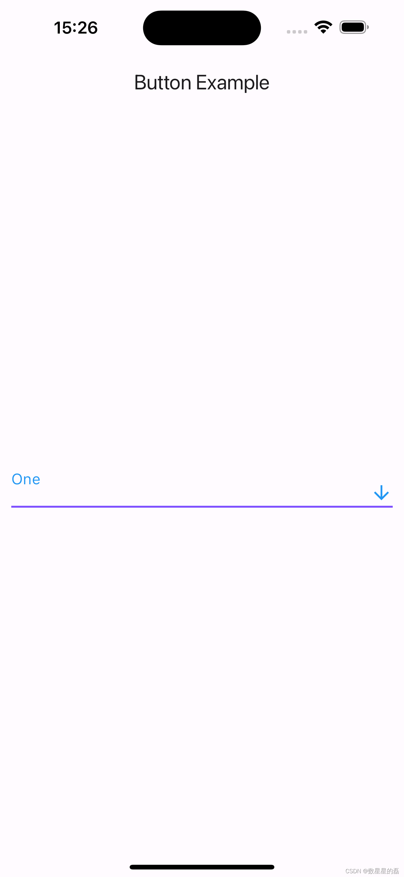
DropdownButton
DropdownButton 是一个下拉菜单按钮,可以从多个选项中进行选择。
属性解析
DropdownButton({
    super.key,
    required this.items,
    this.selectedItemBuilder,
    this.value,
    this.hint,
    this.disabledHint,
    required this.onChanged,
    this.onTap,
    this.elevation = 8,
    this.style,
    this.underline,
    this.icon,
    this.iconDisabledColor,
    this.iconEnabledColor,
    this.iconSize = 24.0,
    this.isDense = false,
    this.isExpanded = false,
    this.itemHeight = kMinInteractiveDimension,
    this.focusColor,
    this.focusNode,
    this.autofocus = false,
    this.dropdownColor,
    this.menuMaxHeight,
    this.enableFeedback,
    this.alignment = AlignmentDirectional.centerStart,
    this.borderRadius,
    this.padding,
    // When adding new arguments, consider adding similar arguments to
    // DropdownButtonFormField.
  })
- key: 控件的唯一标识符,用于在 Widget 树中区分不同控件。
- items: 下拉菜单的所有选项,是一个 List<DropdownMenuItem> 类型的必需字段。
- selectedItemBuilder: 用于自定义选中项的显示方式。
- value: 当前选中的值。
- hint: 按钮显示在没有选中任何值时的提示小部件。
- disabledHint: 当按钮被禁用时显示的提示小部件。
- onChanged: 当用户选择一个新值时触发的回调函数,必需字段。
- onTap: 当按钮被点击但未展开时触发的回调函数。
- elevation: 菜单的阴影高度,默认值为 8。
- style: 用于文本样式的 TextStyle。
- underline: 按钮下方的装饰线。
- icon: 下拉按钮右侧的图标。
- iconDisabledColor: 当按钮被禁用时图标的颜色。
- iconEnabledColor: 当按钮可用时图标的颜色。
- iconSize: 图标的大小,默认值为 24.0。
- isDense: 一个布尔值,指示按钮是否为密集布局,默认值为 false。
- isExpanded: 一个布尔值,指示按钮是否应该扩展以填充其父容器,默认值为 false。
- itemHeight: 菜单项的高度,默认值为 kMinInteractiveDimension。
- focusColor: 按钮获得焦点时的颜色。
- focusNode: 按钮的焦点节点,用于管理焦点。
- autofocus: 一个布尔值,指示按钮是否应该自动获得焦点,默认值为 false。
- dropdownColor: 下拉菜单的背景颜色。
- menuMaxHeight: 下拉菜单的最大高度。
- enableFeedback: 一个布尔值,指示是否启用点击反馈(如振动或声音),默认为 true。
- alignment: 菜单项的对齐方式,默认值为 AlignmentDirectional.centerStart。
- borderRadius: 下拉菜单的边框圆角。
- padding: 按钮内容的内边距。
示例
class ButtonDemo extends StatelessWidget {
@override
Widget build(BuildContext context) {
return Scaffold(
appBar: AppBar(title: Text('Button Example')),
body: Center(
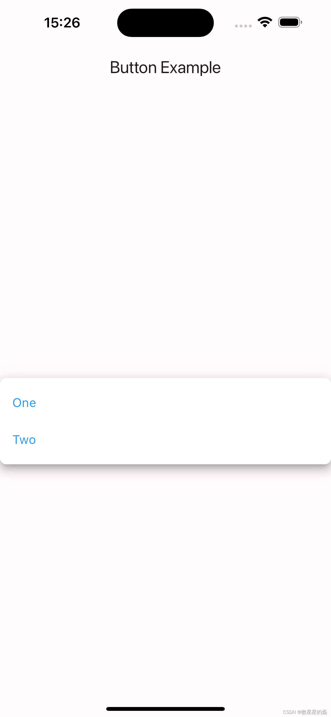
child: DropdownButton<String>(
key: ValueKey('dropdown_button'),
items: [
DropdownMenuItem(
value: 'One',
child: Text('One'),
),
DropdownMenuItem(
value: 'Two',
child: Text('Two'),
),
],
selectedItemBuilder: (BuildContext context) {
return [
Text('One'),
Text('Two'),
];
},
value: 'One',
hint: Text('Select an item'),
disabledHint: Text('Disabled'),
onChanged: (String? newValue) {
print('Selected Value: $newValue');
},
onTap: () {
print('Dropdown tapped');
},
elevation: 8,
style: TextStyle(color: Colors.blue, fontSize: 16),
underline: Container(
height: 2,
color: Colors.deepPurpleAccent,
),
icon: Icon(Icons.arrow_downward),
iconDisabledColor: Colors.grey,
iconEnabledColor: Colors.blue,
iconSize: 24,
isDense: false,
isExpanded: true,
itemHeight: 48.0,
focusColor: Colors.red,
focusNode: FocusNode(),
autofocus: true,
dropdownColor: Colors.white,
menuMaxHeight: 200.0,
enableFeedback: true,
alignment: AlignmentDirectional.centerStart,
borderRadius: BorderRadius.circular(8.0),
padding: EdgeInsets.symmetric(horizontal: 12.0),
),
),
);
}
}
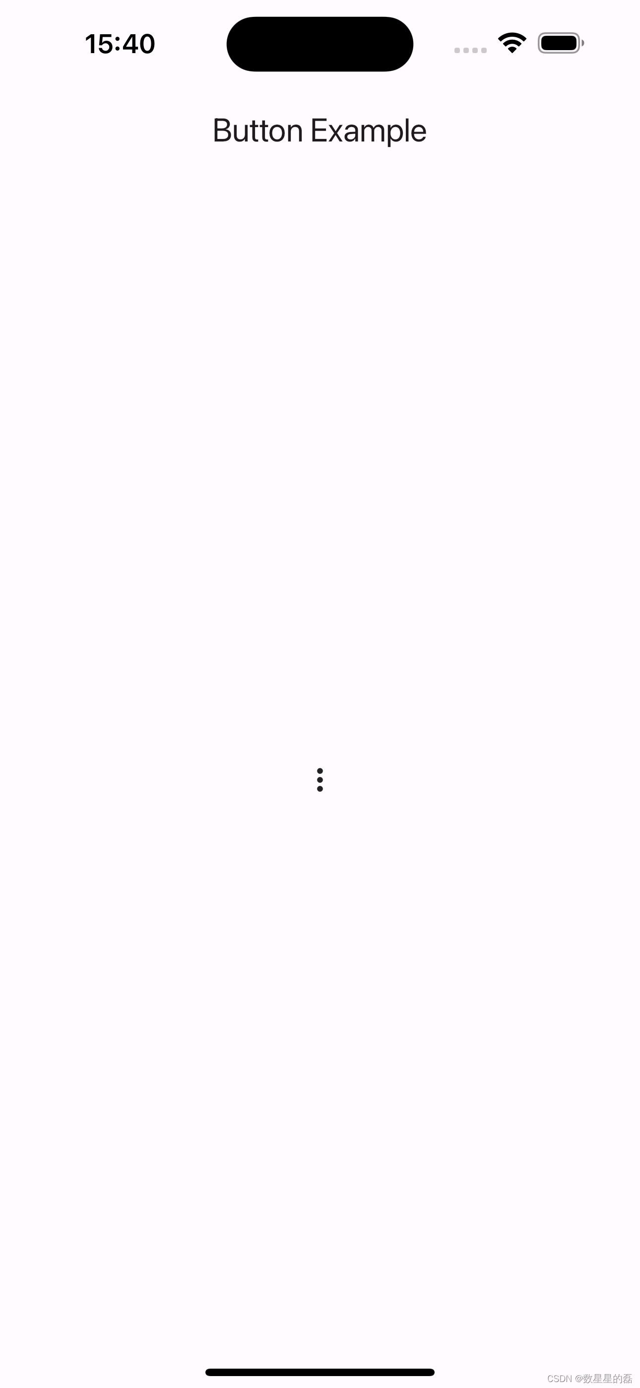
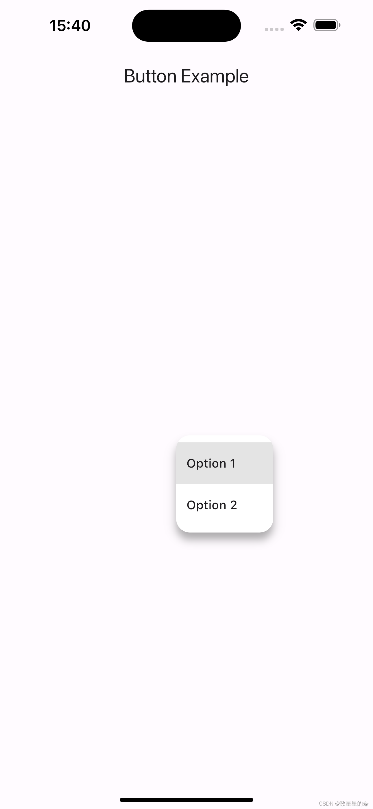
PopupMenuButton
PopupMenuButton 是一个弹出菜单按钮,可以让用户从多个选项中进行选择,并且菜单会覆盖在其他内容之上。
属性解析
const PopupMenuButton({
    super.key,
    required this.itemBuilder,
    this.initialValue,
    this.onOpened,
    this.onSelected,
    this.onCanceled,
    this.tooltip,
    this.elevation,
    this.shadowColor,
    this.surfaceTintColor,
    this.padding = const EdgeInsets.all(8.0),
    this.child,
    this.splashRadius,
    this.icon,
    this.iconSize,
    this.offset = Offset.zero,
    this.enabled = true,
    this.shape,
    this.color,
    this.iconColor,
    this.enableFeedback,
    this.constraints,
    this.position,
    this.clipBehavior = Clip.none,
    this.useRootNavigator = false,
    this.popUpAnimationStyle,
  })
- key: 控件的唯一标识符,用于在 Widget 树中区分不同控件。
- itemBuilder: 一个回调函数,用于生成菜单项,是一个必需字段。
- initialValue: 菜单初始选中的值。
- onOpened: 当菜单被打开时触发的回调函数。
- onSelected: 当用户选择一个值时触发的回调函数。
- onCanceled: 当菜单被取消时触发的回调函数。
- tooltip: 当用户长按或悬停在按钮上时显示的提示信息。
- elevation: 菜单的阴影高度。
- shadowColor: 阴影的颜色。
- surfaceTintColor: 菜单表面的颜色。
- padding: 按钮内容的内边距,默认值为 EdgeInsets.all(8.0)。
- child: 按钮的子组件。
- splashRadius: 点击波纹效果的半径。
- icon: 按钮右侧的图标。
- iconSize: 图标的大小。
- offset: 菜单相对于按钮的偏移量,默认值为 Offset.zero。
- enabled: 一个布尔值,指示按钮是否可用,默认值为 true。
- shape: 菜单的形状。
- color: 菜单的背景颜色。
- iconColor: 图标的颜色。
- enableFeedback: 一个布尔值,指示是否启用点击反馈(如振动或声音)。
- constraints: 用于调整菜单的大小和布局的约束条件。
- position: 菜单的位置,可能值有 PopupMenuPosition.over 和 PopupMenuPosition.under。
- clipBehavior: 决定子组件如何被剪裁,默认值为 Clip.none。
- useRootNavigator: 一个布尔值,指示是否使用根导航器显示菜单,默认值为 false。
- popUpAnimationStyle: 控制弹出菜单动画样式。
示例
class ButtonDemo extends StatelessWidget {
  @override
  Widget build(BuildContext context) {
    return Scaffold(
      appBar: AppBar(title: Text('Button Example')),
      body: Center(
        child: PopupMenuButton<int>(
          key: ValueKey('popup_menu_button'),
          itemBuilder: (BuildContext context) => <PopupMenuEntry<int>>[
            const PopupMenuItem<int>(
              value: 1,
              child: Text('Option 1'),
            ),
            const PopupMenuItem<int>(
              value: 2,
              child: Text('Option 2'),
            ),
          ],
          initialValue: 1,
          onOpened: () {
            print('Menu opened');
          },
          onSelected: (int value) {
            print('Selected value: $value');
          },
          onCanceled: () {
            print('Menu canceled');
          },
          tooltip: 'Show menu',
          elevation: 8,
          shadowColor: Colors.grey,
          surfaceTintColor: Colors.white,
          padding: EdgeInsets.symmetric(horizontal: 12.0),
          child: Icon(Icons.more_vert),
          splashRadius: 20.0,
          // icon: Icon(Icons.menu),
          iconSize: 24.0,
          offset: Offset(0, 10),
          enabled: true,
          shape: RoundedRectangleBorder(
            borderRadius: BorderRadius.circular(16.0),
          ),
          color: Colors.white,
          iconColor: Colors.blue,
          enableFeedback: true,
          constraints: BoxConstraints(
            minWidth: 100,
            maxHeight: 200,
          ),
          position: PopupMenuPosition.over,
          clipBehavior: Clip.antiAlias,
          useRootNavigator: false,
          popUpAnimationStyle: AnimationStyle(curve: Curves.easeInOut),
        ),
      ),
    );
  }
}
BackButton
BackButton 是一个方便的返回按钮,用于导航回到上一页。
属性解析
const BackButton({
    super.key,
    super.color,
    super.style,
    super.onPressed,
  })
- key: 控件的唯一标识符,用于在 Widget 树中区分不同控件。
- color: 按钮图标的颜色。
- style: 按钮的样式,包含颜色、大小等属性(继承自 IconButton)。
- onPressed: 当按钮被点击时触发的回调函数,如果没有提供,则默认行为是调用 Navigator.maybePop 返回到前一个页面。
示例
class ButtonDemo extends StatelessWidget {
  @override
  Widget build(BuildContext context) {
    return Scaffold(
      appBar: AppBar(title: Text('Button Example')),
      body: Center(
        child: BackButton(
          key: ValueKey('back_button'),
          color: Colors.blue,
          style: ButtonStyle(
              // 例如,可以使用 style 属性设置更多细节样式
              ),
          onPressed: () {
            print('Back button pressed');
            Navigator.of(context).pop(); // 手动处理返回操作
          },
        ),
      ),
    );
  }
}

CloseButton
CloseButton 是一个关闭按钮,通常用于模态对话框或抽屉。
属性解析
const CloseButton({ super.key, super.color, super.onPressed, super.style })
- key: 控件的唯一标识符,用于在 Widget 树中区分不同控件。
- color: 按钮图标的颜色。
- onPressed: 当按钮被点击时触发的回调函数,如果没有提供,则默认行为是调用 Navigator.maybePop 以关闭当前页面。
- style: 按钮的样式,包括颜色、大小等属性(继承自 IconButton)
示例
class ButtonDemo extends StatelessWidget {
  @override
  Widget build(BuildContext context) {
    return Scaffold(
      appBar: AppBar(title: Text('Button Example')),
      body: Center(
        child: CloseButton(
          key: ValueKey('close_button'),
          color: Colors.red,
          style: ButtonStyle(
              // 可以通过 style 属性设置更多细节样式
              ),
          onPressed: () {
            print('Close button pressed');
            Navigator.of(context).pop(); // 手动处理关闭操作
          },
        ),
      ),
    );
  }
}

RawMaterialButton
RawMaterialButton 是一个高度可定制的按钮,允许你完全控制其外观和行为。以下是 RawMaterialButton 的构造函数及其参数的详细解释,以及一些示例代码。
属性解析
const RawMaterialButton({
    super.key,
    required this.onPressed,
    this.onLongPress,
    this.onHighlightChanged,
    this.mouseCursor,
    this.textStyle,
    this.fillColor,
    this.focusColor,
    this.hoverColor,
    this.highlightColor,
    this.splashColor,
    this.elevation = 2.0,
    this.focusElevation = 4.0,
    this.hoverElevation = 4.0,
    this.highlightElevation = 8.0,
    this.disabledElevation = 0.0,
    this.padding = EdgeInsets.zero,
    this.visualDensity = VisualDensity.standard,
    this.constraints = const BoxConstraints(minWidth: 88.0, minHeight: 36.0),
    this.shape = const RoundedRectangleBorder(),
    this.animationDuration = kThemeChangeDuration,
    this.clipBehavior = Clip.none,
    this.focusNode,
    this.autofocus = false,
    MaterialTapTargetSize? materialTapTargetSize,
    this.child,
    this.enableFeedback = true,
  })
key: 控件的唯一标识符,用于在 Widget 树中区分不同控件。
onPressed: 当按钮被点击时触发的回调函数,是必需的。
onLongPress: 当按钮被长按时触发的回调函数。
onHighlightChanged: 按钮高亮状态变化时触发的回调函数。
mouseCursor: 鼠标悬停在按钮上时显示的光标。
textStyle: 按钮文本的样式。
fillColor: 按钮的背景颜色。
focusColor: 按钮获得焦点时的颜色。
hoverColor: 鼠标悬停在按钮上时的颜色。
highlightColor: 按钮被点击时的高亮颜色。
splashColor: 按钮点击后的波纹效果颜色。
elevation: 按钮的默认阴影高度。
focusElevation: 按钮获得焦点时的阴影高度。
hoverElevation: 鼠标悬停在按钮上时的阴影高度。
highlightElevation: 按钮被点击时的阴影高度。
disabledElevation: 按钮禁用时的阴影高度。
padding: 按钮内容的内边距,默认值为 EdgeInsets.zero。
visualDensity: 用于调整按钮布局的视觉密度。
constraints: 用于调整按钮大小和布局的约束条件,默认最小宽度 88.0 和最小高度 36.0。
shape: 按钮的形状,默认值为 RoundedRectangleBorder。
animationDuration: 按钮动画的持续时间。
clipBehavior: 描述子组件如何被剪裁。
focusNode: 按钮的焦点节点。
autofocus: 是否自动获取焦点,默认值为 false。
materialTapTargetSize: 按钮的点击目标尺寸。
child: 按钮的子组件。
enableFeedback: 是否启用点击反馈(如振动或声音),默认值为 true。
示例
class ButtonDemo extends StatelessWidget {
  @override
  Widget build(BuildContext context) {
    return Scaffold(
      appBar: AppBar(title: Text('Button Example')),
      body: Center(
        child: RawMaterialButton(
          key: ValueKey('raw_material_button'),
          onPressed: () {
            print('RawMaterialButton pressed');
          },
          onLongPress: () {
            print('RawMaterialButton long pressed');
          },
          onHighlightChanged: (bool isHighlighted) {
            print('Button highlight state changed to $isHighlighted');
          },
          mouseCursor: SystemMouseCursors.click,
          textStyle: TextStyle(color: Colors.white),
          fillColor: Colors.blue,
          focusColor: Colors.green,
          hoverColor: Colors.yellow,
          highlightColor: Colors.red,
          splashColor: Colors.orange,
          elevation: 2.0,
          focusElevation: 4.0,
          hoverElevation: 4.0,
          highlightElevation: 8.0,
          disabledElevation: 1.0,
          padding: EdgeInsets.all(16.0),
          visualDensity: VisualDensity.compact,
          constraints: BoxConstraints(
            minWidth: 100.0,
            minHeight: 50.0,
          ),
          shape: RoundedRectangleBorder(
            borderRadius: BorderRadius.circular(12.0),
          ),
          animationDuration: Duration(milliseconds: 200),
          clipBehavior: Clip.antiAlias,
          focusNode: FocusNode(),
          autofocus: true,
          materialTapTargetSize: MaterialTapTargetSize.padded,
          child: Text('Custom Raw Material Button'),
          enableFeedback: true,
        ),
      ),
    );
  }
}

CupertinoButton
遵循 iOS 风格设计的按钮,用于创建平台一致性的应用。
属性解析
const CupertinoButton({
    super.key,
    required this.child,
    this.padding,
    this.color,
    this.disabledColor = CupertinoColors.quaternarySystemFill,
    this.minSize = kMinInteractiveDimensionCupertino,
    this.pressedOpacity = 0.4,
    this.borderRadius = const BorderRadius.all(Radius.circular(8.0)),
    this.alignment = Alignment.center,
    required this.onPressed,
  })
- key: 控件的唯一标识符,用于在 Widget 树中区分不同控件。
- child: 按钮的子组件,通常是一个文本或图标(必需)。
- padding: 按钮内部的填充,与内容间的空间。
- color: 按钮的背景颜色。
- disabledColor: 按钮被禁用时的颜色,默认值为 CupertinoColors.quaternarySystemFill。
- minSize: 按钮的最小尺寸,默认值为 kMinInteractiveDimensionCupertino。
- pressedOpacity: 按钮按下时的不透明度,默认值为 0.4。
- borderRadius: 按钮的边框圆角,默认值为 BorderRadius.all(Radius.circular(8.0))。
- alignment: 按钮子组件的对齐方式,默认居中对齐。
- onPressed: 当按钮被点击时触发的回调函数(必需)。
示例
class ButtonDemo extends StatelessWidget {
  @override
  Widget build(BuildContext context) {
    return Scaffold(
      appBar: AppBar(title: Text('Button Example')),
      body: Center(
        child: CupertinoButton(
          color: CupertinoColors.activeBlue,
          padding: EdgeInsets.symmetric(horizontal: 16.0, vertical: 10.0),
          borderRadius: BorderRadius.circular(12.0),
          onPressed: () {
            print('CupertinoButton pressed');
          },
          child: Text(
            'Cupertino Button',
            style: TextStyle(color: CupertinoColors.white),
          ),
        ),
      ),
    );
  }
}

MaterialButton
MaterialButton 是 Flutter 中一个基础的、可定制的按钮控件,适用于需要高度灵活性和自定义样式的场景。它通常用作其他按钮(如 RaisedButton, FlatButton 等)的基类。
属性解析
const MaterialButton({
    super.key,
    required this.onPressed,
    this.onLongPress,
    this.onHighlightChanged,
    this.mouseCursor,
    this.textTheme,
    this.textColor,
    this.disabledTextColor,
    this.color,
    this.disabledColor,
    this.focusColor,
    this.hoverColor,
    this.highlightColor,
    this.splashColor,
    this.colorBrightness,
    this.elevation,
    this.focusElevation,
    this.hoverElevation,
    this.highlightElevation,
    this.disabledElevation,
    this.padding,
    this.visualDensity,
    this.shape,
    this.clipBehavior = Clip.none,
    this.focusNode,
    this.autofocus = false,
    this.materialTapTargetSize,
    this.animationDuration,
    this.minWidth,
    this.height,
    this.enableFeedback = true,
    this.child,
  })
- key: 控件的唯一标识符,用于在 Widget 树中区分不同控件。
- onPressed: 当按钮被点击时触发的回调函数(必需)。
- onLongPress: 当按钮被长按时触发的回调函数。
- onHighlightChanged: 当按钮的高亮状态改变时触发的回调函数。
- mouseCursor: 鼠标悬停时显示的光标样式。
- textTheme: 按钮文本的主题。
- textColor: 按钮文本的颜色。
- disabledTextColor: 按钮禁用时的文本颜色。
- color: 按钮的背景颜色。
- disabledColor: 按钮禁用时的背景颜色。
- focusColor: 按钮获取焦点时的颜色。
- hoverColor: 鼠标悬停在按钮上时的颜色。
- highlightColor: 按钮高亮时的颜色。
- splashColor: 点击按钮时的水波纹颜色。
- colorBrightness: 按钮颜色的亮度(Brightness.light 或 Brightness.dark)。
- elevation: 按钮的阴影海拔高度。
- focusElevation: 按钮获取焦点时的阴影海拔高度。
- hoverElevation: 鼠标悬停在按钮上时的阴影海拔高度。
- highlightElevation: 按钮高亮时的阴影海拔高度。
- disabledElevation: 按钮禁用时的阴影海拔高度。
- padding: 按钮内部的填充,与内容间的空间。
- visualDensity: 按钮视觉密度,用于调整组件的紧凑程度。
- shape: 按钮的形状。
- clipBehavior: 剪切行为,默认值为 Clip.none。
- focusNode: 用于管理按钮的焦点状态。
- autofocus: 是否自动获取焦点,默认值为 false。
- materialTapTargetSize: 按钮的点击目标大小。
- animationDuration: 动画持续时间。
- minWidth: 按钮的最小宽度。
- height: 按钮的高度。
- enableFeedback: 是否启用点击反馈,如水波纹效果等,默认值为 true。
- child: 按钮的子组件,通常是一个文本或图标。
示例
class ButtonDemo extends StatelessWidget {
  @override
  Widget build(BuildContext context) {
    return Scaffold(
      appBar: AppBar(title: Text('Button Example')),
      body: Center(
        child: MaterialButton(
          onPressed: () {
            print('MaterialButton pressed');
          },
          onLongPress: () {
            print('MaterialButton long pressed');
          },
          color: Colors.blue,
          textColor: Colors.white,
          disabledColor: Colors.grey,
          highlightColor: Colors.lightBlueAccent,
          splashColor: Colors.blueAccent,
          elevation: 5.0,
          shape: RoundedRectangleBorder(
            borderRadius: BorderRadius.circular(10.0),
          ),
          padding: EdgeInsets.symmetric(horizontal: 20.0, vertical: 15.0),
          child: Text(
            'Material Button',
            style: TextStyle(fontSize: 16.0),
          ),
        ),
      ),
    );
  }
}

ElevatedButton.icon
ElevatedButton.icon 是 Flutter 中一个组合图标和文本的按钮控件,提供了更丰富的视觉表达。它继承自 ElevatedButton,适用于需要在按钮中同时显示图标和文本的场景。
属性解析
factory ElevatedButton.icon({
    Key? key,
    required VoidCallback? onPressed,
    VoidCallback? onLongPress,
    ValueChanged<bool>? onHover,
    ValueChanged<bool>? onFocusChange,
    ButtonStyle? style,
    FocusNode? focusNode,
    bool? autofocus,
    Clip? clipBehavior,
    MaterialStatesController? statesController,
    required Widget icon,
    required Widget label,
  })
- key: 控件的唯一标识符,用于在 Widget 树中区分不同控件。
- onPressed: 当按钮被点击时触发的回调函数(必需)。
- onLongPress: 当按钮被长按时触发的回调函数。
- onHover: 当鼠标悬停或离开按钮时触发的回调函数。
- onFocusChange: 当按钮获取或失去焦点时触发的回调函数。
- style: 按钮的样式,包括颜色、形状等。
- focusNode: 用于管理按钮的焦点状态。
- autofocus: 是否自动获取焦点,默认值为 false。
- clipBehavior: 剪切行为,默认值为 Clip.none。
- statesController: 用于控制按钮状态的对象。
- icon: 按钮中的图标组件(必需)。
- label: 按钮中的文本组件(必需)。
示例
class ButtonDemo extends StatelessWidget {
  @override
  Widget build(BuildContext context) {
    return Scaffold(
      appBar: AppBar(title: Text('Button Example')),
      body: Center(
        child: ElevatedButton.icon(
          onPressed: () {
            print('ElevatedButton pressed');
          },
          onLongPress: () {
            print('ElevatedButton long pressed');
          },
          style: ElevatedButton.styleFrom(
            backgroundColor: Colors.blue,
            foregroundColor: Colors.white,
            padding: EdgeInsets.symmetric(horizontal: 16, vertical: 12),
          ),
          icon: Icon(Icons.add),
          label: Text('Add Item'),
        ),
      ),
    );
  }
}

ElevatedButton.icon 是一个高度定制化且功能强大的按钮控件,通过图标和文本的组合,可以提供更丰富的用户界面和交互体验。通过理解和利用这些参数,你可以灵活地定制 ElevatedButton.icon 控件,以满足各种复杂的交互需求。
ToggleButtons
ToggleButtons 是 Flutter 中一个非常有用的控件,用于创建一组可以切换状态的按钮。它适用于需要多选或单选操作的场景。以下是 ToggleButtons 的构造函数及其参数的详细解释。
属性解析
const ToggleButtons({
    super.key,
    required this.children,
    required this.isSelected,
    this.onPressed,
    this.mouseCursor,
    this.tapTargetSize,
    this.textStyle,
    this.constraints,
    this.color,
    this.selectedColor,
    this.disabledColor,
    this.fillColor,
    this.focusColor,
    this.highlightColor,
    this.hoverColor,
    this.splashColor,
    this.focusNodes,
    this.renderBorder = true,
    this.borderColor,
    this.selectedBorderColor,
    this.disabledBorderColor,
    this.borderRadius,
    this.borderWidth,
    this.direction = Axis.horizontal,
    this.verticalDirection = VerticalDirection.down,
  })
- key: 控件的唯一标识符,用于在 Widget 树中区分不同控件。
- children: 一个包含所有按钮的子组件列表(必需)。
- isSelected: 一个布尔值列表,表示每个按钮的选中状态(必需)。
- onPressed: 当按钮被点击时触发的回调函数。
- mouseCursor: 鼠标悬停时显示的光标样式。
- tapTargetSize: 按钮的点击目标大小。
- textStyle: 按钮文本的样式。
- constraints: 用于定义按钮约束的 BoxConstraints。
- color: 未选中按钮的文本颜色。
- selectedColor: 选中按钮的文本颜色。
- disabledColor: 禁用按钮的文本颜色。
- fillColor: 选中按钮的填充颜色。
- focusColor: 按钮获取焦点时的颜色。
- highlightColor: 按钮高亮时的颜色。
- hoverColor: 鼠标悬停在按钮上时的颜色。
- splashColor: 点击按钮时的水波纹颜色。
- focusNodes: 焦点节点列表,用于管理键盘焦点。
- renderBorder: 是否绘制按钮边框,默认为 true。
- borderColor: 未选中按钮的边框颜色。
- selectedBorderColor: 选中按钮的边框颜色。
- disabledBorderColor: 禁用按钮的边框颜色。
- borderRadius: 按钮的边框圆角。
- borderWidth: 按钮边框的宽度。
- direction: 按钮排列的方向,默认是水平排列 (Axis.horizontal)。
- verticalDirection: 垂直方向按钮的布局顺序,默认是从上到下 (VerticalDirection.down)。
示例
class ToggleButtonsExample extends StatefulWidget {
  @override
  _ToggleButtonsExampleState createState() => _ToggleButtonsExampleState();
}

class _ToggleButtonsExampleState extends State<ToggleButtonsExample> {
  List<bool> isSelected = [false, false, false];

  @override
  Widget build(BuildContext context) {
    return Scaffold(
      appBar: AppBar(title: Text('ToggleButtons Example')),
      body: Center(
        child: ToggleButtons(
          children: <Widget>[
            Icon(Icons.ac_unit),
            Icon(Icons.call),
            Icon(Icons.cake),
          ],
          isSelected: isSelected,
          onPressed: (int index) {
            setState(() {
              isSelected[index] = !isSelected[index];
            });
          },
          color: Colors.black,
          selectedColor: Colors.blue,
          fillColor: Colors.lightBlue[200],
          borderColor: Colors.blue,
          selectedBorderColor: Colors.blueAccent,
          disabledBorderColor: Colors.grey,
          borderRadius: BorderRadius.circular(8.0),
          borderWidth: 2.0,
        ),
      ),
    );
  }
}

CupertinoSegmentedControl
一个 iOS 风格分段控制器,用于在多个互斥的选项中进行选择。
属性解析
CupertinoSegmentedControl({
    super.key,
    required this.children,
    required this.onValueChanged,
    this.groupValue,
    this.unselectedColor,
    this.selectedColor,
    this.borderColor,
    this.pressedColor,
    this.padding,
  })
- key: 控件的唯一标识符,用于在 Widget 树中区分不同控件。
- children: 一个包含所有分段按钮的子组件映射(必需)。
- onValueChanged: 当用户选择某个分段时触发的回调函数(必需)。
- groupValue: 当前选中的分段的值。
- unselectedColor: 未选中分段的背景颜色。
- selectedColor: 选中分段的背景颜色。
- borderColor: 分段边框的颜色。
- pressedColor: 分段按下时的颜色。
- padding: 分段的内边距。
示例
class SegmentedControlExample extends StatefulWidget {
  @override
  _SegmentedControlExampleState createState() =>
      _SegmentedControlExampleState();
}

class _SegmentedControlExampleState extends State<SegmentedControlExample> {
  int? _selectedSegment = 0;

  @override
  Widget build(BuildContext context) {
    return Scaffold(
      appBar: AppBar(title: Text('SegmentedControl Example')),
      body: Column(
        mainAxisAlignment: MainAxisAlignment.center,
        children: <Widget>[
          CupertinoSegmentedControl<int>(
            children: {
              0: Padding(
                padding: const EdgeInsets.all(8.0),
                child: Text('Option 1'),
              ),
              1: Padding(
                padding: const EdgeInsets.all(8.0),
                child: Text('Option 2'),
              ),
              2: Padding(
                padding: const EdgeInsets.all(8.0),
                child: Text('Option 3'),
              ),
            },
            onValueChanged: (int value) {
              setState(() {
                _selectedSegment = value;
              });
            },
            groupValue: _selectedSegment,
            unselectedColor: CupertinoColors.systemGrey4,
            selectedColor: CupertinoColors.activeBlue,
            borderColor: CupertinoColors.activeBlue,
            pressedColor: CupertinoColors.systemGrey,
            padding: EdgeInsets.all(8.0),
          ),
          SizedBox(height: 20),
          Text(
            'Selected segment: $_selectedSegment',
            style: TextStyle(fontSize: 18),
          ),
        ],
      ),
    );
  }
}

自定义按钮
如果内置的按钮不能满足需求,你也可以通过组合不同的小部件来自定义按钮。例如,使用 GestureDetector 来实现自定义按钮行为
GestureDetector
描述: 一个高级手势检测器,可以用来捕获各种手势(如点击、长按、滑动等)并执行相应的操作。
GestureDetector(
  onTap: () {
    // 点击操作
  },
  child: Container(
    padding: EdgeInsets.all(16.0),
    decoration: BoxDecoration(
      color: Colors.blue,
      borderRadius: BorderRadius.circular(8.0),
    ),
    child: Text(
      'Custom Button',
      style: TextStyle(color: Colors.white),
    ),
  ),
);
InkWell
描述: 用于捕获点击事件并提供墨水效果,可以包裹任何小部件,使其具有点击效果。
InkWell(
  onTap: () {
    print('InkWell tapped');
  },
  child: Container(
    padding: EdgeInsets.all(12.0),
    child: Text('Tap me'),
  ),
);
flutter_speed_dial(第三方库)
描述: 一种类似于 Floating Action Button 的快速拨号按钮,可扩展多个子按钮(需要使用 flutter_speed_dial 库)。
flutter_speed_dial:https://pub.dev/packages/flutter_speed_dial


 扫一扫
扫一扫
 595
595

 被折叠的 条评论
为什么被折叠?
被折叠的 条评论
为什么被折叠?
 到【灌水乐园】发言


