


圆角设计
1、 固定宽度的圆角框
1.1、 两背景图像法

然后把上、下两头剪下来,如图所示:
Top头: 
Bottom头:
看一下html代码:
<!DOCTYPE html PUBLIC "-//W3C//DTD XHTML 1.0 Transitional//EN" "http://www.w3.org/TR/xhtml1/DTD/xhtml1-transitional.dtd">
<html xmlns="http://www.w3.org/1999/xhtml">
<head>
<meta http-equiv="Content-Type" content="text/html; charset=gb2312" />
<style>
#rounded{
font-size:12px;
background:#b8f2a1 url(bottom.jpg) no-repeat left bottom;
width:288px;
padding:0 0 18px;
margin:0 auto;
}
#rounded h3{
background:url(top.jpg) no-repeat;
padding:5px 20px 0;
font-size:10px;
line-height:1;
margin:0;
}
#rounded p{
padding:10px 20px 0;
margin:0;
text-indent:2em;
}
</style>
<title>无标题文档</title>
</head>
<body>
<div id="rounded">
<h3>固定圆角框</h3>
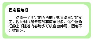
<p>这是一个固定的圆角框,鱿鱼是固定的宽度,因此制作起来容易和简单很多。这个圆角框的上下随着内容增多可以自由伸展,圆角不会被破坏。</p>
</div>
</body>
</html>
1.2、 使用透明背景图
可以把圆角图像的主体颜色变为透明色,而圆角外侧三角形仍然为网页背景颜色。这样的好处是,这个圆角框的颜色可以通过div的背景色任意设置,而不需要在图片中设置了,这样大大增加灵活性。
1.3、 带边框的固定宽度圆角框
其实做法跟上面两背景图像法做法一样,首选切图:


看一下代码:
<!DOCTYPE html PUBLIC "-//W3C//DTD XHTML 1.0 Transitional//EN" "http://www.w3.org/TR/xhtml1/DTD/xhtml1-transitional.dtd">
<html xmlns="http://www.w3.org/1999/xhtml">
<head>
<meta http-equiv="Content-Type" content="text/html; charset=gb2312" />
<style>
#rounded{
font-size:12px;
background:url(22.jpg) repeat-y;
width:288px;
padding:0;
margin:0 auto;
}
#rounded h3{
background:url(11.jpg) no-repeat;
padding:20px 20px 0;
font-size:12px;
margin:0;
}
#rounded p{
padding:10px 20px 18px;
margin:0;
text-indent:2em;
background:url(33.jpg) no-repeat left bottom;
}
</style>
<title>无标题文档</title>
</head>
<body>
<div id="rounded">
<h3>固定圆角框</h3>
<p>这是一个固定的圆角框,鱿鱼是固定的宽度,因此制作起来容易和简单很多。这个圆角框的上下随着内容增多可以自由伸展,圆角不会被破坏。</p>
</div>
</body>
</html>
看一下效果图:
2、 不固定宽度的圆角框
2.1、“4图像”单色不固定宽度圆角框
首先准备4个圆角图像


现在我们来看一下代码:
<!DOCTYPE html PUBLIC "-//W3C//DTD XHTML 1.0 Transitional//EN" "http://www.w3.org/TR/xhtml1/DTD/xhtml1-transitional.dtd">
<html xmlns="http://www.w3.org/1999/xhtml">
<head>
<meta http-equiv="Content-Type" content="text/html; charset=gb2312" />
<style>
#rounded{
font-size:12px;
background: url(topright.jpg) no-repeat right top;
width:288px;
padding:0;
margin:0 auto;
}
#rounded h3{
background:url(topleft.jpg) no-repeat;
padding:20px 20px 0;
font-size:12px;
margin:0;
}
#rounded p{
margin:0;
text-indent:2em;
background:url(bottomleft.jpg) no-repeat left bottom;
}
#rounded span{
background:url(bottomright.jpg) no-repeat right bottom;
display:block;
padding:10px 20px 18px;
}
</style>
<title>无标题文档</title>
</head>
<body>
<div id="rounded">
<h3>固定圆角框</h3>
<p><span>这是一个不固定的圆角框,由于宽度不固定,因此制作取来复杂一点。这个圆角框的上下随着内容的增多可以自由伸展,圆角不会被破坏。此外,使用设置为不同的宽度,同样也使用。</span></p>
</div>
</body>
</html>
效果图如下图所示:

现在看已经可以了,在加上背景色就完工了
在#rounded里面加上background:#b8f2a1 url(topright.jpg) no-repeat right top;就得到下面的效果:

如果把div的宽度设置成60%,然后在不同的浏览器中观看,效果如图所示,可以看到它很好的适应了浏览器窗口宽度的变化。


2.2、“4图像滑动门”单色不固定宽度
我们先来看一下htnl代码:
<!DOCTYPE html PUBLIC "-//W3C//DTD XHTML 1.0 Transitional//EN" "http://www.w3.org/TR/xhtml1/DTD/xhtml1-transitional.dtd">
<html xmlns="http://www.w3.org/1999/xhtml">
<head>
<meta http-equiv="Content-Type" content="text/html; charset=gb2312" />
<style>
#rounded{
font-size:12px/1.6;
background:#318c0d url(top.jpg) no-repeat left top;
width:60%;
padding:0;
margin:0 auto;
}
#rounded h3{
background:url(topright.jpg) no-repeat right top;
padding:20px 20px 0;
font-size:12px;
margin:0;
}
#rounded p{
margin:0;
text-indent:2em;
background:url(bottom.jpg) no-repeat left bottom;
}
#rounded span{
background: url(bottomright.jpg) no-repeat right bottom;
display:block;
padding:10px 20px 18px;
}
</style>
<title>无标题文档</title>
</head>
<body>
<div id="rounded">
<h3>固定圆角框</h3>
<p><span>这是一个不固定的圆角框,由于宽度不固定,因此制作取来复杂一点。这个圆角框的上下随着内容的增多可以自由伸展,圆角不会被破坏。此外,使用设置为不同的宽度,同样也使用。</span> </p>
</div>
</body>
</html>
显示的效果图如下图所示:

但是这样工作的缺点是top.jpg和bottom.jpg的图片要足够的长,要不然就会出现下面的情况:如图所示:

因为上边和下边的图片不足够的长而导致这样的问题。
2.3、“5图像”二维滑动门经典圆角框
首先我们先切图,切图思路如下图:

下面我们来看一下html代码:
<!DOCTYPE html PUBLIC "-//W3C//DTD XHTML 1.0 Transitional//EN" "http://www.w3.org/TR/xhtml1/DTD/xhtml1-transitional.dtd">
<html xmlns="http://www.w3.org/1999/xhtml">
<head>
<meta http-equiv="Content-Type" content="text/html; charset=gb2312" />
<style>
body{
font:12px/1.5;
}
#rounded{
width:80%;
border:1px solid red;
}
#rounded h3{
border:1px solid blue;
}
#rounded #main{
border:1px solid black;
}
#rounded #footer{
border:1px solid magenta;
}
#rounded #footer p{
border:1px solid blue;
}
</style>
<title>无标题文档</title>
</head>
<body>
<div id="rounded">
<h3>固定圆角框</h3>
<div id="main">
<p>这是一个不固定的圆角框,由于宽度不固定,因此制作取来复杂一点。这个圆角框的上下随着内容的增多可以自由伸展,圆角不会被破坏。此外,使用设置为不同的宽度,同样也使用。</p>
</div>
<div id="footer"><p>这是版权问题。</p></div>
</div>
</body>
</html>
效果图:

下面来放置背景图片:
#rounded{
width:80%;
background:url(left-top.jpg) top left no-repeat;
}
#rounded h3{
background:url(right-top.jpg) top right no-repeat;
padding:20px 20px 10px;
margin:0;
}
#rounded #main{
background:url(right.jpg) top right no-repeat;
padding:10px 20px;
margin:-2em 0 0 0 ;
}
#rounded #footer{
background:url(left-bottom.jpg) bottom left no-repeat;
}
#rounded #footer p{
background:url(right-bottom.jpg) bottom right no-repeat;
display:block;
padding:10px 20px 20px;
margin:-2em 0 0 0 ;
}
最后效果如图所示:


 1825
1825


 被折叠的 条评论
为什么被折叠?
被折叠的 条评论
为什么被折叠?
 到【灌水乐园】发言


