


前言
uniapp没有现成的刻度尺滑块实现调整字体大小的功能,通过找到u-view的slider滑块来实现刻度尺方式设置全局字体大小的二次封装。
总体思路:通过刻度尺的方式选择用户合适的字体效果,上面显示用户调整的字体大小来看效果,设置成功后将 像素值 存入vuex以及本地localstorage,防止下次进入App后字体恢复原样,
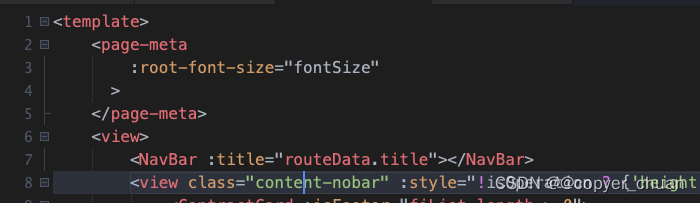
通过uniapp 提供的 <page-meta>标签的 root-font-size 属性来控制页面根文字大小,页面内容采用rem来进行字体大小设置,设置好后,重启app即可生效。
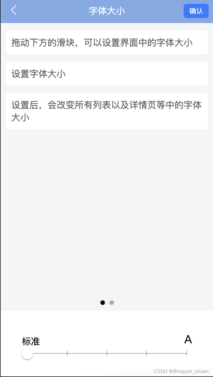
效果图:
slider滑块代码:
简单说下自己的思路,由于自己css基础较差,所以想了一个比较笨的方法,就是通过定位的方法,将直线上的宽度等分后,再设置左右边框线来实现画刻度尺的效果。一条直线一共是100数值,通过传入的step值可以等分宽度,所以用的时候,只需要取到对应值就好了。代码有点长,在下面我再加一个自己的按钮上去,实现调整字体大小。
// Slider.vue
<template>
	<view>
		<view class="u-slider_title">
			<span style="font-size: 32rpx;">标准</span>
			<span style="font-size: 40rpx">A</span>
		</view>
		<view class="u-slider" @tap="onClick" :class="[disabled ? 'u-slider--disabled' : '']" :style="{
			backgroundColor: inactiveColor
		}">
			<view class="u-slider_scale">
				<view
					class="u-slider_scale_item"
					v-for="item in stepList"
					:key="item"
				></view>
			</view>
			<view
				class="u-slider__gap"
				:style="[
					barStyle,
					createStyle,
					{
						height: height + 'rpx',
						backgroundColor: activeColor
					}
				]"
			>
				<view class="u-slider__button-wrap" @touchstart="onTouchStart"
					@touchmove="onTouchMove" @touchend="onTouchEnd"
					@touchcancel="onTouchEnd">
					<view class="u-slider__button" :style="[blockStyle, {
						height: blockWidth + 'rpx',
						width: blockWidth + 'rpx',
						backgroundColor: blockColor
					}]"></view>
				</view>
			</view>
		</view>
	</view>
</template>

<script>
/**
 * slider 滑块选择器
 * @tutorial https://uviewui.com/components/slider.html
 * @property {Number | String} value 滑块默认值(默认0
 * @property {Number | String} step 步长(默认1)
 * @property {Number | String} blockWidth 滑块宽度,高等于宽(30)
 * @property {Number | String} height 滑块条高度,单位rpx(默认6)
 * @property {String} inactiveColor 底部条背景颜色(默认#c0c4cc)
 * @property {String} blockColor 滑块颜色(默认#ffffff)
 * @property {Object} blockStyle 给滑块自定义样式,对象形式
 * @property {Boolean} disabled 是否禁用滑块(默认为false)
 * @event {Function} start 滑动触发
 * @event {Function} moving 正在滑动中
 * @event {Function} end 滑动结束
 * @example <u-slider v-model="value" />
 */
export default {
	name: 'u-slider',
	props: {
		// 当前进度百分比值,范围0-100
		value: {
			type: [Number, String],
			default: 0
		},
		// 是否禁用滑块
		disabled: {
			type: Boolean,
			default: false
		},
		// 滑块宽度,高等于宽,单位rpx
		blockWidth: {
			type: [Number, String],
			default: 30
		},
		// 步进值
		step: {
			type: [Number, String],
			default: 1
		},
		// 滑块条高度,单位rpx
		height: {
			type: [Number, String],
			default: 2
		},
		// 进度条的背景颜色
		inactiveColor: {
			type: String,
			default: '#90959b'
		},
		activeColor: {
			type: String,
			default: '#90959b'
		},
		// 滑块的背景颜色
		blockColor: {
			type: String,
			default: '#ffffff'
		},
		// 用户对滑块的自定义颜色
		blockStyle: {
			type: Object,
			default() {
				return {};
			}
		},
	},
	computed: {
		stepList: function() {
			let arr = []
			const length = 100 / Number(this.step)
			for (let i = 0 ; i < length ; i++) {
				arr.push(i)
			}
			return arr
		}
	},
	data() {
		return {
			startX: 0,
			status: 'end',
			newValue: 0,
			distanceX: 0,
			startValue: 0,
			barStyle: {},
			sliderRect: {
				left: 0,
				width: 0
			},
			createStyle: {},
			min: 0,
			// 最大值
			max: 100,
		};
	},
	watch: {
		value(n) {
			// 只有在非滑动状态时,才可以通过value更新滑块值,这里监听,是为了让用户触发
			if(this.status == 'end') this.updateValue(this.value, false);
		}
	},
	created() {
		this.updateValue(this.value, false);
		this.createStyle = {

		}
	},
	mounted() {
		// 获取滑块条的尺寸信息
		this.$uGetRect('.u-slider').then(rect => {
			this.sliderRect = rect;
		});
	},
	methods: {
		onTouchStart(event) {
			if (this.disabled) return;
			this.startX = 0;
			// 触摸点集
			let touches = event.touches[0];
			// 触摸点到屏幕左边的距离
			this.startX = touches.clientX;
			// 此处的this.value虽为props值,但是通过$emit('input')进行了修改
			this.startValue = this.format(this.value);
			// 标示当前的状态为开始触摸滑动
			this.status = 'start';
		},
		onTouchMove(event) {
			if (this.disabled) return;
			// 连续触摸的过程会一直触发本方法,但只有手指触发且移动了才被认为是拖动了,才发出事件
			// 触摸后第一次移动已经将status设置为moving状态,故触摸第二次移动不会触发本事件
			if (this.status == 'start') this.$emit('start');
			let touches = event.touches[0];
			// 滑块的左边不一定跟屏幕左边接壤,所以需要减去最外层父元素的左边值
			this.distanceX = touches.clientX - this.sliderRect.left;
			// 获得移动距离对整个滑块的百分比值,此为带有多位小数的值,不能用此更新视图
			// 否则造成通信阻塞,需要每改变一个step值时修改一次视图
			this.newValue = (this.distanceX / this.sliderRect.width) * 100;
			this.status = 'moving';
			// 发出moving事件
			this.$emit('moving');
			this.updateValue(this.newValue, true);
		},
		onTouchEnd() {
			if (this.disabled) return;
			if (this.status === 'moving') {
				this.updateValue(this.newValue, false);
				this.$emit('end');
			}
			this.status = 'end';
		},
		updateValue(value, drag) {
			// 去掉小数部分,同时也是对step步进的处理
			const width = this.format(value);
			// 不允许滑动的值超过max最大值,百分比也不能超过100
			if(width > this.max || width > 100) return;
			// 设置移动的百分比值
			let barStyle = {
				width: width + '%'
			};
			// 移动期间无需过渡动画
			if (drag == true) {
				barStyle.transition = 'none';
			} else {
				// 非移动期间,删掉对过渡为空的声明,让css中的声明起效
				delete barStyle.transition;
			}
			// 修改value值
			this.$emit('input', width);
			this.barStyle = barStyle;
		},
		format(value) {
			// 将小数变成整数,为了减少对视图的更新,造成视图层与逻辑层的阻塞
			return Math.round(Math.max(this.min, Math.min(value, this.max)) / this.step) * this.step;
		},
		onClick(event) {
			if (this.disabled) return;
			// 直接点击滑块的情况,计算方式与onTouchMove方法相同
			const value = ((event.detail.x - this.sliderRect.left) / this.sliderRect.width) * 100;
			this.updateValue(value, false);
		}
	}
};
</script>

<style lang="scss" scoped>
// @import "../../libs/css/style.components.scss";

.u-slider {
	width: 94%;
	margin: 0 auto;
	position: relative;
	border-radius: 999px;
	border-radius: 999px;
	background-color: #ebedf0;
}

.u-slider:before {
	position: absolute;
	right: 0;
	left: 0;
	content: '';
	top: -8px;
	bottom: -8px;
	z-index: -1;
}
.u-slider_scale {
	position: absolute;
	top: -4px; left: 0;
	width: 100%;
	display: flex;
	// z-index: 10;
}

.u-slider_scale_item {
	width: 25%;
	height: 9px;
	border-left: 1px solid #90959b;
	&:last-child {
		border-right: 1px solid #90959b;
	}
}

.u-slider__gap {
	position: relative;
	border-radius: inherit;
	transition: width 0.2s;
	transition: width 0.2s;
	background-color: #1989fa;
}

.u-slider__button {
	width: 24px;
	height: 24px;
	border-radius: 50%;
	box-shadow: 0 1px 2px rgba(0, 0, 0, 0.5);
	background-color: #fff;
	cursor: pointer;
}
.u-slider_title {
	display: flex;
	justify-content: space-between;
	align-items: flex-end;
	padding-bottom: 20rpx;
}
.u-slider__button-wrap {
	position: absolute;
	top: 50%;
	right: 0;
	z-index: 11;
	transform: translate3d(50%, -50%, 0);
}

.u-slider--disabled {
	opacity: 0.5;
}
</style>
下方是自己使用到这个功能的页面:
SetFontSize页面
思路:通过uniapp的swiper组件来实现两个页面对字体效果设置的展示,主要参照了微信设置字体大小功能的方式。设置字体大小后,将像素存入vuex并保存到本地,目的是为了下次进来还是这个设置。 第三步: 就是修改全局的字体大小
// SetFontSize.vue
<template>
	<view class="content">
		<NavBar
			title="字体大小"
			:isButton="true"
			:isChange="isChange"
			@confirm="confirm"
		>
		</NavBar>
		<view class="font-content">
			<view class="page-section swiper">
				<view class="page-section-spacing">
					<swiper class="swiper" :indicator-dots="indicatorDots" :interval="interval" :duration="duration">
						<swiper-item>
							<view class="swiper-item uni-bg-green">
								{{这儿写自己页面显示的内容,通过两个页面效果来展示字体效果}}
							</view>
						</swiper-item>
						<swiper-item>
							<view class="swiper-item uni-bg-green">
								{{这儿写自己页面显示的内容}}
							</view>
						</swiper-item>
					</swiper>
				</view>
			</view>
		</view>
		<view class="fixed-bottom">
			<!-- <u-slider
				v-model="value"
				:use-slot="true"
				step="25"
				min="0"
				max="100"
				block-width="40"
			>
			</u-slider> -->
			<Slider
				v-model="value"
				step="25"
				block-width="40"
			/>
		</view>
		<u-modal
			v-model="confirmModel"
			content="新的字体大小需要重启APP才能生效"
			title=""
			:show-cancel-button="true"
			@confirm="confirmSetting"
		>
		</u-modal>
	</view>
</template>

<script>
	import NavBar from '../../components/NavBar.vue'
	import Slider from '../../components/Slider.vue'
	import { mapState } from 'vuex'
	export default {
		name: 'SetFontSize', // 设置全局字体大小
		components: {
			NavBar,
			Slider
		},
		computed: {
			...mapState(['fontSize'])
		},
		data() {
			return {
				value: 0,
				indicatorDots: true,
				interval: 2000,
				duration: 500,
				list: [
					{
						value: '拖动下方的滑块,可以设置界面中的字体大小'
					},
					{
						value: '设置字体大小'
					},
					{
						value: '设置后,会改变所有列表以及详情页等中的字体大小'
					}
				],
				contentList: [
					{
						key: '字体大小',
						value: '拖动下方滑块可以设置界面中的字体大小'
					},
					{
						key: '字体设置',
						value: '设置后,会改变列表以及详情页等中的字体大小'
					},
					{
						key: '其他提示',
						value: '选中后,点击右上角确认按钮即可设置成功'
					}
				],
				isChange: true,
				confirmModel: false,
				barStyle: {},
				font: '0rpx',
				checkValue: '',
			}
		},
		watch: {
			value: function() {
				this.selectWidth()
				if (this.checkValue !== this.value) {
					this.isChange = false
				}  else {
					this.isChange = true
				}
			}
		},
		methods: {
			selectWidth() {
				switch(this.value) {
					case 0:
						this.font = '16px';
						break;
					case 25:
						this.font = '17px';
						break;
					case 50:
						this.font = '18px';
						break;
					case 75:
						this.font = '19px';
						break;
					case 100:
						this.font = '20px';
						break;
					default:
						this.font = '16px'
				}
				this.barStyle = {
					fontSize: this.font
				}
			},
			confirm() {
				this.confirmModel = true
			},
			confirmSetting() {
				this.$store.commit('setFontSize', this.font)
				plus.runtime.restart()
			}
		},
		created() {
			switch(this.fontSize) {
				case '16px':
					this.value = 0;
					break;
				case '17px':
					this.value = 25;
					break;
				case '18px':
					this.value = 50;
					break;
				case '19px':
					this.value = 75;
					break;
				case '20px':
					this.value = 100;
					break;
				default:
					this.value = 0;
			}
			this.checkValue = this.value
		}
	}
</script>

<style scoped lang="scss">
.content {
	width: 100%;
	height: 100vh;
	position: relative;

	.font-content {
		height: calc(100vh - 320rpx);
		background-color: #f5f5f5;

		.swiper {
			height:calc(100vh - 320rpx);
		}

		.list-item {
			width: 90%;
			padding: 20rpx;
			margin: 26rpx auto;
			border-radius: 10rpx;
			background-color: white;
			.item-content {
				color: #5b5c61;
				text-overflow: -o-ellipsis-lastline;
				overflow: hidden;
				text-overflow: ellipsis;
				display: -webkit-box;
				-webkit-line-clamp: 4;
				line-clamp: 4;
				-webkit-box-orient: vertical;
			}
		}
		.content-col {
			width: 48%;
			// display: flex;
			color: #5b5c61;
			margin: 6rpx 1%;
		}
	}
	.fixed-bottom {
		width: 80%;
		padding: 80rpx 10%;
		position: absolute;
		bottom: 0;

		.wrap {
			padding: 30rpx;
		}
		.badge-button {
			padding: 4rpx 6rpx;
			background-color: $u-type-error;
			color: #fff;
			border-radius: 10rpx;
			font-size: 22rpx;
			line-height: 1;
		}
	}
}
</style>
最后一步,将全局的字体大小进行改变
设置全局字体大小
uniapp提供了<page-meta>来修改根组件的方法,可以通过root-font-size属性来更改页面根的字体大小,那么就好办了,页面中内容字体大小采用 rem 单位,那么通过修改root-font-size属性来控制整个页面的文字大小就好了。
<page-meta :root-font-size="fontSize">
</page-meta>
将每个页面加上这个标签。必须是在第一个节点上,如下图所示
在设置字体页面修改好后,通过 plus.runtime.restart() 方法重启App后就生效了!
总结
自己总结一下思路,下一次用到就简单了。


 扫一扫
扫一扫


 3017
3017

 被折叠的 条评论
为什么被折叠?
被折叠的 条评论
为什么被折叠?
 到【灌水乐园】发言


