


两列布局
首先,先来试一下两列布局:两列自适应宽度;
主要是运用%来设置宽度width;这样随着屏幕大小变化,该列宽度也会相应变化:
如果要固定的话,直接将width设置成固定值即可,如下
<!DOCTYPE html>
<html>
	<head>
		<meta charset="utf-8">
		<title>二列自适应宽度</title>
	</head>
	<body>
		<div class="side">此处为side的内容</div>
		<div class="main">此处为main的内容</div>
	</body>
	<style type="text/css">
		.side { background: #0099FF; height:300px;<span style="color:#cc33cc;">width:100px</span>;float:left;}
		.main { background-color:#F8EEA7;height:300px;<span style="color:#3366ff;">width:70%</span>;margin-left:100px;}
	</style>
</html>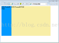
图中side的宽度是固定的,而margin随着浏览器宽度变化
如果要全体居中的话,可以在外面加一个父容器div,只要把它的class设置margin:0 auto;即可
	<body>
		<span style="color:#3366ff;"><div class="contain"></span>
		<div class="side">此处为side的内容</div>
		<div class="main">此处为main的内容</div>
		</div>
	</body>
	<style type="text/css">
		.contain {  <span style="color:#3366ff;">margin:0 auto;</span> width:500px;}
		.side { background-color: #0099FF; height:300px;width:100px;float:left;}
		.main { background-color:#F8EEA7;height:300px;width:400;margin-left:100px;}
	</style>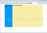
三列自适应宽度
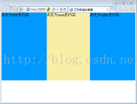
情况一:左右两边固定,中间自适应‘
<body>
        <div class="left">此处为left 的内容</div>
        <div class="right">此处为right 的内容</div>
        <div class="main">此处为main的内容</div>
</body>

<style type="text/css">
  body {margin:0;}
	.left { background-color: #0099FF; height:300px;width:200px;float:left;}
	.right { background-color: #0099FF; height:300px;width:200px;float:right;}
	.main { background-color:#F8EEA7;height:300px;margin:0 200px;}
</style>这个情况的主要思路是设置两边宽度,分别向两边浮动,给中间main留空,这样就可以让中间main自适应屏幕。
情况二:三列宽度固定
与两列宽度固定的情况类似,只要用一个父容器外面加一个父容器div,只要把它的class设置margin:0 auto;同时设定宽度width为固定值,即可:
    <body>
	<div class="contain">
	<div class="left">此处为left 的内容</div>
        <div class="right">此处为right 的内容</div>
        <div class="main">此处为main的内容</div>
        </contain>
   </body>

	<style type="text/css">
	   body {margin:0;}
	   .contain{margin:0 auto; width:800px;}
		.left { background-color: #0099FF; height:300px;width:200px;float:left;}
		.right { background-color: #0099FF; height:300px;width:200px;float:right;}
		.main { background-color:#F8EEA7;height:300px;margin:0 200px;}
	</style>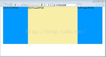
IE6的3像素问题
IE6存在的3像素问题是指当浮动元素月非浮动元素在一起时,中间会出现一个3px的缝隙;这个是IE6一个著名的bug;解决办法是在浮动元素后面加上_margin-right:3px;下划线只有IE6能识别。当两列固定宽度时,最好把.main也固定宽度且向右浮动,这样就可以避免IE6的3像素bug了。
<body>
		<div class="left">此处为left 的内容</div>
        <div class="main">此处为main的内容</div>
	</body>

	<style type="text/css">
	   body {margin:0;}
		.left { background-color: #0099FF; height:300px;width:200px;float:left;_margin-right:-3px}
		.main { background-color:#F8EEA7;height:300px;}
	</style>


 396
396


 被折叠的 条评论
为什么被折叠?
被折叠的 条评论
为什么被折叠?
 到【灌水乐园】发言


