


周末闲来无聊,特地整理Python的画图细节实现,方便日后查看
参考文献
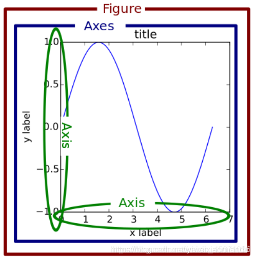
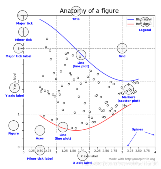
一般画图
曲线图
建议使用面向对象的方法
# 如果是Jupyter notebook
# 加入:%matplotlib inline
from matplotlib import pyplot as plt
import numpy as np
import math
x = np.arange(0, math.pi*2, 0.05)
y = np.sin(x)
font1 = {'family' : 'Arial',
'weight' : 'normal',
'size'   : 18,
} #Arial是字体形式
fig = plt.figure(figsize=(8,4),dpi=144,facecolor='r',edgecolor='w',linewidth = 1)
ax = fig.add_axes([0.8,0.8,1,1])
ax.plot(x,y,linewidth =2.0, label = r"$\mathregular{\xi_a}$=0",color='b', linestyle='-',marker='*')
ax.legend(loc='upper right',labels='sin(x)',font1)
ax.legend(labels = ('tv', 'Smartphone'), loc = 'lower right', fontsize = 'small') # legend placed at lower right
ax.set_title("Advertisement effect on sales")
axe.set_yscale("log")
ax.set_xticks([2,4,6,8,10])
ax.set_xlabels([‘two’, ‘four’,’six’, ‘eight’, ‘ten’])
ax.set_xlim(0,10)
ax.set_xlabel('medium')
ax.set_ylabel('sales') ax.text(0.8,0.2,add_text,fontsize=16,transform = ax.transAxes)
# label=r"$希腊字母代码$"
# label="$普通字母$"
## 更改图框粗细:
TK = plt.gca()#获取边框
TK.spines['bottom'].set_linewidth(bwith)#图框下边
TK.spines['left'].set_linewidth(bwith)#图框左边
TK.spines['top'].set_linewidth(bwith)#图框上边
TK.spines['right'].set_linewidth(bwith)#图框右边
## 去掉任意坐标轴
ax.axis["right"].set_visible(False)
ax.axis["top"].set_visible(False)
子图相关:https://blog.csdn.net/weixin_45671036/article/details/112535961
填色图
def plot_SST_diff(sst_read):
    sst_flip = sst_read
    lon= np.load('lon.npy')
    lat = np.load('lat.npy')

    level = np.linspace(-1,1,11)
    sst_flip[sst_flip==0] = np.nan
    [LON, LAT] = np.meshgrid(lon,lat)
    # print(np.shape(sst_flip))
    dlon, dlat = 60, 30
    xticks = np.arange(0, 360.1, dlon)
    yticks = np.arange(-90, 90.1, dlat)
    fig = plt.figure(figsize=(6,5))
    ax = fig.add_subplot(1,1,1, projection=ccrs.PlateCarree(central_longitude=180))
    ax.coastlines()
    gl = ax.gridlines(crs=ccrs.PlateCarree(), draw_labels=False,
        linewidth=1, linestyle=':', color='k', alpha=0.8)
    gl.xlocator = mticker.FixedLocator(xticks)
    gl.ylocator = mticker.FixedLocator(yticks)
    ax.set_xticks(xticks, crs=ccrs.PlateCarree())
    ax.set_yticks(yticks, crs=ccrs.PlateCarree())
    ax.xaxis.set_major_formatter(LongitudeFormatter(zero_direction_label=True))
    ax.yaxis.set_major_formatter(LatitudeFormatter())
    sm = ax.contourf(LON,LAT,sst_flip,cmap= 'RdYlBu_r', levels = level, extend = 'both')
    fig.colorbar(sm, extend='both', orientation="horizontal", label = "SST($^{o}C$) diff")
区域散点图
 lon = np.load('IQUAM_lon.npy')
    lat = np.load('IQUAM_lat.npy')
    if catagory == "IQUAM":
        sst = np.load('IQUAM_sst.npy')
    else:
        sst = np.load('station_ave.npy')

    level = np.linspace(0,30,16)
    dlon, dlat = 60, 30
    xticks = np.arange(0, 360.1, dlon)
    yticks = np.arange(-90, 90.1, dlat)
    fig = plt.figure(figsize=(6,5))
    ax = fig.add_subplot(1,1,1, projection=ccrs.PlateCarree(central_longitude=180))
    ax.coastlines()
    gl = ax.gridlines(crs=ccrs.PlateCarree(), draw_labels=False,
        linewidth=1, linestyle=':', color='k', alpha=0.8)
    gl.xlocator = mticker.FixedLocator(xticks)
    gl.ylocator = mticker.FixedLocator(yticks)
    ax.set_xticks(xticks, crs=ccrs.PlateCarree())
    ax.set_yticks(yticks, crs=ccrs.PlateCarree())
    ax.xaxis.set_major_formatter(LongitudeFormatter(zero_direction_label=True))
    ax.yaxis.set_major_formatter(LatitudeFormatter())
    sm = ax.scatter(lon,lat,c = sst, s=7, cmap = 'RdYlBu_r', vmin =0, vmax = 30)
    fig.colorbar(sm, extend='both', orientation="horizontal", label = catagory+"SST($^{o}C$)")
物理量散点图
def assessment_model(station_base, station_ave):
    station_lat = np.load('IQUAM_lat.npy')
    station_base = np.squeeze(station_base)
    station_ave = np.squeeze(station_ave)
    idx = np.isfinite(station_base) & np.isfinite(station_ave)
    station_base = station_base[idx]
    station_ave = station_ave[idx]
    station_lat = station_lat[idx]

    fig = plt.figure(figsize=(6,5))
    ax = fig.add_subplot(1,1,1)
    sm = ax.scatter(station_base,station_ave,c = station_lat, s=7, cmap = 'RdYlBu_r',vmin =-60, vmax = 60)
    fig.colorbar(sm, extend='both', orientation="horizontal", label = "Latitude")
    ax.set_xlim(0,30)
    ax.set_ylim(0,30)
    ax.set_xlabel('IQUAM SST')
    ax.set_ylabel('COMINED SST')
    # print(np.shape(station_base))
    # print(np.shape(station_ave))

    corr_coef = ma.corrcoef(ma.masked_invalid(station_base), ma.masked_invalid(station_ave))
    print(corr_coef)
    add_text = "R= "+str(round(corr_coef[0,1],2))
    ax.text(0.8,0.2,add_text,fontsize=16,transform = ax.transAxes)
    ax.plot(np.unique(station_base), np.poly1d(np.polyfit(station_base, station_ave, 1))(np.unique(station_base)),linewidth=2,color='k')
    ax.plot(station_base, station_base,linewidth=3,color='r',linestyle= ':')
补充整理
- 字符串参数顺序最好为标记,线型,颜色,其他顺序形式可能会导致错误。若未全指定上述所有属性,则采用相应属性的默认值,例如:’^-b’
- 当然也可以用参数marker, linestyle(ls), color(c)分别指定上述属性
datald.plot.line(marker = "^", ls = "-", c= "b", figsize = (10,4))
- 利用
plt.tight_layout()自动调整子图的参数,使之填充整个图像区域 - 通过迭代器ax.flat对高维Axes数组ax迭代,获取每一个子图的Axes信息,在每一个循环过程中将各个Axes的地址赋值给axi(按址赋值),然后通过变量axi控制各个子图的绘图属性
for axi in ax.flat:
    axi.set_ylabel("");
- 若要显式查看各个Axes情况可通过
ax.flatten()实现 - 艺术家层绘制示例
# 设置子图Axes
fig = plt.figure()
ax1 = fig.add_subplot(1, 1, 1)
ax2 = fig.add_axes([0.2, 0.6, .2, .2], facecolor='y')
ax3 = fig.add_axes([.65, .6, .2, .2], facecolor='y')

# 主Axes
ax1.plot(t, s)
ax1.axis([0, 1, 1.1*np.amin(s), 2*np.amax(s)])
ax1.set_xlabel('time (s)')
ax1.set_ylabel('current (nA)')
ax1.set_title('Gaussian colored noise')

# 主Axes 之上的一个Axes
ax2.plot(t[:len(r)], r)
ax2.set_title('Impulse response')
ax2.set_xlim(0, 0.2)
ax2.set_xticks([])
ax2.set_yticks([])

# 主Axes 之上另一个Axes
n, bins, patches = ax3.hist(s, 400, density=1)
ax3.set_title('Probability')
ax3.set_xticks([])
ax3.set_yticks([])

fig.canvas.draw()```
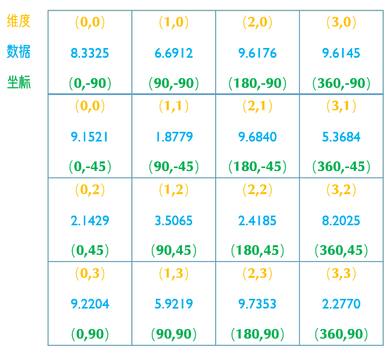
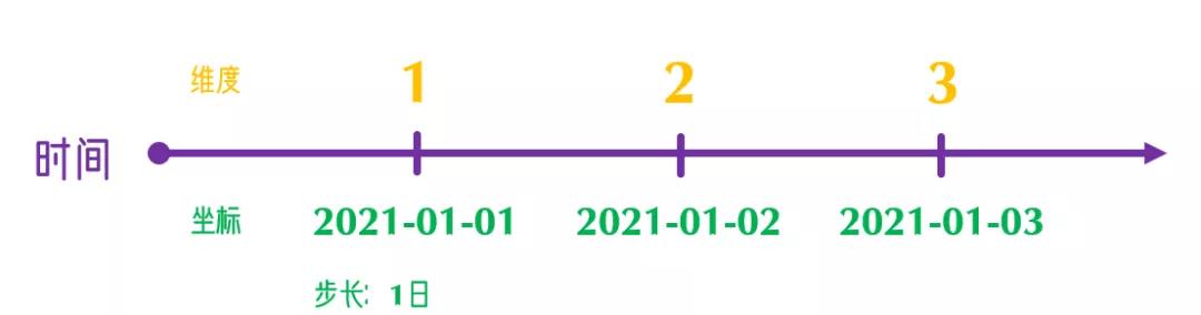
维度:针对计算机内数值的储存位置
坐标:实际时空中的位置信息
二者通过一定的映射关系得以联系到一起
xarray总结
(以下内容转自深雨露微信公众号)
链接: 基本概念、xr.DataArray类、xr.Dataset类介绍.
链接: pandas数据类型转换和读取写入,数据输入输出.
链接: 数据索引和分片(基于维度名称、坐标名称).
链接: 一维插值、多维插值、数据广播、数据对齐.
链接: 基本计算、apply_ufunc函数的使用.
链接: 降维、广播.
链接: 赋权降维(案例:区域平均SST计算)、分割(分组元素迭代访问、逐个访问).
链接: 分割、分箱、应用和组合(1月多年平均场、多年纬度月平均气候场).
链接: 距平、重采样Resample、时间窗移动Rolling.
链接: 指数加权滑动平均、粗化(作用域多个维度、多个坐标)、线性多项式回归.
链接: 基础绘图.plot,直方图,二维绘图.
链接: 比较plt.xxx()与ax.xxx().
链接: 子图创建(一行子图,共享轴,画中画,逐个创建子图,一次性创建多个子图,不规则多行多列子图.
链接: 绘制三维曲面、剖面图、参数robust、参数cbar_kwargs.
链接: 绘图配色方案设置(Matplotlib, Seaborn, NCL, CMasher)、获取子配色方案.
链接:基础线图绘制、各参数调整、坐标标签设置为无字符串的形式.
云台书使总结
链接:Python学习资源介绍、安装方法.
链接:教程合集.
Geopandas
权威辅导资料+实践(操作易上手)
链接:https://pan.baidu.com/s/1tO2hZcXvod6vJIwZosHtdg
提取码:5lyj


 4597
4597


 被折叠的 条评论
为什么被折叠?
被折叠的 条评论
为什么被折叠?
 到【灌水乐园】发言


